The Complete Guide to Arranging Botanical Prints on Your Wall
A decision-making framework for choosing plant prints that actually work together, not just how to hang them.

Botanical prints are forgiving. They share a colour family, a subject, and a sensibility, which makes them one of the easiest categories to group on a wall. The trick isn't hanging them. It's choosing the right ones in the first place, then giving them enough breathing room to look curated rather than crammed.
Gallery wall vs matched set: which approach suits your space
A matched set is three or more prints designed to live together: same artist, same palette, same scale, often the same background. They're the safest option and the fastest route to a finished wall. If you've ever stood in front of a blank lounge wall and felt frozen, a matched set solves the problem in a single decision.
A gallery wall is a curated mix of different prints arranged as a unit. It looks more personal and collected, but it asks more of you. You're balancing colour, scale, frame choice, and subject matter all at once.
Our honest position: if this is your first wall, start with a matched set of 3. It's nearly impossible to mess up, and you can always expand outward later. If you already own one or two prints you love and want to build around them, a gallery wall makes more sense.
Matched sets work brilliantly above sofas, beds, and console tables, where the rectangular footprint mirrors the furniture below. Gallery walls suit staircases, awkward corners, and longer empty walls where a single rectangle would feel too rigid.

The 3-print layout: the easiest botanical gallery wall to get right
Three prints is the sweet spot. Two feels accidental. Four invites mistakes. Three reads as deliberate without demanding a maths degree.
There are three layouts worth knowing.
The horizontal row
Three prints of the same size, hung side by side at the same height, evenly spaced. This is the configuration that suits sofas, beds, and dining sideboards. For a standard three-seater sofa (roughly 200cm wide), three 40x50cm or 50x70cm prints work beautifully. For a longer sectional, scale up to 60x80cm.
The vertical stack
Three prints stacked one above the other, useful for narrow walls between doorways, beside tall bookshelves, or in hallways. Use smaller sizes here, typically 30x40cm or 40x50cm, and keep spacing tighter than you would horizontally.
The L-shape or asymmetric trio
One larger print (say 70x100cm) anchoring the arrangement, with two smaller prints (40x50cm) stacked beside it. This works in corners, beside tall furniture, or in spaces where a perfect rectangle would feel too formal. It's the trickiest of the three but rewards you with a more designed look.
The horizontal row is the version we'd recommend if you want zero risk. Browse botanical art prints and pick three that share a tone before you start measuring anything.
Choosing plant prints that belong together (colour, style, and scale)
Most arrangement disasters start at the buying stage, not the hanging stage. The prints simply don't belong together. Here's how to make sure yours do.
The colour rule: pick one approach and commit
There are three colour strategies that consistently work for botanicals.
Monochrome greens. All three prints sit in the same green family: sage, olive, fern, eucalyptus. Backgrounds are neutral (cream, off-white, soft beige). This is the most foolproof option and reads as calm and considered.
Analogous palette. Greens with adjacent colours: green and warm gold, green and terracotta, green and dusty pink. Two prints lean green, one introduces the secondary colour. This adds warmth without breaking cohesion.
Neutrals with one accent. Black-and-white botanical illustrations or pencil studies, with one print introducing a single colour (a single bloom in coral, a leaf in deep burgundy). This is the most editorial-looking approach.
What doesn't work: warm greens (yellow-based, like olive) mixed with cool greens (blue-based, like emerald). They fight each other in a way you can feel before you can name. Pick a temperature and stay there.
The style rule: match the artistic language
A vintage botanical illustration with hand-labelled Latin names will not sit comfortably next to a saturated tropical photograph. They speak different visual languages. The styles worth grouping:
- Vintage scientific illustrations with each other
- Modern minimalist line drawings with each other
- Tropical photography with other tropical photography
- Watercolour studies with other watercolours
You can occasionally bridge styles if the colour palette is identical, but it's a calculated risk. Safer to commit to one style across all three prints.
The scale rule: match the visual weight
If one print shows a single delicate fern frond and another shows a dense jungle scene packed with foliage, they'll feel mismatched even if the colours align. Look for prints with similar levels of visual density. Three sparse prints work together. Three busy prints work together. Mixing the two creates a hierarchy you didn't ask for.

Exact spacing and heights for horizontal and grid arrangements
This is where most guides get vague. We won't.
Spacing between prints
For botanical prints specifically, 5 to 8cm between frames is the range that works. Tighter than 5cm and the prints start to read as one squashed image. Wider than 8cm and the eye stops grouping them as a set.
Our default: 6cm. It looks intentional in almost every room.
For grids of four or six prints, drop to 4cm. Tighter spacing helps a grid read as a single graphic block.
Height from the floor
The professional consensus is to centre the midpoint of your arrangement at 145 to 152cm from the floor (roughly 57 to 60 inches). This is gallery standard, calibrated to average human eye level.
When hanging above furniture, the rule changes. The bottom edge of your prints should sit 18 to 25cm above the top of the sofa, headboard, or console. Closer than 18cm and the prints feel like they're leaning on the furniture. Further than 25cm and the wall looks disconnected from the room below.
Spacing for a horizontal row above a sofa
For a 200cm sofa with three 50x70cm prints:
- Total width of arrangement: (50 x 3) + (6 x 2) = 162cm
- Centre this on the sofa
- Bottom edge of prints: 20cm above sofa back
For a vertical stack between doorways:
- Three 30x40cm prints with 5cm spacing
- Total height: (40 x 3) + (5 x 2) = 130cm
- Centre point at 150cm from the floor
Write these numbers down before you pick up a pencil. Trying to eyeball it is how walls go wrong.
Mixing monstera, palm, and forest prints without visual chaos
This is the question nobody answers properly, so here it is.
You can absolutely mix different plant types in one arrangement. The key is shared visual DNA.
Combinations that work
Tropical trio: monstera, palm, and banana leaf. All large-leaf, all glossy, all share a similar level of drama. Same green palette, same energy.
Soft botanical trio: eucalyptus, olive branch, and fern. All delicate, all silvery-green, all share a Mediterranean feel.
Forest trio: pine, birch, and oak (often photographed or illustrated as full trees or branches). All woodland, all temperate, all share a moodier palette.
Mixed leaves with shared colour: monstera + palm + eucalyptus. Different shapes and scales, but if they all sit in similar greens with neutral backgrounds, the eye groups them.
Combinations that create chaos
Monstera + cactus + rose. Three completely different climates, three different visual moods. The eye can't find the connection.
Vintage forest engraving + modern tropical photograph + watercolour wildflower. Three styles, three time periods, three colour temperatures.
Dense jungle scene + single minimalist leaf + busy floral. The visual weights are too different.
The rule we'd give you: pick one shared element across all three prints. Same plant family, OR same colour palette, OR same artistic style. If you can only tick one of those boxes, the prints probably don't belong together. If you tick two, you're golden. The full plants and trees collection is organised so you can browse by visual style rather than just subject.

Why frame consistency matters more than print consistency
Here's the secret weapon nobody talks about enough: identical frames will rescue almost any combination of prints.
You can hang three botanically unrelated prints, and as long as the frames match, the wall reads as intentional. You can hang three perfectly coordinated prints in mismatched frames, and the wall reads as cluttered.
Frame consistency creates the visual rhythm that makes a gallery wall look curated. The eye registers the repeating frame first, the prints second.
What "consistent" means
- Same frame colour (all black, all white, all natural oak)
- Same frame width (a thin profile next to a chunky one breaks the rhythm)
- Same finish (all matte, or all with the same sheen)
- Same mount style (all with white borders, or all without)
If you're buying multiple prints, buy them framed and buy them from the same source. Mixing frames from different makers almost never quite works. Even "black" varies wildly: warm black, cool black, satin, gloss. The differences are subtle on their own and obvious side by side.
This is partly why we ship our framed prints with the print already fitted into a solid FSC-certified wood frame, finished and ready to hang. The frame profiles are consistent across sizes, so a 30x40cm and a 50x70cm hung together look like siblings.
Choosing a frame colour for botanicals
- Natural oak is the safest choice. It echoes the organic subject matter and works in almost every room.
- Black sharpens the prints and adds contrast. Best for bold tropical photography or graphic line drawings.
- White disappears into the wall and lets the prints do all the work. Best for vintage illustrations and soft watercolours.
Pick one and use it across the whole arrangement.
Hanging tips: getting it level the first time
The actual hanging is the part that goes wrong most often. Here's how to avoid it.
Use paper templates
Cut paper to the exact size of each print. Tape them to the wall in your planned arrangement. Live with it for a day. Walk past it in the morning, see it in evening light. Adjust before you make any holes.
This single step prevents 90% of hanging regrets.
Measure from the centre, not the corners
When marking where your nail goes, measure from the centre point of where you want the print to land, then offset by half the print's height. Most picture hangers sit a few centimetres below the top of the frame, so account for that.
Use a proper level
Phone apps work in a pinch but a 30cm spirit level is more reliable. Hold it across the top of your print after hanging.
For multi-print arrangements, work from the middle out
Hang the centre print first at the correct height. Then measure spacing outward from that print. This stops small errors from compounding across the row.
When the wall isn't perfectly flat
Older homes have walls that bow. If your arrangement looks crooked even after careful measuring, trust your eye over your spirit level. The prints should look level relative to the ceiling line and skirting, even if that means they're technically a millimetre off. The ceiling is what people register first.

A few final notes
Buy all your prints at once, not over time. Light exposure, paper batches, and frame finishes shift slightly between orders, and the differences are visible when prints hang side by side. Coordinated wall art sets sidestep this entirely.
Hang them slightly lower than feels right. Most people instinctively hang too high. If you're torn between two heights, choose the lower one.
And give yourself permission to take it down and try again. The holes are easily filled. A wall that's worth looking at is worth a few extra nails.

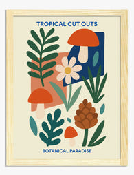
In diesem Blog vorgestellte Fab-Produkte
-

Leinwandbild Treppen-Oase mit Zimmerpflanzen
Translation missing: de.products.product.sale_price Ab €64,95€92,95 -

Poster Botanische Pflanzen auf dem Regal vor gelbem Hintergrund
Translation missing: de.products.product.sale_price Ab €16,95€23,95 -

Poster Botanische Treppe
Translation missing: de.products.product.sale_price Ab €16,95€23,95 -

Leinwandbild Botanischer Treppengarten
Translation missing: de.products.product.sale_price Ab €64,95€92,95 -
Poster botanische Tropen-Collage
Translation missing: de.products.product.sale_price Ab €16,95€23,95 -

Poster Boho-Vasen mit Zimmerpflanzen
Translation missing: de.products.product.sale_price Ab €16,95€23,95 -

Poster Britische botanische Landschaft
Translation missing: de.products.product.sale_price Ab €16,95€23,95 -

Poster Botanischer Wildkräutergarten – Blau, Gelb, Pink
Translation missing: de.products.product.sale_price Ab €16,95€23,95 -
Poster Botanische Muse
Translation missing: de.products.product.sale_price Ab €16,95€23,95 -

Poster botanische Treppe
Translation missing: de.products.product.sale_price Ab €16,95€23,95 -
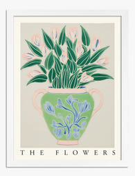
Poster Botanischer Blumenstrauß in Vase – Grün & Pastell
Translation missing: de.products.product.sale_price Ab €16,95€23,95 -

Poster Zimmerpflanzen auf Sonnengelb
Translation missing: de.products.product.sale_price Ab €16,95€23,95 -

Poster Botanische Line Art Kollektion
Translation missing: de.products.product.sale_price Ab €16,95€23,95 -

Leinwandbild Fließende botanische Linien in Pink
Translation missing: de.products.product.sale_price Ab €64,95€92,95 -

Leinwandbild Botanische Boho-Vasen
Translation missing: de.products.product.sale_price Ab €64,95€92,95 -

Poster botanische Eleganz in Dunkelgrün
Translation missing: de.products.product.sale_price Ab €16,95€23,95 -

Leinwandbild Botanische Farbtöne
Translation missing: de.products.product.sale_price Ab €64,95€92,95 -

Poster moderne botanische Blüte in Tiefgrün
Translation missing: de.products.product.sale_price Ab €16,95€23,95 -

Poster botanische Lehrtafel im Vintage-Stil
Translation missing: de.products.product.sale_price Ab €16,95€23,95


Mehr aus The Frame

Why William Morris Prints Look Brilliant in Mod...
William Morris has been quietly miscategorised for decades. His patterns get filed under "country cottage" or "Arts and Crafts revival" and rarely escape, which is a shame because his tree...

Why Arts and Crafts Nature Prints Are the Antid...
The minimalism hangover: why bare walls stopped feeling calming For about a decade, the aspirational interior was a white box with one boucle chair in it. That look has officially...

Botanical Petal Art: Why Close-Up Prints Feel M...
Full florals have had a long run, and they're not going anywhere. But if you've noticed that the botanical art appearing in design magazines, boutique hotel lobbies, and the better-styled...