


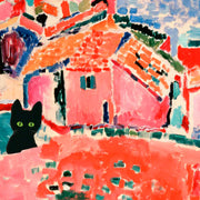


Summer Trio Ice Cream Cone Art Print
Translation missing: en.products.product.sale_price
From €16,95
€23,95

Thats My Jam Art Print
Translation missing: en.products.product.sale_price
From €19,95
€33,25

Monet Still Life with Flowers And Fruit Art Print
Translation missing: en.products.product.sale_price
From €19,95
€33,25

Amsterdam Autumn Canal Art Print
Translation missing: en.products.product.sale_price
From €19,95
€33,25

Modern Desert Retreat Art Print
Translation missing: en.products.product.sale_price
From €19,95
€33,25

Year of The Snake - Serpent & Peony Elegance Art Print
Translation missing: en.products.product.sale_price
From €19,95
€33,25

Retro Seaside Vibes Art Print
Translation missing: en.products.product.sale_price
From €19,95
€33,25

Pickle Cat Pop Art Print
Translation missing: en.products.product.sale_price
From €19,95
€33,25

Goat & Roses Lunar Year Art Print
Translation missing: en.products.product.sale_price
From €19,95
€33,25

Helene by Henri Matisse Art Print
Translation missing: en.products.product.sale_price
From €19,95
€33,25
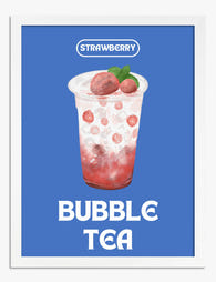
Strawberry Bubble Tea Delight Art Print
Translation missing: en.products.product.sale_price
From €19,95
€33,25

Bold Tomato Pop Art Print
Translation missing: en.products.product.sale_price
From €19,95
€33,25

Cozy Dinner Gathering Art Print
Translation missing: en.products.product.sale_price
From €19,95
€33,25

Lunar Monkey Blossom Art Print
Translation missing: en.products.product.sale_price
From €19,95
€33,25

Iconic London Bridge Art Print
Translation missing: en.products.product.sale_price
From €19,95
€33,25

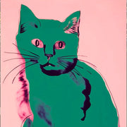
Nine Lives, Bold Cat Art Print
Translation missing: en.products.product.sale_price
From €19,95
€33,25

Sunset Desert Vista Art Print
Translation missing: en.products.product.sale_price
From €19,95
€33,25

Colorful City Stroll Art Print
Translation missing: en.products.product.sale_price
From €19,95
€33,25

Henri Matisse, Bouquet of Anemones Art Print
Translation missing: en.products.product.sale_price
From €19,95
€33,25

Enchanted Garden Retreat Art Print
Translation missing: en.products.product.sale_price
From €19,95
€33,25

William Morris Winter Butterfly Art Print
Translation missing: en.products.product.sale_price
From €19,95
€33,25
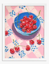
Cherries on Gingham Art Print
Translation missing: en.products.product.sale_price
From €19,95
€33,25

Fresh Picked Simplicity Art Print
Translation missing: en.products.product.sale_price
From €19,95
€33,25

Culinary Lobster Delight Art Print
Translation missing: en.products.product.sale_price
From €19,95
€33,25

Bunny in Sunglasses Art Print
Translation missing: en.products.product.sale_price
From €16,95
€23,95

Poppy Power Scandinavian Art Print
Translation missing: en.products.product.sale_price
From €16,95
€23,95

Playful Lobster Sketch Art Print
Translation missing: en.products.product.sale_price
From €16,95
€23,95

Italian Tomato Cluster Art Print
Translation missing: en.products.product.sale_price
From €16,95
€23,95

Playful Lobster Sketch Art Print
Translation missing: en.products.product.sale_price
From €16,95
€23,95

Modern Scandinavian Blooms Art Print
Translation missing: en.products.product.sale_price
From €16,95
€23,95
More Fab art curations
 We’re serious about art, ask away


From sizing to framing and print quality, Fab's art experts break it all down—so you can find the right art for your space.
Need more help? Contact our team here
Which rooms work best for red art prints?
Red art prints are a power move in living rooms and dining spaces, where you want energy and conversation. A large red abstract art print (say 70x100cm, framed in black) above a sofa or sideboard anchors the room instantly. We'd avoid bright reds in bedrooms unless you're going for deep, muted tones like burgundy or oxblood, which pair beautifully with warm neutrals and actually feel calming. For a hallway or entryway, a smaller red print gives guests an immediate sense of personality without overwhelming a tight space.
What colours go with red wall art?
Red's complementary colour is green, so if your room has olive, sage, or forest green accents, red wall art prints will sing. For a calmer scheme, pair red artwork with warm whites, soft greys, and natural wood tones. We think the combination of a rich red print in a natural oak frame against an off-white wall is genuinely hard to beat. Steer clear of pairing bright red art with orange or hot pink nearby, as the colours compete rather than complement.
Should I choose a red abstract print or something more figurative?
If you have a minimalist or modern space with clean lines, a red abstract art print will feel intentional and cohesive. Abstract reds work especially well in open-plan living rooms because they add warmth without adding visual clutter. If your room already has plenty of pattern (think patterned cushions, a busy rug), a figurative or photographic red print provides a focal point that feels grounded. When in doubt, go abstract. It's easier to live with long-term and pairs with more furniture styles.
How do I stop a red print from overwhelming my wall?
The trick is framing and scale. A red fine art print in a wide white mount with a black or natural wood frame introduces breathing room around the colour, so it feels deliberate rather than aggressive. If you're working with a large blank wall, go big (our prints go up to 70x100cm) rather than hanging something small and lost. One confident red piece reads as a design choice. Three small red prints scattered around the same room reads as chaotic.
What does red symbolise in art and why does it work in homes?
Red carries centuries of meaning in art: passion, power, vitality, and warmth. In a home setting, those associations translate into spaces that feel alive and welcoming rather than flat. A living room with a red art print on the wall naturally draws people in and sparks conversation, which is exactly why designers use it in social spaces. It's also one of the few colours that reads as both contemporary and classic, so a well-chosen red print won't feel dated in five years.