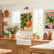
Your kitchen isn't just for cooking. Your dining room isn't just for eating. These are the spaces where life happens. Where you have your morning coffee, where friends gather around...
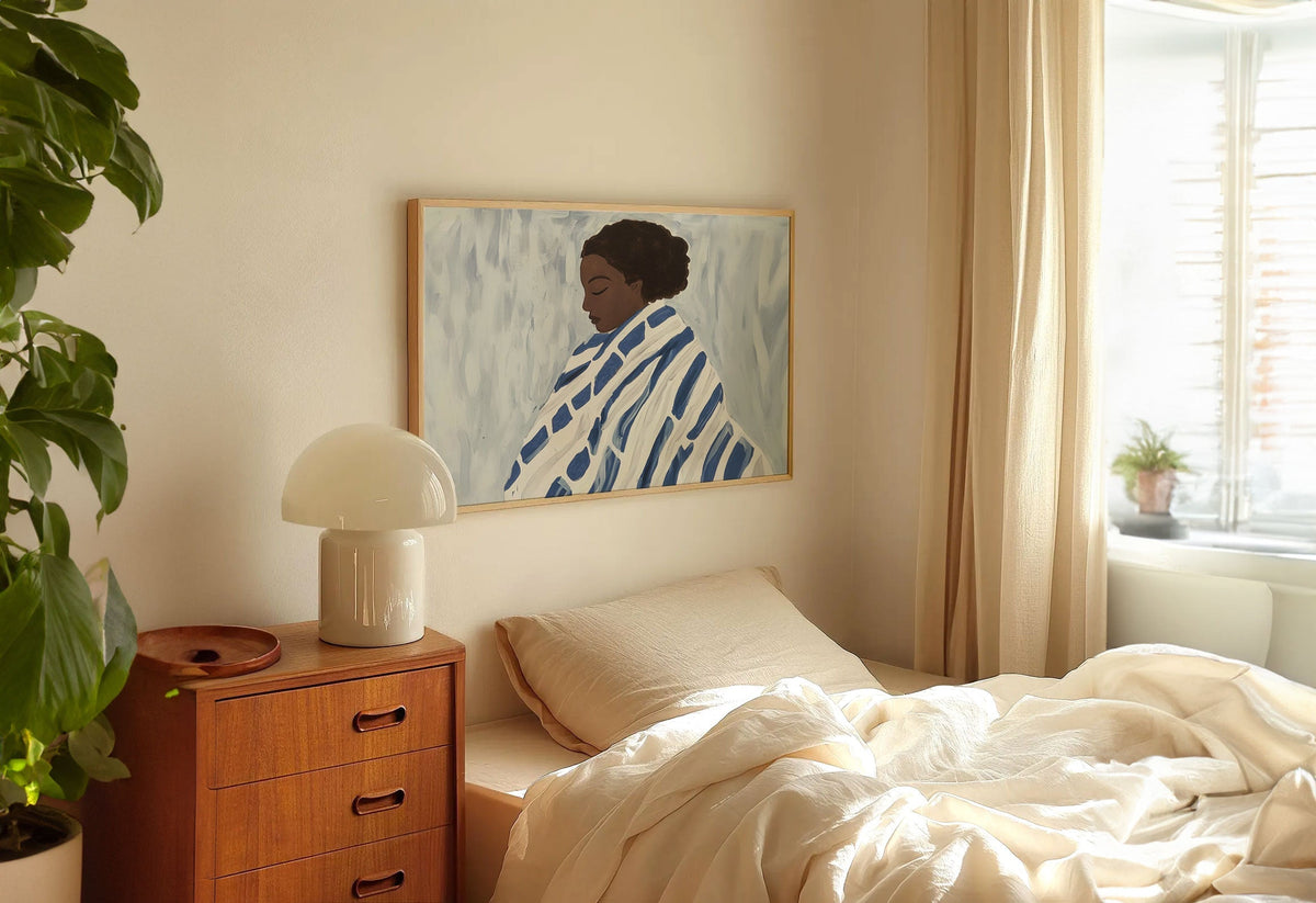
Your bedroom is the most personal room in your home. It's where you start and end each day, where you retreat when you need space, where you go to feel...
Your home office probably started as pure function. A desk, a chair, maybe a lamp. Get the work done, that's it. But if you're spending hours here every day, shouldn't...
We’re serious about art, ask away
From sizing to framing and print quality, Fab's art experts break it all down—so you can find the right art for your space.
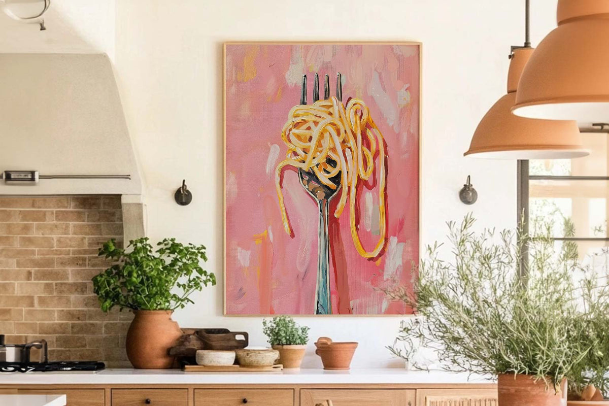
Why choose illustration prints over photographic art for the kitchen?
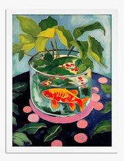
Illustrated kitchen prints bring warmth and personality that photos rarely match in a cooking space. Illustrations stylise everyday subjects like herbs, citrus, or a bottle of wine into something graphic and playful, so they feel intentional rather than generic. They also tend to hold their own against busy countertops, tiled splashbacks, and open shelving because the bold lines and flat colour palettes cut through visual clutter. Our kitchen illustration art prints are giclée printed on thick matte paper, so colours stay rich and there's zero glare from overhead kitchen lighting.
What size illustration print works best on a kitchen wall?
For the narrow wall next to a fridge or above a breakfast bar, a 30x40cm framed print is the sweet spot: visible enough to enjoy but not competing with cabinetry. If you have a clear stretch of wall opposite your cooking area or above a dining bench, go bigger with a 50x70cm or even 70x100cm statement piece. Use the two-thirds rule: your print should be roughly two-thirds the width of whatever sits below it, whether that's a console, a countertop section, or a small table. Our framed prints arrive ready to hang with fixtures already attached, so you can get it on the wall the same evening.
Will kitchen art fade or get damaged by cooking steam and sunlight?
This is a fair worry, but our framed illustration prints use UV-protective acrylic glazing that prevents fading even in direct sunlight, and the museum-grade inks we use are rated to last hundreds of years. For steam, the acrylic glaze also acts as a barrier, so moisture from boiling pasta isn't going to warp your print. We'd still avoid hanging anything directly above a hob or kettle where concentrated steam hits repeatedly, but anywhere else in the kitchen is absolutely fine.
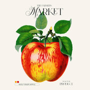
Should kitchen art be abstract or more recognisable subjects like food and drink?
We think kitchens are one of the few rooms where subject matter really should connect to the space. A beautifully illustrated lemon, a line drawing of a French market, or a retro culinary illustration print just makes sense when you're surrounded by food. Abstract art can work if you're going for a very minimal, gallery-kitchen look, but for most homes, illustrated food and drink prints feel more inviting and give guests something to smile at. Pick subjects you genuinely love to cook or eat and the art will feel personal rather than decorative filler.
How can I make a blank kitchen wall more interesting with art?
The fastest fix is a single large illustrated kitchen print in a solid wood frame. Hang it at eye level on that empty wall between your cupboards and the window, and the room immediately feels finished. If you have a longer wall, a row of three matching food illustration prints in the same frame colour at 30x40cm, spaced about 5cm apart, creates a gallery feel without overwhelming the space. Go with a natural oak or black frame to complement most kitchen cabinetry, and stick to a cohesive colour palette across all pieces so it reads as intentional. Our frames are FSC-certified solid wood and arrive properly fitted, so there's no DIY assembly or warped corners to deal with.
Choosing a selection results in a full page refresh.


 We’re serious about art, ask away