The Bedroom Finishing Guide: Art, Scale, and Light
Why finishing a bedroom is a conversation between artwork, proportion, and the light that moves across your walls.

Most bedrooms get decorated, but very few get finished. The difference is not how much you put on the walls, it is whether the art, the scale of your furniture, and the way light moves through the room are working together. This guide treats those three things as one system, because that is how a bedroom actually reads when you walk into it.
Decorating vs finishing: the distinction that changes everything
A decorated bedroom has things in it. A duvet, a rug, maybe a print above the bed. A finished bedroom feels resolved. You cannot point to what is missing, because nothing is.
The reason this matters: art is almost always the element that closes the gap. Furniture sets the proportions. Light sets the mood. Art is the thing that ties them together and tells your eye where to rest. If you skip it, or you get the scale wrong, the room reads as unfinished no matter how nice the bedding is.
So before you start browsing prints, do an audit. Walk into your bedroom and ask three questions. What are the dominant proportions (bed width, ceiling height, window placement)? Where does light enter, and when? Where does your eye naturally land when you walk through the door? Those answers shape every art decision that follows.

The scale rule that actually works
The professional consensus is that art above a piece of furniture should span roughly 60 to 75% of that furniture's width. Above a standard UK double bed (135cm wide), that means art (or a grouping) somewhere between 80cm and 100cm across. Above a king (150cm), you are looking at 90cm to 115cm.
Most people undershoot this. They buy a 40x50cm print, float it above a king bed, and wonder why the wall feels empty. The print is not the problem. The proportion is.
If you want a single statement piece above the bed, go bigger than feels safe. A 70x100cm framed print or a 100x150cm canvas reads as intentional. A 30x40cm print reads as forgotten.
When to go horizontal, when to go vertical
Horizontal art (landscape orientation) sits beautifully above a bed because it mirrors the horizontal line of the headboard. It calms the eye. This is the safest, most restful choice for the wall behind your bed.
Vertical art works better on narrow walls, beside wardrobes, or in pairs flanking a window. It draws the eye upward, which is useful in rooms with low ceilings (under 2.4m) because it makes the wall feel taller.
If your ceiling is tall (2.7m and up), you have more freedom. A vertical piece above the bed can work, but you may want to pair it with a second piece, or hang it lower than instinct tells you, so it does not float in space.
Eye level, and the mistake almost everyone makes
The standard professional guideline is to hang the centre of any artwork at 145 to 152cm from the floor. Gallery hangers use the lower end of that range. It is where the average adult eye lands naturally.
Above a bed, this rule shifts. You are not standing in front of the headboard, you are looking at the wall from across the room. The centre of the art should sit 20 to 25cm above the top of the headboard. Any higher and it floats. Any lower and it crowds the pillows.
A test: lie on the bed and look up. If the bottom edge of the print is in your peripheral vision, it is too low. If you have to crane your neck to see it from the doorway, it is too high.
Light: the variable nobody talks about
Here is the thing most bedroom art guides miss entirely. The same print looks like three different prints depending on the light hitting it at 8am, 2pm, and 9pm. If you choose art without considering this, you are choosing blind.
Start by mapping your bedroom's light. Which way do the windows face? North-facing rooms get cool, even, indirect light all day. South-facing rooms get warm, strong, shifting light. East-facing rooms are bright in the morning, soft by evening. West-facing rooms are the opposite.
Now think about when you actually see your bedroom. If you spend most waking hours in there in the evening, your art needs to hold up under warm artificial light, not under the bright morning sun you only see for ten minutes before work.
Avoiding glare without overthinking it
Direct sunlight on a framed piece can cause two problems: visible glare on the glazing, and (over years) colour fade in cheaper prints. The first is solved by hanging art on walls that receive indirect light rather than direct beams. The wall opposite a window gets light without getting hit by it.
The second is a real concern with poorly made framed prints. Decent framing uses UV-protective acrylic glazing rather than ordinary glass, which prevents fading even in sunny rooms. Museum-grade giclée inks (the kind we use on our art prints) are rated to last for centuries even in direct sunlight, so a south-facing bedroom is not a reason to avoid framed art. It is a reason to be choosier about how the art is made.
Layered lighting and where art fits
A finished bedroom usually has three light sources: ambient (ceiling or wall light), task (bedside lamps), and accent (something that draws the eye, like a picture light or a floor lamp angled at a wall).
Art interacts with all three. Ambient light reveals it. Task light shapes the warmth of the room around it. Accent light, if you have it, can turn a single print into the room's focal point after dark. Even without a dedicated picture light, a tall floor lamp positioned near your art will give it presence in the evening.
If your bedroom is dimly lit, lean toward art with strong contrast or warm tones. Subtle, low-contrast pieces disappear in low light. If your bedroom is flooded with daylight, you can use quieter, more tonal pieces (botanical studies, soft abstracts, monochrome photography) because the light itself is doing the work.

Bedroom wall art ideas, by wall
Not every wall in a bedroom should be treated the same. Here is how we think about it.
The wall behind the bed
This is the anchor wall. It should hold the most weight, visually. A single large piece (70x100cm framed, or 100x150cm on canvas) is the cleanest, most restful choice. Two matching pieces side by side, with 5 to 8cm of space between them, give a similar effect with a touch more rhythm.
Bedrooms benefit from quieter art behind the bed. You do not want to lie down at night staring at something demanding. Landscapes, abstracts with soft tonal shifts, botanical illustrations, and atmospheric photography all sit well here. Browse our landscape prints if you want a starting point.
The wall opposite the bed
This is the wall you see first when you walk in, and the last thing you look at before sleep. It can carry more visual energy than the headboard wall. Portraits, more saturated colour, slightly larger scale, or a tight gallery wall all work here.
If you have a chest of drawers or a chair against this wall, apply the 60 to 75% rule to that piece of furniture rather than the wall itself.
The side walls
These are often forgotten. A single vertical print between the window and the wardrobe, or a small framed piece above a bedside table, finishes the room in a way that a single piece above the bed cannot. Small art (30x40cm, 40x50cm) works here. It does not need to be a statement, it needs to be considered.
Calm vs energising: matching art to the room you want
Bedroom art is almost always quieter than living room art, but quiet does not mean beige.
For a restful bedroom, look for: muted palettes (sage, dusty blue, terracotta, warm grey), soft edges, organic subject matter (water, sky, plants, light through fabric), and lower contrast. These pieces let your nervous system settle.
For a more energising bedroom (often what people want in smaller flats where the bedroom doubles as a dressing/reading space), you can use: deeper colours, stronger graphic compositions, photography with clear focal points, and more contrast. The key is balance. One strong piece in an energising palette will lift a room. Three competing pieces will exhaust it.
Our abstract art prints cover both ends of this spectrum, but the principle is the same: pick the mood first, then pick the piece.
Gallery walls in bedrooms: usually a no, sometimes a yes
The honest answer: gallery walls usually do not work above beds. They create visual noise in the one place you want visual quiet, and the alignment becomes fussy because the headboard takes up so much of the bottom edge.
Where they do work in bedrooms: the wall opposite the bed, the wall behind a desk or reading chair, the wall above a low chest of drawers.
If you want a gallery wall, here are the numbers. Keep 5 to 8cm between frames. Treat the whole grouping as one shape and apply the 60 to 75% rule to that shape. Mix sizes but keep frame finishes consistent (all oak, or all black) so the grouping reads as deliberate rather than collected.

Framed or unframed: which suits a bedroom
Both work. Here is how we think about it.
Framed prints feel more finished, more permanent, more considered. They suit bedrooms with traditional or layered interiors, anywhere you want the art to feel like part of the architecture. The trade-off is weight. A 70x100cm framed piece needs proper fixings, especially on plasterboard walls.
Canvas prints are lighter, have no glazing (so no glare at all), and read as softer and more relaxed. They suit minimalist or coastal bedrooms, rooms with a lot of texture already (linen, wood, wool), and bedrooms in older houses with uneven walls where a frame would draw attention to the wonk. Our canvas prints go up to 100x150cm, which is the right scale for a king-size headboard wall.
One thing worth flagging: poorly made framed prints are the single biggest disappointment in the wall art category. Warped MDF frames, prints that arrive separately and have to be assembled, paper that bubbles inside the frame within months. If you go framed, make sure it ships ready to hang with the print properly fitted inside a solid wood frame, not stapled into something flat-pack.
The step-back test, and how to commit
Before you order, do this. Cut a piece of paper or cardboard to the exact dimensions you are considering. Tape it to the wall at the right height. Step back to the doorway. Look at it for a full minute.
If it feels small from the doorway, go up a size. If it feels right but a little timid, go up a size. People almost never regret going bigger. They regularly regret going smaller.
Then leave the paper up for a day. Look at it in morning light, afternoon light, evening light, lamp light. If it still feels right, that is your size.
A finishing checklist
Walk through this before you order anything.
- Have you measured the wall and the furniture beneath it, and chosen art that spans 60 to 75% of that width?
- Will the centre of the art sit 145 to 152cm from the floor, or 20 to 25cm above the headboard?
- Have you considered which way the windows face, and how the light moves across that wall through the day?
- Does the mood of the piece match the mood you want from the room (restful or energising)?
- Have you tested the size with paper on the wall before committing?
If those five answers line up, the room will feel finished when the art goes up. Not decorated. Finished. That is the whole point.


Fab products featured in this blog
-

The Plants and the Flowers Art Print
Translation missing: en.products.product.sale_price From €17,95€29,95 -

Matisse-Inspired Bedroom with a View Art Print
Translation missing: en.products.product.sale_price From €17,95€29,95 -

The Bedroom by Vincent van Gogh Art Print
Translation missing: en.products.product.sale_price From €16,95€23,95 -

Seaside Bedroom, Matisse-Inspired Art Print
Translation missing: en.products.product.sale_price From €17,95€29,95 -

Vintage Garden Bird Art Print
Translation missing: en.products.product.sale_price From €17,95€29,95 -

Klimt Floral Symphony Exhibition Print Art Print
Translation missing: en.products.product.sale_price From €17,95€29,95 -

Quiet Shoreline Abstract Art Print
Translation missing: en.products.product.sale_price From €17,95€29,95 -

Klimt-Inspired Spring Flower Garden Art Print
Translation missing: en.products.product.sale_price From €17,95€29,95 -

Seaside Bedroom, Matisse-Inspired Canvas Print
Translation missing: en.products.product.sale_price From €64,95€107,95 -

Midnight Butterflies by Gustav Klimt Art Print
Translation missing: en.products.product.sale_price From €17,95€29,95 -

Matisse-Inspired Bedroom with a View Canvas Print
Translation missing: en.products.product.sale_price From €64,95€107,95 -

Sunlit Bedroom Retreat Art Print
Translation missing: en.products.product.sale_price From €17,95€29,95 -

Quiet Shoreline Abstract Canvas Print
Translation missing: en.products.product.sale_price From €64,95€107,95 -

Sunlit Coastline Rise Art Print
Translation missing: en.products.product.sale_price From €17,95€29,95 -

Klimt Art Nouveau Bloom Exhibition Poster Canvas Print
Translation missing: en.products.product.sale_price From €64,95€107,95 -

Klimt Floral Symphony Exhibition Print Canvas Print
Translation missing: en.products.product.sale_price From €64,95€107,95 -

Evening Conversation Art Print
Translation missing: en.products.product.sale_price From €16,95€23,95 -

Bluebirds on a Blossom Branch Art Print
Translation missing: en.products.product.sale_price From €17,95€29,95 -
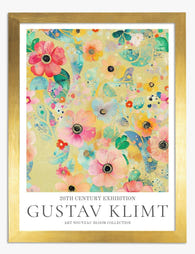
Klimt Floral Symphony Exhibition Print Art Print
Translation missing: en.products.product.sale_price From €17,95€29,95 -

Midnight Butterflies by Gustav Klimt Canvas Print
Translation missing: en.products.product.sale_price From €64,95€107,95


More from The Frame

Kitchen Art: What Works, What Fades
Kitchens are the worst room in your home for art. Heat cycles, steam plumes, airborne grease, and direct overhead lighting will quietly destroy anything you hang without thinking. This guide...

One Statement Piece Is All Your Living Room Needs
Most blank walls stay blank because the brief feels enormous. You don't actually need a gallery, a grid, or a curated grouping you'll second-guess for six months. You need one...

Art That Works with Patterned Wallpaper
Patterned wallpaper is having a proper moment, and the question that comes next is always the same: what on earth do you hang on it? The honest answer is that...