


Margarita Hour Art Print

Vase of Flowers by Pierre-Auguste Renoir Art Print

Confetti Bloom Abstract Floral Art Print

Glittering Lucky Horseshoe Art Print

Sardine Shoal in Colour Art Print

Little Skiers on Snow Art Print

Loyal Companion Art Print

Match Point in Blue Art Print

Shinjuku Gyoen Garden, Tokyo Art Print

Martini — Classic Cocktails Art Print

Cat at the Blue Window Art Print

Modernist Living — The Art of Living Art Print

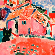
Riviera Arch with Black Cat Art Print
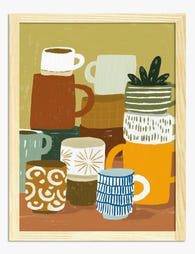
Stacked Mugs Still Life Art Print

River Ride Adventure Art Print

Columbia Road Blooms Art Print

Flower Market Columbia Road Art Print
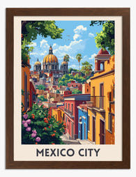
Mexico City Vintage Travel Poster Art Print

Cool Cat in Striped Scarf Art Print
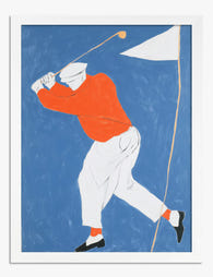
Golfer at Full Swing Art Print

Vanity Purr — Maine Coon Cover Art Print

Vanity Purr Art Print

Vibrant Tropical Fish Parade Art Print

Blue Horse in Bloom Art Print
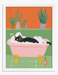
Cat Bath Bliss Art Print

Seville Streetscape Travel Poster Art Print

Mexico City Vintage Travel Poster Art Print
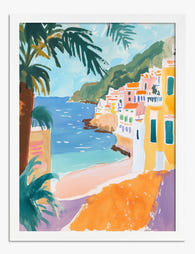
Amalfi Coast Vibrance Art Print

Blue Bottle, Dog Rose and Garden Anemone Art Print

Playful Giraffe Family Art Print

Blush Desert Serenity Art Print

Golden Hour Wanderer Art Print
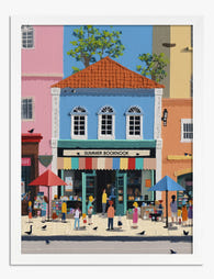
Summer Booknook Bookshop Art Print

Books for Everyone by Robert E. Lee Art Print

Mountain Ride Serenity Art Print

Sunlit Stripes by the Sea Art Print

Cozy Fox Duo in Dotty Jumpers Art Print

The Scream Cat by Munch (Inspired) Art Print
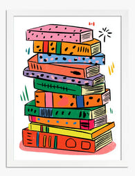
Colourful Book Stack Art Print
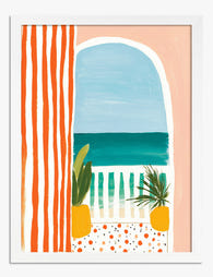
Seaside Stripes View Art Print

Bound and Determined Reading Robin Art Print

A Day at the Zoo Art Print
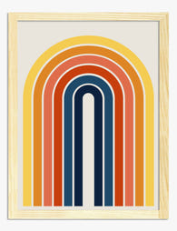
Sunbeam Retro Rainbow Art Print

Cornwall Land's End Travel Poster Art Print

Boho Staircase Botanicals Art Print

Relaxed Retreat Art Print
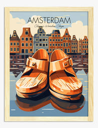
Amsterdam Reflections Art Print

Boho Botanicals on Tile Steps Art Print
More Fab art curations
Orange Art Print Articles From The Frame
How-to guides, styling inspiration, and design ideas for orange art prints in your home from The Frame, Fab's blog.

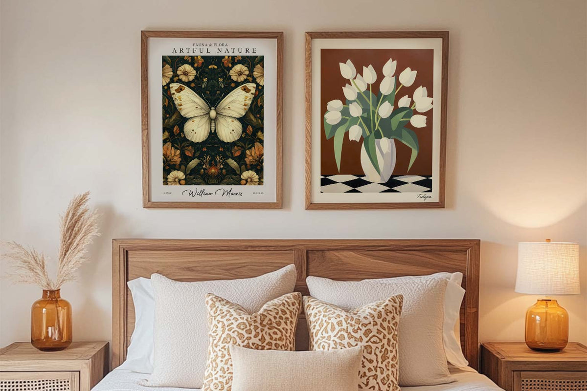
Best Orange Artwork for Bedrooms: Shades, Sizes...
Orange has a reputation problem in bedrooms. Designers regularly warn against bright, saturated oranges because they stimulate rather than soothe, which is the opposite of what you want in a...
Starter Art Prints for First-Time Buyers
A blank wall can be intimidating. You know you want art, but where do you even start? You scroll through endless options online, walk through galleries feeling lost, or stare...
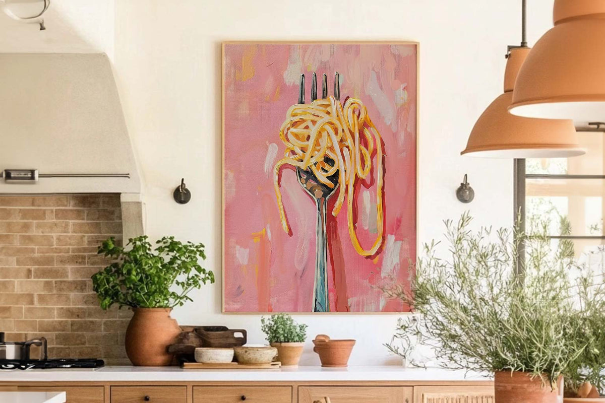
The Best Wall Art for Kitchens and Dining Spaces
Your kitchen isn't just for cooking. Your dining room isn't just for eating. These are the spaces where life happens. Where you have your morning coffee, where friends gather around...
 We’re serious about art, ask away


From sizing to framing and print quality, Fab's art experts break it all down—so you can find the right art for your space.