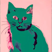
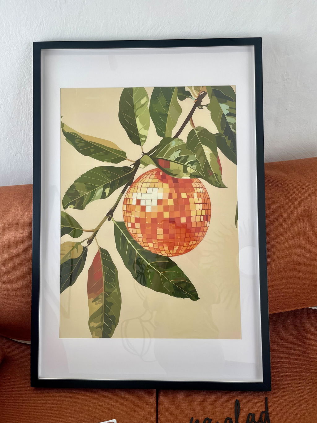
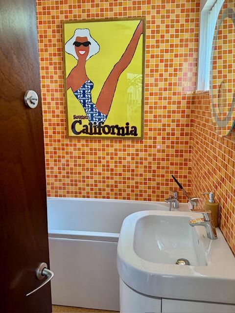
Warhol turned soup cans, banana skins and film stars into images that still refuse to sit quietly. This collection gathers pop art prints in his high-contrast, repeat-and-recolour spirit: loud enough to carry a plain wall alone, or to anchor a grid in a kitchen or hallway. If you want more of that era's colour, Keith Haring Style Art Prints and Yayoi Kusama Art Prints hang happily alongside.
Very cool posters and prints expertly framed and presented
Very cool posters and prints expertly framed and presented. Huge selection on website nicely presented, seamless ordering process and clear instructions with a great friendly team to help with advice if needed. Delivered in safely in quick time securely packaged and kept informed of the process. I can highly recommend this company, I delighted with my poster.
Warhol prints have a reputation problem. Done badly, they look like a first-year flat with a Marilyn poster blu-tacked above a futon. Done well, they're some of the most confident,...
Haring, Warhol, and Basquiat weren't just contemporaries. They were friends, collaborators, and rivals who defined downtown New York in the 1980s. Putting their work together on one wall isn't a...
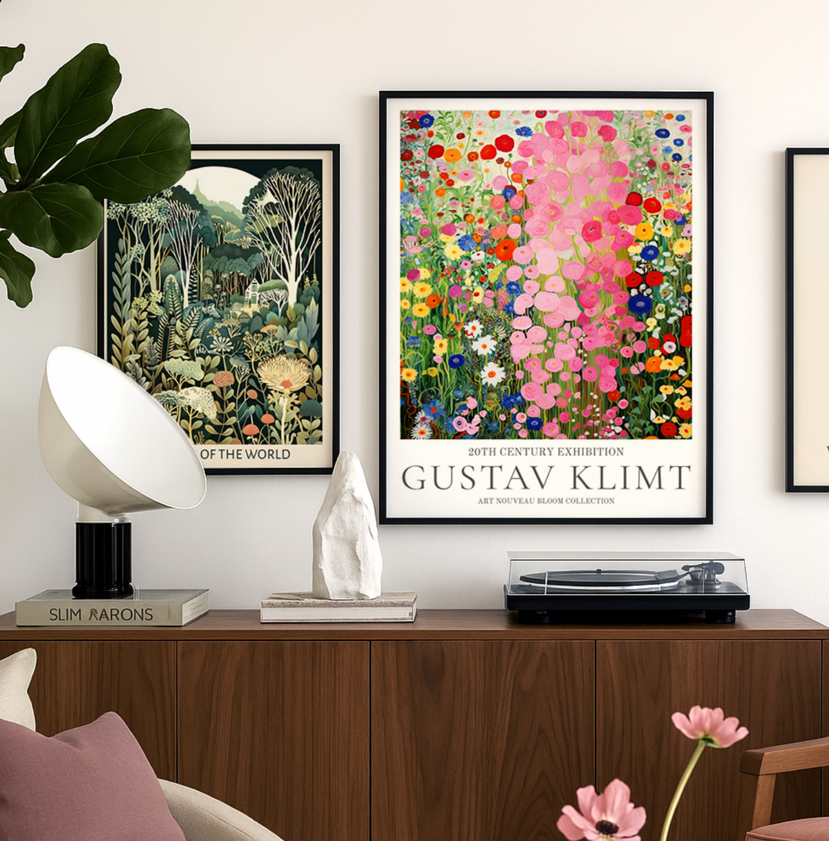
Gustav Klimt wasn’t just an artist — he was a master of seduction through pattern, color, and symbolism. At Fab, we celebrate his work not just as art history, but...
Questions about Warhol prints
Short answers on framing, choosing a colourway, where these prints work and how ordering runs
Warhol's best-known images come from his silkscreen work of the 1960s onward: the Campbell's Soup Cans, the Marilyn Monroe portraits, Coca-Cola bottles and celebrity studies such as Jackie. These are the pieces most people picture when they think of pop art, thanks to their flat blocks of color and repeated, poster-like compositions. Reproductions of these motifs are what make the style so instantly readable on a wall.
Which rooms suit pop art prints best?
Pop art thrives in social, high-energy spaces: living rooms, kitchens and dining areas, home offices, hallways and teen bedrooms. The flat, saturated color reads well from a distance, so it works on a long wall or above a sideboard where you see it head-on. In calmer rooms like bedrooms, one print rather than a grouping keeps the effect graphic without overwhelming the space.
What wall colors work with bold Warhol-style prints?
Neutral walls do the most for pop art. White, soft grey, greige or a warm off-white let the saturated pinks, oranges and blues read cleanly instead of competing. If you prefer a darker backdrop, charcoal or deep navy makes bright color feel even more electric. Avoid busy wallpaper behind a print with strong repeated motifs, since the two patterns tend to fight each other.
Which Andy Warhol print works best as a statement piece above a sofa?
For a living room centrepiece, we'd go with a Warhol Marilyn Monroe print or one of his bold Campbell's Soup compositions in our largest framed size (70x100cm). That scale sits perfectly above a standard sofa and gives the room an instant focal point without needing a gallery wall around it. The flat, punchy colours Warhol used hold up brilliantly at larger sizes, and our museum-grade giclée printing keeps every detail crisp. Our Andy Warhol art prints arrive ready to hang with solid wood framing, so you can have it on the wall the same day it lands.
Are these good enough quality to give as a gift?
Honestly, this is one of our most popular gift categories. The framing quality is what sets these apart: solid FSC-certified wood, UV-protective acrylic glaze, and the print arrives properly fitted and ready to hang in one box. No assembly, no separate frame to wrestle with, no warping. Shoppers regularly tell us the prints look even better in person than on screen, which is exactly what you want when someone's unwrapping it. We also offer a 99-day returns policy, so the recipient has plenty of time if they'd prefer a different piece.
Will the bright pop art colours fade if my wall gets a lot of sunlight?
No, and this matters more with Warhol prints than almost any other artist because the whole point is those electric pinks, yellows, and blues. Our framed prints use UV-protective acrylic glazing and museum-quality inks rated to last hundreds of years, even in direct sunlight. So whether you're hanging a Warhol banana print in a south-facing kitchen or a Marilyn Monroe print opposite a big window, the colours will stay exactly as vivid as the day you hang it.
Can I mix different Warhol prints together, or does that look too busy?
Warhol's work was literally built for repetition, so a set of two or three prints from the same series (like the Soup Cans or his flower series) looks intentional rather than cluttered. The key is to keep the frames consistent and the sizes the same. A row of three matching framed prints along a hallway or staircase wall is one of the best ways to fill a space that always feels a bit blank. We'd avoid mixing completely unrelated Warhol pieces at different scales, though, as that can tip from curated into chaotic.
Why does Andy Warhol's art style still work so well in modern interiors?
Warhol's pop art prints use flat colour, graphic repetition, and bold outlines, which happen to be exactly the visual language of modern design. His work feels at home in minimalist spaces because it adds personality without pattern clashing, and it holds its own in maximalist rooms because the scale and colour intensity can compete with everything else going on. It's also why Warhol wall art has never really gone in or out of fashion: it reads as confident rather than trendy. If you're finishing a room and it still feels like something's missing, a single Warhol print is usually the fastest fix.
Choosing a selection results in a full page refresh.