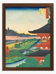
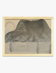
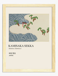
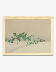
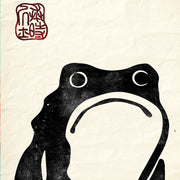
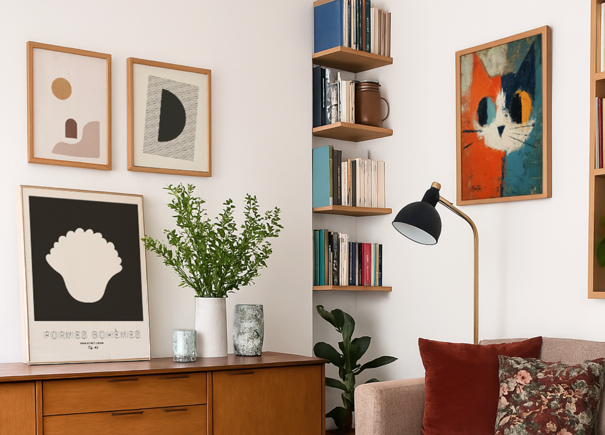
Japandi art borrows Japanese restraint and Scandinavian warmth: soft neutrals, quiet shapes and plenty of breathing room around the subject. Expect clay and oatmeal tones, single stems, hushed horizons. For the leafier end, start with Japandi botanical art prints; for open distance and low light, Japandi landscape art prints. Anything brushier and darker sits closer to ink wash art prints. One piece above a low sideboard is often enough.
You know you want art on your walls, but you're stuck scrolling through endless options wondering what actually fits your taste. Maybe you love the clean simplicity you see in...
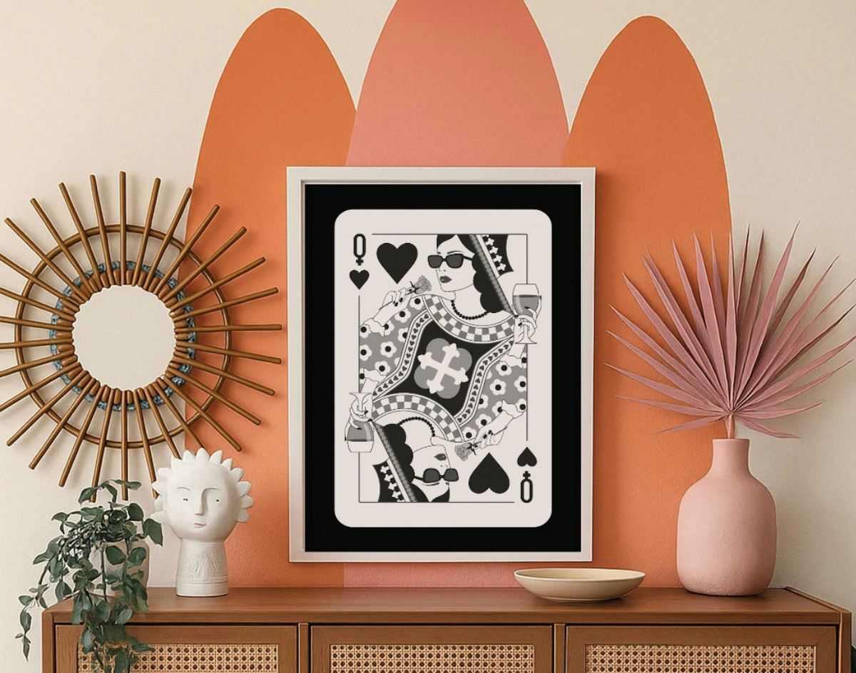
You love the look of black and white art, but you're worried it might make your home feel like a doctor's office. Or maybe you think it's too safe, too...
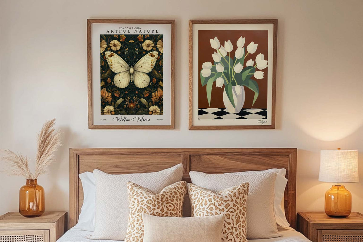
A blank wall can be intimidating. You know you want art, but where do you even start? You scroll through endless options online, walk through galleries feeling lost, or stare...
How do you choose a Japandi print
Short answers on tone, framing choices, scale and the rooms Japandi pieces tend to settle into
Do traditional Japanese prints like ukiyo-e woodblocks or sumi-e ink paintings count as Japandi art?
Not strictly, but many of them work beautifully in a Japandi room. Japandi is a modern hybrid of Japanese aesthetics and Scandinavian simplicity, so the pieces that fit best are the quiet ones: sumi-e ink washes with wide negative space, Ohara Koson bird and branch studies, and softer Hiroshige landscapes or monochrome views. Busy, high-color ukiyo-e scenes with crowds or bold reds tend to read as maximalist Japanese instead. For a Japandi wall, favor muted ink, black, gray and warm neutral tones, and hang one calm piece rather than a dense grouping. You may also like our Traditional Japanese Art Prints.
What does wabi-sabi mean in Japandi wall art, and how does it show up in a print?
Wabi-sabi is the Japanese aesthetic of finding beauty in things imperfect, impermanent and incomplete, shaped by Zen thought and the tea ceremony culture of the 15th century. In a Japandi print it shows up as visible traces of hand and time: loose or uneven brushwork, weathered and cracked-looking surfaces, asymmetry, soft undefined edges, and earthy clay, stone and ink tones. Generous empty space matters just as much, so the composition reads calm rather than busy. To play up that quiet mood, give one piece an uncluttered wall; a simple wood frame keeps the feeling warm and grounded. For a related option, explore our Minimalist Art Prints.
Which Japandi print colors work with sage green, clay or terracotta accents?
Prints built on warm neutrals work best: off-white, oatmeal, warm sand, greige and soft taupe let sage, clay and terracotta accents stay the focus. With sage green, choose art with muted olive, moss or gray-green notes plus walnut or oak wood tones, and pick soft black or charcoal ink details rather than bright brass-toned metallics. With clay and terracotta, look for ochre, dusty rust and warm brown washes echoing unglazed pottery. Sage and terracotta also read beautifully together in one print, balanced by cream space. Choose framed or unframed to match your wood tones.
What subjects and motifs are most common in Japandi art prints?
Nature reduced to its simplest form dominates Japandi art prints. Expect single-stem ikebana style branches, cherry blossom and bamboo, leaves and grasses, plus lone mountain peaks, misty landscapes, quiet seascapes and solitary trees held in wide open space. Bird and flower studies in the kacho-e tradition are popular, as are ink wash brushstrokes, calligraphic marks, enso circles, arches and soft organic shapes borrowed from Scandinavian abstraction. Look for one clear focal subject, generous negative space and muted earth tones. Prints and canvases come framed or unframed, so choose light oak or soft black for the calmest result. For another take, browse our Modern Nature Art Prints.
Which frame colour works best with Japandi art prints?
Go with a natural oak frame. It bridges the warmth of Scandinavian wood tones and the organic simplicity of Japanese design better than anything else. Black frames can work if you want a slightly sharper, more graphic feel against a white wall, but natural oak is the Japandi sweet spot. All our frames are solid FSC-certified wood with UV-protective acrylic glazing, so they'll look just as good in five years, even on a sun-facing wall.
How do I pick the right size Japandi print for above my sofa?
For a standard three-seater sofa (around 200cm wide), a single 70x100cm print creates a calm, intentional focal point, which is exactly what Japandi style calls for. Resist the urge to go smaller or to cluster lots of small frames; Japandi is about breathing room, not filling every gap. If your wall is particularly large, a pair of 50x70cm prints spaced about 10cm apart keeps things balanced without feeling cluttered. Our framed prints arrive ready to hang, so you won't be fiddling with fitting or alignment.
Will these prints work in a bedroom with warm neutral walls?
Absolutely, and honestly bedrooms are where Japandi wall art shines brightest. Warm neutrals like greige, soft clay, or warm white pair beautifully with the muted tones you'll find in this collection. We'd suggest hanging a single print centred above the headboard rather than a gallery wall; bedrooms should feel restful, not busy. Our prints are on thick matte paper with no glare, so they won't reflect lamplight back at you when you're trying to wind down.
Can I mix Japandi prints with art I already own?
You can, but be selective. Japandi style has a very clear visual language of muted tones, natural textures, and quiet compositions, so a bold pop-art piece next to it will fight for attention and both will lose. The prints that sit happily alongside Japandi work tend to be simple line drawings, soft abstract pieces, or nature-inspired photography in a similar tonal range. If you're replacing a few cheap prints that came with misaligned frames or warped edges, swapping them for our Japandi art prints is a quick way to bring the whole wall together since everything arrives properly fitted and ready to hang.
How is Japandi style art different from just minimalist or Scandi prints?
Scandi minimalism tends towards bright whites, clean geometry, and a certain crispness. Japandi art prints layer in the Japanese concept of wabi-sabi, an appreciation for imperfection and organic form, so you'll see softer brushstrokes, asymmetry, natural textures, and a warmer, earthier palette. Think the difference between a perfectly white Ikea shelf and a hand-thrown ceramic bowl. It's still minimal, but it has soul and warmth, which is why this Japanese Scandinavian design crossover has resonated so deeply with people decorating real homes.
Choosing a selection results in a full page refresh.