Morning has a particular light, low, warm, a little hazy, and that's what this collection collects. Expect first-light fields, pale skies, quiet rooms and steaming cups. If you want the sun itself doing the work, sunrise art prints lean dramatic, while breakfast art prints and coffee art prints suit a kitchen wall or the seat you take before the day properly starts.
A blank wall can be intimidating. You know you want art, but where do you even start? You scroll through endless options online, walk through galleries feeling lost, or stare...
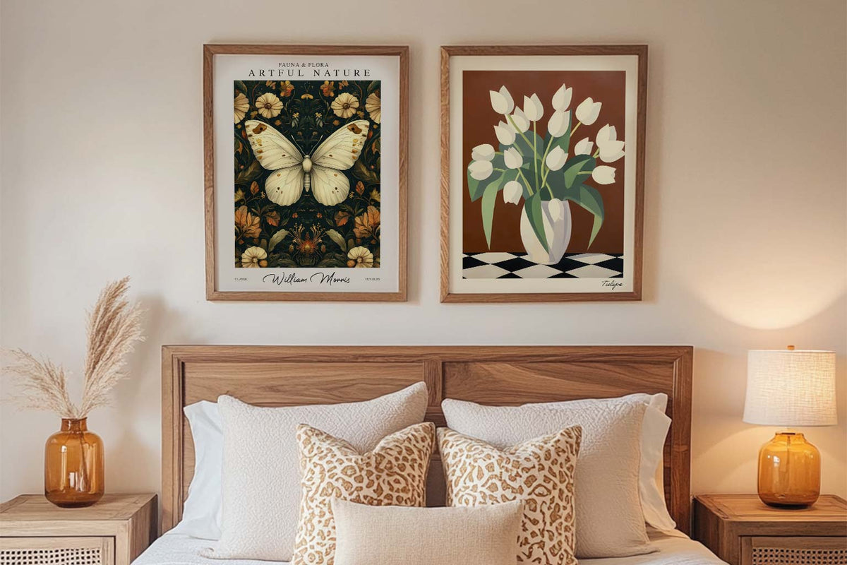
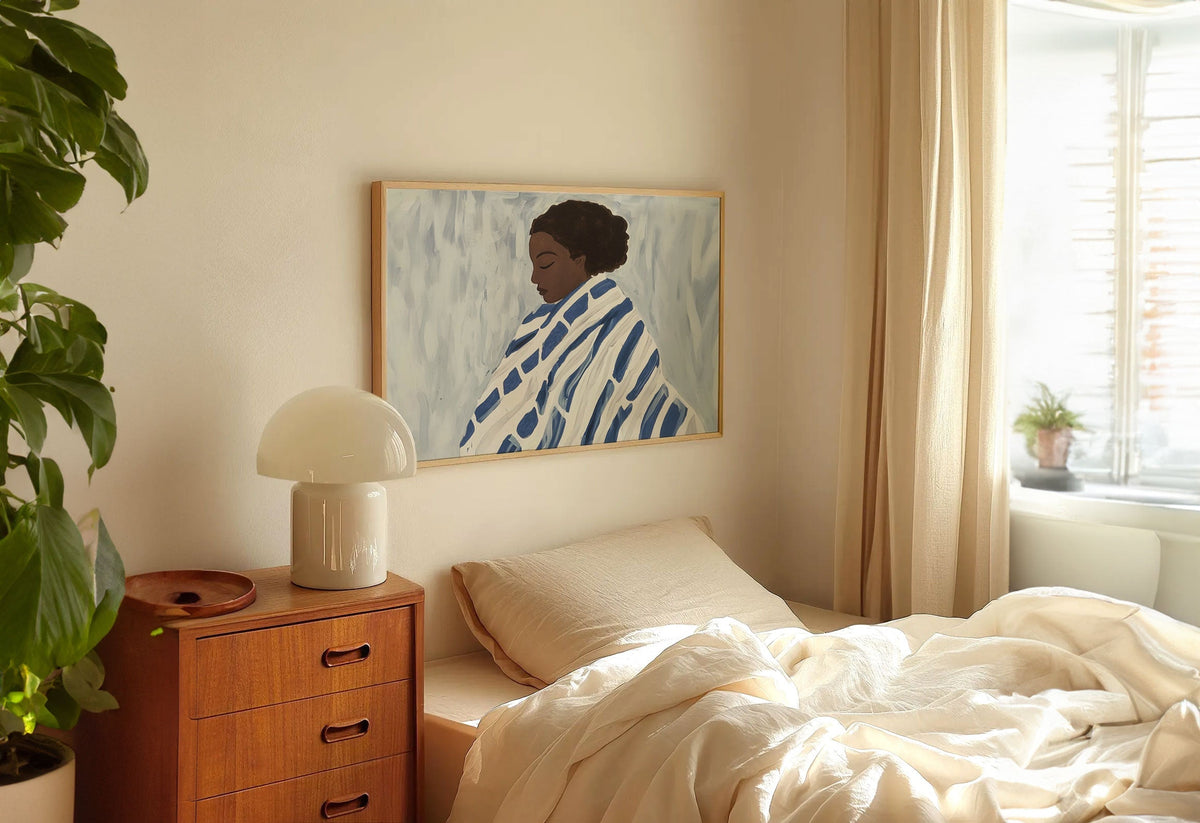
Your bedroom is the most personal room in your home. It's where you start and end each day, where you retreat when you need space, where you go to feel...
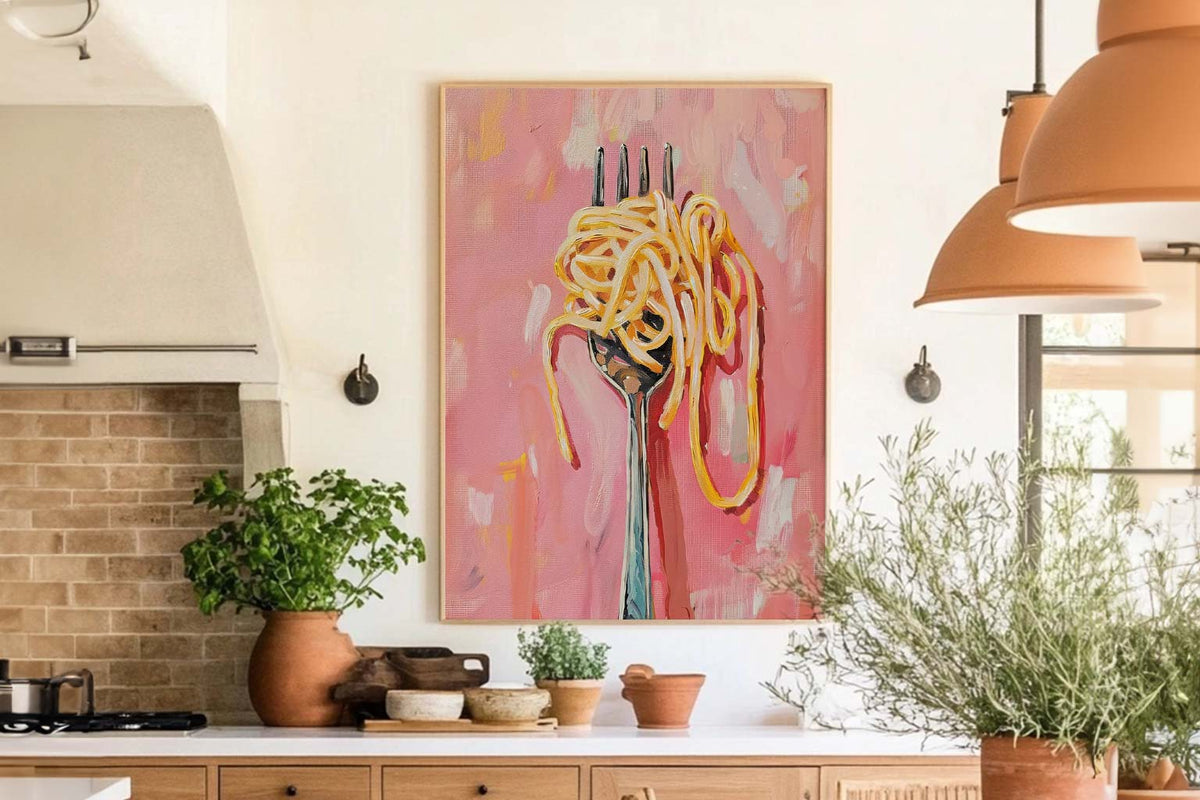
Your kitchen isn't just for cooking. Your dining room isn't just for eating. These are the spaces where life happens. Where you have your morning coffee, where friends gather around...
Which morning print suits your wall
Quick answers on colour, framing, where these prints tend to work and how ordering runs
What styles of morning art are trending right now?
Two directions dominate morning-themed wall art at the moment. Soft, atmospheric painted landscapes with hazy light and muted color read as calm and contemporary, while bright, painterly florals and cheerful "good morning" typography bring a more playful, retro mood. Vintage and Victorian-style morning scenes are also popular for people who want a classic, gallery-like look rather than something obviously modern.
What is the 70/30 rule and how does it help me hang morning prints?
The 70/30 rule is a simple balance guide: let roughly 70 percent of the composition or wall be your dominant element and about 30 percent the contrast or accent. Applied to a morning print, that might mean a wide expanse of soft sky against a smaller band of land, or one large calming landscape balanced by a few smaller, brighter pieces. It keeps a wall from feeling either empty or overcrowded.
Should I choose a serene morning landscape or a typography print?
Pick based on the mood you want the room to set. A misty countryside or soft sunrise landscape is quiet and restful, which suits bedrooms, hallways and reading corners. A "good morning" typography or breakfast-themed print is chattier and more upbeat, so it tends to work better in kitchens, breakfast nooks and kids' rooms. If you're mixing both on one wall, keep the color palette consistent so they read as a set.
What should I check before ordering a morning art print online?
Confirm the format first: art prints and canvas prints can come framed or unframed, and a framed canvas arrives as one finished piece with nothing to assemble. Then check the proportions against your wall, since tall vertical prints and wide horizontal landscapes behave very differently above a sofa or bed. At Fab, shipping is free and returns are open for 99 days, so you can see how the light in your room reads before committing.
Which rooms work best for morning art prints?
East-facing rooms are the obvious pairing because your sunrise wall art will catch real morning light, which is genuinely magical. But we'd actually push you towards kitchens and breakfast nooks first. A 60x80cm framed morning print above a kitchen table or breakfast bar sets the tone for the whole day in a way that no other subject really does. Bedrooms are the other strong choice, especially if you want something calm and warm to wake up to rather than stare at a blank wall.
How can you tell whether a print shows a sunrise or a sunset?
It's a surprisingly common question. Sunrise art tends to feature cooler, softer tones: pale pinks, lavenders, gentle golds, and a crispness that feels fresh rather than dramatic. Sunsets lean heavier into deep oranges, reds, and magentas. If you're choosing morning themed wall art for a calm, understated space, look for those lighter, cooler palettes. They pair beautifully with neutral walls and natural wood frames, which is exactly why we think our oak frame works so well with this collection.
Should I go for a photography print or a painted style for a morning scene?
For breakfast rooms and kitchens, we'd steer you towards sunrise photography prints. They feel immediate and grounding, and the detail you get from giclée printing on our thick matte paper is honestly stunning up close. For bedrooms and living rooms where you want something more atmospheric, painted or abstract sunrise styles tend to feel warmer and more personal. Either way, our UV-protective acrylic glaze means the soft morning tones won't fade, even if your print hangs in direct sunlight for years.
What size morning print works above a bed or sofa?
For above a standard UK double bed (135cm wide), a 70x100cm landscape print is our go-to recommendation. It fills the wall properly without feeling cramped. Above a sofa, the same 70x100cm size works well, or you could do a pair of 40x50cm framed morning prints spaced about 5cm apart for a more curated look. The key thing: don't go too small. A lonely A4 sunrise print above a king-size bed will look like it's lost at sea. Our framed prints arrive ready to hang with fixtures attached, so you can get them up in minutes.
What colours in a room complement sunrise and morning wall art?
Sunrise art prints tend to carry soft golds, pale pinks, and muted blues, so they work brilliantly against warm white, soft grey, or sage green walls. If your room already has a lot of cool tones, a morning coffee scene or golden hour landscape will add warmth without clashing. We'd avoid hanging sunrise art against bold feature walls in orange or red because the subtlety of morning light gets completely drowned out. Keep the surrounding wall calm and let the print do the talking.
Choosing a selection results in a full page refresh.

 Order today for delivery by





 Which morning print suits your wall


