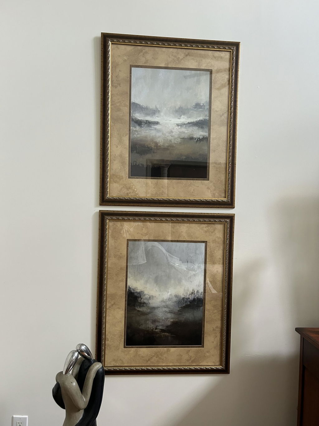
Solid wood. Professionally framed. Arrives ready to hang.
Make your print ready to hang.
Vibrant Abstracts
4.8
Colours that don't apologise. Big, confident abstracts for walls that have been waiting their turn; the kind of pieces that pull the rest of the room together by being unmistakably themselves.
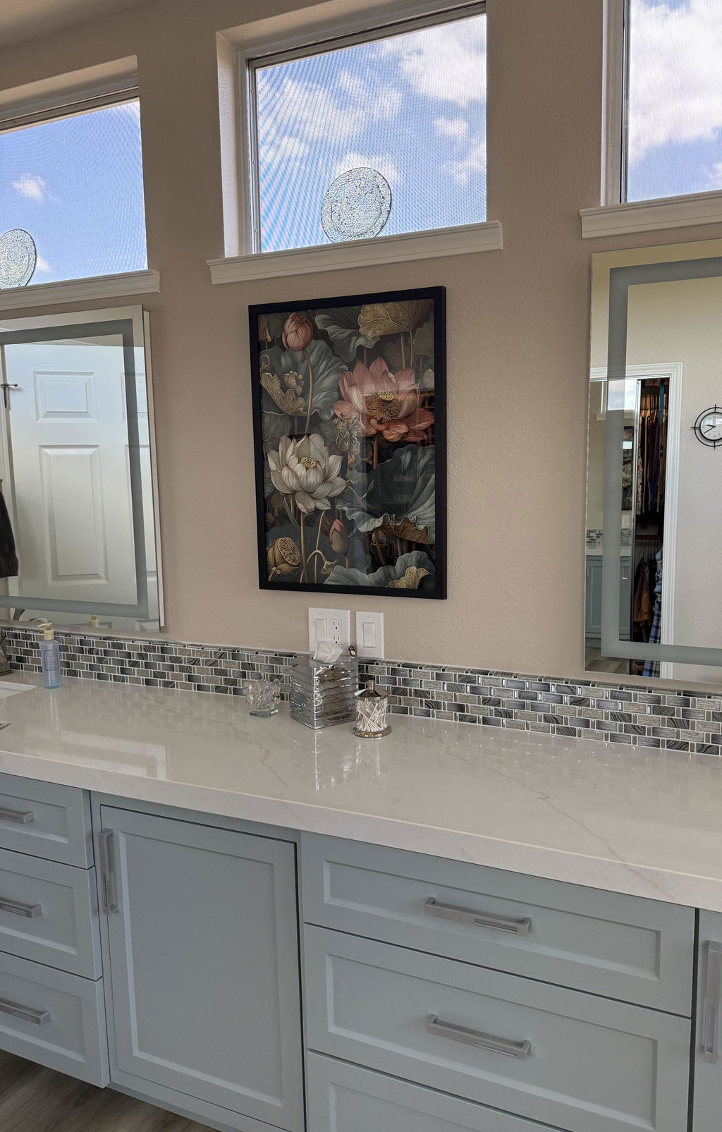
The William Morris art piece was fabulous! The colors were vibrant and bold. The website color description was accurate. It fit my room exactly as I envisioned it. I couldn’t be happier. The black frame really made the whole picture pop.
What does "vibrant" mean when describing abstract wall art?
Vibrant describes color that reads as intense, saturated and full of energy rather than muted or grayed down. In abstract prints that usually means strong hues, high contrast between shapes, and bold color relationships that carry a room on their own. The effect is lively and modern, which is why vibrant abstracts are often chosen for spaces that feel flat or need a focal point.
How do I style a vibrant abstract print without overwhelming a room?
Let the artwork be the loudest thing on the wall. Hang it against a neutral or softly tinted background, keep nearby decor simple, and pull one or two colors from the print into small accents like cushions, a throw or ceramics. If you want more impact, group a bold piece with quieter prints so the eye has somewhere to rest between the colors.
What is the 70/30 rule and how does it apply to hanging colorful abstracts?
The 70/30 idea is a simple balance guideline: let roughly 70% of a composition or scheme stay calm and dominant, and reserve about 30% for contrast and accent. Applied to decorating, keep most of a room in restrained tones and let a vibrant abstract supply the smaller, high-energy share. It is a rule of thumb rather than a strict formula, but it helps bold color feel intentional.
Which rooms suit vibrant abstract prints best?
They work well anywhere you want lift and movement: living rooms above a sofa, entryways where a first impression matters, home offices that feel too gray, and dining spaces that benefit from warmth. Bright, energetic color also suits stairwells and hallways, which are often overlooked and painted neutral. In bedrooms, choose a piece where the palette leans a little softer if you want the space to stay restful.
Choosing a selection results in a full page refresh.