


 Order today for delivery by
Colour Punch


Radiant Pink Sunrise Art Print
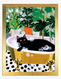
Black Cat in the Bubble Bath Art Print

Poolside Pop Pills Art Print

Endless Flow Art Print
More Fab art curations








Hanging in 100k+ homes
What people say about Colour Punch
Auto-generatedColourful prints suit bathrooms and guest rooms well, with good quality, careful packaging and punctual arrival adding to their appeal.
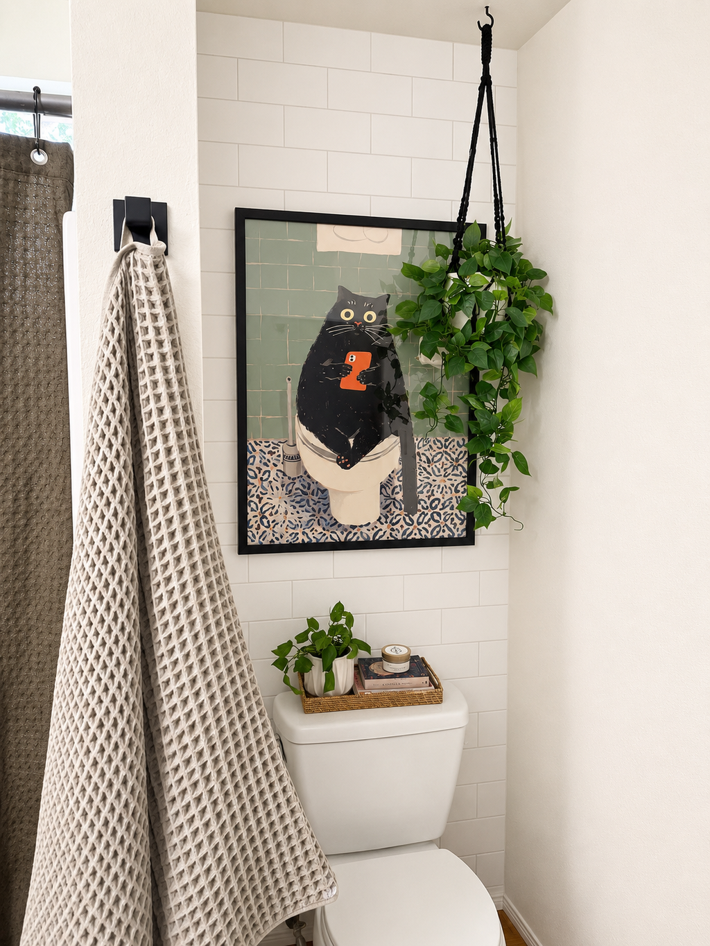
Love it! Grea quality and a fun piece for a little bathroom giggle
Love it! Grea quality and a fun piece for a little bathroom giggle.
 Reviewed
Cat's Bathroom Break Art Print →
Love this print for my bathroom
 Reviewed
Cat's Bath Time Retreat Art Print →
Bold Blooms is great!
I absolutely love Bold Blooms. It looks great.
 Reviewed
Bold Blooms for the Everyday Art Print →
 We’re serious about art, ask away



From sizing to framing and print quality, Fab's art experts break it all down—so you can find the right art for your space.