


 Order today for delivery by
Hills Canvas Prints
Hills give a room depth without demanding much attention, layered ridges, soft green slopes, hazy blue distance. Some here are quiet and misty, closer to Calm Landscape Canvas Prints, while others are graphic and pared back with flat bands of colour. If you know the mood you want, start with Rolling Hills Canvas Prints for gentle open country, or Tuscan Countryside Canvas Prints for warm light and cypress-lined ridgelines.


Sunlit Hillside Retreat Canvas Print

Pink Sky Hillside Village Canvas Print

Brittany Landscape by Paul Gauguin Canvas Print

Whitewashed Farmhouse and Old Oak Canvas Print

Tuscan Villa View Canvas Print

Misted Blue Hills Canvas Print

Misty Blue Hills Watercolour Canvas Print

Shinnecock Hills Golf View Canvas Print

Sunlit Hillside Vista Canvas Print

Environs of Briey by Pierre-Auguste Renoir Canvas Print

Tuscan Hillside Village Canvas Print

Layered Pines, Schillinger Inspired Canvas Print
More Fab art curations


Reading, Ideas And Advice From The Frame
More on landscape art, wall placement and building a scene-led room from The Frame, Fab's blog.
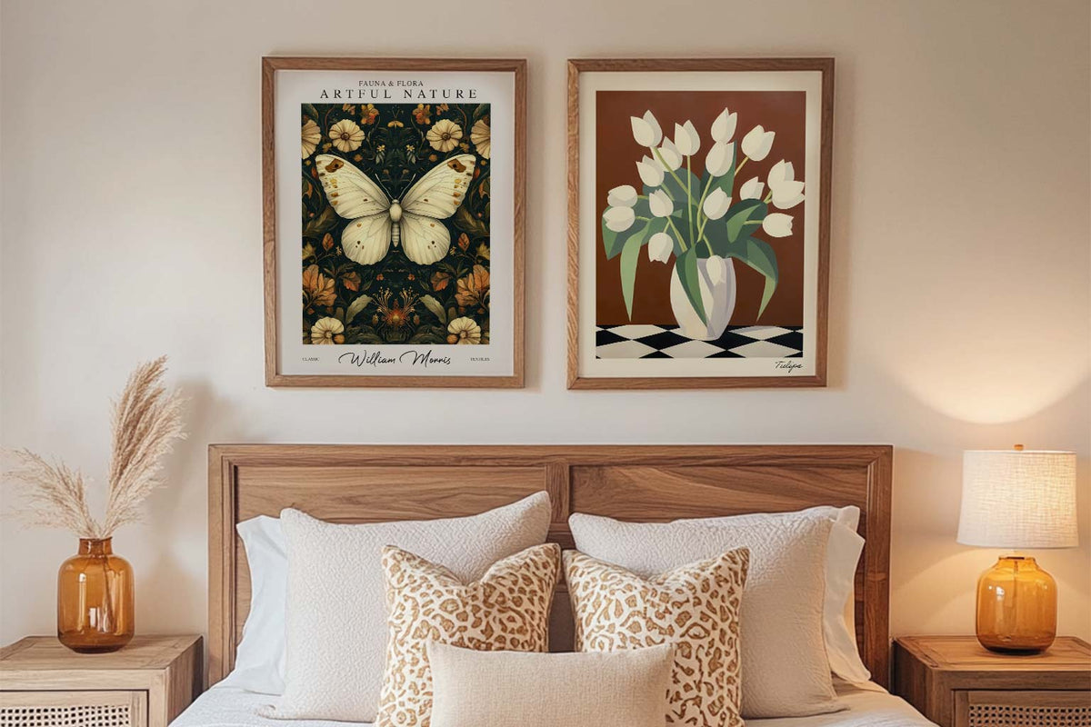
Starter Art Prints for First-Time Buyers
A blank wall can be intimidating. You know you want art, but where do you even start? You scroll through endless options online, walk through galleries feeling lost, or stare...
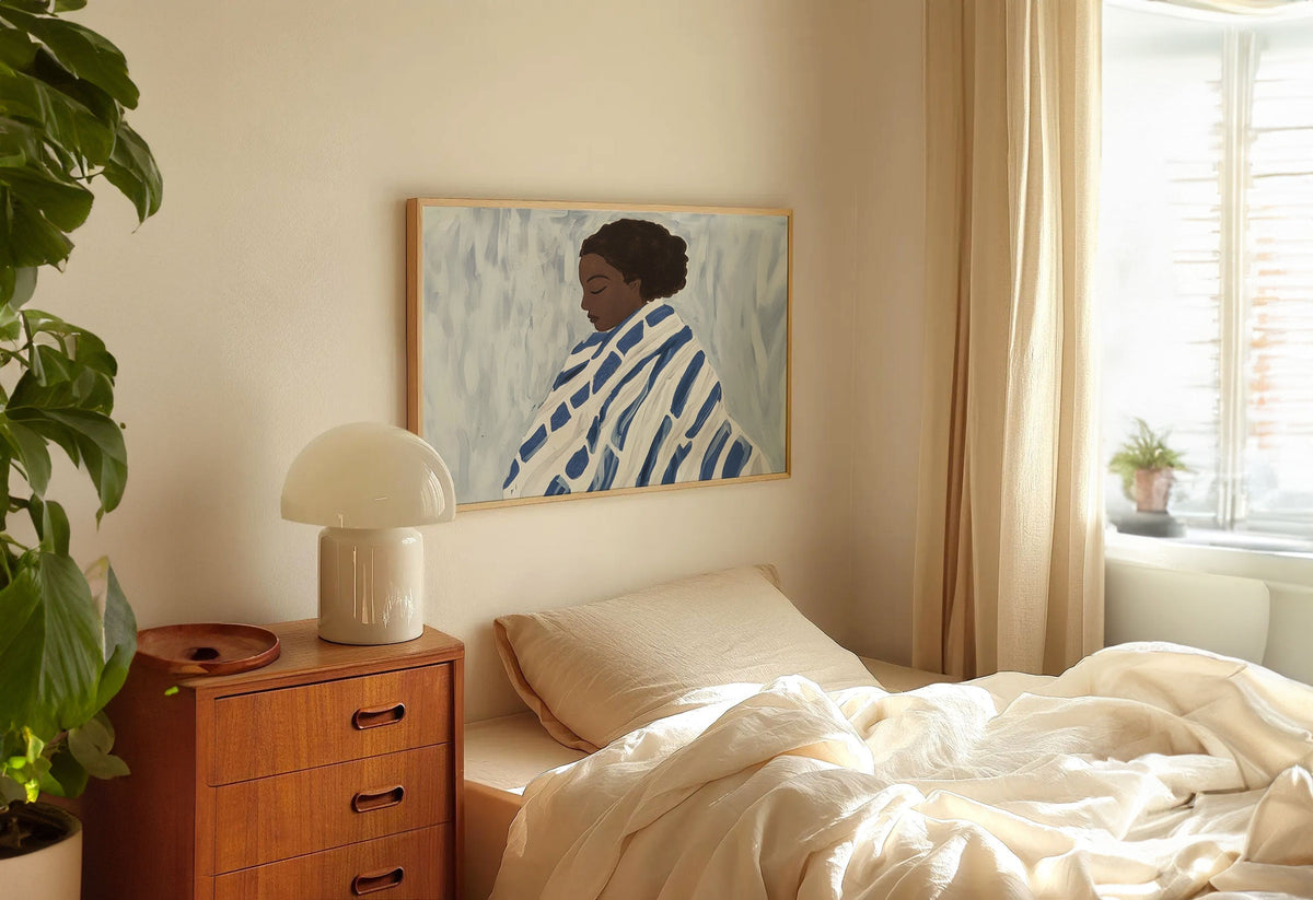
Art for Bedrooms: Calm, Romantic, or Bold?
Your bedroom is the most personal room in your home. It's where you start and end each day, where you retreat when you need space, where you go to feel...
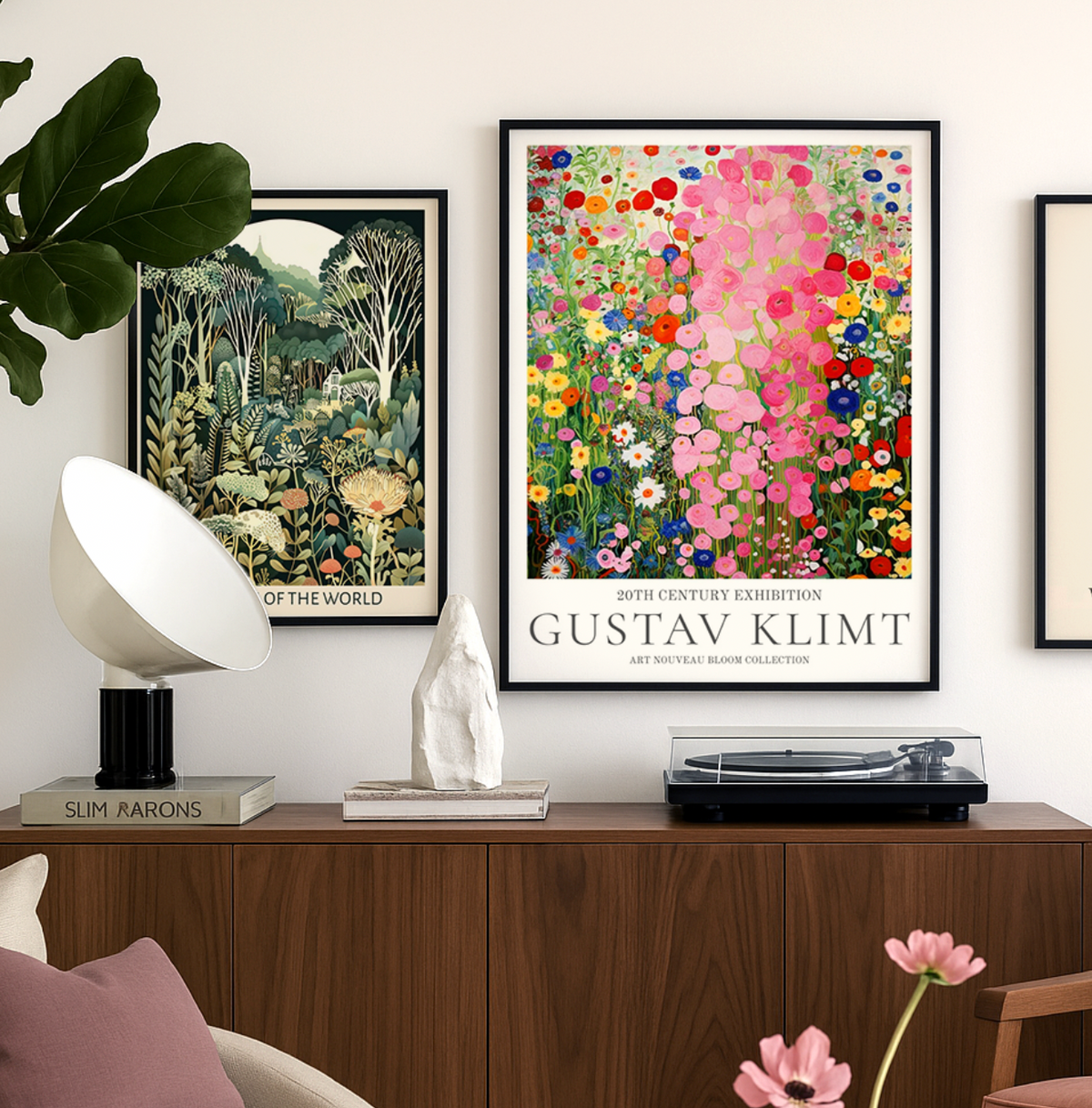
Discover Gustav Klimt Art Prints with Fab
Gustav Klimt wasn’t just an artist — he was a master of seduction through pattern, color, and symbolism. At Fab, we celebrate his work not just as art history, but...
 Choosing a hills canvas: your questions



Short answers on sizing, framing choices, colour matching and where hill scenes tend to hang best