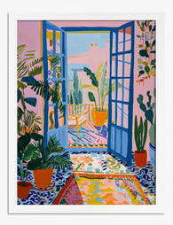
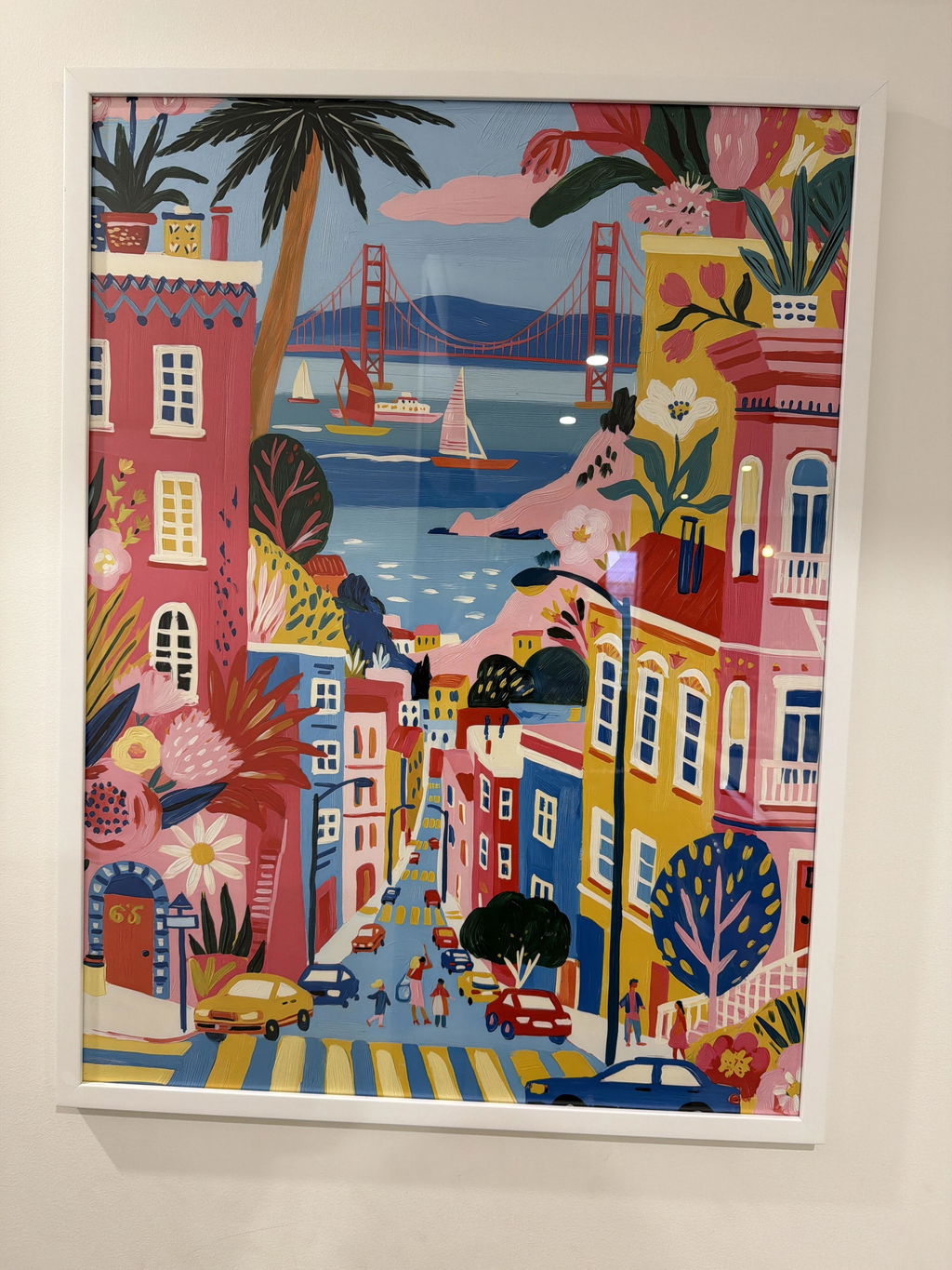
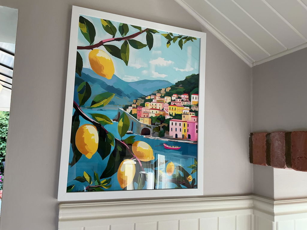
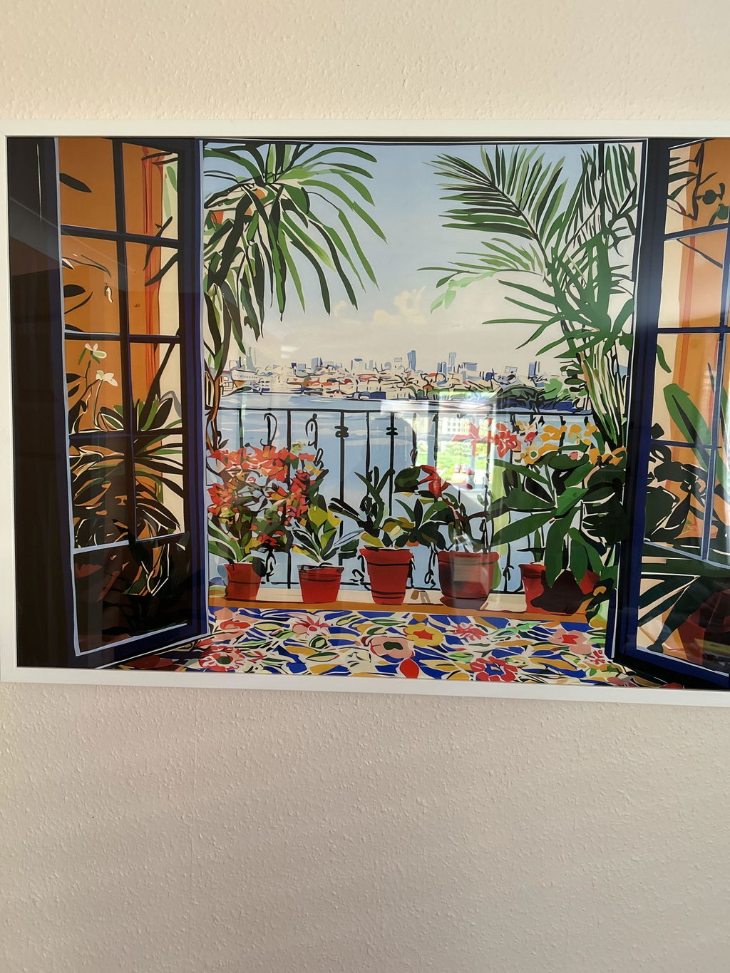
Solid wood. Professionally framed. Arrives ready to hang.
Make your print ready to hang.
Vibrant Art Prints
4.8
Colour that carries across a room. Hot pinks, electric blues, saturated greens, abstracts that hum, and figurative work with the volume turned up, art for walls that have gone quiet. If you want richness rather than brightness, the jewel tone art prints run deeper; for full-spectrum energy try rainbow art prints, or commit properly with maximalist art prints and let the wall do the talking.
I Googled the Colors I Wanted and Found my Perfect Print
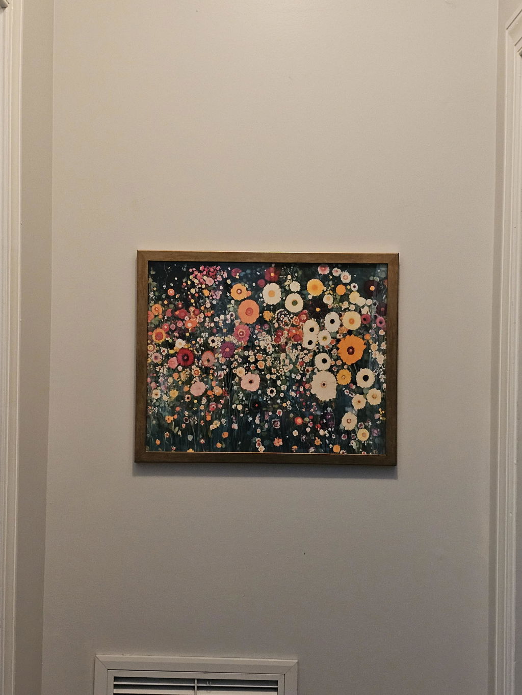
I just moved from a three-bedroom, two story house to a two bedroom ground floor apartment. This is the start of my new life and I want new things in my new place. I stumbled across Fab by Googling, "Print, gold, teal, brown" and they popped up. I found the perfect picture in the perfect orientation with the perfect frame. My anal-retentive brother came over and hung it for me--Perfectly level! It looks perfect. I'm already eyeballing another print for my bedroom that has yet to be decorated. I'll definitely buy from them again.
recently purchased this print and I couldn't be happier with it. The quality is outstanding — the colors are vibrant, the details are crisp and sharp, and it looks even better in person than in the photos. It arrived quickly and well-packaged, with no creases or damage at all.
The print has brought so much life and personality to my wall. It's beautifully designed and really fibishes the look off.
The advice you've been given about small rooms is mostly wrong. Beige walls and timid little prints don't make a compact bedroom feel bigger, they make it feel like a...
You found a print you love. It's loud, joyful, possibly a bit unhinged, and you've now spent four evenings wondering if your living room can actually handle it. That hesitation...
A blank wall can be intimidating. You know you want art, but where do you even start? You scroll through endless options online, walk through galleries feeling lost, or stare...
Questions about strong colour
Short answers on framing choices, matching colours to a room, hanging height, delivery and returns
High quality reproductions are usually described as fine art prints or museum-quality prints, terms that point to heavier paper stocks and faithful color reproduction rather than thin poster paper. Canvas prints are another premium finish, sold framed or unframed. For vibrant, saturated designs, the print finish matters most: a good paper holds bold color cleanly, so brights stay punchy instead of looking flat or muddy.
What kinds of vibrant art prints are trending right now?
Bold abstracts with expressive brushwork, colorful botanicals and florals, playful patterns and retro-inspired vintage designs are the looks most often grouped under bright and colorful wall art. Multicolored statement pieces used as a single focal point are popular, and so are coordinated sets hung as a gallery wall. Pick the direction that matches your room's existing palette rather than chasing every trend at once.
Should I choose paper or canvas for a bright, colorful print?
Paper prints under glass give brights a crisp, graphic edge and suit framed gallery walls, while canvas has a softer, more painterly surface that flatters loose abstract brushwork. Canvas also reflects less light, which helps in a sunny room. Both come framed or unframed depending on the product; a framed canvas arrives as one finished piece, so you don't buy a frame separately.
Which rooms suit vibrant wall art best?
Vibrant prints work hardest where you want energy: entryways, hallways, home offices, kitchens and living-room feature walls all benefit from a lively focal point. In bedrooms, choose the calmer end of the palette or a single larger piece so the room still reads restful. A good rule is one bold statement per sightline, with quieter walls around it to let the color breathe.
Will vibrant art prints actually look as bold on my wall as they do on screen?
They genuinely do, and our reviews back this up. Our giclée printing on thick matte paper produces deep, saturated colour without the glare you get from cheaper glossy prints. The matte finish means your vibrant wall art holds its punch even in bright rooms with lots of natural light, and the UV-protective acrylic glaze on framed prints prevents fading over time. Shoppers regularly tell us the colours look even richer in person than on screen.
How do I pick the right vibrant print for a living room that already has colour going on?
The trick is to pick a print that shares one colour with something already in your room, like a cushion, rug, or even the spine of a book on your shelf. If your living room has warm tones (terracotta, mustard, blush), go for colourful art prints that lean into those same warm hues rather than fighting them with cool blues and greens. A single bold 50x70cm or 70x100cm framed print above the sofa will feel intentional rather than chaotic. Avoid a gallery wall of different vibrant pieces in a room that's already busy. One confident, colourful statement does the job.
Can bright colourful wall art work in a small room or will it overwhelm the space?
Small rooms are actually where vibrant art prints shine hardest. A single bold print on the wall you see first when you walk in gives a small space an immediate focal point and makes it feel more designed, not more cramped. We'd go for a 40x50cm or 50x70cm framed print in a natural oak or white frame to keep things lifted. The key is committing to one piece rather than scattering several smaller ones, which can make a compact room feel cluttered.
What frame colour works best with bright, colourful prints?
For most vibrant art prints, a natural oak frame is our top pick. It adds warmth without competing with the colour in the artwork, and it works across almost every interior style from Scandi to mid-century. Black frames can work well with vibrant abstract prints when you want a more graphic, contemporary feel, but we'd avoid white frames with very bright art as they can wash out the contrast. Every framed print from Fab arrives ready to hang with the print properly fitted, so there's no warping or bubbling to take the shine off your colourful statement.
How do I decorate with bright colourful art without making a room feel like a toy shop?
The secret is contrast. Vibrant wall art looks most intentional against a neutral backdrop. If your walls are white, off-white, or soft grey, a bold colourful print becomes a deliberate focal point rather than noise. Pair your bright wall art prints with muted, textural furnishings like a linen sofa or jute rug to let the artwork do the talking. If you're going for two or three pieces, stick to prints that share a cohesive colour palette rather than grabbing one of everything. Curation beats accumulation every time.
Choosing a selection results in a full page refresh.