
 Order today for delivery by
 Food & Drink Art Prints
Everything edible and drinkable, rendered as art: still life lemons, market produce, espresso cups, bottles on a bar. Kitchens and dining rooms take this subject well, though it works anywhere you want warmth and a bit of appetite. Narrow things down if you already know the mood, fruit art prints for colour and texture, coffee art prints for a morning corner, or wine art prints where people gather to eat.


Carrots Stamp Art Print

Pasta Shapes Line Art Chart Art Print

Pasta Night in Blue Art Print

Two Apricots Painted Study Art Print

Sunny Italian Table Art Print

Ginger Cat Eating Salad Art Print

Fresh Picked Simplicity Art Print
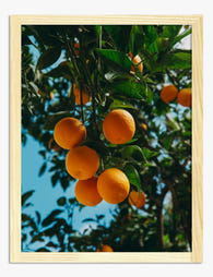
Sun-Kissed Oranges on the Branch Art Print

La Dolce Vita Italian Table Art Print

Morning Coffee Ritual Art Print

Lucky Cat Ramen Bowl Art Print
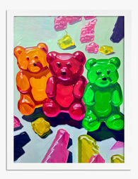
Sweet Pop Gummy Trio Art Print

Golden Pasta Swirl Art Print

La Dolce Vita Art Print

Tulips, Coffee and Cake for Two Art Print

Dapper Terrier with a Pint Art Print

Noodle Cat Happiness Art Print

Little Cherries Pattern Art Print

Bitter Campari Aperitivo Vintage Poster Art Print

Cowboy Hat Champagne Art Print

Pastel Dinner Gathering Art Print

Grapes in a Tote Art Print

Twelve Coffee Mugs Line Drawing Art Print

More Wine Art Print

Pasta La Vista Art Print

Kitten with Lobster and Oysters Art Print

Pastel Table Gathering Art Print
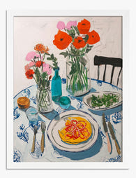
Sunny Brunch Gathering Art Print

Soft Morning Rituals Art Print

Campari Soda — È Sempre Giovane Art Print

Coastal Oyster Palette Art Print
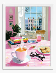
Pink Morning Ritual Art Print

Pasta Party Art Print

Still Life by Alfred Maurer Art Print

La Dolce Vita — Positano Supper Art Print

Buongiorno Coffee Cups Art Print

Tomato (It's Actually a Strawberry) Art Print

Aperol Hour Art Print

Pasta e Vino Art Print

Apples Block Print Art Print

Sunny Side Up Blooms Art Print

Food — Don't Waste It Art Print

Negroni Por Favor Art Print

Amalfi Lemons & Blossoms Art Print

Scarlet Plum Medley Art Print

Red Jelly on a Plate Art Print

Giant Apple on the Beach Art Print

Cat with Champagne Art Print
More Fab art curations


Hanging in 100k+ homes
What people say about Food & Drink Art Prints
Auto-generatedVibrant, saturated colours brighten kitchens, while playful designs also suit desks and make cheerful decorative touches.
Recieved a beautiful canvas that is now hanging
Recieved a beautiful canvas that is now hanging in pride of place in our newly decorated kitchen
 Reviewed
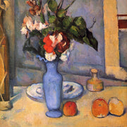
Coffee, Flowers and Chocolate Still Life Art Print →
Reviewed
Coffee, Flowers and Chocolate Still Life Art Print →
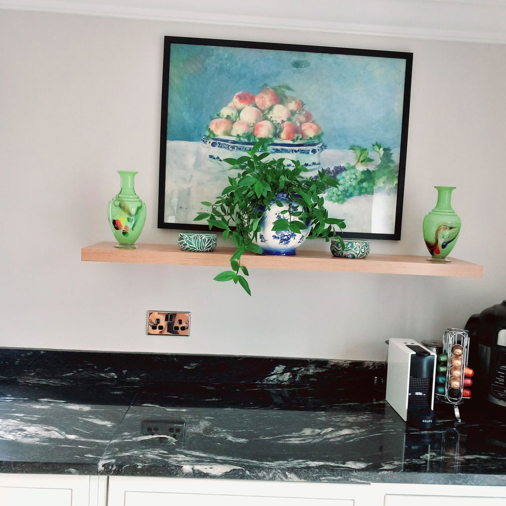
Kitchen print
Received my print today beautiful! will definitely recommend you and will also buy more excellent service fast delivery. Many thanks
 Reviewed
Still Life with Peaches and Grapes by Renoir Art Print →
Reviewed
Still Life with Peaches and Grapes by Renoir Art Print →
love the print - vibrant
love the print - vibrant colors!
 Reviewed
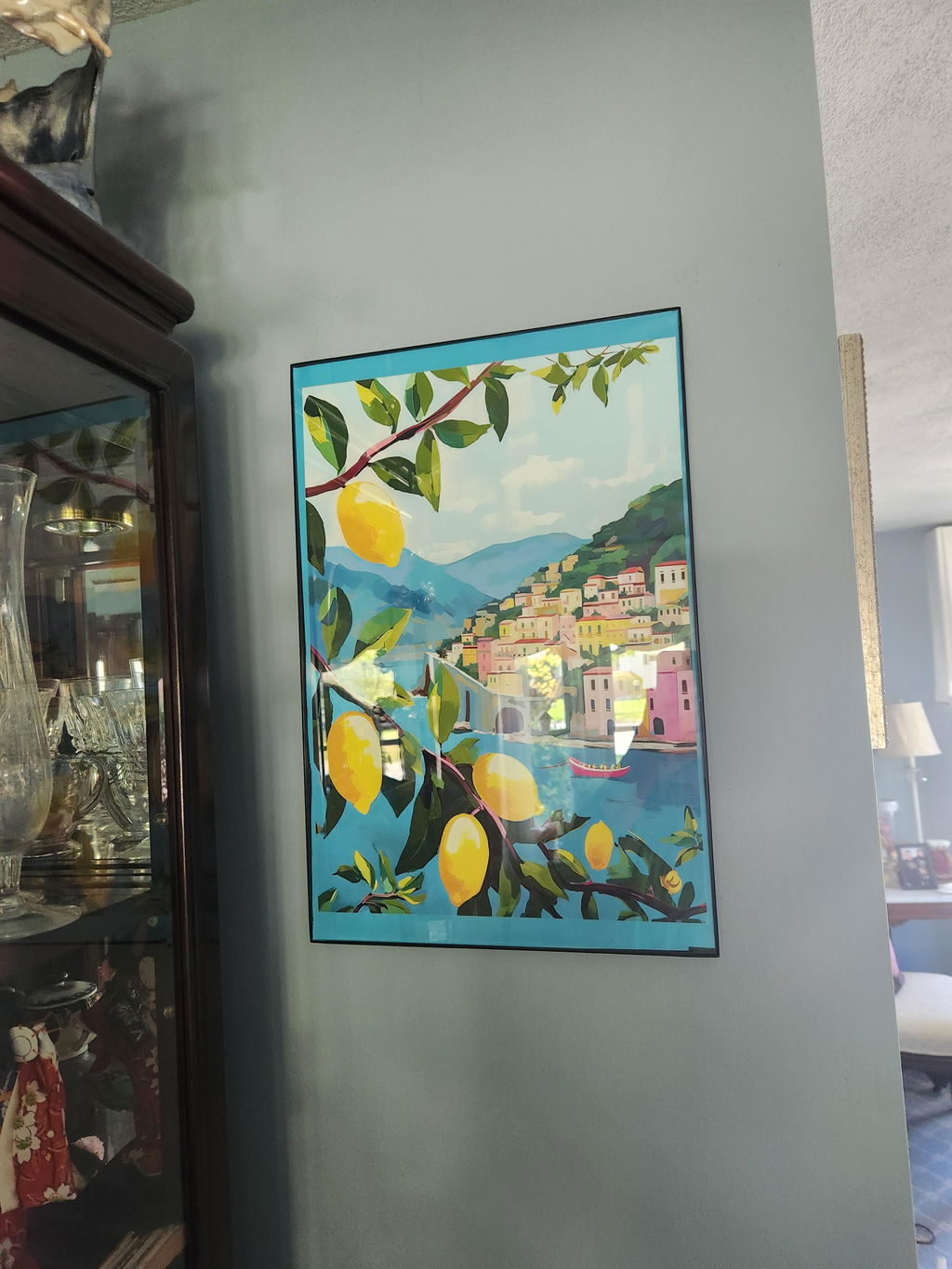
Mediterranean Table by Matisse Art Print →
Reviewed
Mediterranean Table by Matisse Art Print →





Kitchen Walls, Sorted: From The Frame
Ideas on still life, colour pairing and hanging art where you eat from The Frame, Fab's blog.

Transform Your Kitchen with a Food Gallery Wall...
Food and drink prints are the most underrated gallery wall subject in the home. They give you instant cohesion (everyone agrees the kitchen is the right place), they invite genuine...

Kitchen Wall Art: What Actually Works on Kitche...
Kitchens are the hardest room in the house to hang art in. You're working around steam, grease, awkward cabinet gaps, and the very real risk of accidentally turning your home...

Why Kitchen Wall Art Fails (And How to Get It R...
Most kitchen art fails for one of three reasons: it's hung in the wrong place, it's the wrong size, or nobody thought about what the steam would do to it....
 Choosing food and drink art



Quick answers on picking subjects, hanging near kitchen surfaces, framing and getting your order