
 Order today for delivery by
 Food Art Prints
Food art earns its place in a kitchen because it makes the room feel lived in rather than merely fitted. Here you'll find everything from lemons and figs in quiet food still life art prints to loud pop art food prints that carry across a galley kitchen. If your walls lean softer, painterly food art prints sit well near a table where people actually eat and linger.


Fish and Spring Onions Still Life Art Print

Tomato & Garlic Still Life Art Print

Disco Ball Watermelon Art Print

Gourmet Snack Collection Art Print

Sunny Side Up Blooms Art Print

Sunlit Lemons Still Life Art Print

Sourdough Bread Poster Art Print

Highland Cow with a Burrito Art Print

Disco Ball Pear on Pink Art Print

Scottish Summer Watermelon Poster Art Print

Breakfast with Cat Art Print

Breakfast, Paper and Coffee Art Print

Champion Plums Vintage Fruit Print Art Print

Christmas Cookies Recipe Art Print

Pears on a Picnic Platter Art Print

Pesto Pasta and Lemon Art Print

Always Room For Cake Art Print

Fresh Sushi Painted Medley Art Print

Simple Pleasures Still Life Art Print

Cheers to Italian Nights Art Print

Cozy Japanese Supper Art Print

More Spaghetti Less Regretti Art Print

La Dolce Vita Table Art Print

La Dolce Vita — Italian Table Poster Art Print

Fresh Slice Pop Pizza Art Print

Summer Gelato Trio Art Print

Lucky Numbers 222 Alignment Cherries Art Print

Strawberry Disco Ball Art Print

The Milkmaid by Johannes Vermeer Art Print

Pink Table, Yellow Wall Brunch Art Print

Cherry Pop Mosaic Art Print

Italian Table Delights Art Print

Pasta Club — All Are Welcome Art Print

Fruit Market: Indian Mango Art Print

Blue Line Lettuce on a Plate Art Print

Cheese Lineup Line Art Art Print

Sardines and Lemons Pop Collage Art Print

Watercolour Sushi Medley Art Print

More Espresso Less Depresso Art Print

Cool Cat Pizza Party Art Print

Happiness Can Be Fried Art Print

Pickle Cat Art Print

Sweet Treats Parade Art Print

Joyful Tomato Friends Art Print

Grapes in a Tote Art Print

Disco Chilli Spark Art Print
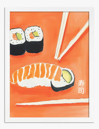
Sushi and Chopsticks Art Print

Sunny Italian Pasta Scene Art Print
More Fab art curations






Hanging in 100k+ homes
What people say about Food Art Prints
Auto-generatedVibrant, saturated colours bring kitchens and themed spaces to life, while playful designs add a cheerful, fun touch.
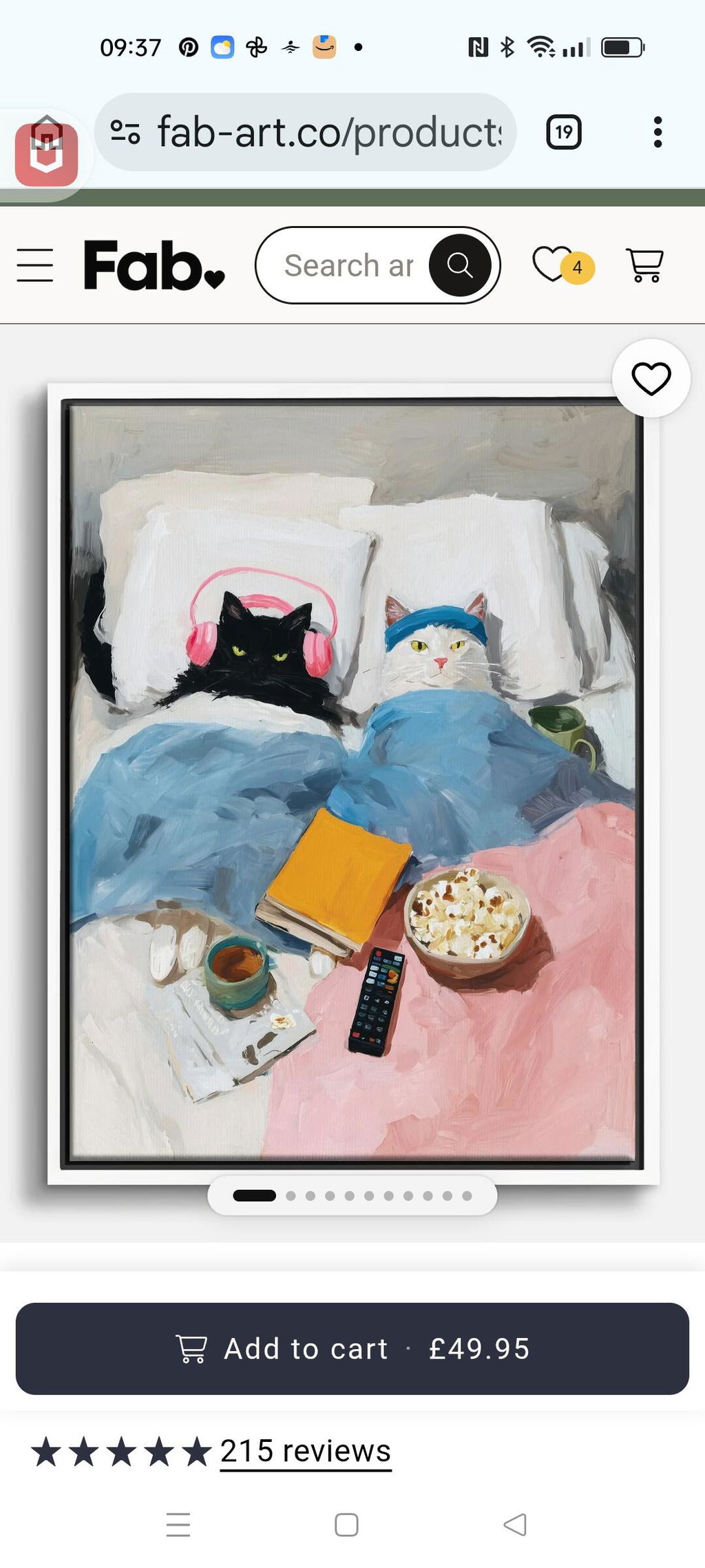
Cosy Cat Movie Night
I absolutely love it.😻 The artist certainly has a good sense of humour. So much so that I have already placed two more orders. ❤️🐾
 Reviewed
Cosy Cat Movie Night Art Print →
Reviewed
Cosy Cat Movie Night Art Print →
love the print - vibrant
love the print - vibrant colors!
 Reviewed
Mediterranean Table by Matisse Art Print →
Reviewed
Mediterranean Table by Matisse Art Print →

Kitchen Walls, Sorted: From The Frame
More on pairing food art with cabinets, tiles and dining tables from The Frame, Fab's blog.

What Art Actually Works in a Kitchen (And What ...
Most kitchen art looks like it was chosen last, in a rush, from a homewares aisle. It doesn't have to. With the right materials and a bit of restraint, your...

The Kitchen Gallery Wall Edit: Curated Food Pri...
Most kitchen gallery walls fail for the same reason: people pick prints they like individually, hang them roughly, and hope for the best. This guide gives you the formulas, the...

Transform Your Kitchen Walls with Art That Work...
Most kitchen art advice is the same recycled list: lemons, herbs, a typography print telling you to "Eat, Drink, Be Merry". You deserve better, and your walls do too. This...
 What should hang in a kitchen



Short answers on framing, placement near cooking areas, colour matching and picking a size that fits