
 Order today for delivery by
 Sardines Art Prints
Silver bodies, blue shadows, a bit of oily shine, sardines are a small subject that carries a lot of colour. Here they turn up stacked in tins, laid across plates, painted loose in oils or drawn flat and graphic for a kitchen wall. Warm market-stall palettes sit happily beside Mediterranean seafood art prints, while quieter, cooler studies lean towards fish still life art prints. Choose unframed, or framed and ready to hang.


No products found
More Fab art curations



Seafood On The Wall: From The Frame
More on hanging kitchen art, sizing prints and building small groups from The Frame, Fab's blog.
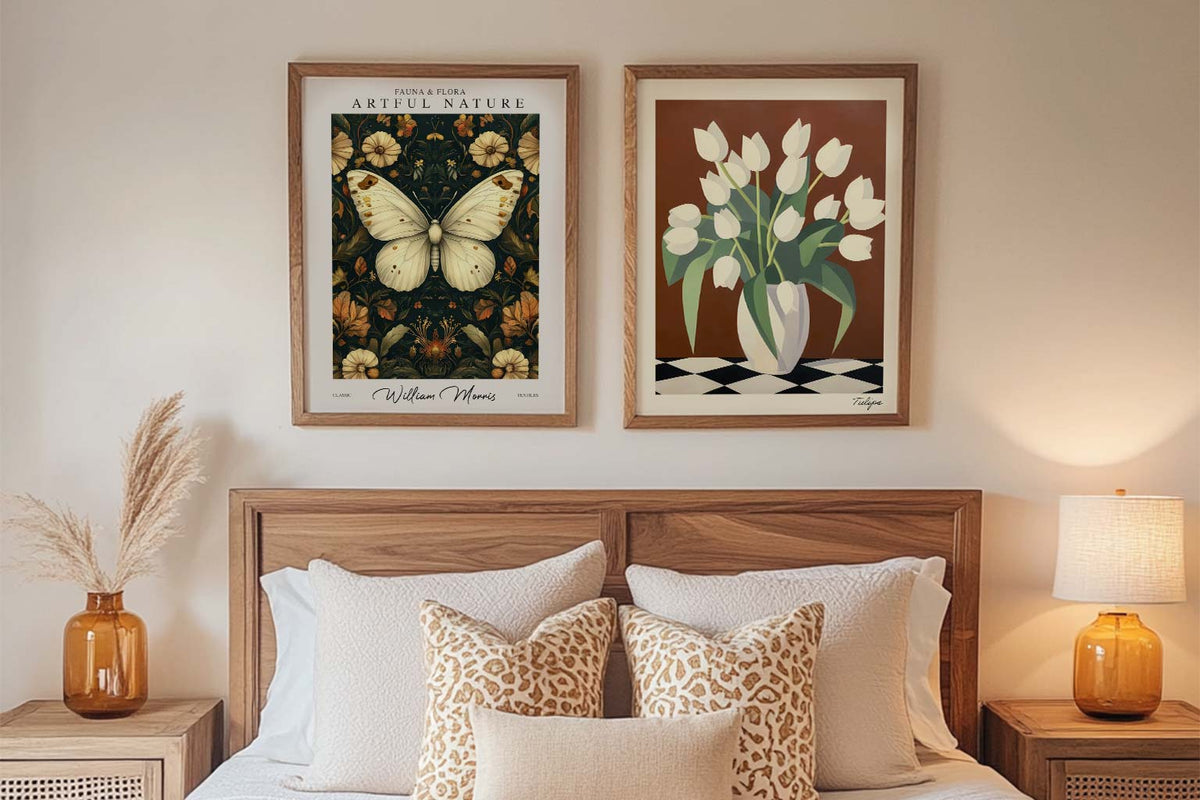
Starter Art Prints for First-Time Buyers
A blank wall can be intimidating. You know you want art, but where do you even start? You scroll through endless options online, walk through galleries feeling lost, or stare...
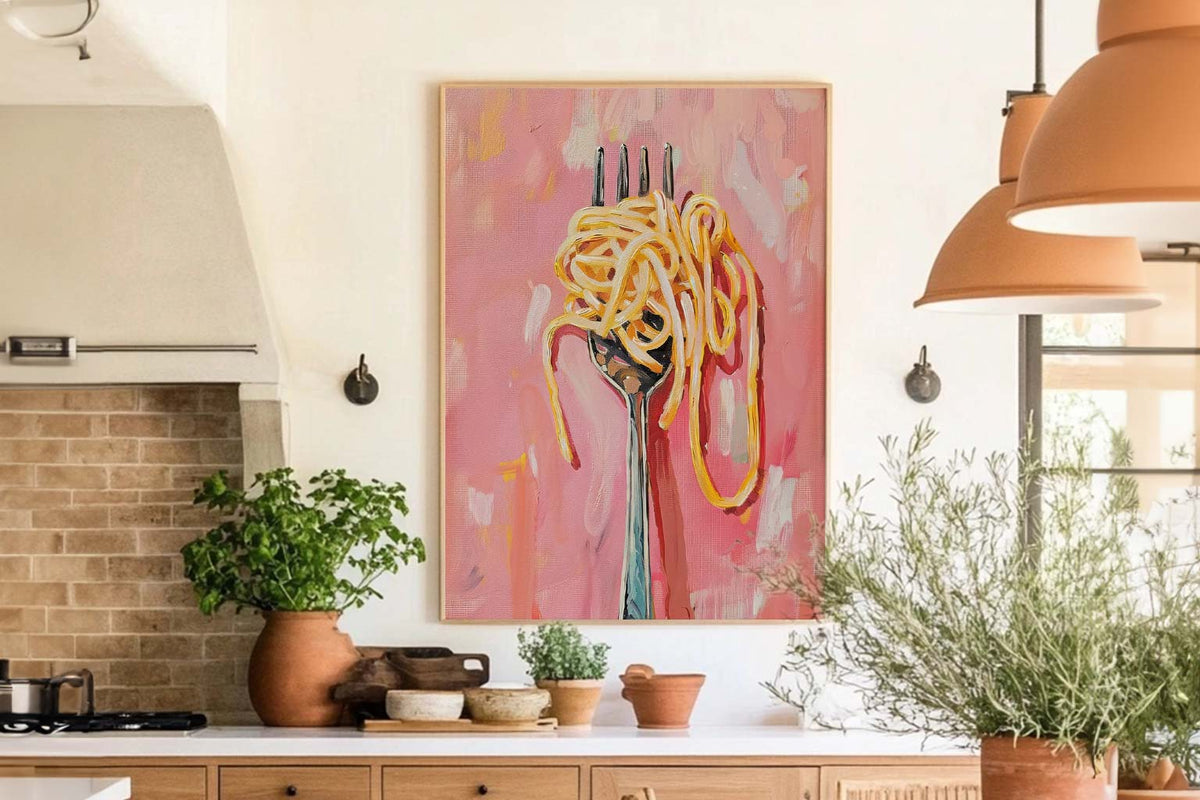
The Best Wall Art for Kitchens and Dining Spaces
Your kitchen isn't just for cooking. Your dining room isn't just for eating. These are the spaces where life happens. Where you have your morning coffee, where friends gather around...
How to Personalise a Rented Home with Wall Art
You're staring at beige walls that scream "rental property" and wondering how to make this place feel like you actually live here. You love art, but the lease says no...
 Which sardine print suits your wall



Short answers on framing, kitchen and dining room placement, delivery and sending something back