
 Pide hoy, entrega el
 Láminas tipográficas
Las palabras en la pared hablan rápido: marcan el tono antes de que nadie se acerque. Aquí tienes declaraciones rotundas, láminas tipográficas y caligrafía más suave y dibujo a mano en láminas de lettering. Algunas se leen antes como formas gráficas y después como palabras, por eso son muy fáciles de integrar. ¿Quieres una frase completa en vez de una sola palabra? Prueba las láminas con frases. ¿Prefieres verlo en lienzo? Mira los lienzos con texto.


No se encontró ningún producto
Más colecciones de arte Fab


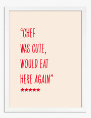


Leer entre líneas, desde The Frame
ideas sobre tipografía, cómo combinar colores y en qué rincones de casa funcionan mejor las palabras from The Frame, Fab's blog.
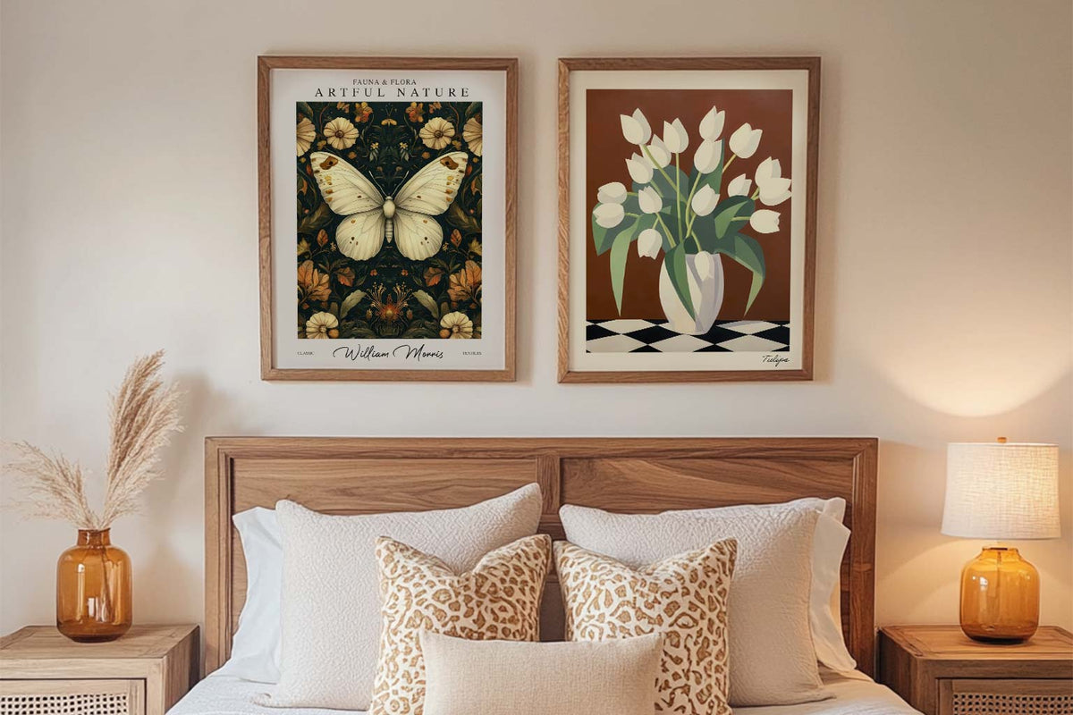
Tus primeras Láminas: cómo elegir arte para tus...
¿Te impone esa pared en blanco? Empieza tu colección con calma: te contamos cómo elegir tus primeras Láminas según tus colores, tu espacio y tu presupuesto, con trucos prácticos para...
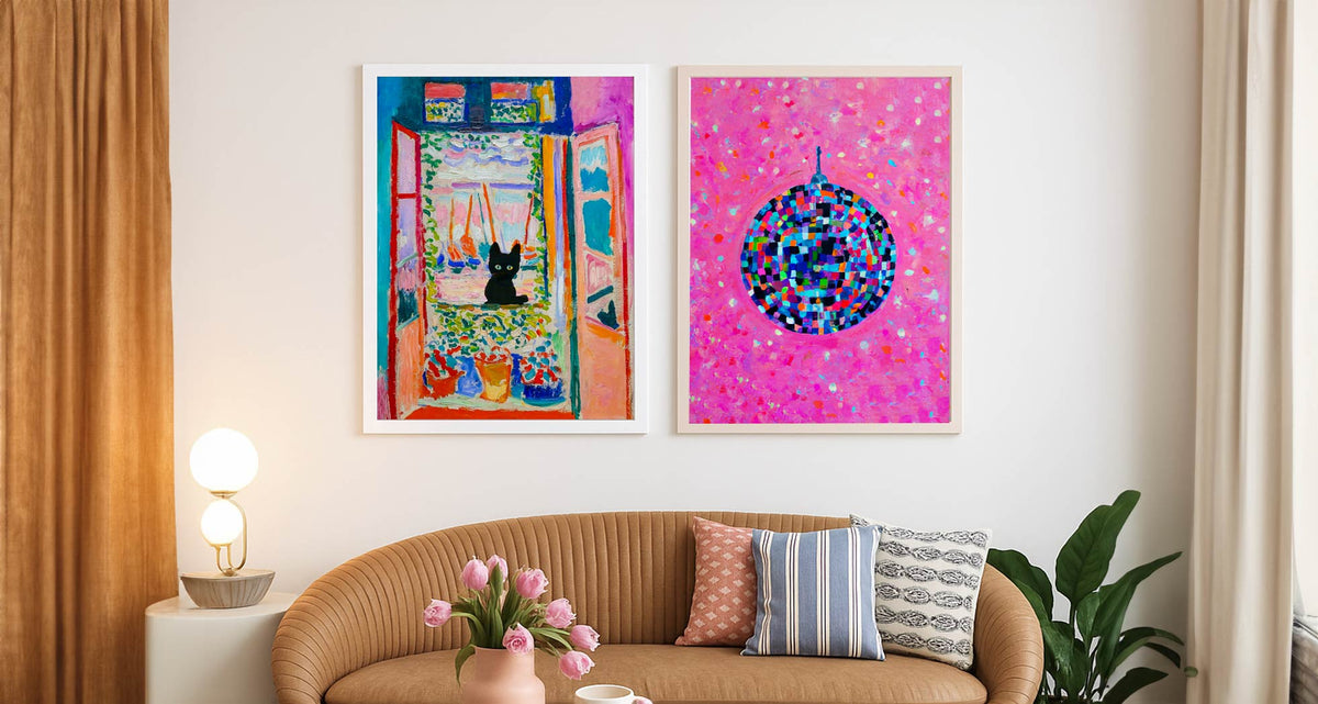
Cómo personalizar tu piso de alquiler con lámin...
Guía práctica para transformar un piso de alquiler con láminas y lienzos, sin taladro ni sustos con la fianza: ideas para colgar sin agujeros, apoyar sobre muebles, elegir marcos y...

Cómo elegir el arte perfecto para tu hogar: lám...
Comprar arte online puede ser fácil y emocionante. Descubre cómo elegir Láminas y Lienzos que reflejen tu personalidad, acierten con el tamaño y el color, y eleven cualquier estancia sin...
 Elegir arte con texto: preguntas frecuentes



Respuestas rápidas sobre cómo elegir el texto, acertar con el tamaño de piezas tipográficas y colgarlas para que se lean de maravilla