Dining Room Art Ideas for Every Style, From Mid-Century to Farmhouse
The art that works in a mid-century dining room will look completely wrong in a farmhouse one. Here's the fix.

Most dining room art advice treats style as an afterthought, listing every possible subject and material and leaving you to work out what actually goes together. This guide does the opposite. Pick your aesthetic, and you'll get the subjects, palettes, and frames that complete it, plus the mistakes that quietly sabotage the look.
Why your dining room style should dictate your art choices
The dining room is one of the few rooms in the house where you sit still and look around. Unlike a hallway you walk through or a kitchen you work in, you spend long stretches facing the walls, which means art has to earn its place. The wrong piece will quietly bother you for years.
Style is the cleanest way to choose well. A walnut sideboard, a brass pendant, and a tufted velvet chair each want different things on the wall above them, and the wrong choice will make the whole room feel slightly off without you knowing why.
The good news: each style has its own visual logic. Once you know what mid-century or farmhouse actually demands (not just "warm" or "natural" but specific subjects, palettes, and frame finishes), the decisions get easier. Browse the full dining room art prints collection if you want to see how this plays out across aesthetics.

Mid-century modern: bold colour, graphic shapes, and warm wood frames
Mid-century dining rooms are built on warm wood, clean lines, and a confident colour palette. Your art needs to match that confidence. This is not the place for whisper-quiet pastels or busy florals.
Subjects that work: geometric abstracts with organic curves, stylised botanicals (think single bold leaves rather than detailed sketches), atomic-era illustrations, and abstract landscapes with horizontal banding. The hallmark of mid-century art is shapes that feel hand-drawn rather than computer-perfect, with a slight imperfection in the line.
Palette: mustard yellow, burnt orange, teal, olive green, terracotta, and chocolate brown, often anchored by cream or off-white backgrounds. Avoid anything in cool grey or stark white, which will fight the warmth of the wood furniture.
Framing: warm wood frames in oak or walnut tones, ideally with a visible grain. Black frames can work for high-contrast graphic prints, but skip white frames entirely. They flatten the depth that wood furniture creates.
Size and approach: mid-century rewards a single large statement piece over a gallery wall. One 70x100cm framed print above a sideboard, or a horizontal piece running roughly two-thirds the width of the dining table, will do more than five smaller prints jostling for attention.
A common mistake: hanging a print that's technically mid-century but in cool, modern colours. Slate grey geometric prints belong in a contemporary apartment, not a room with walnut and brass. Check the palette before you check the shape.
Scandi and minimalist: muted tones, line drawings, and plenty of white space
Scandi dining rooms work because they leave things out. The same restraint has to apply to your walls, which is why so many Scandi rooms fail when their owners panic-buy a colourful print to "fill the space."
Subjects that work: single-line figure drawings, abstract minimalist compositions, soft watercolour washes, architectural photography, and quiet natural subjects like a single branch or a calm seascape. The unifying principle: lots of negative space in the artwork itself, not just around it.
Palette: cool greys, off-whites, pale wood tones, dusty pink, soft sage, and muted navy. Black accents are welcome but should be sparing. If your print has more than three colours, it's probably too busy for a Scandi room.
Framing: pale ash or oak frames with a natural matte finish, thin profile rather than chunky. Black frames work too, particularly for monochrome line drawings, as long as the frame is slim. Wide ornate frames will fight the room's calm.
Size and approach: Scandi rooms suit pairs and triptychs beautifully. Two matching 40x50cm prints side by side, or three slim verticals above a bench, give you visual rhythm without the noise of a full gallery wall. White mounts inside the frame add to the air-and-light feeling.
The biggest Scandi mistake is over-decorating. If your dining wall feels empty with one print, the answer is usually a larger print, not more prints.

Farmhouse and country: botanicals, landscapes, and natural oak frames
Farmhouse is built on warmth, texture, and a slightly nostalgic mood. Done well, it feels like a room that's been lived in for generations. Done badly, it looks like a themed restaurant.
Subjects that work: vintage-style botanical illustrations, pastoral landscapes, farm animals rendered with a bit of charm rather than literalism, hand-lettered typography (used sparingly), and still life with rustic subjects like ceramic jugs or wildflowers. Detailed botanical art prints are particularly strong here, especially the ones that nod to vintage scientific illustration.
Palette: warm cream, soft sage, dusty blue, terracotta, ochre, and the natural greens and browns of the countryside. Avoid anything too saturated or modern. Farmhouse colour wants to look slightly aged.
Framing: natural oak is the default, ideally with a visible grain and a matte rather than glossy finish. Distressed white or off-white wood frames also work, particularly for botanicals. Avoid sleek black metal frames entirely. This is the single most common farmhouse mistake, and it makes the whole room read as confused industrial-rustic rather than country.
Size and approach: farmhouse suits gallery walls better than most styles. A mix of three to six botanicals in mismatched but tonally similar frames, hung in a loose grid above a sideboard, captures the layered feel of a country home. If you go single-statement instead, choose a large landscape with a horizon line and let it anchor the room.
Pay attention to subject realism. A pencil-sketch hare in an oak frame feels right. A cartoon cow in the same frame feels like a gift shop. The line is thin but real.
Contemporary and maximalist: large-scale abstracts and gallery walls
Contemporary dining rooms split into two camps: pared-back minimal (which behaves like Scandi) and full maximalist, where art is the loudest voice in the room. We'll focus on the second, because it's the harder one to get right.
Subjects that work: large-scale abstracts with bold colour fields, contemporary photography, mixed-media compositions, and graphic typography. The key word is scale. A 100x150cm canvas above a dining table makes a statement that three smaller prints cannot match.
Palette: anything goes, but pick a position. Either monochrome black and white with one accent colour, or full chromatic abandon (jewel tones, neons, deep saturated colour blocks). The mistake is being timid in a style that rewards confidence. Browse abstract art prints if you want to see how scale and palette work together.
Framing: thin black metal frames, deep box frames in matte black, or no frame at all. Canvas prints work beautifully here because the gallery-wrap edge gives you the scale without the visual weight of a frame. For framed prints, keep the profile thin so the art does the talking.
Size and approach: this is the one style where a true gallery wall pays off, but it needs intent. Pick a unifying thread (all black frames, or all the same artist, or all the same palette) and let the subjects vary. A random assortment of prints in mismatched frames will read as clutter, not curation.
For modern art prints at this scale, canvas has a practical advantage: a 100x150cm canvas is significantly lighter than the equivalent framed print, which matters if you're hanging above a dining table and want to avoid a heavy fixture overhead.

Traditional dining rooms: still life, portraiture, and classic framing
Traditional dining rooms reward art that takes itself seriously. This is the one style where formality is a feature, not a bug.
Subjects that work: classical still life (fruit, vessels, drapery), botanical etchings, portrait paintings, landscape paintings with depth and atmosphere, and architectural prints. Anything that nods to museum collections or country house galleries will feel at home.
Palette: deep burgundy, forest green, navy, gold, warm cream, and rich brown. Traditional art tends to have darker backgrounds and more tonal depth than other styles. Bright, flat colour will feel out of place.
Framing: this is the only style where ornate, gilded, or wide-profile frames are not just acceptable but desirable. Dark wood frames with a slight ornamental detail, or matte gold frames with a classic moulding, complete the look. Cream or ivory mounts inside the frame add formality.
Size and approach: symmetry matters more here than in any other style. A pair of matching still lifes flanking a mirror, or a single large landscape centred above a sideboard, will feel more correct than a casual gallery wall. If you want multiple pieces, hang them in a perfect grid, not a loose cluster.
The trap with traditional is going so heavy that the room feels stuffy. One way to keep it breathing: pair a traditional subject with a slightly slimmer frame than you'd expect. The art reads as classical, but the room doesn't feel like a museum.
How to mix art styles without it looking like a jumble sale
Open-plan layouts mean your dining art often sits in eyeline of the lounge, which may be a different style entirely. Or you may simply own pieces you love that don't all match. The fix is finding one consistent thread.
Match the frames, vary the subjects. Five wildly different prints in identical oak frames will read as a collection. The same prints in five different frames will read as chaos. Frame consistency is the single fastest way to pull mixed art together.
Match the palette, vary the styles. If everything sits within a warm earthy palette (terracotta, ochre, olive, cream), you can mix a mid-century geometric with a vintage botanical and a contemporary abstract and it will still feel intentional.
Match the scale across rooms. If your lounge has one large 100x70cm canvas above the sofa, your dining room needs something of similar visual weight. Mixing a tiny print in dining with a huge canvas in lounge makes both rooms feel unbalanced when seen together.
The general principle: pick one element (frame, palette, or scale) and hold it constant. Vary the others freely.
Framing choices that make or break the look
Frames do more work than most people realise. The right frame can rescue a mediocre print. The wrong frame can ruin a beautiful one.
Sizing relative to furniture: the two-thirds rule is the cleanest starting point. Your art (or arrangement of art) should be roughly two-thirds the width of the furniture below it. A 180cm sideboard wants art around 120cm wide. A narrower piece floats; a wider piece overwhelms.
Hanging height: centre the artwork at roughly 145 to 152cm from the floor (57 to 60 inches), measured to the middle of the piece, not the top. Above a sideboard, leave 15 to 25cm of space between the top of the furniture and the bottom of the frame. Crucially, centre the art to the table or sideboard, not to the wall. A piece that's perfectly centred on the wall but offset from the table will always look wrong.
Glazing: prints framed behind acrylic rather than glass are lighter, safer above a dining table, and reduce glare from pendant lights. UV-protective glazing matters in dining rooms with large windows, because direct afternoon sun will fade unprotected prints within a few years.
Canvas versus framed: canvas suits maximalist, contemporary, and informal Scandi looks, and is lighter at large sizes. Framed prints suit traditional, mid-century, farmhouse, and any room where polish matters. Neither is better. They serve different aesthetics.
Quality matters more than you think. A warped frame, a print that bubbles inside the mount, or a frame shipped separately from the print and assembled poorly will undo everything else. Buying art and frame as a single fitted unit, made to order in matching materials, is the difference between a wall that looks finished and a wall that looks almost-right.

A final word on getting it right
Pick your style first, your subject second, your frame third. If you reverse that order (falling in love with a print before you've thought about whether it belongs in your room), you'll end up with something beautiful in isolation that quietly fights everything around it.
When you're standing in front of a blank wall trying to decide, ask the simpler question: what would this room look like in a magazine shoot of its own style? Mid-century rooms in magazines have warm wood frames and bold abstracts. Farmhouse rooms have oak and botanicals. The patterns are real, and they exist because they work.

Productos Fab destacados en este blog
-

Lámina cena vibrante con flores, vino y vela
Translation missing: es.products.product.sale_price Desde €16,95€23,95 -

Lámina escena de cena en tonos pastel
Translation missing: es.products.product.sale_price Desde €16,95€23,95 -

Lámina mesa de cena en tonos pastel
Translation missing: es.products.product.sale_price Desde €16,95€23,95 -

Lámina bodegón de mesa festiva
Translation missing: es.products.product.sale_price Desde €16,95€23,95 -

Lámina mesa para dos en tonos pastel
Translation missing: es.products.product.sale_price Desde €16,95€23,95 -
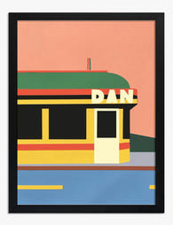
Lámina restaurante americano retro
Translation missing: es.products.product.sale_price Desde €16,95€23,95 -

Lámina sobremesa en tonos pastel
Translation missing: es.products.product.sale_price Desde €16,95€23,95 -

Lámina bodegón fauvista de mesa de comedor
Translation missing: es.products.product.sale_price Desde €16,95€23,95 -

Lámina mesa para compartir en tonos pastel
Translation missing: es.products.product.sale_price Desde €16,95€23,95 -

Lámina mesa de comedor fauvista vibrante
Translation missing: es.products.product.sale_price Desde €16,95€23,95 -

Lámina ambiente mediterráneo moderno
Translation missing: es.products.product.sale_price Desde €16,95€23,95 -

Lámina mesa puesta en tonos pastel
Translation missing: es.products.product.sale_price Desde €16,95€23,95 -

Lámina mesa de desayuno minimalista en blanco y negro
Translation missing: es.products.product.sale_price Desde €16,95€23,95 -

Lienzo mesa de cena en tonos pastel
Translation missing: es.products.product.sale_price Desde €64,95€92,95 -

Lienzo cena acogedora en tonos pastel
Translation missing: es.products.product.sale_price Desde €64,95€92,95 -

Lienzo mesa de comedor acogedora
Translation missing: es.products.product.sale_price Desde €64,95€92,95 -

Lienzo escena en bistró moderno
Translation missing: es.products.product.sale_price Desde €64,95€92,95 -

Lámina cena compartida en tonos pastel
Translation missing: es.products.product.sale_price Desde €16,95€23,95 -

Lienzo cena maximalista
Translation missing: es.products.product.sale_price Desde €64,95€92,95


Más de The Frame

Kitchen Art: What Works, What Fades
Kitchens are the worst room in your home for art. Heat cycles, steam plumes, airborne grease, and direct overhead lighting will quietly destroy anything you hang without thinking. This guide...

The Bedroom Finishing Guide: Art, Scale, and Light
Most bedrooms get decorated, but very few get finished. The difference is not how much you put on the walls, it is whether the art, the scale of your furniture,...

One Statement Piece Is All Your Living Room Needs
Most blank walls stay blank because the brief feels enormous. You don't actually need a gallery, a grid, or a curated grouping you'll second-guess for six months. You need one...