


No se encontró ningún producto
Usa menos filtros o elimínalos todos
Más colecciones de arte Fab
Láminas mid-century modern Print Articles From The Frame
How-to guides, styling inspiration, and design ideas for láminas mid-century modern in your home from The Frame, Fab's blog.

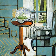
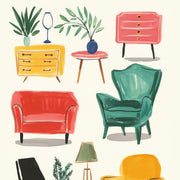
7 Mid-Century Modern Wall Art Rules That Get Pl...
Mid-century modern art lives or dies by placement. A perfect print hung 10cm too high or sized 20cm too small will look like a mistake, and that's the moment most...

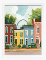
Why Retro Gallery Walls Need Stricter Rules Tha...
Most gallery wall advice was written with muted vintage art in mind. Retro prints play by different rules because they shout: bigger graphics, brighter colours, instantly recognisable decade signatures. Get...
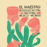
Tus primeras Láminas: cómo elegir arte para tus...
¿Te impone esa pared en blanco? Empieza tu colección con calma: te contamos cómo elegir tus primeras Láminas según tus colores, tu espacio y tu presupuesto, con trucos prácticos para...
 Tomamos el arte en serio, pregunta lo que quieras


Desde tamaños hasta marcos y calidad de impresión, nuestros expertos en arte te explican todo para que encuentres la pieza perfecta para tu espacio.