Why Chic Gallery Walls Work Better With Fewer Frames
The stylist's formula for a gallery wall that looks curated, not chaotic — with exact measurements.

Most gallery walls fail for the same reason: too many frames, in too many finishes, hung too close to the sofa. The chic ones look effortless because they follow a tight set of rules. Here is the full formula, with the measurements, sizes and layout templates that actually work.
Why most gallery walls look messy (and the one fix that changes everything)
The single biggest reason gallery walls look like a school art project is frame chaos. Black frames next to oak frames next to thin gold frames next to a chunky white moulding, all clustered together, fighting for attention. Your eye does not know where to land.
The fix is almost embarrassingly simple: pick one frame finish and commit. All black. All natural oak. All white. That's it. The moment every frame matches, even a slightly wonky arrangement starts to look intentional, because the frames read as a single unified shape rather than a dozen competing objects.
Everything else in this guide builds on that one decision. Skip it and no amount of clever spacing will save the wall.

The 3-5-7 rule and why odd numbers create visual balance
Odd numbers look more relaxed than even ones. A pair of frames reads as symmetrical and a little stiff. Three, five or seven frames feel like a composition.
Three frames is the easiest win. Use it above a console table, a bed, or a narrow stretch of wall. Five is the sweet spot above a standard three-seater sofa. Seven starts to feel like a proper feature wall and works best when you have at least 2.5 metres of clear horizontal space.
Avoid four. Avoid six. They almost always look like a grid that lost its way, unless you commit to a proper symmetrical grid (more on that in a moment). If you're in doubt about how many pieces to buy, our pre-curated wall art sets take this decision off your hands entirely.
Choosing a frame finish and sticking with it
Here is the short list of finishes that consistently look chic in a UK home:
- Matte black. The safest, most forgiving choice. Works against white walls, dark walls, and anything painted in a Farrow & Ball mid-tone.
- Natural oak. Warmer and more Scandinavian. Brilliant in rooms with light wood floors, linen sofas and lots of greenery.
- White. Disappears into pale walls and makes the artwork itself the focus. Best when your prints have strong colour or graphic impact.
Pick one and use it for every frame on the wall. Beginners trying to "mix metals" or pair black with gold almost always end up with something that looks like a clearance shelf. Mixing finishes is possible, but it's a stylist-level move that requires you to balance visual weight carefully. If this is your first gallery wall, don't.
Frame quality matters more than people realise. A thin, hollow frame with plastic glazing will undermine even the most beautiful print. Solid wood frames with proper UV-protective acrylic glaze (rather than glass that catches every overhead light) are worth the small premium because they're what separates "chic" from "cheap."
Layout templates that work: the grid, the salon hang, and the vertical stack
There are dozens of theoretical layouts. In practice, three work reliably in normal living rooms.
The grid
Four or six identical frames, evenly spaced, in two rows. This is the most polished, most formal option and it suits modern interiors, hallways and home offices. The catch is that every frame has to be exactly the same size and the spacing has to be precise. A grid with one frame even five millimetres off looks broken.
A grid of six 30x40cm prints in matching frames will fill a wall around 1.5 metres wide. A grid of four 40x50cm prints fills roughly the same space with more presence.
The salon hang
Mixed sizes, mixed orientations, arranged in a loose rectangle with consistent outer edges. This is the look most people are reaching for when they say "gallery wall." It's also the hardest to pull off because it requires you to balance visual weight by eye.
The trick is to start with one large anchor piece (your biggest frame), place it slightly off-centre rather than dead middle, then arrange the smaller frames around it. The outer boundary of the whole arrangement should still form a rough rectangle, even if the internal layout looks organic.
The vertical stack
Two or three frames stacked one above the other in a single column. Underused and brilliant for narrow walls, between windows, or beside a doorway. A stack of three 30x40cm prints in matching frames covers about 1.4 metres of vertical space and looks immediately considered.

Spacing, alignment, and the paper-template trick for getting it right first time
Spacing between frames should be 5 to 7 cm (roughly 2 to 3 inches). Tighter than that and the arrangement looks cramped. Wider than 8 cm and the frames start to look unrelated to each other, like strangers at a bus stop.
Use the same spacing on every side: between frames horizontally, vertically, and diagonally. Consistency is what makes the eye read the cluster as a single piece.
The paper template method
This is the step that separates chic gallery walls from those with eleven extra nail holes hidden behind the frames.
- Cut a piece of newspaper or brown paper to the exact dimensions of each frame.
- Label each template with the artwork it represents.
- Stick them to the wall with masking tape in your intended layout.
- Live with it for 24 hours. Walk past it, sit on the sofa, see how it feels.
- Adjust until the proportions look right.
- Only then mark the nail position through the paper, hammer in, and remove the template.
This single step will save you hours of regret. It also lets you test the 2/3 rule before committing: the total width of your gallery wall should be 60 to 75% of the furniture below it. So above an 84-inch (213 cm) sofa, your arrangement should span around 130 to 160 cm wide. Anything narrower looks lost; anything wider looks like it's swallowing the sofa.
The bottom edge of your lowest frame should sit 15 to 20 cm above the back of the sofa (roughly 6 to 8 inches). Closer and the art looks squashed. Further away and it floats off into nowhere.
Which print sizes to combine for a chic gallery wall above a sofa
The sizes below are tried-and-tested combinations that work for the most common UK sofa widths. All assume the same frame finish throughout.
Above a 2-seater (around 160 cm wide):
Three prints, all 30x40cm portrait orientation, hung in a row with 6 cm gaps. Clean, minimal, hard to get wrong.
Above a 3-seater (around 210 cm wide):
Five prints in a salon hang: one 50x70cm anchor (slightly left of centre), two 30x40cm prints stacked to its right, two 21x30cm prints filling the gaps. Total span around 150 cm.
Above a large 3-seater or corner sofa (240 cm+):
Seven prints. One 70x100cm anchor, two 40x50cm flanking pieces, four 30x40cm fillers arranged around the edges. Confident, generous, takes up the whole wall as it should.
For a more minimal version of any of these, drop the smallest prints and increase the spacing very slightly. Less really is more here, and our minimalist art prints work particularly well in pared-back arrangements where each piece needs to hold its own.

How to mix subjects without losing cohesion
This is where most guides give up and tell you to "just pick what you love." That's how you end up with a wedding photo next to an abstract next to a vintage botanical, and a wall that looks like a memory board.
Cohesion comes from one of three threads:
A shared colour palette. Every print contains at least one common colour. A wall of prints featuring black, cream and rust will hold together even if the subjects vary wildly (a landscape, a still life, a typographic piece).
A shared tonal feel. All muted, all high-contrast, all soft pastels. Subject matter can be anything, but the mood is consistent.
A shared medium or style. All line drawings. All photography. All vintage oil paintings. The visual language unifies the wall even when the colours differ.
You need at least one of these three threads. Two is better. Three is restrictive but produces the most polished result. Browsing within a single curated collection makes this much easier than picking pieces individually; our artfully chic edit and the living room art prints range are both built around tonal coherence so they layer naturally.
One more rule: balance visual weight across the wall. A very dark print pulls the eye. If you have a heavy, dark piece on one side, balance it with another darker piece (or two medium-toned ones) on the other. Photograph your paper-template layout on your phone and look at the photo in greyscale. Dark patches should be roughly evenly distributed.
Hanging hardware and getting prints level without a spirit level
A few practical things that will make hanging day painless.
For solid walls: standard picture hooks rated to the weight of each frame. Most framed prints up to 50x70cm sit comfortably on a single hook. Larger pieces (70x100cm and above) need either two hooks or a proper D-ring fixing.
For plasterboard: use self-drilling plasterboard fixings or a hook designed for studs if you can find one. Skip ordinary nails, which will eventually pull out.
For rental walls: adhesive strips (the heavy-duty kind rated to 3 kg or more per pair) genuinely work for lighter frames up to about 30x40cm. Use two pairs per frame, press for 30 seconds, then wait an hour before hanging. They won't take the weight of a large framed print, so reserve them for smaller pieces and use traditional fixings for anything bigger.
If your frames arrive ready to hang with the fixtures already attached (as Fab framed prints do), you save the fiddly step of fitting D-rings yourself. Worth checking before you buy, because retrofitting hardware to a finished frame is a job nobody enjoys.
Getting level without a spirit level: open the camera on your phone and turn on the grid overlay in settings. Hold it up to each frame and use the grid lines to align. It's not as precise as a proper level but it's accurate enough for gallery walls and means you can do the whole job solo.
For the final adjustment, step back at least 2 metres. Gallery walls are designed to be seen from across the room, not from 30 cm away. A frame that looks slightly off when you're nose-to-the-wall often looks perfect from the sofa.

The short version
Pick one frame finish. Use an odd number of frames. Keep 5 to 7 cm of space between every frame. Aim for 60 to 75% of the furniture width below. Hang the bottom edge 15 to 20 cm above the sofa back. Use paper templates before you touch a hammer. And let one of three threads (colour, tone, or style) hold the whole thing together.
Do those six things and your gallery wall will look like it was put together by someone who knew exactly what they were doing. Which, by the end of this article, you do.

Productos Fab destacados en este blog
-

Lámina villa retro de diseño geométrico
Translation missing: es.products.product.sale_price Desde £11.95£19.95 -

Lienzo noche chic estilo lounge
Translation missing: es.products.product.sale_price Desde £55.99£79.99 -

Lienzo estilo Bauhaus
Translation missing: es.products.product.sale_price Desde £44.95£74.95 -

Lienzo mujer chic sin esfuerzo
Translation missing: es.products.product.sale_price Desde £44.95£74.95 -

Lámina minimalista de equilibrio sereno en blanco y negro
Translation missing: es.products.product.sale_price Desde £11.95£19.95 -

Lienzo Bauhaus minimalista y moderno
Translation missing: es.products.product.sale_price Desde £44.95£74.95 -

Lámina musa chic a rayas
Translation missing: es.products.product.sale_price Desde £11.95£19.95 -

Lámina de rayas elegante
Translation missing: es.products.product.sale_price Desde £11.95£19.95 -

Lienzo figuras minimalistas
Translation missing: es.products.product.sale_price Desde £44.95£74.95 -

Lámina urbana minimalista en cuadrícula azul y coral
Translation missing: es.products.product.sale_price Desde £11.95£19.95 -

Lienzo frase motivadora minimalista
Translation missing: es.products.product.sale_price Desde £44.95£74.95 -

Lámina menos es más, pero a veces más es más
Translation missing: es.products.product.sale_price Desde £11.95£19.95 -

Lienzo refugio Bauhaus moderno
Translation missing: es.products.product.sale_price Desde £44.95£74.95 -

Lienzo de elegancia sin esfuerzo
Translation missing: es.products.product.sale_price Desde £44.95£74.95 -

Lienzo collage monocromático moderno
Translation missing: es.products.product.sale_price Desde £44.95£74.95 -
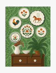
Lámina encanto folclórico con galería de platos
Translation missing: es.products.product.sale_price Desde £11.95£19.95 -

Lienzo copas de champán en cascada con flores
Translation missing: es.products.product.sale_price Desde £44.95£74.95 -

Lienzo minimalista en blanco y negro con líneas audaces
Translation missing: es.products.product.sale_price Desde £44.95£74.95 -

Lienzo paisaje de ensueño Bauhaus
Translation missing: es.products.product.sale_price Desde £44.95£74.95


Más de The Frame

Kitchen Art: What Works, What Fades
Kitchens are the worst room in your home for art. Heat cycles, steam plumes, airborne grease, and direct overhead lighting will quietly destroy anything you hang without thinking. This guide...

The Bedroom Finishing Guide: Art, Scale, and Light
Most bedrooms get decorated, but very few get finished. The difference is not how much you put on the walls, it is whether the art, the scale of your furniture,...

One Statement Piece Is All Your Living Room Needs
Most blank walls stay blank because the brief feels enormous. You don't actually need a gallery, a grid, or a curated grouping you'll second-guess for six months. You need one...