


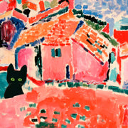


Retro Roller Rink Vibes Art Print
Translation missing: fr.products.product.sale_price
À partir de CHF 16.00
CHF 22.00

Bold Soccer Spirit Art Print
Translation missing: fr.products.product.sale_price
À partir de CHF 16.00
CHF 22.00

Vintage Soccer Match Art Print
Translation missing: fr.products.product.sale_price
À partir de CHF 16.00
CHF 22.00
Plus de sélections d'art Fab
 On prend l'art au sérieux, posez vos questions


Tailles, cadres, qualité d'impression... nos experts art vous expliquent tout pour que vous trouviez la pièce parfaite pour votre espace.
Besoin d'aide supplémentaire ? Contactez notre équipe ici
Which colours work best with orange art prints?
Orange wall art looks its absolute best against soft neutrals like warm grey, cream, or off-white walls. If you want a more sophisticated pairing, try navy or deep teal accents in cushions or throws to create contrast without competing with the print. For a calmer, earthier feel, combine burnt orange prints with sage green or olive tones. We'd steer clear of pairing orange with bright reds or yellows unless you're deliberately going bold, because the whole thing can start to feel like a fast-food restaurant.
Should I choose burnt orange or bright orange prints for my living room?
For most living rooms, we'd go with burnt orange or terracotta art prints. They read as warm and grounded rather than loud, and they play nicely with the natural wood, linen, and stone tones that dominate modern interiors. Bright tangerine or pure orange prints work brilliantly as a single statement piece in a more minimal space, but they can overwhelm a room if you go too big or group too many together. A 50x70cm or 70x100cm framed burnt orange print above a sofa is a safe bet that still makes a real impact.
Are orange prints a good choice for a bedroom?
Orange gets a bad reputation in bedrooms because people picture something neon, but softer shades like terracotta, amber, and burnt orange are genuinely lovely in a sleep space. They bring warmth without the high energy of a true bright orange. We think a pair of smaller orange botanical prints (around 30x40cm each) flanking either side of a bed, or a single abstract in warm burnt tones above the headboard, strikes exactly the right note. Pair them with soft white bedding and you've got a room that feels cosy but not heavy.
How do I know the framing quality will match what I see online?
This is where a lot of people get burned with art prints, especially when the frame arrives warped, separate from the print, or just flimsy. Every one of our framed orange art prints ships ready to hang with the print already properly fitted inside a solid FSC-certified wood frame with UV-protective acrylic glazing. No assembly, no bubbling, no nasty surprises. Thousands of our customers say the prints look even better in person than on screen, which honestly is the review we're proudest of.
What does the colour orange represent in art and interior design?
Orange sits right between the energy of red and the optimism of yellow, so it's historically associated with warmth, creativity, and enthusiasm. In Dutch Golden Age painting, oranges symbolised wealth and abundance. In modern interiors, orange art prints bring a sense of vitality to a space without the intensity of pure red. It's a fantastic colour for rooms where you want to feel energised but not wired, think home offices, kitchens, living rooms, and hallways that need life injected into them.