Klimt's Secret Obsession: A Guide to His Fifty Stunning Landscape Paintings
The summer paintings Klimt made for himself, and how to choose the right one for your wall.

Why Klimt's landscapes are fine art's best-kept secret
Ask anyone to picture a Klimt and they'll describe gold leaf, embracing lovers, a swirling kiss. Almost no one mentions a birch forest or a pond full of water lilies, yet landscapes make up roughly a quarter of Gustav Klimt's entire painted output: around 50 canvases that he made not for clients, but for himself.
Did Klimt paint landscapes? Obsessively. They were his escape from the airless world of Viennese portrait commissions, painted during long summers in the countryside, and they sell today for tens of millions. In 2017, his Bauergarten (Farm Garden) sold for around $59 million. These are not footnotes. They are some of the most distinctive nature paintings ever made, and they translate beautifully to a wall.
Lake Attersee: where Klimt found his landscapes
From 1900 onwards, Klimt spent almost every summer at the Salzkammergut lakes in upper Austria, mostly at Lake Attersee. He went there with Emilie Flöge, his lifelong companion and creative partner, as part of the Austrian Sommerfrische tradition: the bourgeois ritual of fleeing the city heat for cool alpine water.
Vienna was where he worked. Attersee was where he painted. The portraits paid the bills; the landscapes were what he did when no one was watching.
He worked outdoors with a small wooden viewfinder, sometimes a telescope, framing slices of forest, garden and water. He liked to row out onto the lake in a boat and paint the shoreline from the water, which is part of why so many of his lake paintings sit at an oddly low, floating perspective with almost no sky.

How Klimt painted nature differently to his contemporaries
The first thing you notice about Klimt's landscapes is that they are almost all square. He favoured a one-to-one canvas, which was extremely unusual in 1900 and remains rare today. Squares feel still and meditative. They don't pull the eye left to right like a traditional landscape; they hold it in place.
He flattened perspective deliberately. Trees, water and meadows pile up the canvas surface like wallpaper, often with no horizon line at all. This is the same decorative instinct that drives his gold portraits, just translated into chlorophyll and pond water instead of pattern and skin.
He'd also seen Van Gogh. A 1906 exhibition at Galerie Miethke in Vienna brought Post-Impressionist work in front of him, and you can feel its influence in the way his brushwork loosens, dots and dabs of pigment building up into shimmering surfaces. People often call this pointillism, but Klimt used it differently to the French. Where Seurat was scientific, Klimt was atmospheric. The dots create mood, not optical theory.
The result is a style that sits between naturalism and abstraction. Up close, a Klimt landscape dissolves into pure pattern. Step back and a meadow snaps into focus. It is, frankly, made to be looked at slowly.
The most iconic Klimt landscape paintings and what makes each one special
If you're new to his famous nature paintings, a handful of works do most of the heavy lifting. Knowing them makes choosing a print far easier.
On Lake Attersee (1900). Almost entirely water. A pale strip of land floats at the top, the rest is shimmering blue and green ripples. It's hypnotic, almost abstract, and one of his calmest works. Pairs beautifully with quiet, minimal interiors.
Island in the Attersee (c. 1901). Similar territory but with a small dark mass of land breaking the surface. The dominant colour is a deep teal that reads as almost contemporary in a modern lounge.
Schloss Kammer on the Attersee (1909 and several later versions). The yellow-pink castle reflected in the lake, with trees crowding the composition. Warmer and more architectural than the pure water paintings, with rust, ochre and sage tones.
Avenue in Schloss Kammer Park (1912). A receding tunnel of trees flanking a path to the castle. One of the few Klimt landscapes with strong perspective, and consequently one of the most cinematic.
Italian Garden (Malcesine on Lake Garda, 1913). From his Italian summers, more architectural and slightly more sun-bleached than the Austrian work, with terracotta and olive green dominating.
If you want to explore the full range, the Gustav Klimt nature art prints collection groups his landscape work together.
Klimt's tree paintings: from Birch Forest to Tree of Life
The trees are, for many people, where Klimt's landscapes get truly extraordinary.
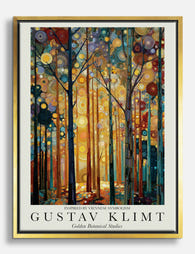
Birch Forest (1903). A dense screen of pale vertical trunks against a carpet of orange-brown autumn leaves. No sky, no horizon. Just rhythm. It's one of the most graphic, design-friendly works in his entire output and reads almost like a textile.
Beech Forest I (1902). Slimmer trunks, more silver-grey, with a glowing red-gold floor of fallen leaves. Slightly moodier than Birch Forest, and a brilliant pick for a room with warm wood furniture.
The Large Poplar II (Gathering Storm, 1903). A single colossal poplar dominating the canvas under a darkening sky. One of the rare Klimt landscapes that actually shows weather, and one of the most emotionally charged.
Avenue to Schloss Kammer (1912). Mentioned above, but worth flagging again as part of the tree group. It's the most directional of his tree works.
Apple Tree I (1912). A single tree fills the square, its canopy a constellation of red apples, leaves and tiny meadow flowers. Pure decorative joy.
Most of these share a defining trick: no sky. By cropping the trees so their canopies hit the top edge and their trunks fill the bottom, Klimt creates a wall of nature with nowhere for the eye to escape. It's the same instinct that turned his portraits into icons. The figure (or tree) is held in a flat, patterned field with no easy way out.
And yes, the Tree of Life from the Stoclet Frieze (1905-1911) belongs in this conversation too, even though it's a decorative frieze rather than an oil landscape. It's the moment his tree obsession meets his gold period head-on: spiralling branches against a flat gold ground. As a print, it remains his single most popular nature image.
You can browse more in the broader tree art prints collection if you want to see how Klimt sits alongside other tree-focused work.

The garden paintings: Flower Garden, Farm Garden, and their explosive colour
If the lake paintings are meditation and the tree paintings are pattern, the gardens are pure euphoria.
Farm Garden with Sunflowers (c. 1907). A wall of flowers from edge to edge: scarlet poppies, white daisies, golden sunflowers, and dark green foliage packed so densely you can barely see soil. There's no garden structure, no path, no fence. Just a curtain of bloom.
Flower Garden (1907). The companion piece, dominated by purples, pinks, oranges and acid greens. The composition rises gently like a painted hill of colour.
Farmhouse with Birch Trees (1903). Quieter than the others. A muted ochre house behind tall pale trunks, with patches of meadow flowers at the foot. A good middle ground if the explosive gardens feel too loud.
Forester's House in Weissenbach on the Attersee (1914). The pink and ochre facade of a small house, half-swallowed by climbing greenery and flower beds. One of his warmest, most domestic compositions.
These are the works that auction houses fight over, and you can see why. Up close they're almost abstract, individual brushstrokes barely tethered to the flowers they describe. Step back and the garden materialises. They are also, not coincidentally, the works that look most spectacular printed large.
Why these paintings work so well as modern wall art
A few practical reasons Klimt landscapes translate to walls better than almost any other early 20th century work.
First, the square format. Squares are forgiving above sideboards, beds, sofas and dining tables in a way long horizontals are not. They centre easily and don't fight rooms with low ceilings. On something like a 60x60cm or 70x70cm framed print, they read as deliberate, contemporary, and quietly confident.
Second, the colour palettes are already interior-ready. Klimt's lakes hover in the sage, teal and dove blue family. His forests sit in russet, ochre and silver-grey. His gardens explode into a colour story you could pull a whole room's accent palette from. None of these require you to redecorate around the artwork.
Third, the detail rewards close looking. The museum-grade giclée printing we use on thick matte paper preserves the brushwork up close, which is essential for Klimt. A cheap glossy print of Farm Garden with Sunflowers flattens it into wallpaper. A properly printed one shows you every dab of pigment. The matte surface also means no glare, which matters because these are paintings you'll want to look at properly, not squint at past your own reflection.
Fourth, and this is genuinely where most of the category falls down: framing. Klimt landscapes need a frame that doesn't compete. A simple solid wood frame in black, natural oak or white lets the painting do the work. What you don't want is a print that arrives warped, a frame that turns up separately in another box, or a print that hasn't been properly fitted to the frame so it bubbles within a month. Our framed prints arrive in one box, professionally fitted, ready to hang.

Choosing your Klimt landscape print: palette, mood, and room pairing
A short, opinionated buyer's guide.
If you want calm: pick a lake. On Lake Attersee or Island in the Attersee. Cool blues and greens, almost no detail to compete with anything else in the room. Brilliant in bedrooms, bathrooms (canvas handles humidity better than framed paper, worth knowing), and minimal living rooms. We'd suggest 70x70cm framed in natural oak above a bed, or larger as canvas above a low sofa.
If you want quiet drama: pick a forest. Birch Forest or Beech Forest I. The vertical rhythm of trunks works particularly well in narrow hallways, behind dining tables, or in rooms with warm wood floors that echo the autumnal palette. Black frames sharpen them. Natural oak softens them.
If you want a statement: pick a garden. Farm Garden with Sunflowers or Flower Garden are not background paintings. They will become the loudest thing in a room and they should. Put one above a plain sofa, in a hallway you walk through every day, or in a kitchen-dining space where colour is welcome. Go large. A 70x100cm framed or 100x100cm canvas earns its keep.
If you want a Klimt that isn't quite a landscape but isn't The Kiss: pick the Tree of Life. It bridges his gold period and his nature work. Works in almost any room and any palette.
A few format notes. Canvas suits the garden paintings particularly well because the mirrored-edge wrap means you don't lose any of the flowers around the perimeter, and the matte poly-cotton surface mimics the original oil texture. Framed prints suit the lake and forest works, where the crispness of the matte paper and the structure of a clean wood frame give the compositions room to breathe. Both options exist in the wider landscape art prints collection if you want to compare.

Klimt's landscapes don't ask to be the centrepiece of a room the way the gold portraits do. They settle in. They reward repeat looking. They sit beside houseplants and reading chairs and morning coffee like they were always meant to be there, which, given how he painted them, they sort of were. Start with the palette that matches your room, pick the mood you want to live with, and go a size larger than you think.

Produits Fab présentés dans cet article
-

Toile paysage luxuriant de Gustav Klimt
Translation missing: fr.products.product.sale_price À partir de £44.95£74.95 -

Affiche paysage luxuriant de Gustav Klimt
Translation missing: fr.products.product.sale_price À partir de £11.95£19.95 -

Affiche paysage fleuri de Gustav Klimt
Translation missing: fr.products.product.sale_price À partir de £11.95£19.95 -

Toile paysage serein de Gustav Klimt
Translation missing: fr.products.product.sale_price À partir de £44.95£74.95 -

Affiche symphonie florale de Klimt
Translation missing: fr.products.product.sale_price À partir de £11.95£19.95 -

Affiche forêt dorée de Klimt
Translation missing: fr.products.product.sale_price À partir de £11.95£19.95 -

Toile allée dorée au jardin de Gustav Klimt
Translation missing: fr.products.product.sale_price À partir de £44.95£74.95 -

Affiche symphonie florale de Klimt
Translation missing: fr.products.product.sale_price À partir de £11.95£19.95 -

Affiche forêt dorée de Gustav Klimt
Translation missing: fr.products.product.sale_price À partir de £11.95£19.95 -

Toile le jardin doré de Klimt
Translation missing: fr.products.product.sale_price À partir de £44.95£74.95 -

Affiche jardin sauvage de Gustav Klimt
Translation missing: fr.products.product.sale_price À partir de £11.95£19.95 -

Toile le baiser de Gustav Klimt
Translation missing: fr.products.product.sale_price À partir de £44.95£74.95 -
Toile forêt dorée style Klimt
Translation missing: fr.products.product.sale_price À partir de £44.95£74.95 -

Affiche forêt enchantée de Klimt
Translation missing: fr.products.product.sale_price À partir de £11.95£19.95 -

Toile forêt dorée de Klimt
Translation missing: fr.products.product.sale_price À partir de £44.95£74.95 -

Affiche Le baiser de Gustav Klimt
Translation missing: fr.products.product.sale_price À partir de £11.95£19.95 -

Toile forêt dorée de Klimt
Translation missing: fr.products.product.sale_price À partir de £44.95£74.95 -

Affiche forêt ensoleillée de Gustav Klimt
Translation missing: fr.products.product.sale_price À partir de £11.95£19.95 -

Affiche forêt ensoleillée de Klimt
Translation missing: fr.products.product.sale_price À partir de £11.95£19.95 -

Toile forêt dorée de Gustav Klimt
Translation missing: fr.products.product.sale_price À partir de £44.95£74.95


Plus de The Frame

Kitchen Art: What Works, What Fades
Kitchens are the worst room in your home for art. Heat cycles, steam plumes, airborne grease, and direct overhead lighting will quietly destroy anything you hang without thinking. This guide...

The Bedroom Finishing Guide: Art, Scale, and Light
Most bedrooms get decorated, but very few get finished. The difference is not how much you put on the walls, it is whether the art, the scale of your furniture,...

One Statement Piece Is All Your Living Room Needs
Most blank walls stay blank because the brief feels enormous. You don't actually need a gallery, a grid, or a curated grouping you'll second-guess for six months. You need one...