


Poster regina di stile in bianco e nero

Poster tipografico Rodeo in toni terrosi

Poster cani giocosi: terrier e labrador

Poster Genova vibrante

Poster tipografico più amore, per favore

Poster stivali rosa stile western

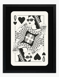
Poster King of Cool pop art

Poster rifugio soleggiato con cagnolino

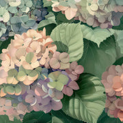
Poster mercato dei fiori di Seul dai colori vivaci

Poster sciatori sulla neve in stile minimalista

Poster sciatori e ombre sulla neve in bianco e nero
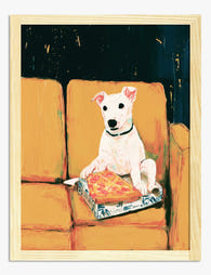
Poster cane che mangia pizza sul divano

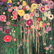
Poster pop art ciliegie disco

Poster zucca gialla di Naoshima
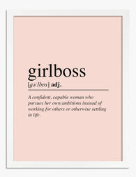
Poster definizione di Girlboss

Poster atmosfere retrò lungo la strada

Poster barboncino che mangia una fetta di pizza

Poster natura morta a righe blu ispirata a Matisse

Poster saggezza intramontabile

Poster zampine di gatto su sfondo rosa

Poster Vespa rossa vintage

Poster trio di orsetti gommosi scintillanti

Poster armonia di rosso e arancio in stile Rothko
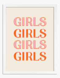
Poster tipografico ragazze audaci
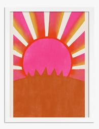
Poster alba rosa radiante

Poster ritratto cubista di gatto

Poster patatine fritte retrò
Altre selezioni d'arte Fab
Dai alle tue pareti l’upgrade che meritano Print Articles From The Frame
How-to guides, styling inspiration, and design ideas for dai alle tue pareti l’upgrade che meritano in your home from The Frame, Fab's blog.

Pink Gallery Wall Ideas: 7 Looks from Soft and ...
Pink is having a long moment, and a gallery wall is the most flexible way to commit to it without painting your walls. The trouble is that "pink gallery wall"...

7 Steps to a Pink Gallery Wall That Looks Inten...
Pink gets a bad rap in interiors, mostly because it's the easiest colour to execute badly. A pink gallery wall done well looks like a curated collection in a Copenhagen...
 Prendiamo l'arte molto sul serio – chiedi pure


Dalle dimensioni alla cornice fino alla qualità di stampa, gli esperti d'arte di Fab ti spiegano tutto per trovare l'opera giusta per il tuo spazio.