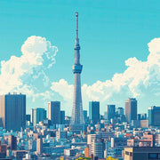
Grattacieli che allungano la parete: griglie d'acciaio, riflessi di vetro, torri che svaniscono nelle nuvole. Alcuni poster alzano lo sguardo dal livello strada per il massimo effetto; altri arretrano e lasciano che le torri si incastrino tra loro. Le fotografie funzionano benissimo in corridoio o sul vano scala, mentre i poster illustrati di paesaggi urbani aggiungono colore e un taglio grafico. Se vuoi l'orizzonte intero invece della singola torre, i poster di skyline allargano la visuale.
What is skyscraper art and why is it popular for wall decor?
Skyscraper art focuses on tall buildings, towers and city skylines, usually emphasizing bold vertical lines, geometry and dramatic perspective looking up or across a city. It appeals to people who like architectural and urban subjects, and the strong repeating lines read well from a distance. Because the compositions are naturally tall and structured, they suit narrow walls, hallways and modern interiors particularly well.
How do I style skyscraper prints in a living room or office?
Skyscraper prints look sharpest against calm walls, so white, grey or soft greige lets the architecture do the talking. Hang a single tall piece above a console or sofa to echo the vertical composition, or run two or three prints in a row for a skyline effect. Pair them with metal, glass and clean-lined furniture, and keep frames simple in black, white or thin metallic tones.
Should I choose a framed art print or a canvas for skyscraper artwork?
It depends on the look you want. Framed prints give crisp edges and a polished, architectural feel that suits monochrome city photography and line-based designs. Canvas has a softer, more textured surface and no glass reflections, which works nicely in bright rooms. A framed canvas arrives as one finished piece with nothing to assemble, so it is the easiest option if you want a ready-made result.
Do black-and-white or color skyscraper prints work better?
Black-and-white skyscraper images emphasize structure, contrast and shadow, so they blend easily into most schemes and feel timeless in offices and minimalist rooms. Color versions, especially sunset or blue-hour city tones, add warmth and can anchor a room's palette. If your space already has plenty of pattern or bold furniture, monochrome usually keeps things calmer; if the walls are neutral, color adds a focal point.
Scegliendo una selezione si ottiene un aggiornamento completo della pagina.

 Ordina oggi, consegna il






 Come scegliere un poster di grattacieli


