
 Ordina oggi, consegna il
 Cibo e bevande
Tutto ciò che si mangia e si beve, trasformato in arte: nature morte di limoni, primizie di mercato, tazzine da espresso, bottiglie sul bancone del bar. Cucine e sale da pranzo si prestano benissimo, ma funziona ovunque tu voglia calore e un pizzico d'appetito. Se hai già in mente l'atmosfera, restringi il campo: poster di frutta per colore e texture, poster di caffè per l'angolo del mattino, oppure poster di vino dove ci si ritrova a mangiare.


Poster la dolce vita a tavola

Poster albicocche russe stile vintage

Poster brindisi alle serate di pasta

Poster colazione parigina

Poster fette di arancia rossa

Poster fetta di limone vivace

Poster anguria palla da discoteca

Poster spaghetti e vino

Poster terrier elegante con berretto e sciarpa

Poster cucina allegra e luminosa

Poster spaghetti e polpette in stile disco

Poster natura morta con tulipani e limoni

Poster toast al miele e burro
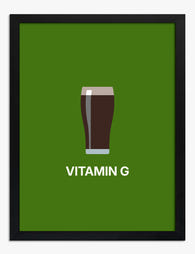
Poster pinta di birra irlandese su sfondo verde

Poster limoni in giallo e blu

Poster gatto nero e ora delle olive

Poster studio del carciofo nei toni del verde

Poster tavola di dolci in festa

Poster brindisi a colori con cocktail

Poster coppia di peperoncini rossi piccanti

Poster grappolo di pomodori di Napoli

Poster gatto paffuto nel ramen
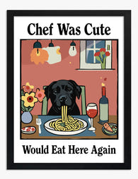
Poster labrador nero chef a tavola

Poster arancia intera e mezza arancia

Poster colazione parigina con croissant e caffè

Poster fetta di pomodoro moderna per cucina

Poster banchetto festivo di Matisse

Poster pop colorato per il soggiorno

Poster tavola imbandita in stile fauvista dai colori vivaci

Poster stagione dei picnic

Poster ritrovo al bistrot rosa

Poster pera dorata in stile disco

Poster utensili da cucina moderni

Poster schizzi di cucina blu giocosi

Poster banchetto mediterraneo al chiaro di luna

Poster gatto nella tazza di caffè

Poster Martini colorato e geometrico

Poster limoni e caffè ad Amalfi

Poster cane amante della pizza

Poster francobollo vintage con uva

Poster tavola di frutta vintage

Poster ostriche rosa su sfondo blu

Poster tortilla spagnola e pomodori

Poster moka e caffè del mattino

Poster brindisi tropicale

Poster tavola fiorita con piatto bianco e blu

Poster ananas pop art tropicale

Poster martini e olive
Altre selezioni d'arte Fab


Appeso in oltre 100.000 case
Cosa dicono le persone di Cibo e bevande
Generato automaticamenteColori vivaci e saturi ravvivano la cucina, mentre i disegni giocosi stanno bene anche sulla scrivania e danno un tocco decorativo allegro.
Ho ricevuto una bellissima tela che ora è appesa
Ho ricevuto una bellissima tela che ora è appesa in bella vista nella nostra cucina appena rinnovata.
 Recensito
Poster natura morta dei rituali del mattino →
Recensito
Poster natura morta dei rituali del mattino →
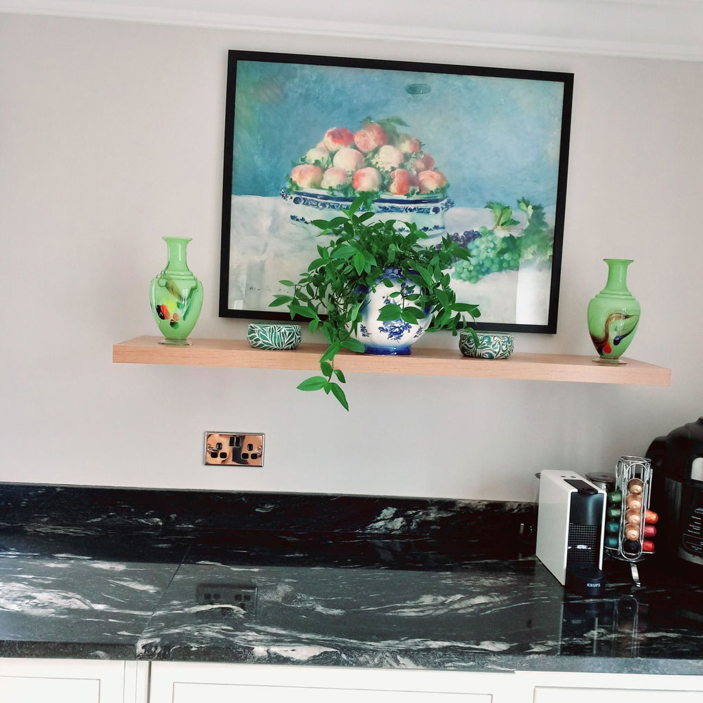
Poster da cucina
Ho ricevuto il mio poster oggi — bellissimo! Vi raccomanderò sicuramente e comprerò ancora. Servizio eccellente, consegna veloce. Grazie mille!
 Recensito
Poster natura morta con pesche e uva di Renoir →
Recensito
Poster natura morta con pesche e uva di Renoir →
Amo la stampa - vivace
Amo la stampa - colori vivaci!
 Recensito
Poster tavolo mediterraneo di Matisse →
Recensito
Poster tavolo mediterraneo di Matisse →


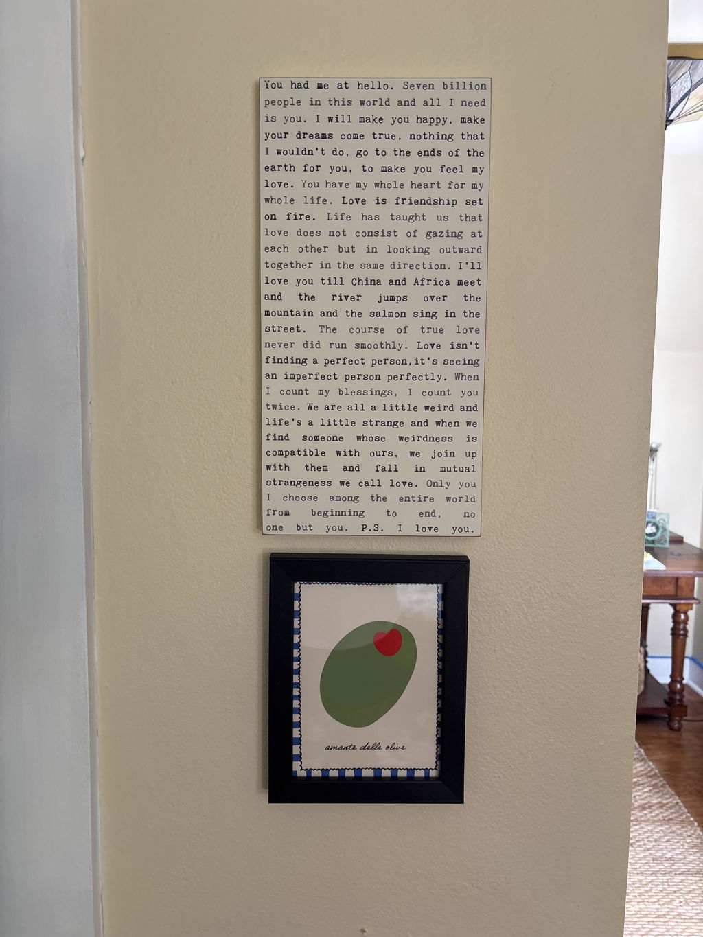

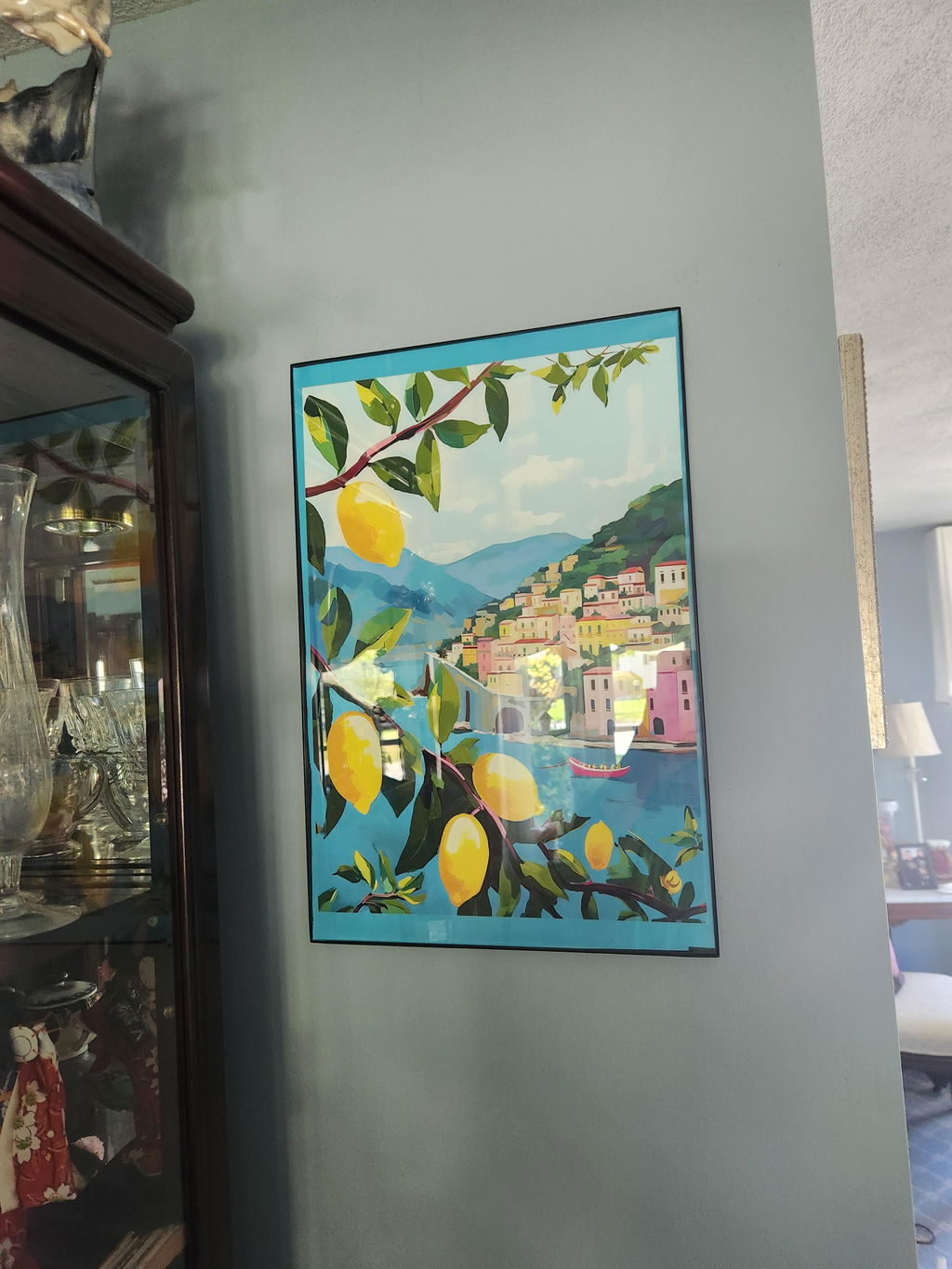


Pareti della cucina, sistemate: da The Frame
Idee su nature morte, abbinamenti di colore e su come appendere i quadri dove mangi from The Frame, Fab's blog.

Trasforma la tua cucina con una parete di stamp...
Le stampe a tema cibo e drink sono il soggetto più sottovalutato per una gallery wall domestica. Offrono coesione immediata (tutti concordano che la cucina è il posto giusto), invitano...

Arte da parete in cucina: cosa funziona davvero...
Come scegliere tele e stampe per la cucina che resistono a vapore, unto e sole, con formati, soggetti e palette che elevano la stanza senza cliché.

Perché l’arte da parete in cucina spesso fallis...
La maggior parte dell’arte in cucina fallisce per uno di tre motivi: è appesa nel posto sbagliato, è della misura sbagliata, oppure nessuno ha pensato a cosa farà il vapore....
 Scegliere quadri su cibo e bevande



Risposte rapide su come scegliere i soggetti, appendere vicino alle superfici della cucina, incorniciare e ricevere il tuo ordine.