
 Ordina oggi, consegna il
 Panda Stampe d'arte


Nessun prodotto trovato
Altre selezioni d'arte Fab





Articoli su Panda Stampe d'arte da The Frame
Guide pratiche, ispirazione per l’arredo e idee di design per Panda Stampe d'arte in casa tua, su The Frame, il blog di Fab.
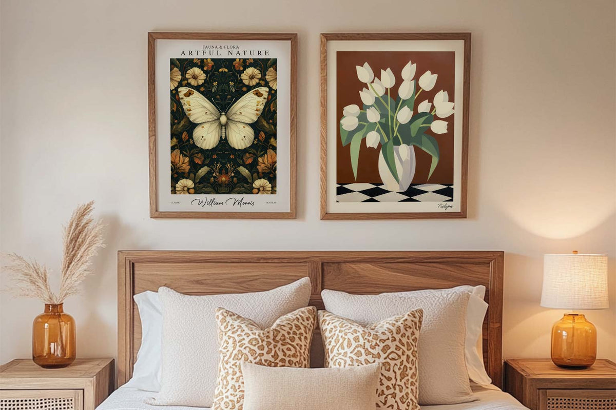
Prime stampe d’arte per chi acquista per la pri...
Una guida semplice per scegliere le prime stampe d’arte: colori, formati, posizionamento e budget, senza stress e con la libertà di cambiare idea.
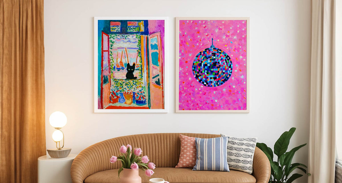
Come personalizzare una casa in affitto con qua...
Idee smart per trasformare un appartamento in affitto con quadri e stampe: soluzioni senza fori, alternative creative, cornici e strategie da trasloco — a prova di cauzione.
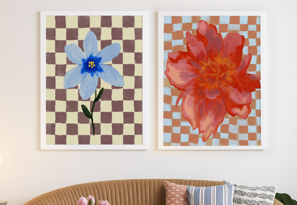
Come usare l’arte per completare una stanza
Scopri come scegliere stampe e quadri che collegano colori, proporzioni ed emozioni, creando un punto focale che trasforma una stanza piatta in uno spazio coerente e intenzionale.
 Prendiamo l'arte molto sul serio – chiedi pure



Dalle dimensioni alla cornice fino alla qualità di stampa, gli esperti d'arte di Fab ti spiegano tutto per trovare l'opera giusta per il tuo spazio.