
 Ordina oggi, consegna il
 Poster e Quadri per la Cameretta
L’arte per la cameretta la guardi più di quasi tutto il resto in casa: tu alle 3 del mattino, e poi chi sta imparando cos’è un coniglio. Quindi scegli cose che piaceranno a entrambi. Cieli morbidi e nuvole chiare, poster per la cameretta ad acquerello in rosa e verde polverosi, poster per la cameretta con cuccioli pieni di carattere, dinosauri per gli anni rumorosi, e poster per la cameretta con stelle e cielo notturno sopra il lettino. Appendili in basso, alla loro altezza.


Poster ritratto di topolino con fiori

Poster sole sorridente per cameretta

Poster gattino con corona di fiori all'acquerello

Poster colomba folk e fiori da giardino

Poster cucciolo di leone con corona di fiori in acquerello

Poster cagnolino soffice con mela rossa
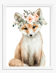
Poster volpe con corona di fiori

Poster triceratopo acquerello blu-grigio

Poster valle giapponese con gru e fiori primaverili
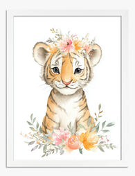
Poster cucciolo di tigre con corona di fiori ad acquerello

Poster ritratto di coniglio con corona di fiori

Poster colomba, sole e giardino

Poster gatto chic sullo scooter

Poster topolini in concerto

Poster safari con elefante e giraffa

Poster piccolo triceratopo

Poster gatto blu notte con fiori

Poster panda nella vasca vintage con bolle

Poster cucciolo di leone con corona di fiori in acquerello

Poster martin pescatore folk su blu navy

Poster coppia di fenicotteri

Poster volpe con corona di fiori

Poster tema safari con coppia di giraffe

Poster colomba bianca nel cielo azzurro

Poster nuvola bianca su cielo rosa

Poster cuccioli di Kamisaka Sekka

Poster elefante giocoso per cameretta

Poster triceratopo amichevole
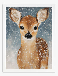
Poster ritratto di cerbiatto sulla neve

Poster gatto con corona di fiori in acquerello

Poster coniglio curioso in grigio e bianco

Poster grande cigno rosa tenue

Poster coccodrillo e paperella nel bagnetto in acquerello

Poster cucciolo di ghepardo nel bagnetto di bolle

Poster grifone fiabesco nei toni oro e marrone

Poster pulcinella di mare decorativo

Poster anatra gialla

Poster anatroccolo con corona di fiori

Poster orso con fiori ad acquerello

Poster uccello bianco su blu

Poster pipistrello a testa in giù per cameretta
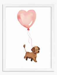
Poster cagnolino con palloncino a forma di cuore

Poster astronauta giocoso in acquerello

Poster colomba bianca su blu

Poster ritratto di coniglio Whiskers & Wonder

Poster coccodrilli giocosi e colorati

Poster triceratopo ad acquerello

Poster pettirosso scandi
Altre selezioni d'arte Fab





Idee per la cameretta da The Frame
Approfondimenti su colore, altezza a cui appendere e su come creare una parete che accompagni la crescita di tuo figlio from The Frame, Fab's blog.

Decorazioni da parete per la cameretta che non ...
La maggior parte dei consigli online sulla cameretta si ferma a 'scegli pastelli delicati e aggiungi una stampa con nuvole'. Puoi fare di meglio, e il tuo bambino passerà più...

Arte da parete per ogni stanza di casa: cosa fu...
Una guida stanza per stanza con misure, formati e consigli onesti: niente vaghezze, solo soluzioni che funzionano davvero nelle case reali.
Prime stampe d’arte per chi acquista per la pri...
Una guida semplice per scegliere le prime stampe d’arte: colori, formati, posizionamento e budget, senza stress e con la libertà di cambiare idea.
 Scegliere i quadri per la cameretta



Tutte le risposte: a che altezza appendere sopra la culla, come scegliere soggetti che durano nel tempo e come arrivano i poster incorniciati