I blocchi di colore dai bordi morbidi di Rothko fanno qualcosa di strano su una parete: tengono la stanza in silenzio. Bordeaux profondi, arancioni bruciati, grigio-blu, neri che non sono proprio neri. Scegli tra poster non incorniciato o poster incorniciato che arriva pronto da appendere, e osa una misura più grande di quanto ti sembra sensato: qui il grande funziona. Da vedere anche: tele di Mark Rothko, oppure la geometria spirituale dei poster di Hilma Af Klint.
Le stampe di Rothko sono seducenti e implacabili in egual misura. Se l’allestimento è giusto, la tua parete‑galleria sembra un piccolo museo privato. Se è sbagliato, ottieni un pasticcio visivo,...
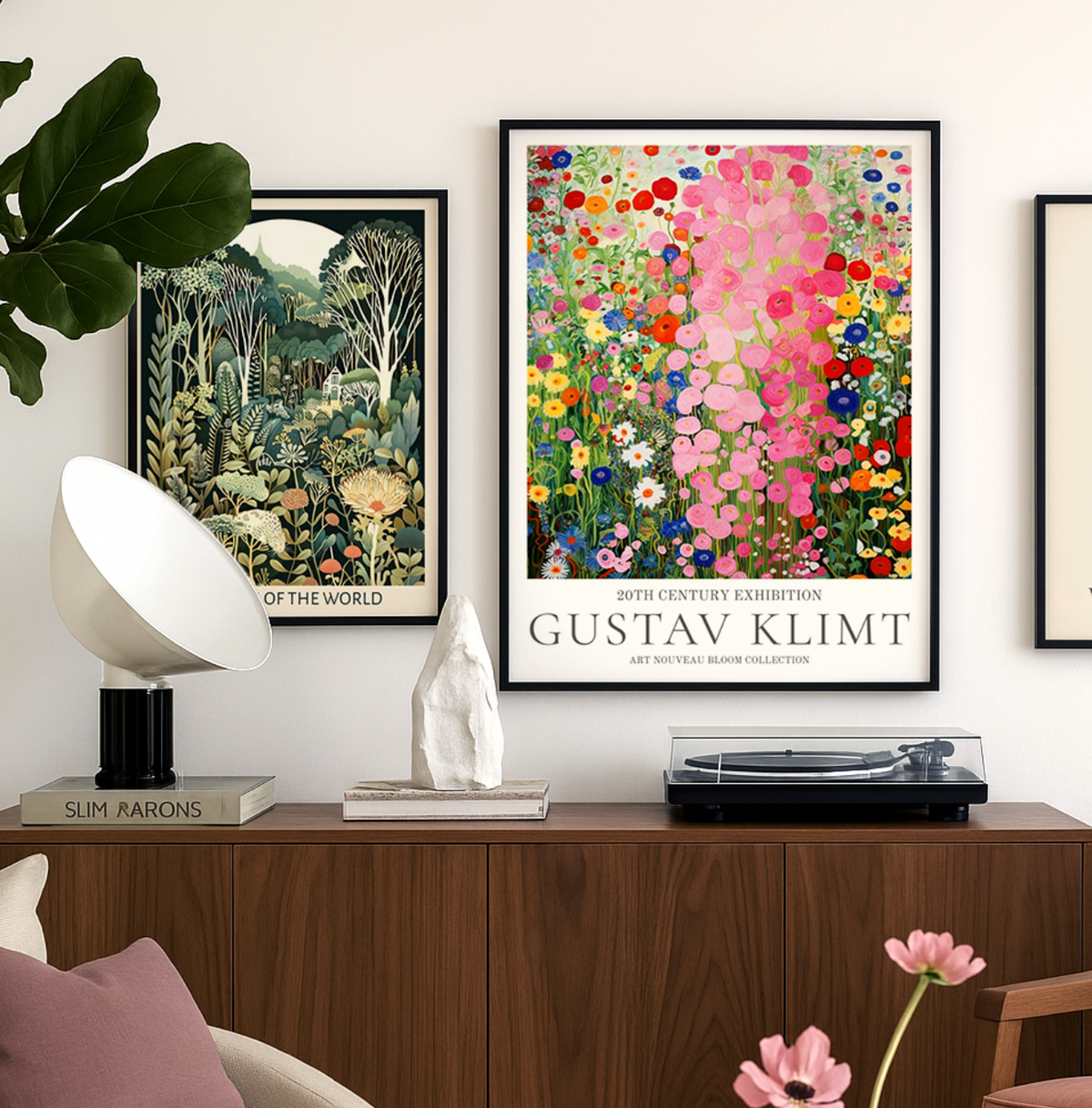
Porta l’eleganza dorata di Klimt nei tuoi interni con la selezione curata di Fab: guida a scelta, stile, formati e cura delle stampe perfette per la tua casa.
Rothko is best known for his large color field paintings, where soft-edged rectangles of saturated color float on a colored ground. Works such as No. 61 (Rust and Blue) and No. 14, 1960 are among the most widely recognized, along with his violet, orange, black and blue compositions. As reproductions, these luminous color blocks translate well to wall art because the impact comes from color relationships rather than fine detail.
What makes Rothko's work so special for wall art?
Rothko was a key figure in Abstract Expressionism and Color Field painting, and he wanted his canvases to provoke a genuine emotional response rather than describe a subject. That quality carries into reproductions: the stacked bands of color read as mood first, so a print sets the emotional temperature of a room. It's also why Rothko works in spaces where you want calm depth rather than busy imagery.
Do Rothko prints work better as a set of three or as one large piece?
Both approaches suit his compositions, and the choice usually comes down to wall shape. A single large print above a sofa or bed gives you one immersive block of color, closer to the scale Rothko himself favored. A set of three in related tones suits long walls, hallways or a bed's width, and works best when you keep the frames and spacing identical so the colors read as one sequence.
How do I choose which Rothko colorway suits my room?
Pick the colorway that matches the mood you want, then check it against your largest soft furnishings. Rust, orange and yellow compositions warm up north-facing or neutral rooms and flatter wood and terracotta. Blue, violet and black-over-blue pieces feel cooler and more contemplative, which suits bedrooms, studies and gray or white interiors. Choosing a print that echoes one shade already in the room keeps a bold color field feeling intentional.
Which Rothko print works best as a single statement piece above a sofa?
For a statement Mark Rothko framed print above a standard sofa, go big. Our 70x100cm size fills the wall properly and gives you that immersive, almost meditative presence Rothko's work demands. We'd pick one of his warm compositions (oranges, reds, yellows) for living rooms with neutral furniture, since those colour fields add warmth without clashing. The museum-grade giclée printing on thick matte paper is key here because Rothko's soft edges and layered tones need zero glare to look right. Your print arrives ready to hang with the frame already fitted, so you're not wrestling with loose parts on a Sunday afternoon.
Do Rothko reproduction prints actually capture the colour depth of the originals?
This is the number one concern people have, and it's valid. Rothko's originals are built from dozens of translucent paint layers, and no reproduction fully replicates that. But our giclée printing on matte paper gets closer than most people expect. The thick, uncoated paper absorbs ink in a way that gives real depth and softness rather than the flat, plasticky look you get from cheap posters. We consistently hear from customers that Rothko prints look even better in person than on screen, which says a lot about how well the colour transitions are rendered.
Should I get a Rothko art print framed or unframed?
For Rothko, we'd say framed every time. His compositions are all about contained fields of colour, and a clean frame gives them a finished, gallery-quality edge that an unframed print pinned or taped to a wall simply can't match. Our frames are solid FSC-certified wood with UV-protective acrylic glazing, so the colours won't fade even if your wall catches direct sunlight. The frame and print ship together, properly fitted in one box, so there's no risk of warping or bubbling. If you've been burned by poor framing before, this is the fix.
Can I pair Rothko prints with other art in a gallery wall, or do they need to stand alone?
Rothko prints are strong enough to anchor a gallery wall, but you need to be intentional. The trick is to let one larger Rothko piece (say 50x70cm) be the focal point and surround it with smaller, quieter works in complementary tones. Abstract line drawings or simple geometric prints work well. Avoid pairing with busy photography or heavily detailed illustrations, as it creates a visual tug-of-war that neither piece wins. Keep the frames consistent across the grouping for a cohesive, considered look.
Why does Rothko's art style work so well in modern interiors?
Rothko's colour field paintings are essentially pure blocks of mood. There's no subject to date them, no figurative detail to clash with your furniture, just colour and atmosphere. That's why Rothko wall art sits so naturally in minimalist, Scandi, and mid-century modern spaces. A deep maroon and black Rothko print can make a cool, grey-toned bedroom feel grounded, while his lighter compositions with soft pinks and tangerines can lift a dark hallway. His work does what most decorative art tries and fails to do: it changes how a room feels without demanding attention.
Scegliendo una selezione si ottiene un aggiornamento completo della pagina.

 Ordina oggi, consegna il









 Recensito
Poster geometrico a blocchi in toni pastello luminosi →
Recensito
Poster geometrico a blocchi in toni pastello luminosi →
 Recensito
Poster astratto rosa e corallo →
Recensito
Poster astratto rosa e corallo →
 Recensito
Poster astratto blu cobalto e rosso in equilibrio →
Recensito
Poster astratto blu cobalto e rosso in equilibrio →

 Quale Rothko sta meglio sulla tua parete


