


Poster margarita cocktail
Aanbiedingsprijs
Vanaf €19,95
€33,25

Poster bloemen in blauwe kan van Renoir
Aanbiedingsprijs
Vanaf €16,95
€23,95

Poster botanische bloei van Morris
Aanbiedingsprijs
Vanaf €19,95
€33,25

Poster glitterend gelukshoefijzer met hartjes
Aanbiedingsprijs
Vanaf €19,95
€33,25

Poster levendige sardines in pop-art stijl
Aanbiedingsprijs
Vanaf €19,95
€33,25

Poster minimalistische skiërs in de sneeuw
Aanbiedingsprijs
Vanaf €19,95
€33,25

Poster Jack Russell in aquarel, van achteren
Aanbiedingsprijs
Vanaf €16,95
€23,95

Poster krachtig tennismoment in koningsblauw
Aanbiedingsprijs
Vanaf €19,95
€33,25

Poster rustgevende tuin Shinjuku Gyoen, Tokio
Aanbiedingsprijs
Vanaf €19,95
€33,25

Poster martiniglas in blauw en perzik met speelse schaduw
Aanbiedingsprijs
Vanaf €19,95
€33,25

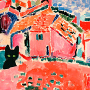
Poster kat bij het blauwe raam
Aanbiedingsprijs
Vanaf €19,95
€33,25

Poster modern wonen in Miami-stijl
Aanbiedingsprijs
Vanaf €19,95
€33,25

Poster Matisse uitzicht op de Rivièra
Aanbiedingsprijs
Vanaf €19,95
€33,25
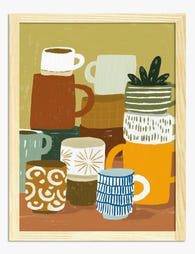
Poster gestapelde mokken in boho stijl
Aanbiedingsprijs
Vanaf €19,95
€33,25

Poster twee fietsers langs de rivier
Aanbiedingsprijs
Vanaf €19,95
€33,25

Poster narcissen van Columbia Road
Aanbiedingsprijs
Vanaf €19,95
€33,25

Poster bloemenpracht Columbia Road
Aanbiedingsprijs
Vanaf €19,95
€33,25
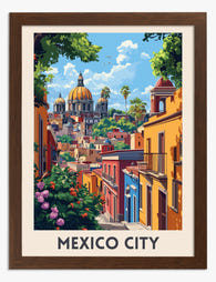
Poster Mexico-Stad, kleurrijk en energiek
Aanbiedingsprijs
Vanaf €19,95
€33,25

Poster coole zwarte kat met gestreepte sjaal en ronde zonnebril
Aanbiedingsprijs
Vanaf €19,95
€33,25
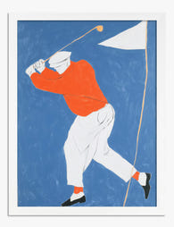
Poster golfer in swing, oranje op diepblauw
Aanbiedingsprijs
Vanaf €19,95
€33,25

Vanity Purr — Maine Coon Cover Art Print
Aanbiedingsprijs
Vanaf €16,95
€23,95

Vanity Purr Art Print
Aanbiedingsprijs
Vanaf €16,95
€23,95

Poster levendige parade van tropische vissen
Aanbiedingsprijs
Vanaf €19,95
€33,25

Poster blauw paard tussen reusachtige bloemen
Aanbiedingsprijs
Vanaf €19,95
€33,25
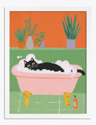
Poster zwarte kat in bad vol schuim
Aanbiedingsprijs
Vanaf €19,95
€33,25

Poster straatbeeld van Sevilla
Aanbiedingsprijs
Vanaf €19,95
€33,25

Poster Mexico-Stad: kleurrijke architectuur en historische pracht
Aanbiedingsprijs
Vanaf €19,95
€33,25
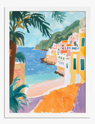
Poster Amalfikust in levendige kleuren
Aanbiedingsprijs
Vanaf €16,95
€23,95

Poster vintage bloemenboeket
Aanbiedingsprijs
Vanaf €19,95
€33,25

Poster speelse giraffenfamilie
Aanbiedingsprijs
Vanaf €19,95
€33,25

Poster serene woestijn in zachtroze en perzik
Aanbiedingsprijs
Vanaf €19,95
€33,25

Poster wandelaar in het gouden uur
Aanbiedingsprijs
Vanaf €19,95
€33,25
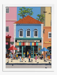
Poster zomerse straat met boekwinkel
Aanbiedingsprijs
Vanaf €19,95
€33,25

Poster lezende vrouwen in retro stijl
Aanbiedingsprijs
Vanaf €19,95
€33,25

Poster fietsers in berglandschap
Aanbiedingsprijs
Vanaf €19,95
€33,25

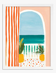
Poster zonovergoten strepen aan zee
Aanbiedingsprijs
Vanaf €19,95
€33,25

Poster vossenduo in warme aardetinten
Aanbiedingsprijs
Vanaf €19,95
€33,25

Poster schreeuwende kat geïnspireerd op Edvard Munch
Aanbiedingsprijs
Vanaf €19,95
€33,25
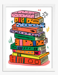
Poster kleurrijke boekenstapel
Aanbiedingsprijs
Vanaf €19,95
€33,25
Poster mediterraan zeezicht met strepen
Aanbiedingsprijs
Vanaf €19,95
€33,25

Bound and Determined Reading Robin Art Print
Aanbiedingsprijs
Vanaf €16,95
€23,95

Poster speelse dag in de dierentuin
Aanbiedingsprijs
Vanaf €19,95
€33,25
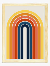
Poster retro regenboog met zonnestralen
Aanbiedingsprijs
Vanaf €19,95
€33,25

Poster kustdorp in Cornwall
Aanbiedingsprijs
Vanaf €19,95
€33,25

Poster boho planten op de trap
Aanbiedingsprijs
Vanaf €19,95
€33,25

Poster rustige oase in perzik en groen
Aanbiedingsprijs
Vanaf €19,95
€33,25
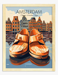
Poster Amsterdam skyline met klompen
Aanbiedingsprijs
Vanaf €19,95
€33,25

Poster boho planten op betegelde trap
Aanbiedingsprijs
Vanaf €19,95
€33,25
Meer Fab kunstcollecties
 Wij nemen kunst serieus – vraag maar raak


Van formaat tot inlijsting en printkwaliteit – de kunstexperts van Fab leggen het allemaal uit, zodat je het perfecte kunstwerk voor jouw ruimte vindt.
Meer hulp nodig? Neem hier contact op met ons team
Which colours work best with orange art prints?
Orange wall art looks its absolute best against soft neutrals like warm grey, cream, or off-white walls. If you want a more sophisticated pairing, try navy or deep teal accents in cushions or throws to create contrast without competing with the print. For a calmer, earthier feel, combine burnt orange prints with sage green or olive tones. We'd steer clear of pairing orange with bright reds or yellows unless you're deliberately going bold, because the whole thing can start to feel like a fast-food restaurant.
Should I choose burnt orange or bright orange prints for my living room?
For most living rooms, we'd go with burnt orange or terracotta art prints. They read as warm and grounded rather than loud, and they play nicely with the natural wood, linen, and stone tones that dominate modern interiors. Bright tangerine or pure orange prints work brilliantly as a single statement piece in a more minimal space, but they can overwhelm a room if you go too big or group too many together. A 50x70cm or 70x100cm framed burnt orange print above a sofa is a safe bet that still makes a real impact.
Are orange prints a good choice for a bedroom?
Orange gets a bad reputation in bedrooms because people picture something neon, but softer shades like terracotta, amber, and burnt orange are genuinely lovely in a sleep space. They bring warmth without the high energy of a true bright orange. We think a pair of smaller orange botanical prints (around 30x40cm each) flanking either side of a bed, or a single abstract in warm burnt tones above the headboard, strikes exactly the right note. Pair them with soft white bedding and you've got a room that feels cosy but not heavy.
How do I know the framing quality will match what I see online?
This is where a lot of people get burned with art prints, especially when the frame arrives warped, separate from the print, or just flimsy. Every one of our framed orange art prints ships ready to hang with the print already properly fitted inside a solid FSC-certified wood frame with UV-protective acrylic glazing. No assembly, no bubbling, no nasty surprises. Thousands of our customers say the prints look even better in person than on screen, which honestly is the review we're proudest of.
What does the colour orange represent in art and interior design?
Orange sits right between the energy of red and the optimism of yellow, so it's historically associated with warmth, creativity, and enthusiasm. In Dutch Golden Age painting, oranges symbolised wealth and abundance. In modern interiors, orange art prints bring a sense of vitality to a space without the intensity of pure red. It's a fantastic colour for rooms where you want to feel energised but not wired, think home offices, kitchens, living rooms, and hallways that need life injected into them.