Spirals, Gold, and Geometry: Klimt's Abstract Patterns Explained
The story behind the gold, the spirals, and the symbols that made Klimt's pattern work quietly radical.

Beyond The Kiss: Why Klimt's Pattern Works Deserve Their Own Spotlight
Everyone knows The Kiss. Far fewer people stop to look at what's actually happening inside it: the rectangles wrapping the man, the soft ovals on the woman, the gold leaf flattening everything onto one shimmering plane. Klimt's pure pattern works, the ones where figures almost dissolve into ornament, are arguably more radical than his portraits, and they're the ones most worth understanding if you're drawn to the gold.
This is a decoder guide for those works. The Tree of Life, the Stoclet Frieze, the dense geometric studies and the pattern-heavy landscapes. The pieces that feel strangely contemporary on a wall in 2025, even though they were made before the First World War.

The Golden Phase and How Byzantine Mosaics Shaped Klimt's Geometry
Klimt's Golden Phase, roughly 1899 to 1910, is the period most people picture when they think of his work. Gold leaf, dense ornament, figures pressed flat against decorative fields. The reason it looks the way it does has a specific origin: a trip to Ravenna in 1903.
Klimt visited the Basilica of San Vitale and saw the sixth-century Byzantine mosaics covering its walls. These weren't paintings pretending to be windows onto another world. They were surfaces. Gold tesserae caught the light, figures stood without shadows, and the whole interior glowed as one continuous decorated plane. For an artist already restless with academic naturalism, this was permission.
He went home and stopped pretending his paintings were windows. He started treating them as surfaces too. The gold backgrounds, the absence of depth, the figures floating in fields of ornament: all of it comes back to what he saw in Ravenna. His father had been a gold engraver, so the material wasn't foreign to him. But Byzantium gave him a reason to use it on canvas.
This is the bridge most product descriptions skip. The gold isn't decorative excess. It's a deliberate borrowing from a sacred visual tradition, repurposed for secular subjects like love, desire and the cycle of life.
Decoding Klimt's Pattern Language: Spirals, Triangles, and Eyes
Klimt's patterns aren't random. He built a personal vocabulary of shapes, and once you can read it, his work opens up considerably.
Spirals
Spirals show up everywhere in Klimt's pattern work, and they're the closest thing he has to a signature motif. They reference organic growth, life cycles, vines, snail shells, water currents. In the Stoclet Frieze, the Tree of Life is essentially a riot of spirals branching out from a central trunk. They suggest movement and continuity in a composition that otherwise has no perspective.
Triangles and Rectangles
The hard-edged geometric shapes, particularly rectangles and triangles, carry a masculine code in Klimt's vocabulary. Look at the man's robe in The Kiss: blocks of black and white rectangles, stable, vertical, architectural. Klimt used angular forms to suggest structure, intellect and what his contemporaries would have called the masculine principle.
Circles, Ovals and Soft Curves
Round and oval shapes do the opposite work. The woman's robe in The Kiss is covered in circles, ovals, swirls and floral forms. Klimt repeatedly coded the feminine through curved, organic, fertile shapes. This binary feels dated now, but it was central to how Symbolist artists thought about pattern around 1900.
Eyes
The all-seeing eye motif, lifted from Egyptian art, shows up across Klimt's pattern work. It signals consciousness, watchfulness, sometimes the divine. Egyptian influence was huge in late 19th-century Vienna, and Klimt absorbed it through both museum visits and Theosophical ideas circulating among his peers.
Checkerboards
Black and white checkerboards appear repeatedly, and they read as duality. Material and spiritual. Light and dark. Body and soul. It's a visual shorthand Klimt deploys whenever he wants to suggest two principles meeting on the same surface.
If you want to see the full pattern vocabulary in one place, his abstract pattern works are where it's most concentrated, stripped of the portraiture that distracts from the geometry.
The Symbolism Hidden in Klimt's Ornamental Designs
Klimt was a Symbolist before he was anything else. The Symbolist movement, which dominated European art in the 1890s, rejected literal storytelling in favour of mood, suggestion and inner experience. Patterns weren't decoration to Symbolists. They were carriers of meaning that couldn't be expressed through realism.
Theosophy, a spiritual movement popular among artists at the time, also fed into his thinking. Theosophists believed that geometric forms held universal spiritual significance, that ancient civilisations had encoded wisdom in their ornaments, and that art could access something deeper than surface appearance. Klimt's spirals, eyes and golden grounds aren't just pretty. They're an attempt to reach the same register as religious art without the religion.
There's also a strong erotic charge running through the symbolism. The fertile, womb-like ovals, the seed-shaped triangles, the entwined figures dissolving into pattern: Klimt was painting about desire and reproduction at a time when Vienna was simultaneously fascinated and uncomfortable with both. Freud was working a few streets away. The patterns let Klimt say things directly that polite society wouldn't have tolerated in figurative form.

How Klimt Bridged Fine Art and Decorative Craft
One of the most important things to understand about Klimt is that he didn't see a hierarchy between painting and the so-called decorative arts. This was unusual. The 19th-century academy treated fine art as a higher calling than craft. Klimt thought that was nonsense.
In 1903 he helped support the founding of the Wiener Werkstätte, a Viennese workshop that produced furniture, jewellery, textiles, ceramics and graphic design. The Werkstätte's whole philosophy was that everyday objects deserved the same artistic seriousness as easel paintings. Klimt collaborated with Werkstätte designers, particularly Josef Hoffmann, and absorbed their pattern-making sensibility back into his canvases.
The Stoclet Frieze is the clearest evidence of this exchange. Commissioned for the dining room of the Stoclet Palace in Brussels, designed by Hoffmann, it was executed in mosaic by Werkstätte craftspeople from Klimt's cartoons. It's simultaneously a painting, an architectural element and a piece of applied art. The figures of the embracing couple and the dancer are almost overwhelmed by the swirling Tree of Life and the abstract panels around them.
This blurring of fine art and craft is part of why his pattern works look right in domestic settings now. They were never meant to live in austere museum spaces. They were designed for rooms people actually used. That sensibility lives on in the broader Art Nouveau tradition Klimt helped define, where the line between picture and interior was deliberately soft.
Why These Abstract Works Feel More Modern Than His Portraits
Here's the contrarian point. Klimt's pure pattern works, the ones least talked about, are the most forward-looking pieces in his catalogue.
Three things make them feel modern. First, the rejection of pictorial depth. Renaissance painting taught Europe to see canvases as windows. Klimt's pattern works refuse this. Everything sits on the surface, like a textile or a wall. This flatness is what mid-century abstract painters spent decades arguing for, and Klimt was already doing it in 1905.
Second, surface as subject. In a pattern-dominated Klimt, the ornament isn't supporting the figure. It is the figure. Decoration becomes the content. This is essentially what abstract art would claim half a century later: that pure pattern, colour and shape can carry meaning without representing anything.
Third, Japonisme. Klimt collected Japanese prints, and their influence shows in his flattened perspective, asymmetric compositions and willingness to crop figures at strange points. Japanese prints showed European artists that decorative flatness wasn't a failure to achieve depth. It was a different and equally valid way of seeing.
Then there's the horror vacui, the fear of empty space. Klimt fills every square centimetre. Stars, dots, spirals, circles, eyes, gold. This maximalist density looks startlingly current, partly because contemporary design has swung back toward maximalism after decades of minimalism, and partly because dense pattern reads well on screens and in busy modern rooms.
When you put a Klimt pattern print next to a piece of mid-20th century abstract art, the family resemblance is obvious. Same flat plane, same emphasis on surface, same belief that pattern itself is enough.
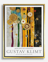
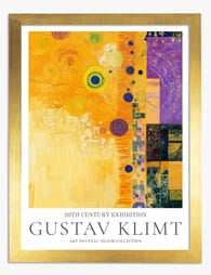
Choosing a Klimt Pattern Print: What to Look For
If you're browsing Klimt prints with the intention of actually living with one, a few distinctions matter.
Portraits vs. Pure Pattern Works
The portraits, including Adele Bloch-Bauer I, Judith and The Kiss, are figure-led. The pattern is rich, but a face anchors the composition. These work best in rooms where you want a focal point that draws the eye in.
The pure pattern works, the Tree of Life, the Stoclet Frieze details, the abstract landscapes and the ornamental panels, are surface-led. There's no face to lock onto. The eye wanders across the whole composition. These work brilliantly above sofas, beds and consoles where you want visual energy without a single dominant focal point.
Composition and Balance
Look at how the print is composed within its frame. A good Klimt reproduction preserves the asymmetry he learned from Japanese prints. If the composition has been cropped to centre everything, you've lost something essential. The Tree of Life, for example, should feel like it's spilling sideways, not sitting politely in the middle.
Detail and Print Quality
Klimt's work lives or dies on detail. Every spiral, every dot, every variation in gold tone matters. A muddy or low-resolution print flattens the work in the wrong way. Look for giclée printing on thick matte paper, which captures fine detail without the glare that ruins gold-heavy compositions under lamplight. Glossy finishes are particularly unforgiving with Klimt because they bounce light off every gold passage and turn the pattern into a glare patch.

Framed or Unframed
Framed works better for Klimt than for most artists, for two reasons. The frame echoes the architectural quality of his compositions, which often have internal borders and panels. And a UV-protective glaze is genuinely useful, because gold tones and warm yellows are among the first colours to fade under sunlight exposure. The trade-off is weight: a large framed Klimt is heavier than a canvas equivalent, so check your wall fixtures.
Canvas works if you want a softer, more textural read. The poly-cotton surface mutes the gold slightly, which some people prefer because it tones down the visual intensity. Canvas also handles humid rooms (kitchens, bathrooms near showers) better than framed paper.
Size
Klimt's pattern works reward size. The detail only fully reads at scale. For a Tree of Life or a Stoclet Frieze detail above a sofa, 70x100cm is the minimum. Smaller than that and the spirals start to look like noise rather than a legible pattern. For a feature wall, 100x150cm canvas is where these works really start to behave the way Klimt intended, which is closer to a mural than a picture.

A Final Thought
The reason Klimt's pattern works still hold attention more than a century later is that he was solving a problem artists are still solving now: how to make a flat surface feel alive without pretending it's a window. The gold, the spirals, the eyes, the checkerboards: all of it is a vocabulary for treating decoration as content, surface as meaning.
When you choose a Klimt pattern print, you're choosing a piece of that argument. Look closely at the work before you buy. Trace the spirals, find the eyes, notice where he's used rectangles and where he's used circles. The patterns reward slow looking, and that's the real test of art you want to live with. Browse the full Gustav Klimt collection when you have time to look properly, not in a rush.

Fab-producten in dit blog
-

Poster gouden omhelzing van Klimt
Translation missing: nl.products.product.sale_price Vanaf €16,95€23,95 -

Poster Expectation van Gustav Klimt
Translation missing: nl.products.product.sale_price Vanaf €16,95€23,95 -

Poster spiraalvormige boom van Gustav Klimt
Translation missing: nl.products.product.sale_price Vanaf €16,95€23,95 -

Canvas gouden tuinpad van Klimt
Translation missing: nl.products.product.sale_price Vanaf €64,95€92,95 -
Canvas gouden harmonie van Klimt
Translation missing: nl.products.product.sale_price Vanaf €64,95€92,95 -

Canvas spiraalvormige boom van Gustav Klimt
Translation missing: nl.products.product.sale_price Vanaf €64,95€92,95 -

Poster gouden omhelzing van Gustav Klimt
Translation missing: nl.products.product.sale_price Vanaf €16,95€23,95 -

Poster wildebloemen van Gustav Klimt
Translation missing: nl.products.product.sale_price Vanaf €16,95€23,95 -

Poster florale symfonie van Klimt
Translation missing: nl.products.product.sale_price Vanaf €16,95€23,95 -

Poster gouden bospad van Klimt
Translation missing: nl.products.product.sale_price Vanaf €16,95€23,95 -

Canvas abstracte symfonie van Gustav Klimt
Translation missing: nl.products.product.sale_price Vanaf €64,95€92,95 -

Canvas sereen pad van Gustav Klimt
Translation missing: nl.products.product.sale_price Vanaf €64,95€92,95 -

Canvas gouden omhelzing van Gustav Klimt
Translation missing: nl.products.product.sale_price Vanaf €64,95€92,95 -

Canvas levendige symfonie in goudtinten van Klimt
Translation missing: nl.products.product.sale_price Vanaf €64,95€92,95 -

Poster gouden harmonie van Klimt
Translation missing: nl.products.product.sale_price Vanaf €16,95€23,95 -

Poster zonnebloemen van Gustav Klimt
Translation missing: nl.products.product.sale_price Vanaf €16,95€23,95 -

Poster waterslangen II van Gustav Klimt
Translation missing: nl.products.product.sale_price Vanaf €16,95€23,95 -
Poster abstracte elegantie van Gustav Klimt
Translation missing: nl.products.product.sale_price Vanaf €16,95€23,95 -

Poster altaarstuk van Hilma af Klint
Translation missing: nl.products.product.sale_price Vanaf €16,95€23,95


Meer van The Frame

Kitchen Art: What Works, What Fades
Kitchens are the worst room in your home for art. Heat cycles, steam plumes, airborne grease, and direct overhead lighting will quietly destroy anything you hang without thinking. This guide...

The Bedroom Finishing Guide: Art, Scale, and Light
Most bedrooms get decorated, but very few get finished. The difference is not how much you put on the walls, it is whether the art, the scale of your furniture,...

One Statement Piece Is All Your Living Room Needs
Most blank walls stay blank because the brief feels enormous. You don't actually need a gallery, a grid, or a curated grouping you'll second-guess for six months. You need one...