
 Bestel vandaag, levering vóór
 Narcissen posters
Narcissen brengen sneller dan bijna alles dat zonnige geel in huis. Hier zie je ze los en schilderachtig, glashelder botanisch, verzameld in een kan op tafel of zwevend over een lentewei. Dat geel komt tot zijn recht in een schemerige hal of boven je aanrecht. Voor nog meer seizoensgevoel passen tulpenposters er heerlijk naast, terwijl posters met bloemstillevens juist rustiger en dieper aanvoelen.


Geen producten gevonden
Meer Fab kunstcollecties


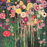

Geel, bloei en wandideeën van The Frame
Kleur, plaatsing en combinatietips voor bloemenposters from The Frame, Fab's blog.
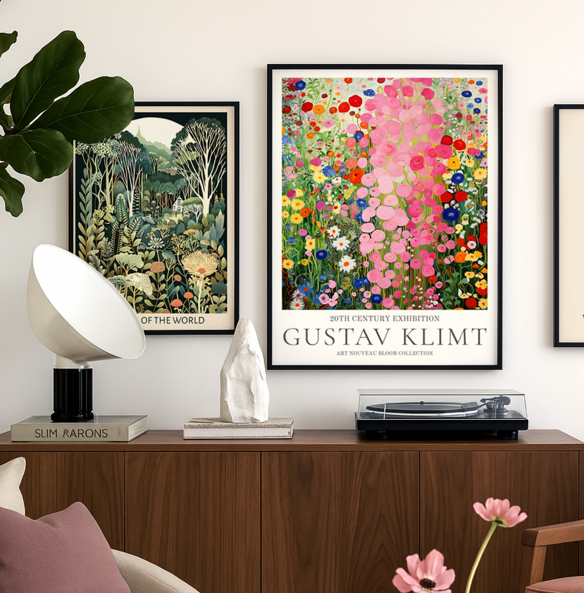
Ontdek Gustav Klimt-kunstdrukken bij Fab
Haal de magie van Klimt in huis met onze gids voor het kiezen, stylen en verzorgen van kunstdrukken.
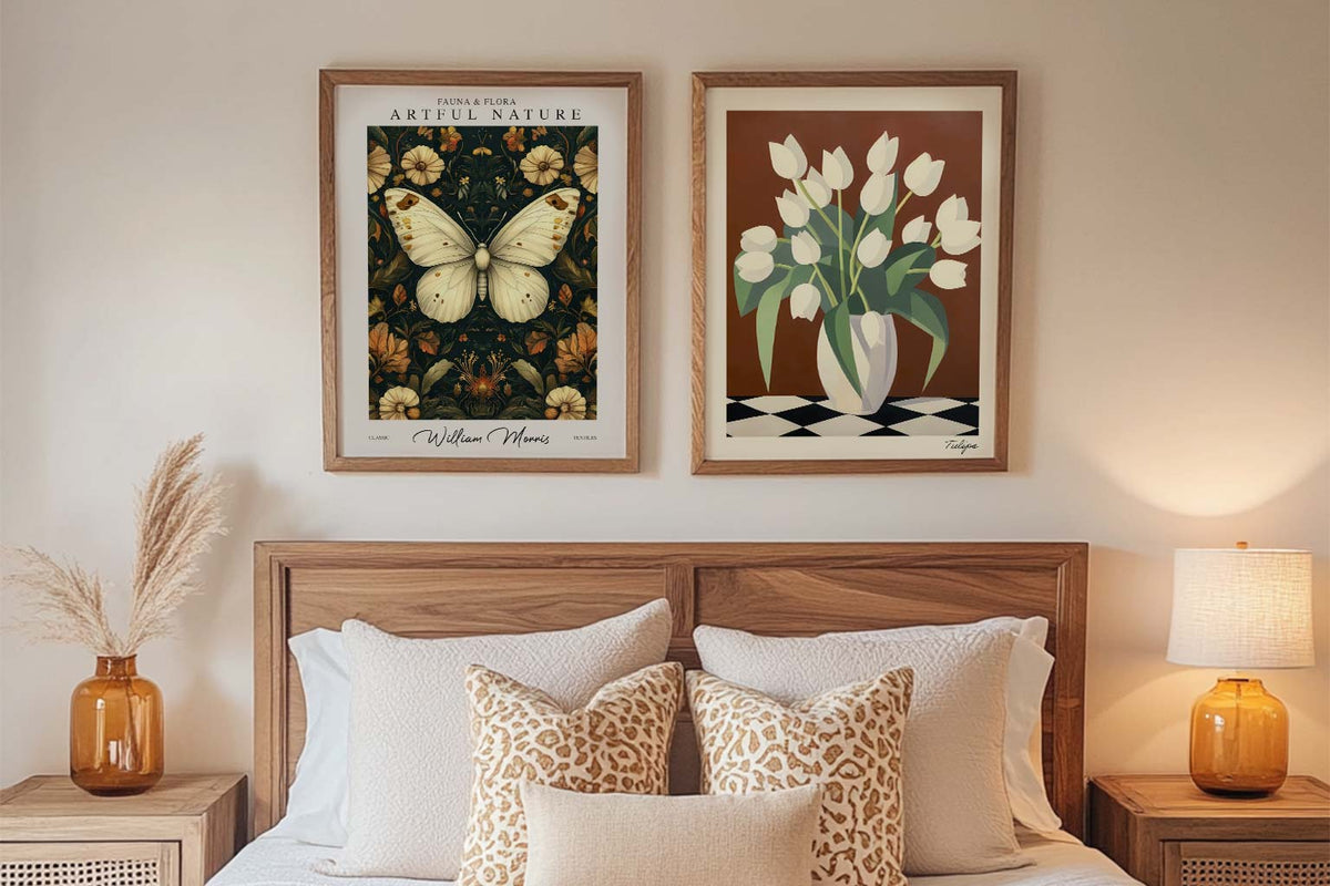
Je eerste kunstprints: een gids voor beginners
Begin zonder keuzestress: praktische tips om je eerste kunstprints te kiezen op kleur, plek en budget — zodat je huis meteen meer als thuis voelt.
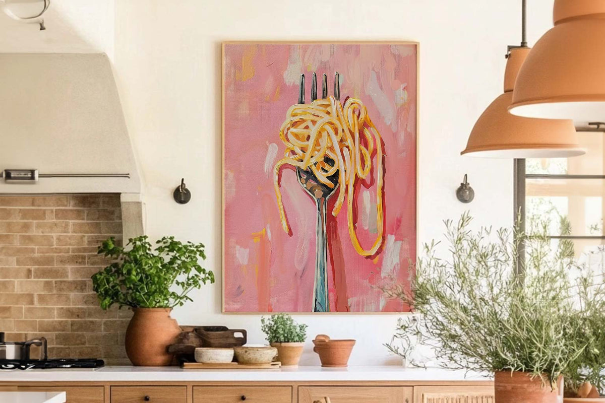
De beste wandkunst voor keukens en eetruimtes
Geef je keuken en eetruimte dezelfde aandacht als de rest van je huis. Inspiratie voor thema’s, kleur, plaatsing, formaat en praktische keuzes die warmte brengen zonder rommel.
 Een narcissenposter kiezen



Snel antwoord op inlijsten, kleur, waar deze posters het best tot hun recht komen en hoe kopen bij Fab werkt