Je bent nog £69.99 verwijderd van GRATIS verzending
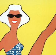
Mid-century modern posters
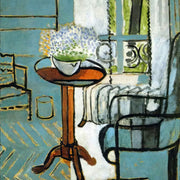
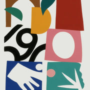
Geef je interieur een tijdloze, betaalbare update met onze Mid-century modern posters. Met strakke lijnen, organische vormen en warme tinten brengen ze direct karakter in huis, zonder dure verbouwing. De zorgvuldig samengestelde collectie maakt het eenvoudig om jouw eigen stijl te laten zien en elke ruimte een rustige, samenhangende look te geven. Kwaliteit en gemak staan voorop: elke poster wordt op bestelling gemaakt, ingelijst voor een verfijnde uitstraling en klaar om op te hangen. Hoogwaardige materialen zorgen voor een nette afwerking en een resultaat dat lang mooi blijft. Geschikt voor woonkamer, eethoek, hal of thuiskantoor. Blader door de collectie en kies de posters die jouw interieur compleet maken.
A blank wall can be intimidating. You know you want art, but where do you even start? You scroll through endless options online, walk through galleries feeling lost, or stare...
You know you want art on your walls, but you're stuck scrolling through endless options wondering what actually fits your taste. Maybe you love the clean simplicity you see in...
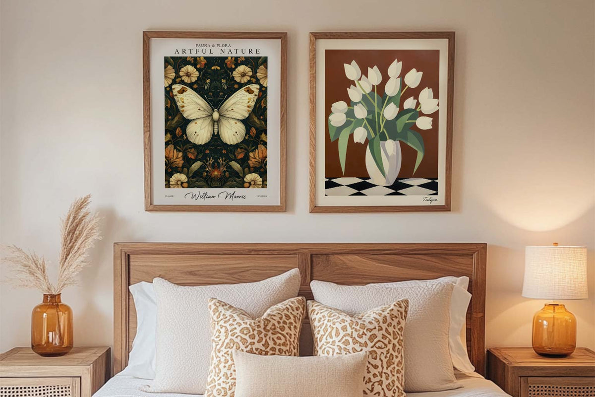
Discover the World of William Morris Art Prints Step into the world of William Morris — where every pattern tells a story, and every print is a celebration of beauty,...
Wij nemen kunst serieus – vraag maar raak
Van formaat tot inlijsting en printkwaliteit – de kunstexperts van Fab leggen het allemaal uit, zodat je het perfecte kunstwerk voor jouw ruimte vindt.
Which mid-century modern art prints work best for a living room?
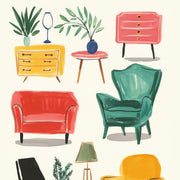
For the wall above a sofa, go with a single large framed print (70x100cm) featuring bold mid-century abstract shapes in warm tones like mustard, burnt orange, or teal. This anchors the room without needing a complicated gallery arrangement. If your sofa is a neutral colour, that's your green light to pick something graphic and punchy. Our framed mid-century modern art prints arrive ready to hang with solid wood frames and UV-protective glazing, so you can place them on a sunlit wall without worrying about fading.
Do these prints come framed and ready to hang?
Yes, every framed mid-century modern print ships as one piece, with the print already properly fitted into a solid FSC-certified wood frame with UV-protective acrylic glazing. No separate shipments, no DIY assembly, no bubbling or warping. You'll have it on the wall within minutes of opening the box. If you've been burned by flimsy frames from other purchases before, the difference here is night and day.
What colours define mid-century modern art, and how do I match them to my room?
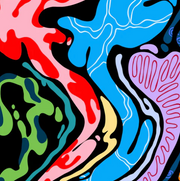
The classic mid-century modern colour palette centres on mustard yellow, olive green, burnt orange, teal, and warm cream set against rich walnut and charcoal tones. If your room already has a lot of warm wood furniture (teak sideboards, walnut shelving), lean into a print with teal or olive to create contrast rather than blending in. For a room that feels too cool or grey, a mid-century print heavy on orange and gold will warm the whole space up instantly.
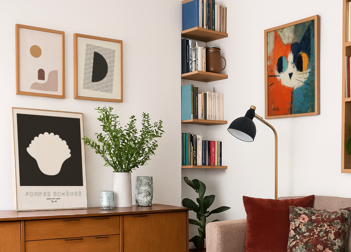
How do I arrange a set of mid-century modern prints as a gallery wall?
The two-thirds rule is your friend: your arrangement should span roughly two-thirds the width of the furniture below it. For a mid-century gallery set, we'd recommend three framed prints in the same frame finish, hung in a tight horizontal row with 5cm gaps between each frame. Stick to prints that share a colour thread (say, all featuring teal or warm terracotta) rather than matching them too literally. This looks intentional and cohesive, not like a random collection.
Is mid-century modern art still in style in 2026?
Absolutely, and it's actually gaining momentum. The broader shift away from cool greys toward warmer, earthier interiors plays perfectly into mid-century modern's strengths. Bold geometric patterns, organic shapes, and that signature warm palette feel completely current right now. Mid-century modern wall art has outlasted dozens of trends because it strikes a balance between retro character and clean graphic simplicity, making it one of the safest long-term investments you can put on a wall.
Een selectie kiezen resulteert in het geheel verversen van de pagina.


 Wij nemen kunst serieus – vraag maar raak