
 Beställ idag, leverans senast
 Modern konst för vardagsrum


Poster färgsprakande blomsterbukett

Poster vårmorgon på golfbanan

Poster regniga ögonblick vid stranden
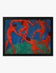
Poster dansen – Henri Matisse
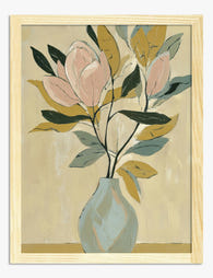
Poster magnoliabukett i mjuka toner

Poster abstrakta blomblad i färgstarka penseldrag

Poster flödande botanisk form

Poster lekfull dag i djurparken

Poster skogsmosaik i solsken
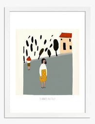
Poster italiensk sommarpromenad

Poster bergstoppens anda

Poster rödhårig kvinna av Modigliani

Poster minimalistiskt skidmotiv i svartvitt med skidlift

Poster sommar vid poolen

Poster randig stillhet i blått och vitt

Poster Monaco, franska rivieran

Poster nattbotanik av William Morris

Poster Margherita av Modigliani

Poster färgglad trädgårdsoas med blå stuga

Poster Love You Today – textposter i orange och rosa

Poster lugna vågor och sandstrand

Poster Sky Blue av Kandinsky

Poster strandpromenad i pastell
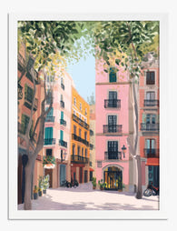
Poster Barcelona gatubild i pastell

Poster sphynxkatt i mjukt solljus

Poster ansiktsillustration i modern folkkonst

Poster ormbunksblad i solljus

Poster morgon på blommarknaden på Mallorca

Poster rosa stövlar med västernkänsla

Poster miró-inspirerad lekfull katt

Poster eftertänksam hund

Poster geometrisk hund i blockfärger

Poster tulpaner mot Amsterdams takåsar

Poster färgstarka kullar i Toscana

Poster cyklist i rörelse – blå ränder och gyllene cykel

Poster eftertänksam i ränder

Poster Loch Ness i solnedgång

Poster två svarta katter och kaffe

Poster Sorrentos solkyssta by
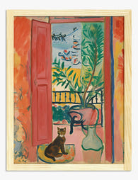
Poster öppet fönster med katt av Matisse

Poster randigt porträtt i marinblått och beige

Poster bubbel i sängen

Poster Bauhaus pooloas

Poster vilande hund i solsken

Poster cyklister på solbelyst bergsväg

Poster solnedgång vid Louvre-pyramiden, Paris

Poster samtal över ett glas vin

Poster Sorrentos klippor på Amalfikusten
Fler Fab konstkureringar






Hänger i över 100 000 hem
Vad folk säger om Modern konst för vardagsrum
Automatiskt skapadFärgstarka tryck och kvalitetsramar sticker ut, affischerna smälter lätt in i vardagsrummet och kommer klara att hängas upp.
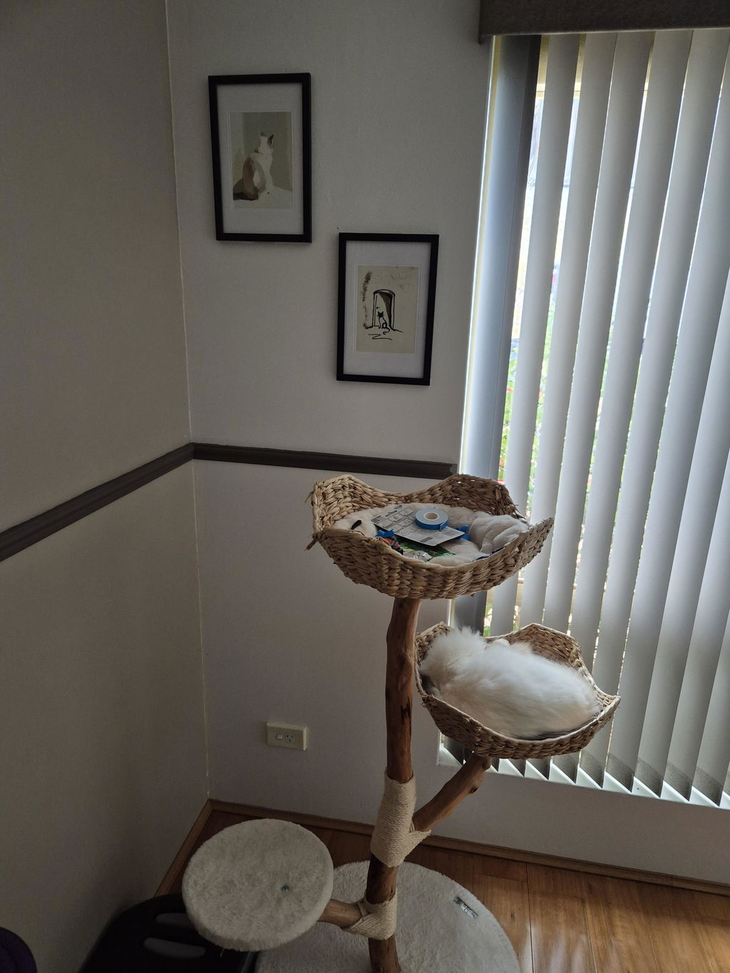
Älskar den här kattpostern
Älskar den här kattpostern. Rekommenderas till alla kattälskare.
 Recenserad
Poster katt i mjukt eftermiddagsljus →
Recenserad
Poster katt i mjukt eftermiddagsljus →
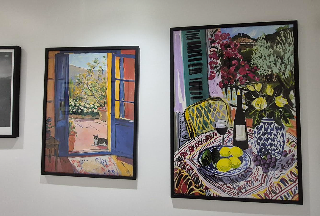
Passar perfekt bredvid den första
Den här printen ser underbar ut bredvid den första vi köpte.
 Recenserad
Poster Matisse blå dörr med katt →
Recenserad
Poster Matisse blå dörr med katt →
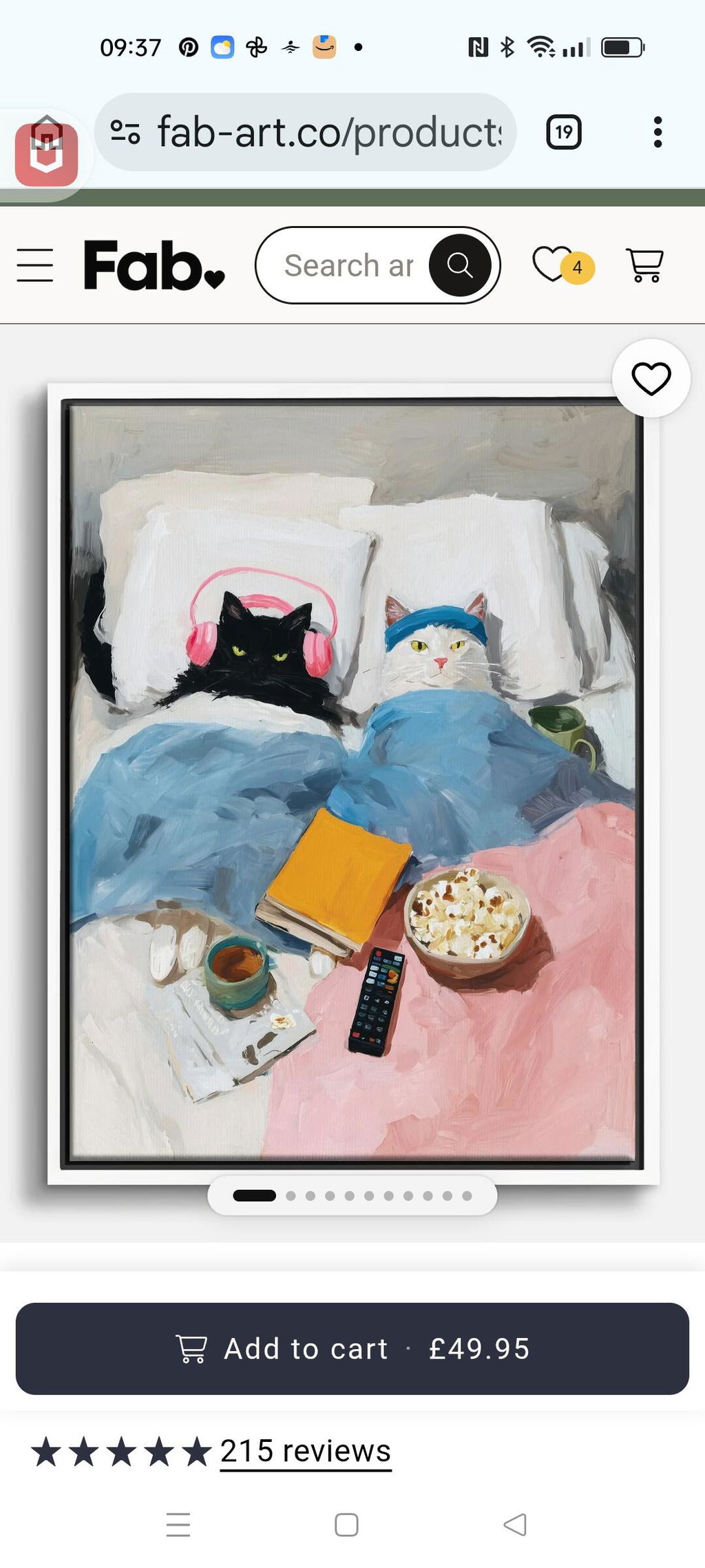
Mysig kattfilm‑kväll
Jag älskar den helt klart.😻 Konstnären har verkligen humor. Så mycket att jag redan lagt två beställningar till. ❤️🐾
 Recenserad
Poster mysig filmkväll med katter →
Recenserad
Poster mysig filmkväll med katter →




Artiklar om Modern konst för vardagsrum från The Frame
Guider, inredningsinspiration och designidéer för Modern konst för vardagsrum i ditt hem – från The Frame, Fabs blogg.

12 moderna väggdekoridéer för vardagsrummet du ...
De flesta artiklar om väggkonst stannar vid att säga ”välj något du gillar” – och lämnar dig där. Resultatet? Ett litet tryck som svävar sorgset ovanför en tresitssoffa. Här är...

Sluta matcha allt: så väljer du konst som hänge...
Att matcha konst rakt av är det snabbaste sättet att få ett vardagsrum att kännas som en hotellobby. Det du egentligen vill åt är sammanhang – en mycket intressantare utmaning....
 Vi tar konst på allvar – fråga på



Från storlek till inramning och tryckkvalitet – Fabs konstexperter förklarar allt så att du hittar rätt konst för ditt hem.