Bathroom Gallery Wall Ideas: 5 Layouts That Work in Tight Spaces
Five tested layouts with real measurements for the trickiest wall in your home.

Bathroom walls break the rules that work everywhere else in your home. They're narrower, interrupted by towel bars and light switches, and you're standing two feet away from them while you brush your teeth. This guide gives you five specific layouts with actual measurements, not vague inspiration.
Why a bathroom gallery wall needs different rules from a living room
In a living room, you hang art to be viewed from across the sofa, roughly two to three metres away. That distance forgives a lot. Slightly off-centre spacing, mixed frame finishes, eclectic sizing all read as "considered" from a distance.
A bathroom is different. You're often within arm's length of the wall. Every gap, every misaligned edge, every wonky frame is right in your face. Standard gallery wall advice ("aim for 5cm spacing, mix sizes, trust your eye") falls apart at close range.
There's also the geometry. Most bathroom walls are interrupted: a toilet tank in the middle, a towel ring 60cm from the corner, a light switch nobody thought through. You rarely get a clean rectangle to fill. The layout has to work around fixtures, not pretend they don't exist.
Then there's humidity. Steam rises and settles on whatever's nearest the shower. We'll get to specifics, but as a rule, anything within 1.2 metres of a shower head needs proper protection. Our framed prints use UV-protective acrylic glaze rather than glass, which won't shatter if knocked, and the FSC-certified wood frames are sealed properly so they don't warp in the way cheaper veneered frames do.

Layout 1: The vertical column (ideal for narrow walls)
The vertical column is the workhorse of bathroom wall art ideas. It's three prints stacked vertically, perfect for the narrow strips of wall you find beside a shower, between a basin and a door, or in a slim alcove.
When to use it
Use this layout when your usable wall is between 30cm and 50cm wide and at least 130cm tall. Anywhere a horizontal arrangement would feel squashed.
The measurements
Three identical prints at 30x40cm, framed. Total framed dimension is roughly 34x44cm each.
- Spacing between frames: 5cm
- Total stack height: around 142cm
- Centre point of the middle print: 145cm to 150cm from the floor
- Minimum wall width: 44cm (frame width plus 5cm clearance either side)
If your wall is taller and you want more presence, scale up to three 40x50cm prints with 6cm gaps. If you're tighter on space, three 21x30cm prints with 4cm gaps still reads beautifully.
The visual logic
Vertical columns draw the eye upward, which makes a small bathroom feel taller. The repetition of identical frame sizes does the cohesion work for you. You don't need to be clever with arrangement. You just need three prints that share a colour palette or theme.
Layout 2: The diptych or triptych (clean and contemporary)
A diptych (two prints) or triptych (three prints) hung horizontally is the most polished layout for above a toilet, above a basin, or on the main sightline as you walk in. It's quietly symmetrical, which suits bathrooms because they're already full of symmetrical elements (taps, mirrors, twin basins).
Above the toilet
This is the classic bathroom dilemma. The space is awkward: usually 60cm to 75cm wide, with the cistern eating into the bottom of the zone.
For a diptych, use two 30x40cm framed prints in portrait orientation, hung with 5cm between them. The bottom edge of the frames should sit 25cm to 30cm above the cistern lid. Don't go lower. You want breathing room, not a frame resting on porcelain.
For a triptych above a wider toilet area or vanity, three 21x30cm prints in landscape orientation work beautifully. Same 5cm spacing, same 25cm clearance from any fixture below.
Above the basin
Hang the centre of your diptych at eye level, which in a bathroom means around 155cm to 160cm from the floor (slightly higher than living room standard because you're often standing). Leave at least 20cm between the top of the tap and the bottom of the frames.
Why it works
A diptych or triptych reads as one piece, not several. That's the trick. It fills the wall confidently without the visual noise of a true gallery cluster. For matching pairs and trios, our wall art sets are designed to work together by colour and composition, which removes the guesswork.

Layout 3: The asymmetric cluster (for larger bathrooms only)
The asymmetric cluster is the layout most people picture when they hear "gallery wall." Five to seven prints in mixed sizes, arranged to feel collected rather than planned. It's also the layout most likely to fail in a bathroom.
When to use it
Only attempt this if you have an unbroken wall of at least 120cm wide and 140cm tall. A larger family bathroom, a powder room with a generous feature wall, or above a freestanding bath with no taps in the cluster zone.
The template
Build around an anchor print. We recommend a 50x70cm framed print, positioned slightly off-centre toward the upper left of your wall area. Then arrange smaller prints around it:
- One 30x40cm to the right of the anchor, top-aligned
- One 21x30cm below the anchor, left-aligned
- One 30x40cm to the lower right
- One 21x30cm filling the gap on the right side
Keep all spacing between frames at exactly 5cm. The asymmetry is in the sizing, not the gaps. Inconsistent gaps are what makes amateur clusters look chaotic.
The 60cm rule
Lay everything out on the floor first. Step back and check that the entire cluster fits within an imaginary rectangle. If your prints are spilling outside that rectangle in awkward ways, tighten it up. The cluster should feel contained, not scattered.
Choosing a frame finish that ties everything together
Frame finish is where most bathroom gallery walls quietly go wrong. The fix is to match your frames to your existing metal fixtures, not to the wall colour.
The matching rules we use
- Chrome or polished nickel taps: black frames or natural light oak. Chrome is cool-toned, so warm wood balances it. Avoid brass-toned frames here.
- Brass or aged gold taps: warm walnut frames or black. Both pick up the warmth without competing.
- Matte black taps: black frames are the obvious choice, but white frames also work brilliantly for contrast in a darker bathroom.
- Mixed metals: choose black. Black is the neutral that lets mixed fixtures coexist.
Stick to one finish across the whole gallery
Three frame finishes in one cluster reads as indecision. One finish, repeated, reads as design. If you want variety, get it from the prints themselves, not the frames.
Our framed prints use solid FSC-certified wood, not MDF or veneer, which matters in a humid room. Cheaper frames swell and split at the corners after a few months of steam exposure. Solid wood, properly sealed, doesn't.
Colour palette cohesion: the trick that makes any gallery wall look curated
"Aim for cohesion" is useless advice. Here's the actual method.
Pull two colours from your tile or floor
Look at your bathroom and identify the two strongest existing colours. In most bathrooms, that's the tile colour plus a metal finish. Maybe terracotta floor tile and brass taps. Maybe sage green tile and chrome. Maybe a neutral palette of warm white and oak.
These two colours are your anchor.
Apply the 60/40 rule across your prints
Sixty percent of your gallery wall should reference your dominant colour. Forty percent should reference your secondary colour. So if your bathroom is sage green and brass, choose prints where roughly two-thirds lean green or earthy and one-third lean warm gold or ochre.
You don't need exact colour matches. You need colour family agreement.
When in doubt, go monochrome
Black and white art prints are the easiest cohesion shortcut. They work with any bathroom palette because they don't compete with it. A column of three black and white photographs or a triptych of black and white abstract prints will look intentional in almost any space, which is why so many of the most polished bathroom gallery walls we see are monochrome.

How to measure and mark before you drill (bathroom walls are less forgiving)
Bathroom walls are often tile, plasterboard with awkward stud spacing, or solid masonry behind plaster. You don't get to redo holes the way you might in a bedroom.
Map your fixtures first
Before you commit to a layout, measure and write down:
- Distance from the floor to the top of any fixture below your art zone (toilet cistern, basin, towel rail)
- Distance from the ceiling down to your zone
- Distance from any side wall, window, or door frame
- Location of light switches and sockets
You need a minimum 25cm of clearance above any fixture below the art, and at least 15cm from any vertical edge (door frame, corner, window).
The paper template method
Cut sheets of newspaper or kraft paper to the exact framed dimensions of each print. Tape them to the wall with low-tack masking tape. Live with it for 24 hours. Move things until the layout looks right at the angles you actually use the bathroom from (sitting on the toilet, standing at the basin, walking in).
Then, with the paper still up, mark the hanging point on each sheet, drill or hammer through the paper, and remove. Your holes will be exactly where they need to be.
Avoid the steam zone
Don't hang art within 1.2 metres of a shower head or directly above a bath without a screen. The protective acrylic glaze on our framed prints and the sealed wood frames handle ambient bathroom humidity perfectly well, but no framed art is built for direct, repeated water contact.
For shower-adjacent walls, canvas prints are the better choice. Our canvas is hand-stretched poly-cotton over solid FSC wood, with no glass to fog and no paper edges to absorb moisture. It also weighs less, which matters if you're hanging on plasterboard with limited stud access.
Renter-friendly options
If you can't drill, heavy-duty adhesive strips rated for 2kg can hold a 30x40cm framed print, but check the manufacturer's humidity rating. Most strips lose their grip in steamy conditions. A safer bet: leaning a larger framed print on a deep shelf above the toilet or basin, with smaller prints clustered alongside.
Our top bathroom art print pairings for gallery walls
A few combinations we keep coming back to, with sizing.
The botanical column. Three 30x40cm prints of pressed leaves, ferns, or single-stem florals in matching black frames. Calm, classic, works in almost any bathroom palette.
The architectural diptych. Two 40x50cm black and white photographs of architectural details (arches, doorways, staircases) in oak frames. Brilliant above a double basin.
The abstract triptych. Three 21x30cm muted abstract prints in landscape, sharing a colour palette of two or three tones. Above a toilet, this is hard to beat. Browse our abstract art prints for sets that already coordinate.
The mixed cluster. One 50x70cm anchor print (a moody landscape or large-scale botanical), surrounded by four 21x30cm prints that pull colours from the anchor. For larger bathrooms only.
The line drawing pair. Two 30x40cm minimalist line drawings, framed in white or natural oak, hung as a diptych. Quiet, modern, suits compact powder rooms.

A final thought
The biggest mistake in bathroom gallery walls isn't choosing the wrong art. It's underestimating how much the proximity of the viewer changes everything. Measure your wall, map your fixtures, pick a layout that fits your geometry, and stick to one frame finish. Do that, and the art does the rest.

In diesem Blog vorgestellte Fab-Produkte
-

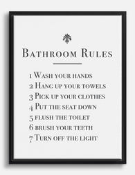
Poster Klassischer Leitfaden für Badezimmerregeln
Translation missing: de.products.product.sale_price Ab €16,95€23,95 -
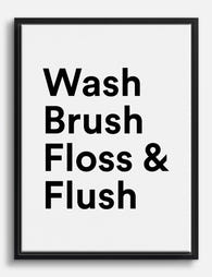
Leinwandbild Stilvolle Badregeln in Schwarz-Weiß
Translation missing: de.products.product.sale_price Ab €64,95€92,95 -

Poster Tägliche Badezimmer-Rituale – Line Art
Translation missing: de.products.product.sale_price Ab €16,95€23,95 -

Poster Badezimmer-Spruch in Schwarz-Weiß – Typografie
Translation missing: de.products.product.sale_price Ab €16,95€23,95 -

Poster 'Best Seat' – Schwarz-Weiß Spruch fürs Badezimmer
Translation missing: de.products.product.sale_price Ab €16,95€23,95 -

Leinwandbild Tägliche Baderituale – Schwarz-Weiß Line Art
Translation missing: de.products.product.sale_price Ab €64,95€92,95 -

Poster Frecher Gruß fürs Bad - Schwarz auf Weiß
Translation missing: de.products.product.sale_price Ab €16,95€23,95 -

Poster Pop-Art-Blumen fürs Badezimmer
Translation missing: de.products.product.sale_price Ab €16,95€23,95 -

Leinwandbild verspielte Typografie fürs Bad in Pastell
Translation missing: de.products.product.sale_price Ab €64,95€92,95 -

Leinwandbild Lesende Katze auf der Toilette
Translation missing: de.products.product.sale_price Ab €64,95€92,95 -

Leinwandbild Frecher Badezimmer-Spruch in Schwarz-Weiß
Translation missing: de.products.product.sale_price Ab €64,95€92,95 -

Leinwandbild Otter mit Toilettenpapier – Humor fürs Bad, schwarzweiß
Translation missing: de.products.product.sale_price Ab €64,95€92,95 -

Leinwandbild Neugierige schwarze Katze im Badezimmer
Translation missing: de.products.product.sale_price Ab €64,95€92,95 -

Leinwandbild Neugierige schwarze Katze im Badezimmer
Translation missing: de.products.product.sale_price Ab €64,95€92,95 -
Leinwandbild Badezimmer-Spruch 'Fresh Start' – Schwarz-Weiß
Translation missing: de.products.product.sale_price Ab €64,95€92,95 -

Leinwandbild gemütliche Katzenpause im Badezimmer
Translation missing: de.products.product.sale_price Ab €64,95€92,95 -

Poster Schwarze Katze im Badezimmer
Translation missing: de.products.product.sale_price Ab €16,95€23,95 -

Poster Katze liest Zeitung auf der Toilette
Translation missing: de.products.product.sale_price Ab €16,95€23,95


Mehr aus The Frame

Every Flower in William Morris's World: A Guide...
William Morris designed roughly 50 wallpapers and around 30 chintzes across his career, and almost every single one features a plant. If you've ever stood in front of a Morris...

What Colours Go With Bouquet Prints? Pairings I...
You've found a bouquet print you love. Now you need to know if it will actually work above your sofa, opposite that mustard armchair, next to the curtains you spent...

Boho Sun Wall Art: How to Nail the Look Without...
Boho sun art has a reputation problem. Done badly, it screams student halls and macramé overload. Done well, it's one of the warmest, most grounding aesthetics you can put on...