The Best Rooms for Whimsical Botanical Prints (and How to Hang Them)
A room-by-room placement guide for the playful plant art everyone's afraid to commit to.

Whimsical botanical prints get treated like a personality trait rather than a design choice. You either go all in on smiling mushrooms and dancing ferns, or you avoid them entirely. The truth is they belong in more rooms than you think, and most of those rooms are the ones you've been ignoring.
Why whimsical botanical prints belong in the rooms you least expect
Traditional botanical illustrations, the Victorian fern studies and pressed-flower diagrams, suit formal rooms. They look at home in a dining room with panelled walls. Whimsical plant art does the opposite job. It works hardest in the small, functional, slightly unloved corners of your home: the downstairs loo, the boot room, the bit of hallway between the kitchen and the back door.
That's because playfulness needs contrast. A grinning monstera leaf in a serious living room can feel like it's trying too hard. The same print above a kettle, or beside a bathroom mirror, lands perfectly. It catches you off guard in a space where you weren't expecting art at all.
The other reason these prints belong in utility spaces: you spend more time in them than you admit. You stand at the kitchen counter for twenty minutes a day. You wash your hands eight times. You walk past the hallway mirror constantly. Decorating with playful plant art in those spots gives you small, repeated hits of joy, which is more than most living room art ever delivers.

Kitchens: the easiest wall upgrade you'll ever make
Kitchens are usually decorated like showrooms. Clean surfaces, matching appliances, no clutter. The result is often cold, even when the cooking is warm. A whimsical botanical print is the fastest way to put a face on a kitchen.
The wall above the kettle, toaster or coffee machine is prime real estate. So is the gap between upper cabinets and the worktop, if you have one. Avoid hanging anything directly above a hob or sink, where steam and splashes are constant.
Sizing and placement for kitchens
For a single print above a counter, aim for 40x50cm or 50x70cm. Smaller and it disappears against the cabinetry. The bottom edge of the frame should sit roughly 25-30cm above the worktop, low enough to feel connected to the space, high enough not to compete with the toaster.
If you have a longer stretch of wall, a triptych of three 30x40cm prints in matching frames creates rhythm without overwhelming. Space them 5-8cm apart for a tight, gallery feel. Spread them wider, say 15cm, if you want a more relaxed look.
Canvas prints actually shine in kitchens. They don't have glazing, so steam and humidity are less of a concern, and the matte finish means no reflections from spotlights. Our kitchen wall art collection has more on this if you want to see what works.
Colour choices that suit kitchen light
Most kitchens are lit by a mix of spotlights and one big window. That tends to flatten colour. Choose prints with strong, saturated greens, deep terracottas or bright corals to push back against the lighting. Pastels can wash out under LEDs unless your kitchen has serious natural light.
Bathrooms: adding personality to the most overlooked room
The bathroom is where most people give up on decorating. Tiles, a mirror, possibly a plant in a basket, and that's it. But bathrooms are where you start and end your day, and they're the only room a guest will definitely visit. They deserve more.
Whimsical plant decor ideas suit bathrooms better than almost any other style. The room is already humid, soft and tactile. Playful art adds warmth without adding clutter, and it gives guests something to look at instead of inspecting your shampoo collection.
What to hang and where
The wall opposite the toilet is the single best spot in any bathroom. People stare at it longer than they'd like to admit. A 30x40cm or 40x50cm framed print works well here, hung so the centre sits at roughly 145-150cm from the floor (the gallery standard).
Above the towel rail or beside the mirror works too, but keep prints away from direct shower spray. Even a print with UV-protective acrylic glazing prefers a dry life.
Our framed prints use UV-protective acrylic instead of glass, which matters in a bathroom for two reasons: it won't shatter if knocked, and it resists the moisture that warps cheaper frames. If you want a wider browse, the full bathroom wall art range covers more options.
Powder rooms deserve more
If you have a small downstairs loo, this is where you go full whimsy. Dark walls, a single 30x40cm print of an absurdly cheerful plant, decent lighting overhead. Tiny rooms reward bold decisions. A timid print in a small space looks apologetic.

Home offices: playful art that actually helps you focus
The advice you usually hear about office art is "keep it calm" or "avoid distractions." That's wrong, or at least incomplete. What you actually want is art that gives your eyes somewhere to rest between tasks, without pulling you into a different mental state entirely.
Whimsical botanical prints are good at this. They're warm enough to feel human, but botanical subjects don't have the narrative pull of figurative art or landscapes. You look up, register a friendly fern, and go back to your spreadsheet.
Placement above the desk
The wall directly in front of your desk is where most people hang art, and it's the wrong spot. Anything there competes with your monitor for attention. Hang your print on the wall to the side of your desk instead, so you catch it when you turn your head or lean back.
A single 50x70cm print works well for most home offices. Bigger if you have a long wall, smaller if your desk sits in an alcove. Centre the print at standing eye height, around 155cm to the middle of the frame, because you'll see it from both seated and standing positions throughout the day.
Gallery walls in offices
If you want a gallery wall behind your desk (the bit your video call colleagues see), keep it tight: four to six prints in matching frames, all from the same colour family. Mixed styles look chaotic on camera. Stick to one palette, maybe soft sage and cream, or rusts and ochres, and the whole wall reads as intentional even on a grainy webcam.
The whimsical plants art prints collection is a good starting point if you want pieces that work together without matching exactly.
Living rooms: going big with a statement whimsical print
This is where most people get whimsical art wrong. They buy a small, cute print, hang it above a three-seater sofa, and wonder why the room feels off. The print is too small, too apologetic, and too playful for the formality of the space.
If you're putting whimsical botanicals in a living room, commit. Go big or don't bother.
Sizing above a sofa
The rule most interior designers use: art above a sofa should be roughly two-thirds the width of the sofa. For a standard 200cm sofa, that's a print around 130cm wide. A 100x150cm canvas does this job beautifully, and the mirrored edge wrapping means the image isn't cropped at the sides.
Hang the bottom of the frame 15-25cm above the back of the sofa. Any higher and the art floats off into space, disconnected from the furniture below.
Single statement or gallery wall
For whimsical work specifically, we think a single statement print works better than a gallery wall in a living room. Gallery walls work best with mixed media, varied frames and a curated, lived-in feel. A row of whimsical botanical prints can tip into "themed restaurant" territory quickly.
If you do want multiple pieces, go for two: a large 70x100cm framed print and a smaller 40x50cm print hung beside or below, in the same frame finish. Two feels intentional. Six feels like a stockroom.

Framing for whimsical prints in living rooms
This is where framing choices matter most. A thin black frame keeps a whimsical print feeling contemporary. A wide white mat with a natural oak frame gives the print more space to breathe and reads as gallery-style. Avoid ornate or gilt frames, which fight the playful aesthetic instead of supporting it.
Our framed prints arrive ready to hang with all fixtures attached, which sounds like a small thing until you've spent a weekend trying to bolt a frame back together because the print arrived flat-packed and the corners don't quite line up.
Hallways and landings: first impressions that make people smile
Hallways are the most underused walls in any home. They're long, often well-lit, and they're the first thing anyone sees when they walk in. Most people hang nothing there, or a single small mirror, and call it done.
A hallway is the perfect place to commit to playful plant art. The room exists to move through, so you don't need anything cerebral or moody. You need something that says hello.
Long hallway approach
For a hallway over 3m long, a series of three or four prints in identical frames, hung in a single horizontal line, works beautifully. Use 30x40cm or 40x50cm prints, spaced 10-15cm apart. Centre the line at 150cm from the floor.
For shorter hallways, a single bold piece at the end of the corridor draws the eye through the space and makes the hallway feel longer. A 50x70cm framed print does this well.
Landings and stair walls
Landings are tricky because the natural light is usually poor and the wall is short. A single medium print, around 40x50cm, hung on the wall opposite the top of the stairs, gives you something to look up at as you climb. Keep colours warm: terracotta, mustard, deep green. Cool palettes can look dingy in low light.
The wider botanical art prints collection has options across both whimsical and more classical styles if you want to mix things up across different parts of your home.
Sizing cheat sheet: which print size for which room
Quick reference, because nobody wants to scroll back through 1,800 words to find a measurement.
Small spaces (powder rooms, narrow hallways, above small consoles)
- Single print: 30x40cm framed
- Hang centre at 145-150cm from floor
Medium walls (above desks, kitchen counters, beside mirrors)
- Single print: 40x50cm or 50x70cm framed
- Bottom edge 25-30cm above any furniture or counter
Large walls (above sofas, dining sideboards, beds)
- Single statement: 70x100cm framed or 100x150cm canvas
- Bottom edge 15-25cm above furniture
Gallery groupings
- Tight cluster: 5-8cm spacing between frames
- Relaxed grid: 10-15cm spacing
- Always plan the layout on the floor first, photograph it, then transfer to the wall
Universal placement rule
- Centre of artwork at 145-150cm from the floor for standalone pieces
- Reference the bottom edge to nearby furniture (not the centre) when hanging above sofas, beds or counters
A final practical note: whatever room you're hanging in, use proper picture hooks rated for the weight of the frame, not adhesive strips alone for anything over 40x50cm. Adhesive hooks are fine for renters experimenting with smaller prints, but a 70x100cm framed piece needs a screw and a wall plug. The frame and the print are made to last centuries. The hook should at least make it to next year.


In diesem Blog vorgestellte Fab-Produkte
-

Poster botanische Verspieltheit in Pastelltönen
Translation missing: de.products.product.sale_price Ab €16,95€23,95 -

Leinwandbild verspielte Botanik
Translation missing: de.products.product.sale_price Ab €64,95€92,95 -

Poster Botanische Pflanzen auf dem Regal vor gelbem Hintergrund
Translation missing: de.products.product.sale_price Ab €16,95€23,95 -

Poster Botanische Verspieltheit in Grün
Translation missing: de.products.product.sale_price Ab €16,95€23,95 -

Poster Boho-Vasen mit Zimmerpflanzen
Translation missing: de.products.product.sale_price Ab €16,95€23,95 -

Poster Zimmerpflanzen in Boho-Vasen
Translation missing: de.products.product.sale_price Ab €16,95€23,95 -

Leinwandbild Botanische Boho-Vasen
Translation missing: de.products.product.sale_price Ab €64,95€92,95 -

Poster Verspielte botanische Blätter in Blau und Grün
Translation missing: de.products.product.sale_price Ab €16,95€23,95 -

Poster Botanische Treppe
Translation missing: de.products.product.sale_price Ab €16,95€23,95 -

Leinwandbild Fließende botanische Linien in Pink
Translation missing: de.products.product.sale_price Ab €64,95€92,95 -

Leinwandbild Farbenfrohe Zimmerpflanzen
Translation missing: de.products.product.sale_price Ab €64,95€92,95 -

Leinwandbild Treppen-Oase mit Zimmerpflanzen
Translation missing: de.products.product.sale_price Ab €64,95€92,95 -

Poster Botanische Boho-Harmonie
Translation missing: de.products.product.sale_price Ab €16,95€23,95 -

Poster Zimmerpflanzen auf Sonnengelb
Translation missing: de.products.product.sale_price Ab €16,95€23,95 -

Leinwandbild Harmonie der Botanik in Grün & Rosa
Translation missing: de.products.product.sale_price Ab €64,95€92,95 -

Poster moderne botanische Blüte in Tiefgrün
Translation missing: de.products.product.sale_price Ab €16,95€23,95 -

Poster botanische Boho-Formen in Grün & Pink
Translation missing: de.products.product.sale_price Ab €16,95€23,95 -

Leinwandbild botanische Abstraktion in warmem Braun
Translation missing: de.products.product.sale_price Ab €64,95€92,95 -
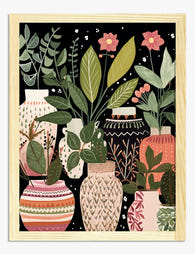
Poster Boho-Vasen mit botanischen Motiven
Translation missing: de.products.product.sale_price Ab €16,95€23,95 -

Leinwandbild Urban Jungle fürs Bad
Translation missing: de.products.product.sale_price Ab €64,95€92,95


Mehr aus The Frame

Tropical Pool Prints or Coastal Calm? Finding Y...
There's a version of coastal style that involves rope-wrapped vases and starfish in apothecary jars. This is not that guide. This is about using swimming pool wall art as the...

Why Interior Designers Never Treat Nature Print...
Nature prints are the most over-bought, under-styled category in wall art. People pick a fern, hang it too high above a sofa that's too big for it, and wonder why...

What Interior Stylists Know About Whimsical Pla...
Botanical art has been hanging on walls since the 1700s, but the current wave of playful, illustrated plant prints is different. Stylists are leaning into it precisely because it feels...