How to Build a French-Themed Gallery Wall That Actually Looks Elegant
The difference between a sophisticated Parisian arrangement and a chaotic tourist mood board comes down to seven decisions.

A French-themed gallery wall can go one of two ways: refined Left Bank apartment, or first-year student dorm with a beret problem. The difference is not the prints you choose. It's how you arrange them, frame them, and edit them.
This guide walks you through the whole process, from picking the anchor piece to hanging the final frame, with measurements you can actually use.
Start with one anchor: the Eiffel Tower watercolour
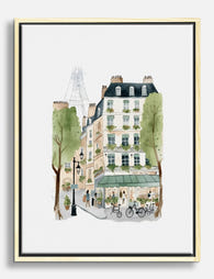
Every good gallery wall has a centre of gravity. For a French theme, the most reliable anchor is a watercolour Eiffel Tower print, and we'd argue it's the only Paris cliché worth leaning into. Done in soft washes of grey, dusty blue, or sepia, it reads as romantic rather than touristy. Done as a saturated postcard, it reads as a souvenir shop.
Size matters here. Your anchor should be the largest piece in the arrangement, ideally 50x70cm or 70x100cm, so it commands the wall and gives smaller pieces something to orbit. If your anchor is the same size as everything else, nothing leads the eye and the whole arrangement flattens out.
Look for watercolour Eiffel Tower prints with a clear focal point and plenty of negative space around the tower itself. Watercolours with too much detail compete with the rest of your wall. The best ones feel almost unfinished at the edges, with the paper showing through.

How many pieces? The case for 3, 5, and 7
Odd numbers work. This isn't superstition, it's how the eye reads symmetry. With even-numbered groupings, your brain searches for a centre line and finds a gap. With odd numbers, the middle piece becomes the anchor and everything else balances around it.
Three pieces
Best for narrow walls, above a console table, or in a hallway. Use one large anchor (50x70cm) flanked by two smaller pieces (30x40cm each). Keep them in a horizontal line at matching heights. This is the most foolproof French arrangement and almost impossible to mess up.
Five pieces
The sweet spot for most living rooms and bedrooms. One large anchor in the centre, four medium pieces (40x50cm or 30x40cm) around it. You can arrange these in a tight grid, a loose cluster, or a horizontal banner above a sofa. Five gives you enough variety to mix subjects without the wall feeling busy.
Seven pieces
For larger walls (over 2 metres wide) or when you want a salon-style effect. One anchor, two medium pieces, four smaller pieces (20x30cm or A4). Salon-style hanging means stacking work densely from floor to ceiling, originally how 19th-century Parisian galleries displayed paintings. It works beautifully with French themes but requires a confident hand. If you're hesitant, stick with five.
Avoid four, six, and eight pieces unless you're doing a strict grid. They tend to look unfinished or weirdly symmetrical in ways the eye doesn't trust.
Mixing subjects without making it a Paris mood board
If every print is a Paris landmark, you've made a souvenir wall. The Eiffel Tower, Arc de Triomphe, Sacré-Coeur, Notre-Dame, and Louvre together is too literal. It reads as a checklist, not a curation.
The fix is to use Paris as roughly 40 to 50 percent of the wall, not 100 percent. Your anchor and one or two supporting pieces can be recognisably Parisian. The rest should evoke France or simply complement the watercolour mood.
Subjects that work alongside Paris watercolours:
- Botanical watercolours (lavender, peonies, olive branches)
- Architectural details (a single window, balcony, or doorway)
- French typography or vintage menu reproductions
- Loose figure studies or fashion illustrations
- Abstract watercolour washes in your palette
- A single line drawing for visual contrast
The trick is including one piece that doesn't match. A bold black-and-white line drawing among soft watercolours, or a piece of French text in serif type, adds the kind of friction that makes a wall look curated rather than themed. Without it, your arrangement risks tipping into overly feminine or one-note territory.
Browse Paris art prints for the anchor pieces, then mix in watercolour art prints of different subjects to round out the arrangement.
Colour palette rules: how to pick prints that feel unified
Watercolour prints are forgiving in some ways and ruthless in others. They blend beautifully when the palettes overlap, but throw any high-saturation outlier into the mix and the whole wall looks broken.
The three-colour rule
Pick three colours and commit. For a classic French palette, that's usually a soft neutral (cream, oatmeal, dove grey), a muted accent (dusty blue, sage green, blush pink), and a grounding dark (charcoal, ink black, deep sepia). Every print on your wall should feature at least two of these three colours.
The repetition rule
Each colour should appear in two or three pieces minimum. If only one print has blush pink in it, that pink will look like a mistake. If three prints share a soft pink wash, the wall feels intentional. This is the single most useful rule for cohesion and the one most people skip.
Wall colour matters more than you think
Soft watercolours disappear on bright white walls. They look washed out and the prints lose presence. Off-white, warm cream, putty, sage, or even a deep navy or forest green make watercolours pop. If you're committed to white walls, lean on darker frames to give each piece its own visual weight.

Frame consistency: the biggest thing separating good walls from messy ones
If you only follow one rule from this guide, make it this one. Matching frames are what separate an elegant gallery wall from a chaotic one. Mismatched frames sabotage even the most carefully chosen prints.
This doesn't mean every frame must be identical. It means they should share a clear visual language: same colour, same width, same finish. You can vary sizes freely. You cannot vary frame style without it looking accidental.
Which frame colour works best with watercolours?
For French-themed watercolours, our position is this:
- Thin black frames: most versatile, works on any wall colour, creates definition without competing with soft prints. Our default recommendation.
- Natural oak or light wood: warmer, more relaxed, perfect for cream or sage walls. Avoid if your watercolours have a lot of warm tones already (the wood will compete).
- White frames: only on coloured walls. On white walls they vanish and your prints float awkwardly.
- Gold or brass: can work but tips quickly into ornate or shabby chic. If you go gold, keep frames thin and modern, not antiqued.
Avoid mixing frame colours unless you're confident. "Eclectic mix of frames" is what people say after they've already bought mismatched frames.
Mat or no mat?
For watercolours, we'd lean towards no mat or a very thin mat. Watercolours have a natural border of paper showing through that already creates breathing room around the image. A thick mat can make the print feel small and overly precious. If you do want mats, keep them consistent across all pieces and stick to off-white, never bright white.
A note on what often goes wrong: gallery walls fall apart when frames arrive warped, when prints aren't fitted properly, or when frames ship separately and you have to assemble them yourself. Buying prints that arrive framed, fitted, and ready to hang in one box solves most of this. Solid wood frames hold their shape. UV-protective glazing means even a sunny wall won't fade your prints over time.
Layout templates you can copy
Plan your layout on the floor first, or trace each frame onto kraft paper, cut it out, and tape the templates to the wall. This takes 20 minutes and saves you from a wall full of unnecessary nail holes.
The standard spacing between frames is 5 to 8 centimetres (roughly 2 to 3 inches). Tighter than 5cm and the wall feels cramped. Wider than 8cm and the arrangement loses cohesion and reads as separate pieces rather than one composition.
Template 1: The horizontal trio (above a sofa or console)
Three pieces, eye level. Centre piece 50x70cm, two flanking pieces 30x40cm. Tops of all frames aligned. 6cm between frames. Total width roughly 130cm. The centre of the arrangement should sit at 145cm from the floor.
Template 2: The five-piece cluster
One 70x100cm anchor in the centre. Two 40x50cm pieces stacked on the left, two 30x40cm pieces stacked on the right. 6cm spacing throughout. This works on walls 180cm wide or more and reads beautifully above a bed or large sofa.
Template 3: The five-piece banner
All five pieces in a single horizontal line. Centre piece 50x70cm, two 40x50cm flanking it, two 30x40cm at the outer edges. Bottoms of all frames aligned, not tops. This creates a stronger horizontal line and works above long sofas or sideboards.
Template 4: The seven-piece salon
Anchor at 70x100cm, slightly off-centre. Cluster six smaller pieces around it in varying sizes (40x50cm, 30x40cm, 20x30cm), keeping the outer edges of the arrangement roughly rectangular. Spacing 5 to 7cm. This is the most ambitious layout and benefits most from kraft paper planning.
The 145cm rule
Hang the centre of the entire arrangement at 145cm (about 58 inches) from the floor, which is gallery-standard eye level. Don't centre each individual piece at this height. Centre the whole grouping. Your anchor piece's middle should sit at or near this line.
If you're hanging above furniture, leave 15 to 25cm between the top of the furniture and the bottom of the lowest frame. Closer than 15cm and the arrangement feels heavy. Further than 25cm and it floats unmoored.
If you'd rather skip the planning entirely, pre-curated wall art sets take care of size relationships and palette cohesion for you.

Common mistakes and how to avoid them
Buying all the same size
A gallery wall of identical 30x40cm prints reads as a grid, not a gallery. Vary your sizes. The standard ratio: one large anchor, two medium pieces, two to four smaller pieces.
Skipping the anchor
If every piece is the same visual weight, the eye has nowhere to land. One piece should be clearly the largest and most dominant. Without it, the arrangement looks like a mood board, not a focal point.
Hanging too high
Most people hang art too high. The centre of your arrangement should sit at 145cm from the floor, which feels lower than instinct says. Trust the measurement.
Mixing too many subjects
If you have an Eiffel Tower, a Notre-Dame, a Louvre, a Sacré-Coeur, and a Champs-Élysées, you've made a brochure. Edit ruthlessly. Two Paris landmarks maximum, then complementary subjects.
Mismatched frames
Repeating because it matters: matching frames. Same colour, same width, same finish. Vary the sizes of the prints, not the frames.
Buying small prints for big walls
A wall that's 3 metres wide needs prints sized accordingly. A cluster of A4 prints on a vast wall looks like postage stamps. Scale up your anchor to 70x100cm for any wall over 2.5 metres wide.
Forgetting negative space
Your gallery wall shouldn't fill the entire wall. Leave generous breathing room on all sides, ideally 30cm or more between the outer edge of the arrangement and the nearest wall edge, ceiling, or piece of furniture.

The short version
Pick one watercolour Eiffel Tower as your anchor. Choose three colours and make sure each appears in at least two prints. Mix Paris subjects with botanicals, typography, or architectural details so the wall doesn't read as a souvenir shop. Match your frames in colour, width, and finish, and vary only the sizes. Plan the layout on the floor or with kraft paper before you put a single nail in the wall. Centre the whole arrangement at 145cm from the floor, leave 5 to 8cm between frames, and trust the odd number.
Get those decisions right and the wall does the rest of the work for you.

In diesem Blog vorgestellte Fab-Produkte
-

Poster Eiffelturm in Paris – Aquarell, parisische Eleganz
Translation missing: de.products.product.sale_price Ab €16,95€23,95 -

Leinwandbild Eiffelturm im Aquarell – Pariser Eleganz
Translation missing: de.products.product.sale_price Ab €64,95€92,95 -

Poster Paris Aquarell – Eiffelturm & Café-Szene
Translation missing: de.products.product.sale_price Ab €16,95€23,95 -

Leinwandbild Pariser Tagtraum mit Eiffelturm & Rosen
Translation missing: de.products.product.sale_price Ab €64,95€92,95 -

Leinwandbild Pariser Straßenidylle – Aquarell
Translation missing: de.products.product.sale_price Ab €64,95€92,95 -

Leinwandbild Paris – Verspieltes romantisches Stadtbild
Translation missing: de.products.product.sale_price Ab €64,95€92,95 -

Leinwandbild Pariser Charme – Kollektion
Translation missing: de.products.product.sale_price Ab €64,95€92,95 -

Poster Pariser Café-Szene in Aquarell
Translation missing: de.products.product.sale_price Ab €16,95€23,95 -

Poster Eiffelturm in Paris – Pariser Charme
Translation missing: de.products.product.sale_price Ab €16,95€23,95 -

Leinwandbild Paris – Straßenromantik in Aquarell
Translation missing: de.products.product.sale_price Ab €64,95€92,95 -

Leinwandbild Pariser Aquarell mit Eiffelturm, Croissants & Tulpen
Translation missing: de.products.product.sale_price Ab €64,95€92,95 -

Leinwandbild Pariser Straßenszene in Aquarell
Translation missing: de.products.product.sale_price Ab €64,95€92,95 -

Leinwandbild Paris: Balkonblick auf den Eiffelturm
Translation missing: de.products.product.sale_price Ab €64,95€92,95 -

Leinwandbild Pariser Straßenszene – Aquarell
Translation missing: de.products.product.sale_price Ab €64,95€92,95 -

Leinwandbild Paris – Eiffelturm mit Kopfsteinpflaster im Vintage-Stil
Translation missing: de.products.product.sale_price Ab €64,95€92,95 -

Leinwandbild Paris – Pariser Charme in Aquarell
Translation missing: de.products.product.sale_price Ab €64,95€92,95 -

Leinwandbild Pariser Charme mit Eiffelturm
Translation missing: de.products.product.sale_price Ab €64,95€92,95 -

Poster Pariser Straße – Aquarell in sanften Pastelltönen
Translation missing: de.products.product.sale_price Ab €16,95€23,95 -
Leinwandbild Pariser Straßenszene in Aquarell
Translation missing: de.products.product.sale_price Ab €64,95€92,95


Mehr aus The Frame

Boho Sun Wall Art: How to Nail the Look Without...
Boho sun art has a reputation problem. Done badly, it screams student halls and macramé overload. Done well, it's one of the warmest, most grounding aesthetics you can put on...

Every Animal in William Morris's Designs: The C...
Most people know the thrush in Strawberry Thief and stop there. But Morris's wider body of work contains foxes, hares, peacocks, ravens, lions, herons, woodpeckers, deer, and doves, often half-buried...

Countryside Decor Ideas: How to Bring Rural Cal...
Countryside art has quietly become one of the most versatile choices in modern interiors. Not the chintz-and-bunting version, but the kind of soft, considered pastoral scenes that bring the outside...