House Print Decorating Ideas That Work in Every Room
How to decorate with the prints you actually love without turning your lounge into a property brochure.

You bought a beautiful print of a Georgian townhouse, or maybe a row of pastel Lisbon facades, because you genuinely love architecture. Six months later you've added two more, and now your hallway looks suspiciously like the window display of an estate agent. The fix isn't fewer house prints. It's smarter ones, arranged better, mixed with other things.
Why house prints work (and why they sometimes don't)
House prints have an immediate emotional pull. They evoke holidays, childhood homes, the daydream of one day owning a crooked cottage in Cornwall. Architectural subjects also do something most art doesn't: they give the eye structure. Windows, rooflines, doorways, all that geometry makes a print feel grounded and considered on a wall.
The problem is that they can also feel deeply literal. A house is a house. Hang three in a row and your brain stops seeing art and starts reading a property listing. The category tips into theme faster than landscapes or botanicals because the subject is so specific and so domestic.
That's the tension this guide solves. You don't need to abandon the prints you love. You need to stop treating them like a collection and start treating them like part of a wider visual conversation.

Pick the right house style for your room's personality
Not all house prints read the same way. The rendering style matters far more than the subject itself, and matching the style to the room is where most people go wrong.
Line drawings and ink illustrations
Clean black-and-white line work feels contemporary, almost graphic. These suit modern interiors, home offices, and rooms with a lot of white walls. They sit beautifully next to typography prints or minimalist abstracts. A line-drawn Parisian apartment block can feel as cool as any abstract piece if you frame it well.
Watercolour and gouache
Softer, painterly house prints lean cosy and personal. They work in bedrooms, snugs, and reading corners where you want warmth rather than statement. Pair them with vintage botanicals or muted landscapes and they sing.
Photography
Architectural photography is the trickiest style to use without slipping into estate agent territory. It works best when the image is unusual: a tight crop on a coloured door, a single window with washing hanging out, an aerial of pastel rooftops. Wide, straight-on shots of whole houses are the danger zone.
Abstract and stylised
Cubist-leaning, block-colour, or geometric interpretations of buildings are our favourite for larger sizes. They give you the subject you love without the literalism. A 70x100cm abstract cityscape reads as art first, architecture second.
Browse architectural art prints with a critical eye for rendering style, not just subject. The same Tuscan villa rendered in watercolour versus photography will land entirely differently on your wall.
The golden rule: mix house prints with other subjects
Here is the formula we keep coming back to: in any wall arrangement or any single room, no more than half the prints should be houses. Ideally less.
A workable ratio for a three-print gallery wall is one house print and two non-house prints. For a five-print arrangement, two house prints maximum. The non-house prints break the visual pattern, stop your eye from cataloguing properties, and let the house print actually be admired.
What to mix with them:
- Botanicals. Leaves, pressed flowers, and herbarium studies are the natural counterweight to architectural lines. The organic shapes soften the geometry. A pothos study next to a townhouse facade is a chef's kiss combination.
- Abstract shapes or colour fields. A muted abstract in tones picked from your house print pulls the arrangement together without repeating the subject.
- Landscape prints. Wide horizons and open countryside give the eye somewhere to rest. They also play conceptually with the idea of a house, sheltered structure against open nature.
- Still life or object studies. A single vase, a bowl of lemons, a stack of books. Quiet, domestic, and a brilliant tonal partner.
What to avoid mixing with house prints: more house prints in a different style. Two watercolour cottages and a line-drawn Brooklyn brownstone together looks like indecision. Pick a lane within each arrangement.
Botanical prints and landscape prints are the two collections we send people to when they message us asking what to pair with their house prints. They never fail.
Layout ideas for a two or three print arrangement (with dimensions)
Vague advice to "mix sizes" isn't useful. Here are layouts that actually work, with specific dimensions you can order.
The hero plus two
One larger house print flanked by two smaller complementary subjects. This is the most forgiving layout in the book.
- Central: 50x70cm house print (something stylised or watercolour works best at this size)
- Left and right: 30x40cm botanical studies, hung at the same height as the centre print's midline
- Spacing: 5-7cm between each frame
The flanking prints should be quieter than the centre. If your house print is colourful, go monochrome on the sides. If it's black and white, you can introduce muted colour either side.
The asymmetric trio
Three prints of varying sizes arranged off-centre. Better for narrower walls and more contemporary rooms.
- Largest: 60x80cm abstract or landscape, hung slightly left of centre
- Medium: 40x50cm house print, hung to the right at upper height
- Smallest: 30x40cm botanical or still life, hung lower-right beneath the medium
The house print sits in the middle of the visual hierarchy, not at the top. That's deliberate. It stops the room reading "house picture, plus some other stuff."
The pair
Two prints, side by side, same size. Simple and quietly confident.
- Two 50x70cm prints, one house and one not, with 8cm between them
- Hang the midpoint between the two frames at roughly 145cm from the floor (lower than people instinctively go, but eye level for most viewers)
Works above a sideboard, a console table, or a low bench in a hallway.

Above the sofa
The single most asked question we get: what size art above a sofa? The combined width of your art should be roughly two-thirds the width of the sofa. For a 200cm three-seater, you want around 130-140cm of total art width. That's one 100x70cm landscape-orientation house print, or a trio of 40x50cm prints with spacing.
Hang the bottom edge 15-20cm above the back of the sofa. Closer than that and it floats; further and it disconnects.
Colour palettes that keep house prints feeling elevated
Colour is where house prints either ascend into proper art territory or sink into kitsch. A few rules we stand by.
Stay tonal within the arrangement
If your house print features sage green shutters and terracotta tiles, pull those exact tones into the prints around it. A botanical with sage foliage, an abstract with terracotta blocks. The arrangement reads as one composition rather than three separate decisions.
Mute the surroundings
House prints look most elevated against soft, knocked-back wall colours: warm white, clay, mushroom, dusty plaster pink, deep sage. Brilliant white walls can make architectural prints feel clinical. Bold accent walls can fight them. Aim for a wall colour that lets the print breathe.
Limit your palette to three
Across any wall, restrict yourself to three dominant colours plus neutrals. If your house print has navy, ochre, and cream, those are your three. Everything else on that wall, including frames, should support them.
Frame colour matters more than you think
A thin black frame makes a house print feel like a graphic art piece. A natural oak frame makes the same print feel softer and more lived-in. A white frame can tip even a beautiful illustration into something that looks like it came with the room. Our preference for house prints is usually a slim black or warm oak frame, depending on whether the room leans modern or natural. Avoid wide white frames for this subject.
Rooms where house prints shine: hallways, bedrooms, and home offices
Some rooms can handle more house imagery than others. The rule is simple: the less time you spend living in a room, the more theme it can carry.
Hallways
Hallways are transition spaces. You walk through them. You don't sit and stare at the walls for an hour. That means they can support a more thematic arrangement without becoming oppressive. A hallway is the one place we'd happily put three house prints in a row, provided they share a rendering style and a colour family.
Long hallways suit a series of equally sized prints (say, four 30x40cm framed line drawings of European doorways) spaced evenly. It feels considered, almost gallery-like.
Bedrooms
Bedrooms want softness. A single large watercolour house print above the bed, paired with a small botanical on a bedside wall, is plenty. Avoid photography here. The realism of a photographic house can feel intrusive in a sleeping space.
Home offices
Offices benefit from the structure house prints bring. Architectural lines reinforce focus and order. A pair of line-drawn architectural prints above a desk, or a single large abstract cityscape on the wall opposite, gives the room intent without distraction.
Living rooms and kitchens
These need the most restraint. One house print, maximum, properly anchored within a wider mix of subjects. The living room is where guests sit and look. The kitchen is where you spend hours. Both reward subtlety.

Common mistakes and how to avoid the estate agent look
The estate agent look is a specific visual: multiple photographic house prints, all roughly the same size, all hung in a neat grid, all showing whole houses from the front. Avoid every element of that and you're fine.
Mistake one: all photography
Photographic house prints are the most literal version of the subject. Use one at most per room, and crop tight rather than wide. A close-up of an arched window beats a full house exterior every time.
Mistake two: matching sizes in a grid
Four identical-sized house prints in a 2x2 grid is the single fastest way to make a wall look like a property catalogue. Vary the sizes, break the grid, or commit fully to a long single line.
Mistake three: all literal, no abstraction
If every house print in your home shows a recognisable, accurately rendered building, the cumulative effect is documentary, not decorative. Mix in at least one stylised or abstract interpretation.
Mistake four: scale inversion
Counterintuitive but true: larger house prints should be more abstract, smaller ones can be more detailed. A 100x70cm photographic house dominates a room with its literalism. A 100x70cm abstract cityscape commands the same space as art. Save the detailed, illustrative house prints for 30x40cm or 40x50cm sizes.
Mistake five: ignoring the personal connection question
A print of your actual childhood home, or the holiday cottage you got married in, can carry more literalism because it carries meaning. A generic stock cottage cannot. Be honest with yourself about which yours is.
Mistake six: hanging too high
Most people hang art 15-20cm too high. The centre of your arrangement should sit around 145-150cm from the floor, which feels low until you live with it for a week. Then it feels right forever.

The shortcut to all of this: treat house prints as one ingredient, not the recipe. Browse house art prints for the piece you genuinely love, then build the rest of the wall around restraining it. The best architectural arrangements we've seen in customers' homes have one strong house print doing the talking and everything else playing supporting roles. That's the difference between a home that loves architecture and a home that looks like it's for sale.

In diesem Blog vorgestellte Fab-Produkte
-

Poster Sonnenuntergang am Meer mit Segelboot
Translation missing: de.products.product.sale_price Ab €16,95€23,95 -

Poster Londoner Stadthaus in Pastellrosa
Translation missing: de.products.product.sale_price Ab €16,95€23,95 -

Poster Willkommen im Irrenhaus – Schwarz-Weiß-Statement
Translation missing: de.products.product.sale_price Ab €16,95€23,95 -

Poster Moderne geometrische Formen in Gelb und Grün
Translation missing: de.products.product.sale_price Ab €16,95€23,95 -

Poster Mi Casa Su Casa – Willkommen in Schwarz-Weiß
Translation missing: de.products.product.sale_price Ab €16,95€23,95 -

Poster Willkommen im verrückten Haus
Translation missing: de.products.product.sale_price Ab €16,95€23,95 -
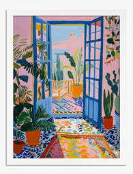
Poster Matisse-inspirierter Wintergarten in Pink und Blau
Translation missing: de.products.product.sale_price Ab €16,95€23,95 -

Poster Londoner Reihenhäuser in Pastellfarben
Translation missing: de.products.product.sale_price Ab €16,95€23,95 -

Poster 'House of Fun' – Typografie in Blau
Translation missing: de.products.product.sale_price Ab €16,95€23,95 -

Leinwandbild Modernes Bauhaus-Refugium
Translation missing: de.products.product.sale_price Ab €64,95€92,95 -

Poster Pastellfarbene Pariser Häuser
Translation missing: de.products.product.sale_price Ab €16,95€23,95 -
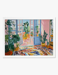
Poster Wintergarten im Matisse-Stil
Translation missing: de.products.product.sale_price Ab €16,95€23,95 -

Poster Bunte Pop-Art-Illustration fürs Wohnzimmer
Translation missing: de.products.product.sale_price Ab €16,95€23,95 -

Poster Bunte Reihenhäuser in der Stadt
Translation missing: de.products.product.sale_price Ab €16,95€23,95 -

Poster Sonnendurchfluteter moderner Raum
Translation missing: de.products.product.sale_price Ab €16,95€23,95 -

Poster Blaues Stadthaus mit Gartenpflanzen und schwarzer Katze
Translation missing: de.products.product.sale_price Ab €16,95€23,95 -

Poster Pastellfarbener Reihenhaus-Charme
Translation missing: de.products.product.sale_price Ab €16,95€23,95


Mehr aus The Frame

The Complete Guide to Colours That Go With Peta...
Most colour guides assume you're building a room from scratch. You're probably not. You've fallen for a specific petal print, and now you need your existing lounge, bedroom or hallway...

Why William Morris Gallery Walls Work Better wi...
Morris prints are dense, layered, and full of movement. Hang too many together, or hang them wrong, and a wall meant to feel romantic ends up feeling exhausting. This guide...

The Most Famous William Morris Designs: From Pe...
William Morris in 60 seconds: the man behind the movement William Morris (1834-1896) was a designer, poet, socialist, and the loudest voice of the Arts and Crafts movement, the late-Victorian...