How to Build a Gallery Wall Around One Inspirational Print
The art of restraint, exact measurements, and frame combinations that turn one meaningful print into a wall worth living with.

Most gallery walls fail because they try to say too much. A truly great inspirational display works like a well-edited sentence: one strong message, supported by quieter elements that hold the composition together. This guide walks you through the exact dimensions, layouts, and finishes to make that work on a standard UK wall.
Why one inspirational print is enough (and more is too many)
Stack five quotes together and your eye doesn't know where to land. The brain reads competing messages as visual noise, and the meaning of each piece dilutes. One inspirational print, properly placed, becomes a daily anchor. Five becomes wallpaper.
The principle here is the same one designers borrow from typography: hierarchy. You need a hero, then supporting acts. When you treat every print as equally important, none of them are.
This is also why the most common mistake we see (and it's everywhere) is the three-panel quote canvas where each panel shouts a different motto. The eye bounces. Nothing sticks. Pick one message that genuinely matters to you, and let the rest of the wall serve it.

Choosing your anchor piece: size, message, and style
Your anchor is the print everything else orbits. It should be the largest, the most visually striking, and ideally the most emotionally resonant.
Size: For a standard UK wall (most rooms have 2.4m ceilings and clear wall sections of 1.5 to 2.5m wide), your anchor should be between 50x70cm and 70x100cm. Smaller than 40x50cm and it loses authority. Larger than 100x70cm and you've stopped making a gallery wall and started making a single statement piece, which is a different exercise entirely.
Message: The best inspirational wall art is specific, not generic. "Live, Laugh, Love" has been worn out by a decade of mass production. Look for typography that reads like something a real person would say to you on a hard day. Lyrics, lines from books, single words with weight. If you wouldn't quote it in conversation, don't quote it on your wall.
Style: Match the anchor's typographic style to the room's mood. Serif typography with generous spacing reads classic and calm. Bold sans-serif feels modern and direct. Hand-lettered scripts feel personal but date faster. Browse our inspiration art prints for pieces that lean editorial rather than novelty.
Budget allocation: Spend roughly 60% of your total budget here. The anchor needs to be the highest quality piece on the wall because it carries the most visual responsibility. A washed-out print or a flimsy frame will undermine everything around it.
Complementary art: what to pair with a motivational centrepiece
The supporting prints exist to balance the visual weight of your anchor without competing with it. Text is heavy. Images are softer. So the rule is simple: if your anchor is text-heavy, your supporting prints should be image-based.
Three categories work consistently well:
Botanical prints soften typography and add organic shapes that contrast cleanly with letterforms. A single fern study or pressed-flower print next to a bold quote creates immediate visual breathing room. The botanical art prints collection works particularly well for this because the muted greens and creams sit quietly without disappearing.
Abstract art brings movement and colour without narrative. Loose shapes, brushy textures, and soft colour fields read as atmosphere rather than information. For a quote-led wall, abstract art prints are the safest companion because they never argue with your message.
Black and white photography anchors a wall in mood. A single architectural detail, a landscape, or a quiet still life adds depth without colour competition.
Avoid: other quote prints (always), busy patterns, anything with a competing focal subject (a portrait will always fight a quote for attention).
Three gallery wall layouts that work every time
These templates assume a clear wall area of at least 150cm wide. All measurements include the 5cm spacing between frames.
Template 1: The Classic Triptych (150cm wide)
- 1x 50x70cm anchor (centre)
- 2x 30x40cm supporting prints (one each side, vertically centred to anchor)
- Total wall span: approximately 130cm wide, 70cm tall
This is the most forgiving layout. The anchor sits dead centre, flanked by two smaller prints that mirror each other in size. Use it above a sofa, console, or bed.
Template 2: The Asymmetric Cluster (180cm wide)
- 1x 70x100cm anchor (left of centre)
- 1x 30x40cm print (top right of anchor)
- 1x 40x50cm print (bottom right of anchor)
- 1x 21x30cm print (far right, vertically between the other two)
Looks more curated and editorial. The anchor dominates the left, and three smaller prints stair-step to the right. Keep 5cm between every frame edge.
Template 3: The Six-Piece Grid (160cm wide, 120cm tall)
- 1x 60x80cm anchor (centre top)
- 4x 30x40cm prints (two below the anchor, one each side)
- 1x 21x30cm print (tucked into the corner gap)
This works best on tall walls or above a low piece of furniture. It feels more architectural and rewards a slow look. A coordinated wall art set makes this layout much easier to pull together because the supporting prints are designed to work as a group.

Frame finishes: keeping it cohesive without being boring
"Mix your frames" is advice everyone gives and nobody explains. Here are three combinations that actually work, with the logic behind each.
Combination A: Black + natural oak + brass accents. The most flexible. Black frames for your anchor and one supporting print, natural oak for the rest, and any metallic objects nearby (a lamp, a shelf bracket) tie it together. Works in nearly every room.
Combination B: All-white frames with varied mat colours. Best for minimalist, gallery-style spaces. Use a white mat for some prints and a soft cream or warm grey for others. The frames disappear and the prints do all the talking.
Combination C: All-natural oak. A safe, warm choice for Scandinavian-leaning rooms. Less drama, more cohesion. Pair with linen sofas, wool rugs, and ceramic.
What to avoid: more than three different frame finishes (chaos), ornate carved frames mixed with modern slim profiles (the styles fight), and shiny gold mixed with brushed brass (close but never quite right).
A note on frames themselves: cheap MDF frames warp within a year, especially in kitchens or bathrooms with humidity changes. Solid wood frames hold their shape and their corners stay tight. If you're investing in an anchor piece you plan to keep for years, the frame quality matters as much as the print.
The spacing and hanging technique that makes it look professional
Spacing is where most DIY gallery walls go wrong. Too tight and it looks crowded. Too generous and the wall reads as separate prints rather than a composition.
The 5cm rule: Keep exactly 5cm between every frame edge. Not 3cm, not 7cm. This is the spacing professional installers use because it's tight enough to read as a group and loose enough to give each piece air.
The 145cm centre line: Hang the visual centre of your gallery wall (not the centre of the anchor, the centre of the whole composition) at 145cm from the floor. This is the British gallery standard, slightly lower than the American 150cm because UK ceilings tend to be lower. For seated viewing areas like behind a sofa, drop this to 135cm so the art reads when you're sitting down.
The paper template method: Cut paper rectangles to match each frame size. Tape them to the wall with masking tape. Step back. Adjust until the composition feels balanced. Only then mark your fixing points through the paper. This takes twenty minutes and saves you from a wall full of test holes.
For renters: Heavy-duty Command strips hold up to 7.2kg per pair, which covers most framed prints up to 50x70cm. For anything larger, picture rail hooks (if your property has rails) or a single discreet nail per frame causes minimal damage and is easily filled.
Levelling: Use a small spirit level or the level app on your phone. The eye can detect a tilt of about 1 degree. Get it right.
Gallery wall ideas for offices, bedrooms, and living rooms
The same gallery wall concept needs to shift depending on where it lives. Different rooms ask different things of motivational art.
Office and workspace
Place your anchor directly opposite your desk, not above it. You want to see the message when you look up from your screen, not crane your neck. Eye level when seated is roughly 115-120cm from the floor, so drop your composition's centre to around 130cm.
For motivational art for workspace ideas, choose messages that reinforce focus rather than hustle culture. A single line about patience or craft tends to wear better over years of looking at it than something performative.
Avoid glare: if your desk faces a window, make sure the art on the opposite wall isn't in direct sunlight at midday. Glass-fronted frames reflect badly. UV-protective acrylic glaze handles light better and won't fade your print, which matters if the wall gets afternoon sun.
Bedroom
Place the anchor on the wall opposite the bed, not above the headboard. Above the bed is fine for landscape orientation pieces, but inspirational text directly over your head is intense and oddly anxious-making. Opposite the bed means it's the first thing you see in the morning.
Lean into calm: muted typography, soft colours, botanical supporting prints. Bedrooms aren't where you need to be motivated; they're where you need to be reassured.
Living room
Above the sofa or above a console table. The anchor's centre should sit roughly 20-25cm above the back of the sofa (any higher and it floats). For social spaces, choose messages with universal warmth rather than personal mantras. The wall is on display to guests, not just you.

Swapping prints seasonally without rehanging everything
The smartest gallery walls are designed for rotation. Here's the technique:
Standardise your frame sizes. Pick two or three sizes (for example, 30x40cm and 21x30cm) and use them consistently across your supporting positions. When you want to swap a print, you're sliding new artwork into an existing frame, not re-measuring and re-drilling.
Designate 'swap zones'. Choose one or two positions in your composition (usually the smaller supporting prints) as your seasonal rotation spots. Keep the anchor and one or two other pieces permanent. The wall keeps its structure while the mood shifts.
Keep the anchor permanent. This is the whole point. The anchor is the message that doesn't change. The supporting prints can shift from spring botanicals to autumn abstracts to winter monochromes, but the anchor stays.
Store off-rotation prints flat. A drawer with acid-free tissue paper between prints is ideal. Avoid rolling them, which causes lasting curl, especially with thicker matte papers.
This approach also lets you build your gallery wall slowly. Start with the anchor and two supporting pieces. Add more over months, not in a single afternoon. The walls that look the most considered are usually the ones that took the longest to finish.

A final word on restraint
The best inspirational walls don't shout. They hold one idea steady, surround it with quieter pieces that earn their place, and trust the viewer to slow down. If you remember nothing else: choose one message worth living with, frame it properly, and let everything else support rather than compete. That's the whole guide.

In diesem Blog vorgestellte Fab-Produkte
-

Leinwandbild mit Spruch 'Build a Life You Love'
Translation missing: de.products.product.sale_price Ab €64,95€92,95 -
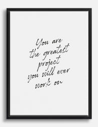
Leinwandbild Motivationszitat »Greatest Project«
Translation missing: de.products.product.sale_price Ab €64,95€92,95 -

Leinwandbild Herz in Erdtönen
Translation missing: de.products.product.sale_price Ab €64,95€92,95 -

Poster Herz-Illustration in Rosa und Rot
Translation missing: de.products.product.sale_price Ab €16,95€23,95 -

Poster 'Make Yourself Proud' – Motivationsspruch in Schwarz-Weiß
Translation missing: de.products.product.sale_price Ab €16,95€23,95 -

Leinwandbild Motivierende Worte im monochromen Design
Translation missing: de.products.product.sale_price Ab €64,95€92,95 -

Poster Elegante Balance – Line Art in Schwarz-Weiß
Translation missing: de.products.product.sale_price Ab €16,95€23,95 -

Leinwandbild Zitat 'Bold Confidence' – schwarz-weiß
Translation missing: de.products.product.sale_price Ab €64,95€92,95 -

Poster Spruch zur inneren Schönheit – Schwarz-Weiß
Translation missing: de.products.product.sale_price Ab €16,95€23,95 -

Leinwandbild Minimalistische Figuren
Translation missing: de.products.product.sale_price Ab €64,95€92,95 -

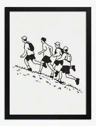
Leinwandbild Vier Wanderer am Grashang – Schwarz-Weiß
Translation missing: de.products.product.sale_price Ab €64,95€92,95 -
Poster Bergauf-Abenteuer – Vier Wanderer in Schwarz-Weiß
Translation missing: de.products.product.sale_price Ab €16,95€23,95 -

Poster Andy Warhol Zitat „Fantasy“ – Schwarz-Weiß
Translation missing: de.products.product.sale_price Ab €16,95€23,95 -

Leinwandbild inspirierendes Zitat von Henri Matisse in Schwarz-Weiß
Translation missing: de.products.product.sale_price Ab €64,95€92,95 -

Poster Zitat von Paul Cézanne – handgeschrieben in Lavendel
Translation missing: de.products.product.sale_price Ab €16,95€23,95 -

Poster Sie ging ihren eigenen Weg
Translation missing: de.products.product.sale_price Ab €16,95€23,95 -

Poster Kleine Welten IX – inspiriert von Kandinsky
Translation missing: de.products.product.sale_price Ab €16,95€23,95 -

Poster Bedeutungsvolle Verbindungen – Handschriftliches Zitat
Translation missing: de.products.product.sale_price Ab €16,95€23,95 -

Leinwandbild Nachdenkliche Figur in Grün
Translation missing: de.products.product.sale_price Ab €64,95€92,95


Mehr aus The Frame

Every Animal in William Morris's Designs: The C...
Most people know the thrush in Strawberry Thief and stop there. But Morris's wider body of work contains foxes, hares, peacocks, ravens, lions, herons, woodpeckers, deer, and doves, often half-buried...

Countryside Decor Ideas: How to Bring Rural Cal...
Countryside art has quietly become one of the most versatile choices in modern interiors. Not the chintz-and-bunting version, but the kind of soft, considered pastoral scenes that bring the outside...

Arts and Crafts Animal Prints: The Victorian De...
The Arts and Crafts revival: why Victorian animal prints are trending again Scroll through any interior design hashtag right now and you'll see them everywhere: hares peering through curling foliage,...