Modern Tropical Interior Design: How to Get the Look Without the Kitsch
Tropical can look incredible or like a tiki bar, and one decision determines which way your room tips.

Tropical design has a reputation problem. It either reads as a quietly confident, sun-warmed sanctuary or like the lobby of a budget resort, and there is almost no middle ground. The single biggest factor deciding which side of the line you land on is your wall art.
What modern tropical design actually is (and isn't)
Modern tropical is not palm-leaf wallpaper, flamingos, or pineapple-shaped anything. It draws from the architectural traditions of places like Bali, Sri Lanka, and coastal Mexico, where interiors are built around natural materials, deep shade, slow airflow, and a restrained palette of clay, sand, off-white, terracotta, and the green of actual living plants.
The aesthetic is closer to warm minimalism than to a tiki bar. Think rattan and cane used sparingly, linen in oatmeal and ecru, smooth plaster walls, low timber furniture, and one or two confident pieces of botanical art. The vibe is "shaded verandah at 4pm" rather than "duty-free shop at the airport."
What it isn't: bright turquoise, neon coral, novelty parrots, oversized resort signage, or four different palm-print cushions fighting each other on the same sofa. If a holiday rental in Florida would buy it in bulk, it is not modern tropical.

The one-print rule: why restraint is the whole game
Here is the rule that does most of the work: one piece of tropical art per room. Maybe two if the room is large and they are in different zones. That is it.
The instinct with tropical is to layer it, to add a palm print here and a banana leaf cushion there and a toucan cushion in the corner. Resist all of it. The reason luxury hotels in Ubud and Tulum feel calm rather than cartoonish is that they commit to one or two strong botanical moments and let everything else be quiet.
A single large-scale piece of tropical wall art above the sofa, at 70x100cm or larger, will always read as more expensive and more intentional than three medium prints clustered together. Scale signals confidence. Quantity signals a gift shop.
The psychological mechanism is simple. When the eye sees one focal point, it reads the room as curated. When it sees the same motif repeated across multiple objects, it reads the room as themed. Themed is the kiss of death.
What "one print" lets you do everywhere else
Once the wall art is doing the heavy lifting, the rest of the room can be neutral. Linen, timber, ceramic, stone. You don't need a palm-leaf rug because you already have a palm-leaf print, and that print can be brilliant precisely because nothing else is competing with it.
Choosing tropical art that ages well: subject, palette, and composition
Three filters separate sophisticated tropical art from the dated kind.
Subject. Botanical accuracy reads as refined. Cartoon stylisation reads as themed. A detailed study of a single monstera leaf, a banana frond against a pale background, a vintage botanical illustration of a bird of paradise: these all age well. A grinning parrot wearing sunglasses does not.
Palette. Modern tropical art uses muted, earthy greens, warm off-whites, soft terracotta, dusty rose, and the occasional smoky black. It avoids high-saturation turquoise, hot pink, and bright yellow. If the print looks like a postcard, walk away. If it looks like a page from an 18th century plant catalogue or a contemporary art gallery, you are on the right track.
Composition. Negative space is your friend. A large print with a single botanical subject on a calm background will work in almost any room. Busy compositions with multiple competing elements are harder to live with and date faster.
The best tropical wall art tends to share these traits: one clear subject, a restrained palette, generous negative space, and either a clearly illustrative or clearly photographic style. Hybrid stylisations (semi-cartoon, semi-realistic) are where things start to feel cheap.
For shoppers nervous about commitment, botanical art prints are the safest entry point. A detailed leaf study is technically tropical without screaming it, which means the room reads as sophisticated rather than themed.
Frame choices that sharpen the look
This is where a lot of tropical interiors fall apart. The art is right, the wall is right, the frame is wrong.
For modern tropical, the frame should be either natural oak or matte black. Natural oak echoes the timber and rattan elsewhere in the room and feels warm. Matte black creates a clean, gallery-like contrast against off-white walls and pulls the look towards minimalism. Avoid ornate gold, distressed white, or chunky driftwood frames, all of which push the room towards beachy kitsch.
White mounts (the border between the print and the frame) help. They give the image room to breathe and signal "considered" rather than "casual." Skipping the mount and pushing the image to the edge of the frame is fine too, particularly with botanical prints, but it asks more of the surrounding wall.
A note on framing quality: tropical interiors live or die on the small details, and a warped frame or a print that has bubbled in transit kills the whole illusion. This is the single most common failure in the wall art category, and it is worth checking that whatever you order arrives properly fitted in a single box, ready to hang, rather than as parts you have to assemble. UV-protective glazing also matters if the wall gets afternoon sun, which a lot of tropical-styled rooms do by design.

Mixing tropical art with other styles
Modern tropical rarely lives alone. It almost always shares a room with Scandinavian, minimalist, or mid-century furniture, and the mixing is where it gets genuinely interesting.
Tropical art + Scandinavian furniture
The formula: warm white walls, pale timber furniture (oak, ash), linen upholstery in oatmeal or sand, one large tropical print in a natural oak frame.
This works because Scandi gives you the calm, neutral base and tropical gives you the warmth and life. Without the tropical art, Scandi can feel cold. Without the Scandi restraint, tropical can feel busy. Together, they balance.
Tropical art + minimalist interiors
The formula: smooth plaster walls, low-profile furniture in stone or charcoal, no clutter, one large botanical print as the only decorative element on the main wall.
This is the most editorial version of modern tropical. The print is doing all the visual work, so it needs to be exceptional. Photographic or highly detailed illustrative prints work best here. Pair with minimalist art prints in adjacent rooms to keep the visual language consistent.
Tropical art + mid-century modern
The formula: walnut furniture, tapered legs, mustard or olive accents, one tropical print with a slightly graphic, illustrative quality.
Mid-century and tropical share a heritage moment in the 1950s and 60s when designers were obsessed with bringing the outdoors in. The pairing feels historically coherent rather than forced. Stick to muted palettes that echo mid-century colours: olive green, burnt orange, mustard, and cream, all of which appear naturally in good tropical art.
For broader inspiration on combining styles, browsing modern art prints alongside tropical can help you find pieces that feel current rather than themed.
The 2025/2026 shift: warm tones replacing grey and how tropical fits in
For the better part of a decade, interiors were dominated by cool greys, white, and black. That cycle is over. The shift now is unambiguously towards warm neutrals: clay, sand, terracotta, mushroom, warm off-white, and the kind of dusty, lived-in pinks and greens you see in old Mediterranean and Southeast Asian houses.
Modern tropical fits this shift almost perfectly, which is part of why it is having a moment. The palette of refined tropical interiors (sand, clay, muted green, warm white) is the same palette currently replacing grey across the rest of the design world. A botanical print that would have looked out of place in a cool grey lounge in 2018 looks completely at home against a warm plaster wall in 2026.
The practical implication: if your walls are still cool white or grey, the tropical look will fight you. Even a warmer paint colour on a single feature wall (something in the off-white, bone, or pale clay family) will make tropical art sit far more naturally.
This is also why bright, saturated tropical art now reads as so obviously dated. It belongs to a different colour era. The current moment is muted, warm, and quiet, and tropical art works best when it speaks that language.
Five rooms that nail modern tropical without trying too hard
1. The living room with one statement print
Warm white walls, a low linen sofa in oatmeal, a natural oak coffee table, one real plant (fiddle leaf fig or rubber plant), and a single 70x100cm botanical print above the sofa in a natural oak frame. No tropical cushions. No palm-print rug. Just the one piece doing all the work.
2. The bedroom that feels like a shaded verandah
Linen bedding in warm white or stone, a rattan headboard or low timber bed, sheer linen curtains, terracotta or cream walls, and one large framed print of a banana leaf or palm frond above the bed. Keep bedside tables small and minimal.
3. The hallway with a single anchor
Hallways are the easiest place to introduce tropical without commitment. One large vertical print at the end of a hallway, framed in matte black or natural oak, against a warm off-white wall. The eye is drawn down the corridor and the rest of the house feels considered.

4. The bathroom that doesn't look like a spa cliche
The risk with tropical in bathrooms is full beach-resort territory. The fix: one small to medium framed botanical print on a wall away from direct water spray, warm white tiles, brushed brass fixtures, and a single trailing plant. Skip the seashells.
5. The dining room with mid-century bones
Walnut dining table, tapered-leg chairs, a warm off-white wall, and one large botanical or illustrative tropical print as the room's only major artwork. The mid-century furniture stops the tropical art from reading as beachy and the tropical art stops the mid-century furniture from feeling stiff.

A note on resale and longevity
A common worry: does tropical limit who will love the house later? The honest answer is that themed tropical absolutely does, and refined tropical absolutely does not. A grinning parrot above the sofa narrows your buyer pool. A detailed botanical print of a single monstera leaf in a natural oak frame reads as contemporary art to almost anyone who walks in.
The same logic applies to your own taste over time. Loud tropical wears out fast. Quiet, well-composed botanical art is the kind of thing you can live with for years and move from room to room as your home changes.
If your tropical already feels dated
Three quick fixes, in order of impact. First, edit down to one piece per room. Pack the rest away for a season and see how the room feels. Second, reframe whatever you keep in natural oak or matte black. The frame change alone can move a piece from kitsch to considered. Third, warm up the walls. A cool white repainted in a soft bone or clay tone makes existing tropical art look ten times better instantly.
Modern tropical is, in the end, a discipline more than a style. Pick one strong piece of botanical art, frame it properly, give it a warm wall to live on, and let everything else stay quiet. That is the whole game.

In diesem Blog vorgestellte Fab-Produkte
-

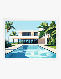
Poster moderne Oase im Mid-Century-Stil mit Pool
Translation missing: de.products.product.sale_price Ab €16,95€23,95 -

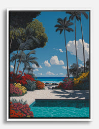
Leinwandbild Tropisches Paradies
Translation missing: de.products.product.sale_price Ab €64,95€92,95 -
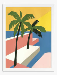
Poster Tropische Auszeit – geometrisch, kräftige Farben
Translation missing: de.products.product.sale_price Ab €16,95€23,95 -
Leinwandbild Tropische Pool-Oase
Translation missing: de.products.product.sale_price Ab €64,95€92,95 -

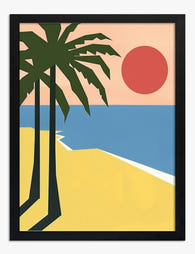
Poster tropisches Strandparadies mit Palmen
Translation missing: de.products.product.sale_price Ab €16,95€23,95 -

Poster modernes Miami-Refugium
Translation missing: de.products.product.sale_price Ab €16,95€23,95 -

Poster Moderner mediterraner Stil – türkise Tür & orangefarbener Stuhl
Translation missing: de.products.product.sale_price Ab €16,95€23,95 -
Poster moderne Oase mit Palmen und blauem Wasser
Translation missing: de.products.product.sale_price Ab €16,95€23,95 -

Poster moderne Oase mit Pool
Translation missing: de.products.product.sale_price Ab €16,95€23,95 -
Poster Tropische Oase – Palmensilhouetten am Strand
Translation missing: de.products.product.sale_price Ab €16,95€23,95 -

Poster modernes Wohnen in Miami im Mid-Century-Stil
Translation missing: de.products.product.sale_price Ab €16,95€23,95 -

Leinwandbild Tropischer Pfad
Translation missing: de.products.product.sale_price Ab €64,95€92,95 -

Poster Modernes Miami-Interieur
Translation missing: de.products.product.sale_price Ab €16,95€23,95 -

Poster Tropische Oase
Translation missing: de.products.product.sale_price Ab €16,95€23,95 -

Poster Tropische Gewächshausoase
Translation missing: de.products.product.sale_price Ab €16,95€23,95 -

Leinwandbild Tropical Vibes – Palmen vor geometrischem Hintergrund
Translation missing: de.products.product.sale_price Ab €64,95€92,95 -

Poster Palmen am Pool – Mid-Century-Flair
Translation missing: de.products.product.sale_price Ab €16,95€23,95 -

Poster Brot-Übersicht in minimalistischer Linienzeichnung
Translation missing: de.products.product.sale_price Ab €16,95€23,95 -

Leinwandbild Tropisches Gewächshaus – Grünes Refugium
Translation missing: de.products.product.sale_price Ab €64,95€92,95


Mehr aus The Frame

What to Hang in Awkward Corners
Corners are the dead zones of most homes. Your eye skims past them, furniture refuses to sit flush against them, and you end up with a triangular patch of wall...

Art for Narrow Walls and Hallways
Narrow walls are the most under-decorated surfaces in most homes. Not because they're hard to style, but because most advice treats every awkward space as the same problem when really...

What to Put on a Big Blank Wall
Big blank walls feel impossible because they multiply your options instead of narrowing them. Every idea seems plausible, nothing feels right, and the wall stays empty for another six months....