Realism vs Impressionism in Garden Art: Which Style Belongs on Your Wall?
One paints the rose petal by petal. The other paints how the rose feels at dusk.

Two paintings of the same peony can give a room entirely different energy. One feels precise and grounded, the other dreamy and atmospheric. This guide is about choosing between them, and occasionally choosing both.
The one-line difference
Realism shows you the garden. Impressionism shows you what it feels like to stand in it.
That's it. Everything else, the brushwork, the palette, the historical context, flows from that single distinction. Realist painters render the garden as the eye actually sees it, down to the veins on a leaf. Impressionists chase the fleeting impression of light, movement and atmosphere, often at the expense of fine detail.
Realism came first, emerging in mid-1800s France as a rejection of romanticised, idealised subjects. Impressionism followed in the 1870s, partly as a reaction against realism's insistence on photographic accuracy. The two have been in conversation ever since.
How each style feels in a room
A realist garden print acts as a focal point. Your eye lands on it and stays there, because there's something to study. Petal structure, the way light catches a single drop of water, the texture of soil. It rewards close looking, which is why realism garden art prints work so well in spaces where people actually pause: dining rooms, home offices, reading corners.
Impressionist garden art behaves differently. It softens a room rather than commanding it. You don't lean in to study individual brushstrokes from across a sofa, you absorb the overall mood: that hazy summer afternoon, the dappled light through a wisteria, the blur of a hundred poppies. It's wallpaper in the best sense, atmospheric rather than analytical.
This translates directly into energy. Realism brings stillness and focus. Impressionism brings movement and warmth. Neither is better. They just do different jobs.

The same garden, two ways
Picture a classic English rose garden in full bloom. Now picture how each style would render it.
Roses in realism: Every petal has weight and curl. You can see the gradient from cream to blush at the petal's edge, the tiny serrations on the leaves, the thorn on the stem. The background is usually muted or dark, throwing the flowers forward. Colours feel true to life: deep crimson, soft coral, the precise green of a glossy rose leaf.
Roses in impressionism: The flowers become dabs and strokes of pink, red and white, suggested rather than drawn. The background is alive with broken colour, lavender shadows, golden sunlight, the green not quite green. Step back and the bouquet appears. Step forward and it dissolves into pure paint.
The same logic applies to water lilies, vegetable plots, lavender fields and orchards. Realism gives you botanical accuracy. If you're a plant person who wants to identify the species on your wall, this is your style. Impressionism gives you the sensory memory of being there, the warmth on your face, the hum of bees, the smudge of colour against blue sky.
This matters for size, too. Impressionist work generally benefits from scale because the brushwork needs room to breathe. A 30x40cm impressionist piece can feel cramped. Realist work holds up at any size because the detail itself is the draw, a small realist print of a single tulip can be just as powerful as a 100x150cm canvas.
Which rooms suit which style
Realism works best in
Kitchens and dining rooms. The crispness pairs beautifully with hard surfaces (marble, brass, glossy cabinetry) and the detail gives dinner guests something to look at. A realist print of figs, lemons or kitchen herbs above a console feels intentional rather than decorative.
Home offices and studies. Focused work suits focused art. The discipline of realism mirrors the discipline of a tidy desk. Charcoal, forest green and terracotta tones complement contemporary neutrals without feeling busy.
Hallways and entrances. A statement realist piece sets a confident tone. Because it works in lower light (you're not relying on natural light to bring out colour vibrancy), it suits north-facing hallways that would dull an impressionist piece.
Modern minimalist spaces. This is where realism is currently having its moment. More on that below.
Impressionism works best in
Bedrooms. Soft brushwork and dreamy palettes are an obvious match for a restful room. Impressionist garden art at the foot of a bed reads as calm without being clinical.
Lounges and snugs. The warmth and movement of impressionism encourages lingering. It pairs particularly well with velvet sofas, layered rugs and warm lamp light.
Conservatories and garden rooms. Bringing the impression of a garden into a room that already overlooks one creates a lovely echo, especially in spring and summer when natural light is abundant.
Reading nooks and bathrooms. Anywhere you want a soft, atmospheric backdrop rather than a focal point.
A note on light. Impressionist pieces rely on you being able to see their colour. In a dim corner the magic dies. If your room is light-starved, lean realist. If you have south-facing windows or strong artificial lighting, impressionism will sing.

Can you mix realism and impressionism on one wall?
Yes, and a well-executed mix often looks more interesting than a single-style gallery. The trick is to give the wall a shared thread so the styles don't fight each other.
Use a unified palette. If your realist piece is heavy on sage and cream, choose impressionist pieces that share those tones. The eye reads the wall as one composition rather than a collision.
Match the framing. Mixed styles with mismatched frames look chaotic. Pick one frame finish (we'd suggest a slim natural oak or a matte black) and apply it across both styles. Solid wood frames with UV-protective acrylic glaze keep the wall feeling considered rather than thrown together.
Anchor with realism, fill with impressionism. A common gallery wall mistake is too many atmospheric pieces, which leaves nothing for the eye to settle on. Use one or two crisp realist prints as anchors and surround them with softer impressionist work.
Repeat the subject, vary the style. Three pieces all featuring poppies, but one realist, one impressionist and one botanical study, creates a deliberate conversation. This works far better than mixing roses, vineyards and water lilies across styles, which can feel random.
Browse the full garden art prints collection if you want to see how pieces across both movements sit together. Pulling four or five favourites into a single view is the fastest way to test whether your mix has cohesion.
Why realism is having a moment
For about fifteen years, interiors leaned heavily into the soft, the abstract and the atmospheric. Plaster pinks, ambiguous shapes, hazy landscapes. Impressionism fitted that mood perfectly.
The pendulum has swung. Contemporary interiors are moving toward sharper edges, richer contrasts and a renewed appetite for craftsmanship. Realism reads as confident and considered in a way that pure abstraction sometimes doesn't. There's also something quietly defiant about hanging a beautifully rendered, technically accomplished piece on the wall when so much visual culture is fast and disposable.
Realism also photographs well, which matters more than anyone wants to admit. Detail translates to a phone screen. A subtle impressionist haze can look muddy in a poorly lit Instagram post.
You'll see this play out in current trend-led spaces: pared-back kitchens with a single botanical realist print, home offices anchored by a detailed study of a fig or a fern, dining rooms where a hyper-real bouquet replaces the predictable landscape. It's the kind of art that makes guests ask where you got it.
The reproduction question matters here too. Impressionism is forgiving in print, the brushwork was never meant to be read pixel-by-pixel, so a good giclée copy holds up beautifully. Realism is less forgiving. Detail must stay sharp at any size, which is why printing on thick matte paper with high-resolution giclée presses (and avoiding glossy finishes that throw glare) matters more for realist work than impressionist.

Our favourite realism garden prints (and a few impressionist picks)
Realism to start with
Detailed rose studies. A single bloom against a dark background is one of the most timeless wall art choices you can make. Works in almost any room, scales beautifully from 30x40cm up to 70x100cm. Pair with a slim black frame.
Vegetable garden compositions. Heirloom tomatoes, artichokes, garlic bulbs, rendered with botanical precision. Excellent for kitchens and dining rooms. The earthy palette (terracotta, deep green, ivory) sits naturally with most cabinetry.
Single-stem botanical studies. Closer to scientific illustration than fine art, these have a calm clarity that suits home offices and bathrooms. Often work best as a series of three or four in matching frames.
Realist still lifes with garden flowers. Peonies in a glass jug, hydrangeas on a wooden table. The realism extends beyond the flowers to the surfaces and shadows, which gives the piece weight.
Explore more in the realism garden art prints collection.
Impressionism worth considering
Water lily pond pieces. The obvious choice for a reason. Look for ones with strong compositional structure rather than pure colour wash, so the piece has somewhere for the eye to rest.
Poppy fields. Endless variations exist, but the best ones have a clear horizon line and a real sense of depth. Excellent at large sizes, less effective small.
Cottage garden scenes. Loose, layered planting rendered with quick, confident brushwork. Suits bedrooms and country-leaning interiors.
Orchard and blossom pieces. Spring trees in full bloom, with that characteristic impressionist haze of pinks, whites and pale green. A canvas print in 100x150cm makes a serious statement above a sofa.
The full impressionism garden art prints collection is the easiest place to browse these side by side.
A seasonal rotation idea
If you're the sort of person who rearranges, consider rotating styles by season. Impressionist garden art in spring and summer keeps the room feeling light and alive. Switch to realist botanical studies in autumn and winter, when the detail and richer palette feel more appropriate to the season. Two prints, same frame, swap once or twice a year. Cheaper than redecorating.
For something between the two styles, the botanical art prints collection sits in interesting territory: more illustrative than full realism, more precise than impressionism, often the easiest place to start if you can't decide.

How to actually decide
If you remember nothing else: realism for focus, impressionism for mood. Choose realism for rooms where you want the art to lead. Choose impressionism for rooms where you want the art to atmosphere.
When in doubt, hold up the image you're considering, step back to where you'd actually view it from, and ask whether you want to study it or sit beside it. Your honest answer is your style.

In diesem Blog vorgestellte Fab-Produkte
-

Poster Wilder Garten von Gustav Klimt
Translation missing: de.products.product.sale_price Ab €16,95€23,95 -

Poster Frühlingsgarten von Gustav Klimt
Translation missing: de.products.product.sale_price Ab €16,95€23,95 -

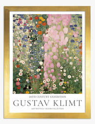
Poster Rosa Garten von Gustav Klimt
Translation missing: de.products.product.sale_price Ab €16,95€23,95 -
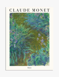
Poster Monets Irisgarten
Translation missing: de.products.product.sale_price Ab €16,95€23,95 -

Leinwandbild Gartenweg von Van Gogh
Translation missing: de.products.product.sale_price Ab €64,95€92,95 -

Poster Impressionistische Landschaft – im Stil Renoirs
Translation missing: de.products.product.sale_price Ab €16,95€23,95 -

Poster Gartenspaziergang von Renoir
Translation missing: de.products.product.sale_price Ab €16,95€23,95 -

Poster Monets Garten in Giverny
Translation missing: de.products.product.sale_price Ab €16,95€23,95 -

Poster Gartenweg von Vincent van Gogh
Translation missing: de.products.product.sale_price Ab €16,95€23,95 -

Leinwandbild Klimts Wilder Garten
Translation missing: de.products.product.sale_price Ab €64,95€92,95 -
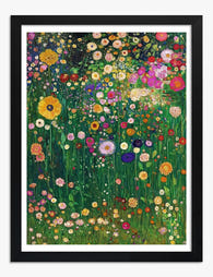
Poster Klimts Wildblumengarten
Translation missing: de.products.product.sale_price Ab €16,95€23,95 -

Poster Van Goghs Gartenstimmung
Translation missing: de.products.product.sale_price Ab €16,95€23,95 -

Leinwandbild Klimts Farbenfroher Garten
Translation missing: de.products.product.sale_price Ab €64,95€92,95 -

Leinwandbild Klimts verzauberter Garten
Translation missing: de.products.product.sale_price Ab €64,95€92,95 -
Poster Gartenzauber von Gustav Klimt
Translation missing: de.products.product.sale_price Ab €16,95€23,95 -

Poster Bauerngarten von Klimt
Translation missing: de.products.product.sale_price Ab €16,95€23,95 -

Leinwandbild Klimts Gartenidylle
Translation missing: de.products.product.sale_price Ab €64,95€92,95 -

Leinwandbild Klimts Gartenblüte
Translation missing: de.products.product.sale_price Ab €64,95€92,95 -

Leinwandbild Klimts blühender Garten
Translation missing: de.products.product.sale_price Ab €64,95€92,95 -

Poster Blumengarten von Gustav Klimt
Translation missing: de.products.product.sale_price Ab €16,95€23,95


Mehr aus The Frame

Arts and Crafts Animal Prints: The Victorian De...
The Arts and Crafts revival: why Victorian animal prints are trending again Scroll through any interior design hashtag right now and you'll see them everywhere: hares peering through curling foliage,...

You're Overthinking Your Arts and Crafts Galler...
Most gallery wall advice assumes you're working with clean, simple imagery. Photographs. Line drawings. Quiet little prints with breathing room baked in. Arts and Crafts prints are the opposite of...

Watercolor Painting Styles Explained: From Bota...
A quick primer on why watercolour looks the way it does Watercolour behaves unlike any other medium. Pigment suspended in water, applied to absorbent paper, with the artist controlling roughly...