Stop Making Your Leaf Prints Look Like a Textbook: A Gallery Wall Guide
How to curate a leaf gallery wall that feels editorial and intentional, not like a Year 9 biology poster.

Leaf prints have a specific failure mode. Hang three or four of them together without thinking, and your living room starts to resemble a botany lecture. The fix is curation, not more prints.
The problem with most botanical gallery walls
The textbook look happens when prints are too similar in tone but too different in style. You end up with what looks like a labelled specimen chart: each leaf isolated, centred, scientifically rendered, and side by side with another leaf doing exactly the same thing. The eye reads it as information, not art.
The other common failure is the opposite. People panic about looking too academic, so they throw in a random palm sketch, a vintage fern lithograph, a modern monstera line drawing, and a watercolour eucalyptus. Now nothing relates to anything. It looks like four people decorated the wall.
Good leaf gallery walls sit in the middle. They have a clear throughline that ties everything together, and enough variation in scale, density, or treatment that your eye has somewhere to travel. That's the whole game.

Picking a throughline: colour, style, or species
Before you choose a single print, pick one unifying element. Just one. Three or more, and you'll be stuck searching forever for prints that hit every criterion. Here are the three that actually work.
Colour as the throughline
The most forgiving option. Decide on a tonal range and stick to it. Something like sage green to forest green, or warm neutrals (cream, ochre, soft brown) for a more vintage feel. With colour locked, you can mix detailed illustrations with minimalist line work and it will still feel cohesive.
This is the route to take if you want a year-round wall, not a seasonal one. Skip the orange and rust autumn palette unless you genuinely want to redecorate twice a year.
Style as the throughline
All line drawings. All watercolours. All photographic prints on dark backgrounds. The species can vary wildly (a fig leaf next to a fern next to a eucalyptus branch) but the visual treatment keeps the wall calm. This is the easiest way to make leaf art feel contemporary rather than dated. Minimalist leaf art is particularly forgiving here because the negative space does most of the work.
Species as the throughline
The riskiest, but the most striking when it lands. Pick one plant family (palms, monsteras, ferns) and collect different interpretations: a detailed ink illustration, a flat graphic version, a cropped photographic close-up. The variation in treatment stops it feeling like a field guide. The variation in species is what you've avoided, so the wall reads as a considered study rather than a random selection.
Our take: if you're new to gallery walls, choose colour. It's the most forgiving and the hardest to get wrong.
The best size combinations for a 3, 5, or 7-piece leaf gallery wall
Sizes are where most guides go vague. Here are combinations that actually work, using standard print sizes you can buy.
Three-piece wall
Three is the friendliest number for a first gallery wall. Two layouts to consider:
- Triptych row: three prints at 50x70cm, hung in a horizontal line with 5cm between them. Clean, museum-style, works above a sofa or sideboard.
- Asymmetric trio: one large 70x100cm print on the left, two smaller 30x40cm prints stacked on the right. Feels more editorial and less symmetrical.
Total wall width for the triptych is roughly 160cm. Plan for that.
Five-piece wall
Five is where things get interesting and where people most often go wrong. The trick is to vary sizes deliberately.
- The classic mix: one 60x80cm anchor, two 40x50cm mid-size prints, two 30x40cm smaller prints. Arrange with the anchor slightly off-centre.
- The grid: four 40x50cm prints in a 2x2 grid plus one 50x70cm print to the side. Works beautifully in a hallway.
Vary print density too. If your anchor is detailed and busy, the smaller prints should be quieter (a single leaf on white, for example). The eye needs rest.
Seven-piece wall
Seven prints needs real planning. Don't attempt this above a small piece of furniture. You want at least 200cm of clear wall.
- One 70x100cm anchor
- Two 50x70cm prints flanking
- Four 30x40cm prints filling the corners and gaps
Think of it as a rough rectangle with the largest print pulling slightly off-centre. Keep spacing consistent at 5 to 6cm between every print, regardless of size. Inconsistent gaps are the single fastest way to make a gallery wall look amateur.
For pre-curated combinations that already balance scale, wall art sets take the guesswork out entirely.

Mixing minimalist leaf art with more detailed botanical prints
This is the move that separates a polished gallery wall from a flat one. All minimalist line drawings together can feel sterile. All detailed botanical illustrations together can feel heavy and academic. Mixing them gives you contrast.
The rule we follow: roughly 60% in one camp, 40% in the other. If you want a modern, airy feel, lean minimalist with one or two detailed prints as visual anchors. If you want a warmer, library-style wall, lean detailed and use minimalist prints as breathing space.
Keep the colour palette tight when you mix styles. A detailed sage green watercolour and a minimalist sage green line drawing read as siblings. The same two prints in clashing greens read as strangers. Browse botanical leaf prints with one specific tone in mind rather than scrolling open-endedly.
A note on matting: detailed botanical illustrations almost always look better with a generous white mount inside the frame. It gives the image room to breathe and signals "considered" rather than "filled to the edges". Minimalist prints can go either way. Frame to the edge for a sharper modern feel, mount for something softer.
Frame consistency vs frame contrast: our recommendation
Match your frames. We'll caveat this in a second, but as a default rule, matching frames is what gives a gallery wall its polish. The variation should come from the prints, not the frames.
Match means same wood, same finish, same profile width. Black, natural oak, and white are the three finishes that work hardest for leaf art. Black makes greens look richer and more graphic. Natural oak warms everything up and reads contemporary. White disappears into the wall and lets the prints take over.
The caveat: you can absolutely mix two frame finishes if you do it deliberately. The pattern that works is alternating two colours (say, black and oak) in a visually balanced way, not scattered randomly. Three or more frame finishes is almost always a mistake.
What matters more than the finish itself is build quality. Frames made from solid wood (rather than MDF wrapped in plastic veneer) sit flatter on the wall and don't warp over time, which matters when you've got seven of them lined up and any inconsistency is visible. UV-protective glazing also matters for leaf prints specifically because greens are particularly prone to fading in direct sunlight, and most leaf gallery walls end up in the brightest rooms in the house.
Step-by-step layout: map it on the floor before you pick up a hammer
Do not start hammering. The single most common gallery wall mistake is committing to positions before testing them.
Step 1: Lay it out on the floor
Clear a floor space the same size as your wall. Arrange your prints exactly as you want them on the wall, with realistic spacing (5 to 6cm between frames). Step back. Take a photo from directly above. Look at the photo on your phone. You will see imbalances you cannot see from floor level.
Step 2: Trace and tape
Cut paper templates the exact size of each frame. Brown parcel paper or old newspaper works. Stick them to the wall with masking tape in your chosen layout. Live with it for a day. Walk past it. See how it sits with your furniture.
Step 3: Get the height right
The professional standard is to hang artwork so the centre of the piece (or the centre of the overall arrangement, for a gallery wall) sits at roughly 145cm from the floor. This is eye level for the average adult.
If you're hanging above furniture, the bottom of the lowest frame should sit 15 to 25cm above the top of the sofa, console, or headboard. Closer than 15cm and the art looks like it's resting on the furniture. Further than 25cm and the wall above starts to feel disconnected.
Step 4: Measure twice, hammer once
Mark hanging points on the paper templates, drill or hammer through the paper, then tear the paper away. The fixings end up exactly where you planned. This is the single most useful trick in this entire guide.
Step 5: Use a spirit level
Phone levels are fine for a single print. For a gallery wall, borrow or buy a proper spirit level. Frames that are 2 degrees off look drunk, and your eye will catch it every time you walk into the room.

Where to hang it: the rooms where leaf gallery walls work hardest
Leaf prints are versatile, but they're not equally suited to every room. Here's where they pull their weight.
Living rooms
The obvious choice, and usually the right one. Above a sofa is the classic placement. Aim for an arrangement that's roughly two-thirds the width of the sofa, centred horizontally. Anything narrower looks lost. Anything wider competes with the furniture.
Living rooms also tend to have the best natural light, which leaf prints reward. Greens look noticeably different in morning light versus afternoon light, and a well-placed gallery wall becomes something you actually look at rather than scenery.
Bedrooms
Above the headboard is excellent territory for leaf art because the subject matter is calming. Stick to softer treatments here: watercolours, muted line drawings, ferns rather than spiky monsteras. High-contrast graphic leaf prints can feel too energetic in a space meant for sleep.
Hallways and staircases
Long, narrow walls are perfect for leaves art prints because the repetition of similar subject matter actually reads as elegant in a corridor, where you walk past rather than sit and contemplate. A row of five matching frames at consistent height is one of the easiest gallery walls to pull off.
Bathrooms and kitchens
Counterintuitive but effective. Canvas prints in particular handle the humidity of a bathroom well, and a small cluster of leaf art near the bath softens what's often a hard, tiled space. Just keep prints away from direct splash zones.
Home offices
Detailed botanical illustrations work brilliantly here. The studious quality you want to avoid in a living room is actually an asset in a workspace. Lean into the library aesthetic. Mounted prints, matching dark wood frames, three to five pieces tightly grouped.
Where leaf walls don't work as well
Dining rooms with strong colour stories already in play. Rooms with very little natural light (greens go muddy). Walls that face a window directly with no curtains, where glare and fade become real problems even with UV-protective glazing.

A few final principles
Limit yourself before you browse. Decide on the throughline, the room, the size, and the rough layout before you start choosing prints. Open-ended browsing is how you end up with seven prints that don't speak to each other.
Buy your prints together rather than over time. Colours and paper finishes vary between batches and suppliers, and a wall built from prints bought across two years rarely has the visual consistency of a wall built in one go.
And give yourself permission to live with the paper templates for a few days before committing. Gallery walls are one of the few decorating decisions you genuinely cannot rush, and the ones that look effortless almost always took the longest to plan.

In diesem Blog vorgestellte Fab-Produkte
-
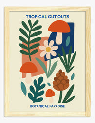
Poster botanische Tropen-Collage
Translation missing: de.products.product.sale_price Ab €16,95€23,95 -

Leinwandbild Botanische Lehrtafel
Translation missing: de.products.product.sale_price Ab €64,95€92,95 -

Leinwandbild Eklektischer Urban Jungle
Translation missing: de.products.product.sale_price Ab €64,95€92,95 -

Poster Britische botanische Landschaft
Translation missing: de.products.product.sale_price Ab €16,95€23,95 -

Poster Wellenförmiges botanisches Blatt
Translation missing: de.products.product.sale_price Ab €16,95€23,95 -

Leinwandbild Boho-Blätter in Erdtönen
Translation missing: de.products.product.sale_price Ab €64,95€92,95 -

Poster Modernes botanisches Blattmotiv in Grün
Translation missing: de.products.product.sale_price Ab €16,95€23,95 -
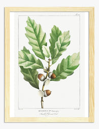
Poster elegante botanische Eichenblattstudie
Translation missing: de.products.product.sale_price Ab €16,95€23,95 -

Poster Botanische Boho-Harmonie
Translation missing: de.products.product.sale_price Ab €16,95€23,95 -

Poster Botanische Treppe
Translation missing: de.products.product.sale_price Ab €16,95€23,95 -

Poster botanische Lehrtafel im Vintage-Stil
Translation missing: de.products.product.sale_price Ab €16,95€23,95 -

Leinwandbild Moderne Boho-Blattsilhouette in Terrakotta
Translation missing: de.products.product.sale_price Ab €64,95€92,95 -

Leinwandbild Botanisches Eichenlaub & Eicheln
Translation missing: de.products.product.sale_price Ab €64,95€92,95 -

Leinwandbild Botanisches Motiv in Heritage-Grün
Translation missing: de.products.product.sale_price Ab €64,95€92,95 -

Leinwandbild Botanisches Grün im Heritage-Stil
Translation missing: de.products.product.sale_price Ab €64,95€92,95 -

Poster Zimmerpflanzen auf Sonnengelb
Translation missing: de.products.product.sale_price Ab €16,95€23,95 -

Leinwandbild Üppige botanische Blätter
Translation missing: de.products.product.sale_price Ab €64,95€92,95 -

Leinwandbild Harmonie der grünen Blätter
Translation missing: de.products.product.sale_price Ab €64,95€92,95 -

Leinwandbild Botanische Blätter in Line Art
Translation missing: de.products.product.sale_price Ab €64,95€92,95


Mehr aus The Frame

Planned or Organic? Building Your Amalfi Coast ...
A great Amalfi Coast gallery wall does two things at once: it transports you, and it looks like it belongs in your home. Most attempts fail because people buy beautiful...

The Citrus Wall Art Edit: Our Curated Picks for...
Citrus prints have a reputation problem. Done badly, they tip a room into themed-restaurant territory in about three frames flat. Done well, they bring warmth, graphic punch and a slightly...

The Biggest Animal Wall Art Mistake and What to...
Most animal gallery walls fail for one reason: people pick prints they love individually, hang them together, and end up with something that looks like a primary school corridor. The...