Warm Minimalism: Restraint Without Coldness
A philosophical, art-led guide to choosing wall art that feels calm and considered without tipping into cold or clinical.

Warm minimalism is what happens when minimalism remembers it's meant for humans. It keeps the discipline, the breathing room, the refusal to clutter, but swaps out the gallery-white sterility for something you actually want to come home to. The hardest part is the calibration: too restrained and you're back in a showroom, too cosy and you've lost the point entirely.
What warm minimalism actually is
The original minimalism, the one descended from Donald Judd and the mid-century austerity movement, was a philosophical position before it was a decorating style. It was about removing everything non-essential to reveal form, line and material in their purest state. Beautiful in a museum. Slightly punishing in a lounge.
Warm minimalism is the correction. It keeps the editing instinct (fewer objects, more space, no visual noise) but rejects the idea that "essential" must mean "cold." It borrows from Scandinavian hygge, from Japanese wabi-sabi, from organic modernism, and arrives at something that feels considered but lived-in.
The clearest definition we've found: warm minimalism is restraint guided by feeling rather than rules. Cold minimalism asks "can I remove this?" Warm minimalism asks "does this earn its place by making the room feel more human?"
Warm minimalism vs soft minimalism vs Japandi
These terms get used interchangeably and they shouldn't be. Soft minimalism interior design is the broader umbrella, anything that softens minimalist principles with curves, textiles or muted colour. Warm minimalism is specifically about temperature: earthy palettes, natural materials, golden undertones. Japandi is a specific fusion of Japanese restraint and Scandinavian warmth, often more graphic and contrast-driven than warm minimalism proper.
If you're choosing art, the distinction matters. A high-contrast Japandi print can read as cold in a fully warm minimalist room. A soft, curvy abstract might feel too loose in a Japandi space.

Why this aesthetic resonates right now
Warm minimalism isn't an arbitrary trend. It's a direct response to two exhausting conditions: visual overstimulation from screens, and the realisation that the all-white minimalism of the 2010s often felt like living inside a stock photo.
People want calm. They also want their homes to feel like theirs. Warm minimalism is the answer that doesn't require choosing between the two. It's why the aesthetic has stuck around through several trend cycles and why it reads as timeless rather than faddish. The principles (natural materials, restrained palettes, human-centred design) predate the hashtag by about a century.
The colour palette, properly explained
Most guides will hand you a list: beige, terracotta, cream, oatmeal, sage. Fine, but useless without understanding why those colours work and when they don't.
Undertones decide everything
Every neutral has an undertone, and the undertone decides temperature. A beige with a pink or yellow base reads warm. A beige with a grey or green base reads cold (this is why so many "greige" paints feel clinical despite being technically neutral). The same applies to whites: a chalky off-white with a yellow undertone feels enveloping, while a blue-white feels surgical.
When you're choosing warm minimalist wall art, hold it against the wall it'll live on and check whether the undertones agree. A print full of cool greys against a warm cream wall will fight the room, even if both are technically "neutral."
The working palette
The reliable warm minimalist palette runs through:
- Chalky off-whites with yellow or pink undertones (not blue-white)
- Oatmeal and bone for backgrounds and large surfaces
- Clay, terracotta and rust for moments of saturation
- Ochre and mustard sparingly, usually in art rather than walls
- Sage, olive and muted moss as the "cool" anchor that still reads warm
- Soft black or warm charcoal for grounding contrast (never a true cold black)
The trick is letting one or two of these dominate and using the others as accents. A room with all of them at equal volume becomes a swatch book.
What makes art feel warm vs cold
This is the part most guides skip. They tell you to "add texture" without explaining why texture matters or how to read it in a piece of art.
Organic vs geometric form
Hard-edged geometric shapes, perfect circles, ruler-straight lines: these read as cold. Not bad, just cold. Hand-drawn lines, organic curves, shapes that look like they were made by a person rather than a machine, these read as warm. A warm minimal aesthetic almost always favours the slightly imperfect line over the perfectly rendered one.
This is wabi-sabi at work. The Japanese aesthetic principle that finds beauty in imperfection and impermanence is the philosophical backbone of warm minimalism, whether people realise it or not.
Matte over gloss
Glossy finishes reflect light sharply and read as cold and synthetic. Matte surfaces absorb light and feel tactile even from across the room. This is one reason we print our art prints on thick matte paper rather than anything glossy. Glare flattens nuance, and warm minimalism lives in nuance.
Visible texture and gesture
A print where you can see the brushstroke, the paper grain, or the subtle inconsistency of pigment feels warm because it carries evidence of being made. A perfectly flat digital gradient feels cold because it doesn't. This is why abstract art often anchors warm minimalist rooms so effectively: gestural marks, layered washes and visible surface read as human.
Canvas adds another dimension here. The weave catches light differently across the surface and adds physical depth that a print on paper can't quite match. In a room that's already restrained, that subtle texture does a lot of emotional heavy lifting.

A framework for choosing warm minimalist art
Stop scrolling and asking "do I like this?" Start asking these questions instead.
1. Does the palette have warm undertones? Even a piece dominated by white or grey can read warm if the undertones are right. Check for the yellow, pink, ochre or earth pulling underneath.
2. Is there evidence of the hand? Brushstrokes, ink bleed, irregular edges, visible texture. Not necessarily messy, but not machine-perfect either.
3. Are the shapes organic or geometric? Neither is wrong, but organic forms (curves, blobs, soft horizons, suggestions of landscape) lean warmer. Sharp geometry leans cooler.
4. Does it have negative space? Warm minimalism needs breathing room. A piece that fills every centimetre with content, however muted, isn't minimal.
5. Would you describe it as "quiet"? This is the test. Warm minimalist art doesn't shout, but it isn't silent either. It hums.
If a piece passes four out of five, it'll work. Three out of five and you're on the edge of another aesthetic entirely.
Scale, placement and negative space
Restraint doesn't mean small. One of the biggest mistakes people make in minimalist rooms is hanging art that's too modest for the space, hoping smallness equals minimalism. It doesn't. It just looks tentative.
Sizing for presence
Above a sofa or bed, your art should span roughly two-thirds of the furniture's width. For a standard three-seater, that means a single piece around 80x100cm or 100x70cm, or a pair sized to read as one composition. For statement walls in lounges or hallways, go bigger: a 100x150cm canvas can anchor a whole room without adding visual clutter, because it's one object rather than several.
A larger single piece reads as more minimal than a cluster of small ones, even though it takes up more wall. The eye registers one decision instead of many.
Letting walls breathe
Negative space in warm minimalism isn't emptiness, it's pause. The wall around a piece is part of the composition. Resist the urge to fill the corners of every room. A blank wall in a warm minimalist home isn't unfinished. It's the rest between notes.
The exception is a considered gallery wall, which we'll come to.
Texture is the secret weapon
If we had to name the single most important element separating warm minimalism from cold minimalism, it would be physical texture. Not pattern. Texture.
The matte paper we print on has a subtle tooth that catches raking light. Canvas has weave. A solid FSC-certified wood frame has grain that no veneer or MDF can fake. These small physical realities add up to a room that feels warm even when the palette is pared back to almost nothing.
Synthetic materials and glossy surfaces undo this. A high-gloss frame, a slick acrylic face mount, a print on flimsy stock: all technically minimalist, all cold. The materials matter as much as the image.
This is also where botanical and nature-referencing pieces earn their place. A muted, abstracted plant study on textured paper brings the organic warmth of the natural world into the room without leaning into farmhouse or cottage territory.
Layering art without losing restraint
Gallery walls and minimalism seem like opposites. They don't have to be.
The rule: a warm minimalist gallery wall is a single composition made of multiple pieces, not multiple pieces hung near each other. That means:
- A tight, consistent palette across all pieces
- Frames in the same finish (mixing oak and black is fine, mixing five woods is not)
- Generous spacing between pieces, usually 5-8cm
- An odd number of pieces, or a deliberately symmetrical pair
- One dominant piece that anchors the rest
Three pieces tend to work better than five. Five better than seven. The more pieces you add, the harder the restraint becomes to maintain.

Common mistakes that push you into the wrong territory
Mistake one: confusing beige with warm. Cool beige exists and it's everywhere. If a colour feels slightly chalky or slightly grey, check the undertone before committing.
Mistake two: under-scaling. Small art in a minimalist room looks like you couldn't decide. Go larger than feels safe.
Mistake three: too many pieces. Warm doesn't mean cluttered. If you can't see the wall, you've crossed into another aesthetic.
Mistake four: glossy finishes. Acrylic face mounts, lacquered frames, high-gloss prints. All cold, even in warm palettes.
Mistake five: thin or hollow frames. Cheap framing reads as cheap regardless of how good the art is. Solid wood frames make a measurable difference. So does the print being properly fitted in the first place, with no warping, no bubbling, no gap between the print and the frame.
Mistake six: matching everything too tightly. Warm minimalism allows variation. If every piece of art uses the exact same three colours as your sofa and rug, the room becomes a mood board rather than a home.
Building a collection slowly
Warm minimalism rewards patience. A room with three considered pieces beats a room with twelve impulse buys, every time. If you're starting out:
- Choose the largest piece first, for the main wall in your most-used room. Get it right.
- Live with it for a few weeks before buying anything else.
- Add secondary pieces only where they earn their place, not to fill walls.
- Allow your taste to evolve. The best warm minimalist collections are built over years, not weekends.
The 99-day return window we offer exists partly for this reason. Art looks different on a wall than on a screen, and the only honest way to know if something works is to put it up and live with it for a while.
Is warm minimalism timeless?
Yes, with caveats. The underlying principles (restraint, natural materials, human-centred design, attention to undertones) are timeless because they're rooted in how people actually want to feel in their homes. The specific palette of clay and oatmeal and sage will eventually feel of-its-moment, the way 2010s greige does now.
The way to future-proof your space is to invest in the principles, not the trend keywords. Choose art with evidence of the hand. Print on materials that feel good. Frame in solid wood. Let the wall breathe. Whatever the next decade calls itself, those choices will still read as considered.

Where to start
Pick one wall. The one you look at most. Decide whether it wants a single large anchor piece or a tight trio. Hold sample undertones against it before you commit. Choose art with visible texture, organic form and quiet confidence. Frame it properly, in solid wood, and hang it at eye level. Then leave the rest of the walls alone for a month and see how the room feels.
That's the discipline. Warmth comes from doing less, better.

In diesem Blog vorgestellte Fab-Produkte
-
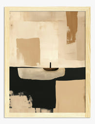
Poster Minimalistische Dämmerung in warmen Tönen
Translation missing: de.products.product.sale_price Ab €16,95€23,95 -

Leinwandbild Warme Dämmerung – minimalistisch in Beige und Braun
Translation missing: de.products.product.sale_price Ab €64,95€92,95 -

Poster Soft Harmony Minimal – Abstrakt in Beige und Weiß
Translation missing: de.products.product.sale_price Ab €16,95€23,95 -

Poster Minimalistische Kontur – Organische Form in Erdtönen
Translation missing: de.products.product.sale_price Ab €16,95€23,95 -

Poster stille Winterbegegnung
Translation missing: de.products.product.sale_price Ab €16,95€23,95 -

Poster Ausgewogener Minimalismus – Handgezeichnete Linien
Translation missing: de.products.product.sale_price Ab €16,95€23,95 -

Poster Modernes, abstraktes Stillleben in sanften Naturtönen
Translation missing: de.products.product.sale_price Ab €16,95€23,95 -

Poster Goldenes Band – Minimalistisches Design
Translation missing: de.products.product.sale_price Ab €16,95€23,95 -

Poster Minimalistische schwarze Kaffeetasse in Beige
Translation missing: de.products.product.sale_price Ab €16,95€23,95 -
Poster Minimalistische Muse
Translation missing: de.products.product.sale_price Ab €16,95€23,95 -

Poster Soft Sand – Minimalistische abstrakte Kunst
Translation missing: de.products.product.sale_price Ab €16,95€23,95 -

Poster Sanfte Kurven – Minimalistische weiße Linien in Beige
Translation missing: de.products.product.sale_price Ab €16,95€23,95 -

Poster Skandinavische organische Linien in Taupe & Creme
Translation missing: de.products.product.sale_price Ab €16,95€23,95 -

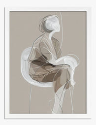
Poster Minimalistische Muse – Linienzeichnung einer Frau
Translation missing: de.products.product.sale_price Ab €16,95€23,95 -

Poster Ruhende Figur in Neutraltönen
Translation missing: de.products.product.sale_price Ab €16,95€23,95 -

Poster Ruhende Frau im grünen Sessel
Translation missing: de.products.product.sale_price Ab €16,95€23,95 -

Poster Abstrakte Minimalform mit weichen Kanten
Translation missing: de.products.product.sale_price Ab €16,95€23,95 -

Leinwandbild Sanfte minimalistische Formen auf warmem Beige
Translation missing: de.products.product.sale_price Ab €64,95€92,95 -

Poster Nachdenkliche Ruhe – Frauenporträt
Translation missing: de.products.product.sale_price Ab €16,95€23,95 -

Poster modernistische Wohnzimmeroase im Sonnenlicht
Translation missing: de.products.product.sale_price Ab €16,95€23,95


Mehr aus The Frame

Creative Studio: Colour and Personality, on Pur...
Most maximalism advice treats colour like a costume. Pile it on, mix the patterns, call it personality. But a creative studio is not a stage set. It is the room...

The Boutique Hotel Feel at Home: What to Copy, ...
There's a specific feeling you get walking into a good boutique hotel. The lobby art makes you stop. The bedroom print feels like it was chosen for that exact room....

Mediterranean Escape: Terracotta, Sage, and the...
There's a reason the same three colours keep showing up in every Mediterranean room you've pinned. Terracotta, sage green, and warm white aren't just pretty together. They're a coded language...