Abstract vs Geometric Patterns: Which Wall Art Style Suits Your Space?
A practical guide to choosing between crisp lines and free-flowing forms, and how to confidently mix the two.

Most shoppers stall at the same point: do you want clean shapes that feel ordered, or expressive forms that feel alive? Both belong to the same broad family of non-representational art, but they create very different rooms. Here's how to tell them apart, where each one shines, and why the line between them blurs more than you'd expect.
Defining the terms: what counts as abstract vs geometric
Geometric pattern art is built on structure. Think circles, triangles, grids, repeating shapes, hard edges, and mathematical precision. The visual language is borrowed from architecture and design movements like Bauhaus, mid-century modern, and Memphis. You can usually trace every line with a ruler.
Abstract pattern art is the opposite impulse. It's fluid, organic, gestural, and emotion-led. Brushstrokes wander. Colours bleed. Shapes suggest things rather than define them. Think watercolour washes, expressive marks, biomorphic forms, and the kind of compositions that look effortless but reward a long stare.
The honest answer to "what are abstract patterns" is: any non-representational composition that prioritises mood, movement, or feeling over precise structure. Geometric patterns are technically a subset of abstract art, but the look and feel is so different that treating them as separate categories makes practical sense for decorating.
A useful shorthand: geometric is crisp, abstract is flowing. Geometric is structured, abstract is spontaneous. If you can imagine the artist using a compass and a set square, it's geometric. If you can imagine them with a wide brush and loose wrist, it's abstract.
Sub-styles worth knowing
Within geometric, you'll find mid-century modern (warm tones, simple shapes, often Scandinavian-inflected), Bauhaus (primary colours, strict grids), and Memphis design (playful, clashing, postmodern). Within abstract, you'll see colour field work (large planes of soft colour), expressionist brushstroke pieces, watercolour flows, and organic biomorphic shapes that echo natural forms.
Knowing the sub-style helps you shop with intent. "Geometric" is too broad. "Mid-century geometric in mustard and teal" is a brief.

The visual difference on a wall
Hung side by side, the contrast is immediate. A geometric print pulls your eye to its edges and corners. You read it almost like a diagram. The composition has anchor points, and the image holds itself together with internal logic.
An abstract print does the opposite. Your eye drifts. There's no obvious entry point, no clear hierarchy. You linger on a colour transition, then a textured patch, then a stray mark. Abstract pieces tend to feel larger than they are because they don't contain themselves the way geometric work does.
This matters for placement. Geometric prints look strong as solo statements above a sofa, console, or bed because they hold the wall with confidence. Abstract prints often work better in pairs or trios because the eye wants to keep moving, and a series gives it somewhere to go.
Geometric work also reads well from across the room. An abstract piece tends to reward closer viewing, where the texture of brushwork or the layering of washes becomes visible. If you're hanging art in a hallway you mostly walk past, geometric tends to land harder. If you're hanging it where you'll sit for hours, abstract often gives more back.
Which rooms suit geometric precision
Geometric works best in rooms where you want clarity, focus, or a sense of order. There's a reason offices, kitchens, and entryways tend to favour structured imagery. The eye reads geometric quickly, which means it doesn't compete for attention while you're chopping onions or signing for a parcel.
Home offices. A clean geometric piece, ideally in a calm palette of sage, navy, terracotta, or muted ochre, helps the room feel composed without becoming busy. You want art that supports concentration rather than pulls you out of it. Look at our geometric art prints for examples that anchor a desk wall without demanding constant attention.
Kitchens and dining rooms. Hard edges and bold shapes hold up against the visual noise of appliances, tiles, and tableware. A 50x70cm framed geometric print above a dining sideboard pulls a room together. In humid kitchens, canvas can be a smarter pick than framed prints because there's no glazing to mist up and no paper to react to steam.
Hallways and entryways. These are quick-glance spaces. Geometric reads in two seconds, which is exactly what you need when you're walking through. A vertical 40x50cm or 50x70cm piece above a console works hard for its size.
Modern minimalist living rooms. If your space leans towards clean lines, low-slung furniture, and restrained palettes, geometric extends that visual logic. It feels native rather than imposed.
The emotional register of geometric is calm, ordered, focused. It's the design equivalent of a tidy desk.

Which rooms suit freeform abstract patterns
Abstract thrives where you want emotion, atmosphere, and depth. These are rooms where you slow down, where conversations happen, where you read a book or fall asleep. Abstract art rewards lingering, which is exactly what these spaces are for.
Bedrooms. A soft abstract piece in dusty pink, sage, or warm grey above the bed creates a mood without shouting. Watercolour washes and gestural brushwork feel restful in a way that crisp geometry rarely does. Scale up here. A 70x100cm framed print or a 100x150cm canvas above a king bed grounds the room.
Living rooms and lounges. Abstract pieces become conversation pieces. They invite interpretation, which means guests look at them, ask about them, and respond to them. If you want a room that feels personal and considered, abstract earns its place.
Creative spaces and studios. If you paint, write, or make, abstract art tends to stimulate rather than discipline. Expressive brushwork mirrors the energy of the work you're doing in the room.
Bathrooms and bedrooms with awkward light. Abstract forgives uneven lighting in a way geometric doesn't. A skewed grid in poor light looks wrong. A gestural abstract piece just looks moody. Canvas works particularly well in bathrooms because it tolerates humidity and there's no glazing to deal with.
The emotional register of abstract is expressive, individual, atmospheric. Browse our abstract pattern art prints if you're trying to find a piece with that quality of slow, rewarding looking.
How to mix both styles in a gallery wall without chaos
This is where most guides give up. The truth is that mixing geometric and abstract is one of the most reliable ways to make a gallery wall feel intentional rather than accidental. The two styles balance each other. Geometric gives the wall its bones. Abstract gives it its breath.
Use geometric as the anchor
Pick your largest piece, and make it geometric. Structured imagery holds a wall in place. Then arrange smaller abstract pieces around it. The geometric work establishes the grid, and the abstract pieces soften it.
This is the inverse of what most people instinctively do, which is to make the abstract piece the centrepiece. That tends to produce walls that feel slightly off-balance. Geometric anchors better.
Aim for a 60-40 ratio
Roughly 60% geometric, 40% abstract works for most gallery walls. Flip it (60% abstract, 40% geometric) for bedrooms or lounges where you want the room to feel softer. Pure 50-50 is harder to land because the eye doesn't know which style is leading.
Bridge with a unified colour palette
This is the single most important rule. If your geometric pieces and abstract pieces share three or four colours, the styles stop competing. A wall of mixed work in sage, terracotta, cream, and black reads as one collection. A wall of mixed work where each piece has its own palette reads as a charity shop.
Pick your palette before you shop. Three colours minimum, four maximum. Every piece you choose should contain at least two of those colours.
Mind the scale relationship
Don't put a tiny geometric piece next to an enormous abstract one. Vary scale, but vary it within reason. A useful approach is to anchor with one large piece (70x100cm or larger), pair it with two medium pieces (50x70cm), and finish with two or three smaller pieces (30x40cm).
Our wall art sets are pre-curated for this kind of mixing if you'd rather skip the curation work.
Frame consistently
Mixed styles need consistent framing to read as intentional. Either go all-natural wood, all-black, or all-white. Mixing frame finishes on top of mixed styles is the fastest way to make a gallery wall look chaotic. Natural oak tends to soften abstract work and warm up geometric. Black sharpens both but reads more formal.

Why the distinction matters less than you think
Here's the contrarian point. Most shoppers spend hours agonising over abstract vs geometric and the decision rarely matters as much as they think.
Both styles are non-representational. Both prioritise composition, colour, and form over depicting real things. The category boundary is fuzzy at the edges. Plenty of work sits in the middle, and that's often the most interesting place to shop.
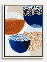
Geometric abstract prints, the kind that combine structured shapes with painterly colour or imperfect edges, are arguably the most versatile pieces you can buy. They have the discipline of geometric work and the warmth of abstract. They're the gateway pieces for anyone who can't decide.
What actually matters more than style category:
Colour palette. A piece in the wrong colours will fight your room regardless of whether it's geometric or abstract. A piece in the right colours will work either way.
Scale. Most people buy art too small. Whatever style you pick, go a size up from your instinct. A 50x70cm print over a three-seater sofa looks lost. 70x100cm or larger holds the wall.
Print and frame quality. A beautifully composed abstract print in a warped frame ruins the whole effect. A simple geometric print in a properly fitted solid wood frame with UV-protective acrylic glaze looks expensive whether it cost £40 or £400. The biggest failure in this category is poor framing: warped materials, frames shipped separately from prints, sloppy fitting. If your print arrives ready to hang in one box and the corners are crisp, you're already ahead of most of what's out there.
Light. Direct sunlight fades cheap prints in months. Museum-grade giclée printing with UV-protective glazing holds colour for decades. If you're hanging in a sunny lounge, this matters more than style choice.

Trust your eye
The final filter is whether you actually like looking at the piece. Style theory is useful for narrowing down, but the last 10% of the decision should be instinct. If a geometric print makes you feel calm and a particular abstract piece makes you feel nothing, buy the geometric one even if your room "should" have abstract.
You're going to look at it every day for years. That matters more than what category it sits in.
Where to land
Start with your room and your mood. If you want order, focus, or clarity, lean geometric. If you want atmosphere, emotion, or softness, lean abstract. If you want a gallery wall, mix both with geometric as your anchor and a tight colour palette as your bridge. Get the scale right, get the framing right, and the style debate mostly resolves itself.

In diesem Blog vorgestellte Fab-Produkte
-

Leinwandbild Bauhaus geometrisches Muster in Grün
Verkaufspreis Ab €64,95€107,95 -

Leinwandbild Geometrisches Muster im Bauhaus-Stil
Verkaufspreis Ab €64,95€107,95 -

Poster Moderne geometrische Formen in Gelb und Grün
Verkaufspreis Ab €17,95€29,95 -

Poster Geometrische Botanik – Blauer Topf, grüne Blätter
Verkaufspreis Ab €16,95€23,95 -
Leinwandbild Abstrakte Formen & Muster in Dunkelblau und Terrakotta
Verkaufspreis Ab €64,95€107,95 -

Poster Moderne Geometrie im Bauhaus-Stil
Verkaufspreis Ab €17,95€29,95 -

Poster Bauhaus geometrische Komposition
Verkaufspreis Ab €17,95€29,95 -

Leinwandbild Abstrakte Geometrie im Bauhaus-Stil
Verkaufspreis Ab €64,95€107,95 -

Leinwandbild Bauhaus-Geometrie in Tiefgrün auf Beige
Verkaufspreis Ab €64,95€107,95 -

Poster Bauhaus: Geometrische Formen in Primärfarben
Verkaufspreis Ab €17,95€29,95 -

Leinwandbild Abstrakte Boho-Geometrie
Verkaufspreis Ab €64,95€107,95 -

Leinwandbild Bauhaus grafisches Muster schwarz-beige
Verkaufspreis Ab €64,95€107,95 -

Poster Bauhaus Geometrisches Raster
Verkaufspreis Ab €17,95€29,95 -

Poster Botanische Geometrie in sanften Pastell- und Erdtönen
Verkaufspreis Ab €16,95€23,95 -

Poster modernes geometrisches Design
Verkaufspreis Ab €17,95€29,95 -

Poster Bauhaus-Muster in Schwarz und Creme
Verkaufspreis Ab €17,95€29,95 -

Poster Abstrakte Geometrie in sanften Neutraltönen
Verkaufspreis Ab €17,95€29,95 -

Poster/Leinwandbild Bauhaus-Geometrie in Blau und Weiß
Verkaufspreis Ab €64,95€107,95


Mehr aus The Frame

The Best Wall Art for Plant Lovers (That Doesn'...
You already have too many plants. You know it, your partner knows it, the fiddle leaf fig blocking the window knows it. But your walls are still bare, and there's...

Are Botanical Prints Still in Style? The Trend ...
Botanical prints have been declared "over" roughly every three years since 2015, and yet they keep hanging on more walls than ever. The truth is they're not a trend at...

Room-by-Room or Whole-Home? Styling Botanical P...
Most botanical prints are hung wrong. They're too small for the wall, glossy in rooms that need calm, and floating at eye level above sofas they should be anchoring. This...