Art Nouveau vs Art Deco Prints: How to Tell Them Apart (and Style Each One)
One has whiplash curves and lily pads. The other has gold fans and skyscrapers. Here's how to shop with confidence.

If you've ever stood in front of two beautiful vintage prints and had no idea whether you were looking at Art Nouveau or Art Deco, you're in good company. The two movements sit next to each other in art history but represent almost opposite ideas about what beauty should look like. This guide will sort it out in plain English, then help you actually use that knowledge on your walls.
The 30-second distinction: curves vs geometry
Art Nouveau is what happens when nature gets stylised. Think long, whiplash curves, ivy-like tendrils, women with rivers of hair, peacocks, irises, dragonflies. Everything flows. Lines refuse to sit still.
Art Deco is what happens when geometry gets glamorous. Think fans, sunbursts, zigzags, stepped pyramids, sleek greyhounds, chrome, gold, and women rendered as sharp silhouettes. Everything is built, balanced, and a little bit smug about it.
If a print looks like it grew, it's probably Art Nouveau. If it looks like it was engineered, it's probably Art Deco. That's your 30-second test. The rest of this article is the long version.

A brief history of each movement (and why they're so often confused)
Art Nouveau came first. It bloomed roughly between 1890 and 1910 across Europe, with Paris, Brussels, Vienna and Glasgow as its main strongholds. The name literally means "new art" in French, and the movement was a reaction against the heavy, copy-paste historicism of Victorian design. Artists like Alphonse Mucha, Gustav Klimt and Aubrey Beardsley wanted decoration that felt alive again, so they looked at plants, insects, water, and the female form.
Art Deco arrived after the First World War and ran from around 1920 to 1940. It officially got its name from the 1925 Paris exhibition (the Exposition Internationale des Arts Décoratifs et Industriels Modernes, if you want to be insufferable at a dinner party). Where Nouveau looked to nature, Deco looked to machines, skyscrapers, ocean liners, Egyptian tombs (Tutankhamun's was discovered in 1922), and Cubism. It was optimistic, urban, and unapologetically luxurious.
The confusion is understandable. Both movements are roughly a century old, both are "decorative" rather than fine art in the strictest sense, both feature stylised women, and both got rediscovered in the 1960s and 70s. They sit next to each other on the bookshop shelf, but they're not siblings. They're more like neighbours who can't stand each other's taste.
And no, the Eiffel Tower is neither. It predates both movements (1889) and is closer to engineered industrial design. The Chrysler Building, however, is pure Art Deco.
Visual side-by-side: motifs, colours, and compositions
The fastest way to identify a print is to scan for a few specific features. Here's what to look for.
Art Nouveau design characteristics
Motifs: peacocks, lilies, irises, poppies, vines, dragonflies, swans, women with impossibly long hair, crescent moons, Celtic-influenced knotwork.
Lines: continuous, sinuous, asymmetric. Often described as "whiplash." A line might start at the bottom of the print, sweep up through a woman's hair, and dissolve into a flower.
Composition: vertical, panel-like, often resembling stained glass or theatre posters. Mucha's work is the textbook example. Borders are common, and they're usually as decorated as the centre.
Colours: muted, earthy, slightly faded looking. Sage green, terracotta, mustard, cream, dusty rose, deep burgundy, ochre, soft browns. Nothing screams.
Art Deco design characteristics
Motifs: sunbursts, fans, chevrons, stepped pyramids (ziggurats), stylised animals (greyhounds, gazelles, panthers), skyscrapers, ocean liners, Egyptian and Aztec references.
Lines: straight, angular, symmetrical. Curves exist but they're perfect arcs, not organic squiggles.
Composition: balanced, centred, often radiating outward from a focal point. Think travel posters for the French Riviera or jazz-era nightclub adverts.
Colours: high contrast and confident. Black and gold, deep emerald, navy, cream, oxblood, jade, silver, ivory. Metallics are almost a requirement.
A 5-second shopping checklist
When you're browsing prints online and need to make a quick call:
- Curved or angular lines? Curves means Nouveau, angles means Deco.
- Is there a flower or a fan? Flower = Nouveau. Fan = Deco.
- Does the woman in the print look like she's underwater, or like she's about to host a cocktail party? Underwater = Nouveau. Cocktails = Deco.
- Is the palette muted or metallic? Muted = Nouveau. Metallic = Deco.
Which rooms suit Art Nouveau prints (and which suit Art Deco)
This is where most guides go silent, so we'll be specific.
Where Art Nouveau works best
Bedrooms. The soft palette and flowing lines are calming. Art Nouveau prints reward slow looking, and bedrooms are where slow looking happens. A large Mucha-style panel above a bed feels romantic without tipping into twee.
Bathrooms and dressing rooms. The movement's affinity with water, lilies and feminine forms suits these intimate spaces. Just keep prints away from direct steam.
Reading nooks and snugs. Nouveau prints have a bookish, slightly literary quality. They love a velvet armchair and a brass floor lamp.
Period properties. Victorian, Edwardian and arts-and-crafts homes were designed with this kind of decoration in mind. Picture rails, ceiling roses, dado lines, it all sings together.
Browse our Art Nouveau collection if you want to see what we mean.
Where Art Deco works best
Living rooms. Deco is built for entertaining. A pair of symmetrical sunburst prints above a low velvet sofa is a whole vibe.
Home offices. This is the secret weapon. Deco's geometric confidence makes a workspace feel intentional rather than functional. It says you have things under control, which is sometimes the most important thing a room can say.
Bars and dining rooms. The movement was born alongside the cocktail, so it would be rude not to. Deco prints next to a drinks trolley is practically a design law.
Modernist and mid-century interiors. Deco actually bridges to mid-century beautifully because both share an appreciation for clean lines and rich colour.
Browse our Art Deco collection for a sense of what's out there.

How to mix both styles without your walls looking like a history textbook
The short answer: yes, you can mix them. The longer answer requires a bit of restraint.
The trick is to pick a dominant style and let the other play a supporting role. A living room dressed mostly in Deco can take one Nouveau print as a softener. A bedroom full of Nouveau can take one geometric Deco piece as a counterweight. Roughly 80/20 is the ratio we'd suggest.
Find a common colour. If your Nouveau print has a deep emerald background and your Deco print has emerald and gold, they're already friends. Colour bridges almost any stylistic gap.
Use the same frame across both. Mixed styles read as deliberate when they share a frame finish. Mixed styles in mixed frames read as a charity shop haul.
Avoid putting them on the same wall. Gallery walls combining both movements rarely work because the eye doesn't know where to rest. Use separate walls or separate rooms.
Don't mix the most ornate examples of each. A wildly intricate Mucha panel next to a maximum-zigzag Deco print is too much information. Pick a calmer version of one of them.
If you like both but can't commit, our broader vintage prints collection is a good middle ground. Many early 20th-century prints sit between the two movements and won't pick a fight with either.
A note on reproductions vs vintage originals
Original Art Nouveau and Art Deco posters from the early 20th century are collectible and expensive. A genuine Mucha lithograph can run into thousands. Original Cassandre travel posters, the same.
For most of us, high-quality modern reproductions are the sensible route. The benefit is that you get the design without worrying about a fragile century-old paper, and you can have it in the exact size your wall needs. The downside is purely psychological: there's no patina, no provenance.
If you want the visual richness of the period without the auction-house anxiety, look for prints made with proper giclée printing on thick matte paper. Cheap reproductions tend to have a glossy sheen and slightly washed-out colours, which kills the whole effect. Our prints use museum-grade giclée on thick matte paper, which is what these designs were originally meant to be seen on.
Our favourite Art Nouveau and Art Deco prints right now
A few specific recommendations, because being told to "browse the collection" is annoying.
For Art Nouveau lovers: look for Mucha-style panels of the four seasons or the times of day. They were designed to be hung as sets and they still work that way. A pair of them flanking a bed, in matching frames, is one of the most satisfying decorating moves in this category. Peacock prints are also having a moment, and they sit nicely with our botanical art collection if you want to lean into the naturalistic side of the movement.
For Art Deco lovers: vintage travel posters from the 1920s and 30s are the gateway drug. French Riviera, Monte Carlo, ocean liners, ski resorts in the Alps. They're decorative, evocative, and almost always feature the gold-and-jewel palette Deco does so well. Geometric abstract prints in black, gold and cream are the other safe bet, and they slot into almost any modern living room.
Size matters more than you think. Art Nouveau prints reward larger sizes because the detail is in the linework, and small prints lose the flow. We'd go 50x70cm minimum, ideally 70x100cm. Art Deco prints can work smaller because the geometry reads cleanly at any size, but a single large Deco print above a sofa (think 100x70cm or larger) is more dramatic than three small ones.

Framing tips: wood tones vs metallic finishes
This is where a lot of people make the print look worse than it needs to. Each movement has frame finishes it loves and frame finishes it actively fights with.
Framing Art Nouveau
Go with warm wood tones. Natural oak, walnut, or a soft black frame all work. The movement is rooted in craft and nature, so anything that feels handmade complements it.
Avoid high-shine metallics, especially silver. They drag a Nouveau print into the wrong century and make the soft palette look anaemic.
A thin to medium frame works best, since the prints often already have decorative borders. A thick chunky frame competes with the artwork.
Framing Art Deco
Go with black, dark wood, or warm metallics like brass and antique gold. The movement was obsessed with luxury materials and your frame should reflect that.
Avoid pale wood frames like natural pine or limed oak. They look beachy, and Deco is not a beach.
A medium-weight frame with a clean profile works best. Ornate carved frames clash with Deco's love of clean lines.
Why the frame and print need to arrive together
A quick practical note. The single biggest reason people end up disappointed with framed prints is that the print and frame arrive separately, get assembled at home, and end up with bubbles, warping, or the print sitting crookedly inside the frame.
Our framed prints arrive in one box, properly fitted with UV-protective acrylic glaze (not glass, so they don't shatter in transit), with fixtures already attached. The frames are solid FSC-certified wood, not MDF or veneer, which matters because cheap frames warp in the first humid summer. For prints in these movements, where the visual richness depends on everything sitting flat and precise, that fit-and-finish is non-negotiable.
A few final things worth saying
Lighting changes everything. Art Nouveau benefits from soft, warm light: table lamps, wall sconces, anything with a bulb under 2700K. Direct overhead lighting flattens the linework. Art Deco can take more dramatic lighting: picture lights, angled spots, anything that catches the metallic tones.
Don't be precious about authenticity. You don't need to be an expert in early 20th-century European decorative arts to enjoy a Mucha-style print above your bed. You just need to know what you like and frame it properly.
And if you've spent ten minutes staring at a print trying to decide which movement it belongs to, that probably means it sits somewhere between the two, which is fine. The categories are useful for shopping, not laws of physics.

Pick the style that matches the mood you want the room to have. Curves and calm for Nouveau, geometry and glamour for Deco. Frame it in something that respects the design, hang it at eye level, and light it warmly. That's the whole job.

In diesem Blog vorgestellte Fab-Produkte
-

Poster Art-Déco Blumen Vintage – inspiriert von Emile Alain Seguy
Translation missing: de.products.product.sale_price Ab €17,95€29,95 -

Poster Art Deco Blumen von Séguy
Translation missing: de.products.product.sale_price Ab €17,95€29,95 -

Poster Jugendstil: verwunschener botanischer Garten
Translation missing: de.products.product.sale_price Ab €17,95€29,95 -

Poster Verzauberter Jugendstil-Garten
Translation missing: de.products.product.sale_price Ab €17,95€29,95 -

Poster Fahrradrennen im Vintage-Stil mit Jugendstil-Bordüre
Translation missing: de.products.product.sale_price Ab €17,95€29,95 -

Leinwandbild Seguy Jugendstil-Blumenmuster
Translation missing: de.products.product.sale_price Ab €64,95€107,95 -
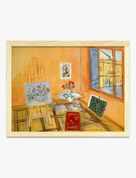
Poster Atelier-Interieur von Raoul Dufy
Translation missing: de.products.product.sale_price Ab €16,95€23,95 -

Poster Bauhaus-Muster in Schwarz und Creme
Translation missing: de.products.product.sale_price Ab €17,95€29,95 -

Poster Bauhaus-Geometrie in tiefem Marineblau
Translation missing: de.products.product.sale_price Ab €17,95€29,95 -

Poster Sonnenuntergang am Meer mit Segelboot
Translation missing: de.products.product.sale_price Ab €17,95€29,95 -

Poster im Bauhaus-Stil – Schwarze Formen auf Beige
Translation missing: de.products.product.sale_price Ab €17,95€29,95 -

Poster Bauhaus Minimalistische Geometrie
Translation missing: de.products.product.sale_price Ab €17,95€29,95 -
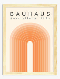
Poster moderner Bogen im Bauhaus-Stil
Translation missing: de.products.product.sale_price Ab €17,95€29,95 -
Leinwandbild Verwunschener Jugendstil-Garten mit Leopard
Translation missing: de.products.product.sale_price Ab €64,95€107,95 -

Poster moderne Boho-Vase mit abstrakten Blättern
Translation missing: de.products.product.sale_price Ab €17,95€29,95 -

Poster Vintage-Blaupause – technische Zeichnung mit Charme
Translation missing: de.products.product.sale_price Ab €17,95€29,95 -

Poster Pont Neuf in Paris von Renoir
Translation missing: de.products.product.sale_price Ab €16,95€23,95 -

Poster Bauhaus-Geometrie 1919
Translation missing: de.products.product.sale_price Ab €17,95€29,95


Mehr aus The Frame

Why William Morris Prints Look Brilliant in Mod...
William Morris has been quietly miscategorised for decades. His patterns get filed under "country cottage" or "Arts and Crafts revival" and rarely escape, which is a shame because his tree...

Why Arts and Crafts Nature Prints Are the Antid...
The minimalism hangover: why bare walls stopped feeling calming For about a decade, the aspirational interior was a white box with one boucle chair in it. That look has officially...

Botanical Petal Art: Why Close-Up Prints Feel M...
Full florals have had a long run, and they're not going anywhere. But if you've noticed that the botanical art appearing in design magazines, boutique hotel lobbies, and the better-styled...