Countryside Decor Ideas: How to Bring Rural Calm Into Every Room
A room-by-room guide to using pastoral art as the quiet backbone of a modern, grounded home.

Countryside art has quietly become one of the most versatile choices in modern interiors. Not the chintz-and-bunting version, but the kind of soft, considered pastoral scenes that bring the outside in without turning your lounge into a tea room. This guide treats countryside artwork as the foundation of a room, not a finishing touch, and walks through how to use it well in every space you actually live in.
The appeal of countryside decor in modern homes
Most homes are over-stimulated. Phone screens, harsh overhead lighting, traffic noise, open-plan layouts that never quite switch off. Countryside art works because it does the opposite of all that. Rolling hills, misted fields, a hedgerow at dusk, these are visual subjects the eye can rest on rather than decode.
The modern application is what's changed. You no longer need oak beams and a Belfast sink to make rural art work. A single well-chosen print of a Yorkshire moor will sit just as comfortably above a sleek concrete-effect sideboard as it would in a thatched cottage. The trick is restraint: one or two confident pieces, not a museum of farm scenes.
The cluttered cottage look comes from layering too many small, fussy items. Countryside decor done well in a modern home is the opposite. It's a few large, calm images, a muted palette pulled from those images, and natural materials in the furniture and frames. That's the whole formula.

Living rooms: anchor the space with a single pastoral print
The instinct in a lounge is to fill the main wall with a gallery. Resist it. A single large countryside print, properly scaled, will do far more work than four smaller ones competing for attention.
For sizing above a standard three-seater sofa (around 200cm wide), aim for art that's roughly two-thirds the width of the furniture. That puts you at 70x100cm or thereabouts, which is the upper end of most framed print sizes. Hang the bottom edge about 20cm above the back of the sofa. Any higher and it floats; any lower and it crowds the cushions.
Subject matter matters more than you'd think. A wide, horizontal landscape, think a low horizon with a big sky, will visually stretch the room and lower the ceiling slightly, which is exactly what most living rooms need. Vertical scenes (a single tree, a country lane vanishing into the distance) draw the eye up and suit narrower walls between windows.
The pull-the-palette trick is the most useful thing you can do here. Look at your chosen print and identify three colours: the dominant tone (often a sage, dove grey, or muted ochre), a secondary tone (sky blue, soft cream), and an accent (the rust of a barn roof, a slate path). Use those three colours for cushions, a throw, and one ceramic. That's it. The art and the room now speak to each other without anything matching too obviously.
Browse countryside art prints with this in mind: pick the piece first, then build the palette around it, not the other way round.
Bedrooms: why soft rural scenes beat abstract art for sleep
Abstract art rarely works in bedrooms. Bold geometric shapes and high-contrast colour fields are designed to provoke a response, which is the opposite of what you want at 11pm. Countryside scenes do the work that abstract art can't: they give your eye somewhere gentle to land.
There's a reason hospitals and hotels lean on landscapes for patient rooms and lobbies. Soft natural imagery, particularly green-dominant scenes with depth (a distant valley, a path through wheat), signals safety to the nervous system. You don't need a study to feel it. Try it for a week and you'll notice.
For above the bed, go horizontal and go big. A 60x90cm or 70x100cm print in a slim frame, hung centred and around 15-20cm above the headboard, sets the tone for the entire room. Misty mornings, lavender fields at dusk, sheep in soft afternoon light: these are the subjects to look for. Avoid anything dramatic, no stormy skies, no harsh contrast, no figures looking directly out at you.
Two smaller prints (40x50cm) on the wall opposite the bed can also work beautifully, particularly if your bedroom doubles as a reading nook. Frame them in matching pale oak or off-white and leave 8-10cm between them.
For more ideas on what works in this space specifically, our edit of bedroom wall art leans into exactly this kind of restful palette.

Kitchens and dining rooms: farmhouse prints that feel fresh, not kitsch
The kitchen is where countryside decor most often slides into pastiche. Roosters, "Bless This Mess" signs, decorative milk churns. The fix is to treat your kitchen art like you'd treat art in any other room: chosen for its quality, not its theme.
A single print of a vegetable patch, an orchard, or a rural still life (a bowl of figs, freshly picked herbs) works far better than anything overtly "farmhouse." Photography also performs well here, particularly black and white shots of countryside markets or harvest scenes, which feel editorial rather than nostalgic.
In dining rooms, scale up. The wall behind a dining table can take a larger piece than you'd expect, often 70x100cm or bigger, because you view it from a seated distance and across the table. Canvas works particularly well in dining spaces because it absorbs light rather than reflecting it, so you avoid glare from pendant lights overhead.
Humidity is a real consideration in kitchens. Canvas tends to handle steam and temperature swings better than paper-backed framed prints, which is worth knowing if your art will live near the hob or kettle. Hang it well away from direct steam regardless.
Hallways and staircases: creating a countryside gallery wall
Hallways are the one place where the gallery wall actually earns its keep. They're transitional, you're moving through them, and a collection of related images rewards the eye in a way a single print can't.
Three formulas worth knowing:
The horizontal trio. Three prints of identical size (say, 30x40cm), identically framed, hung in a line with consistent spacing (around 5cm gaps). Best on a long straight wall. Pick three images that vary slightly in subject but share a palette: a field, a coastline, a woodland, all in the same muted greens and greys.
The five-piece asymmetric grid. One larger anchor print (50x70cm) with four smaller prints (20x30cm) arranged around it. Works on shorter walls and feels collected rather than rigid. The anchor should be your strongest image.
The staircase climb. Prints hung following the diagonal of the stairs, with the centre of each piece roughly 145cm from the step directly below it. Vary the sizes slightly for rhythm, but keep frames consistent.
The "too matchy" problem solves itself if you mix media. Combine a painting-style landscape with a documentary photograph and a botanical illustration. Different artists, different decades, same emotional register. That's how galleries do it, and it's how your hallway should feel too.
Our hallway wall art edit is built around this kind of mix-and-match logic, with prints that share a tonal family without looking like a matching set.

Home offices: calming country views that help you focus
A countryside view at eye level when you look up from your screen does something simple and useful: it gives your eyes a focal point at a longer distance than your monitor, which reduces strain.
The principle designers use here is "soft fascination," the idea that gentle natural imagery holds attention without demanding it. A meadow, a long view across hills, a quiet woodland path. The eye drifts across the image and back to work without effort. Bold abstracts and high-contrast graphics demand cognitive processing every time you glance up, which is the last thing you want during a long working day.
Position your art directly in front of your desk or slightly to the side, ideally at eye level when seated. A 50x70cm print in a simple frame is usually the right scale for a home office wall. Avoid anything with text, anything too busy, anything with strong directional movement (a river rushing toward you, for instance) that pulls your focus.
If your office is also used for video calls, a calm countryside print as your backdrop reads as considered and grounded. Far better than an empty wall or a bookshelf you have to keep tidy.
Mixing countryside prints with other subjects
The fastest way to make countryside art feel collected rather than themed is to mix it with adjacent subjects: botanicals, abstracts, and architectural prints.
With botanicals. Botanical prints are the most natural pairing. A field landscape next to a detailed study of wildflowers shares a colour family and emotional tone, but the difference in scale (wide view vs close-up) creates interest. Browse botanical art prints and look for pieces that share two or three tones with your countryside choices.
With abstracts. This works if the abstract is muted and organic. Think soft washes of green and ochre, or minimalist line work suggesting hills and horizons. Avoid high-contrast geometrics. The rule: the abstract should look like it could be a detail pulled from the landscape, not a different visual language entirely.
With architectural and still life. A black-and-white photograph of a stone barn, a watercolour of a country church, or a quiet still life of pottery on a windowsill all sit comfortably alongside pastoral scenes. They add narrative without breaking the mood.
The unifying thread is always palette and tone. If everything sits in a muted, naturalistic range, you can mix subject matter freely. If one piece has a saturated electric blue, it'll fight everything else regardless of subject.
Choosing frames and finishes that tie countryside art into your scheme
Frames are where most countryside art schemes fall apart. A heavy dark wood frame on a delicate watercolour landscape will overwhelm it. A glossy black frame on a misty meadow scene will feel cold and clinical.
A few rules that hold up:
Light oak or natural ash for almost any countryside print. It's the safest, most flexible choice and it picks up the natural warmth in pastoral imagery. Works in modern, traditional, and Scandinavian-leaning interiors.
Off-white or pale grey for soft, light-toned prints (lavender fields, misty mornings, snow scenes). Keeps the focus on the image and adds airiness.
Warm walnut or mid-brown wood for richer, more saturated landscapes (autumn woodlands, harvest scenes, golden hour). Adds depth without going heavy.
Avoid black frames for countryside art in almost all cases. They're built for graphic, modernist work, not soft natural imagery.
A mount (the card border between print and frame) adds breathing room and a more considered, gallery feel. A 5-7cm white or off-white mount around a 40x50cm print transforms it. Worth the extra cost if budget allows.
One practical note worth flagging: the most common complaint with framed prints is poor execution. Frames shipped separately to the print, prints not fitted properly, warping after a few weeks. The pieces in our collection arrive in a single box, the print already fitted into the frame, with the hanging fixtures attached. UV-protective acrylic glaze (not glass) means no glare and no fading, even in a sunny lounge or south-facing bedroom.

A final thought
Countryside decor done well isn't about commitment to a style. It's about choosing imagery that calms a room and then letting the rest of the space breathe around it. Start with one print you genuinely love, hang it properly, and pull two or three colours from it into the room. Build slowly from there. The rooms that feel best are almost always the ones with fewer, better things in them.

In diesem Blog vorgestellte Fab-Produkte
-

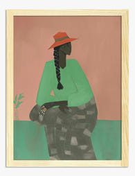
Poster Ländliche Anmut – Porträt mit Strohhut
Translation missing: de.products.product.sale_price Ab €17,95€29,95 -
Poster Ländliche Muse – Porträt mit Sonnenhut und langem Zopf
Translation missing: de.products.product.sale_price Ab €17,95€29,95 -

Leinwandbild ländliche Muse – Porträt mit Sonnenhut
Translation missing: de.products.product.sale_price Ab €64,95€107,95 -

Poster Porträt einer ländlichen Muse
Translation missing: de.products.product.sale_price Ab €17,95€29,95 -

Poster Pastellige Hügellandschaft – ländlicher Charme
Translation missing: de.products.product.sale_price Ab €17,95€29,95 -

Leinwandbild Porträt einer Frau mit Korallenhut
Translation missing: de.products.product.sale_price Ab €64,95€107,95 -

Leinwandbild Ländliche Anmut – Ruhiges Porträt in Grün & Terrakotta
Translation missing: de.products.product.sale_price Ab €64,95€107,95 -
Poster sonnendurchflutetes Landidyll
Translation missing: de.products.product.sale_price Ab €17,95€29,95 -

Poster Feldweg von Fab
Translation missing: de.products.product.sale_price Ab €17,95€29,95 -
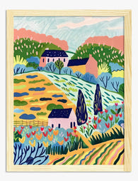
Leinwandbild Pastellfarbene Hügellandschaft mit Häuschen
Translation missing: de.products.product.sale_price Ab €64,95€107,95 -

Poster Toskanische Hügellandschaft
Translation missing: de.products.product.sale_price Ab €17,95€29,95 -

Leinwandbild Ländlicher Weg
Translation missing: de.products.product.sale_price Ab €64,95€107,95 -

Poster Lebendiger Gartenweg
Translation missing: de.products.product.sale_price Ab €17,95€29,95 -

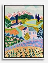
Leinwandbild Pastellfarbene Hügellandschaft im Landhausstil
Translation missing: de.products.product.sale_price Ab €64,95€107,95 -

Leinwandbild Toskana Hügellandschaft mit Zypressen
Translation missing: de.products.product.sale_price Ab €64,95€107,95 -

Poster Italienische Landschaft im Sonnenlicht
Translation missing: de.products.product.sale_price Ab €16,95€23,95 -

Poster Ländliche Landschaft unter weitem Wolkenhimmel
Translation missing: de.products.product.sale_price Ab €16,95€23,95 -

Poster Schottische Highlands – Sanfte Hügel & nebelblaue Gipfel
Translation missing: de.products.product.sale_price Ab €17,95€29,95


Mehr aus The Frame

Arts and Crafts Animal Prints: The Victorian De...
The Arts and Crafts revival: why Victorian animal prints are trending again Scroll through any interior design hashtag right now and you'll see them everywhere: hares peering through curling foliage,...

You're Overthinking Your Arts and Crafts Galler...
Most gallery wall advice assumes you're working with clean, simple imagery. Photographs. Line drawings. Quiet little prints with breathing room baked in. Arts and Crafts prints are the opposite of...

Watercolor Painting Styles Explained: From Bota...
A quick primer on why watercolour looks the way it does Watercolour behaves unlike any other medium. Pigment suspended in water, applied to absorbent paper, with the artist controlling roughly...