How to Build a Floral Gallery Wall That Looks Curated, Not Chaotic
A template-based guide for anyone who owns one floral print and wants to build a gallery wall that actually feels intentional.

Most gallery walls fail because they grow randomly. You buy one print, then another six months later, and suddenly your wall looks like a mood board nobody finished. This guide gives you the templates, frame rules, and colour formulas to build a floral gallery wall on purpose, starting from the one print you already love.
Why floral prints are the easiest subject for a gallery wall
Florals do something most other subjects can't: they share a visual language even when the styles are wildly different. A 1920s chromolithograph of a peony and a modern minimalist line drawing of a tulip both speak "flower." Your eye recognises the family resemblance, which means you can mix more boldly than you could with, say, abstract art or photography.
They also bring colour without committing you to a specific palette. A botanical print pulls from sage, ochre, dusty pink, and cream all at once, which gives you flexibility in what you hang next to it. Compare that to a graphic colour-block print, where one wrong neighbour throws the whole thing off.
The third advantage: scale forgives. Florals look good zoomed in (a single bloom filling the frame) or pulled back (a whole meadow). You can mix a tight crop of a poppy with a wide field of wildflowers and the wall still reads as one collection. That's much harder with portraits or landscapes.
The takeaway: floral pattern decor ideas are genuinely the most beginner-friendly route into a gallery wall. You have permission to experiment more than the design internet usually suggests.

Starting point: building around one hero print
Every good gallery wall has a hero. This is the print that anchors the composition, sets the colour palette, and tells you what the rest of the wall has to live up to. If you already own a floral print you love, congratulations, that's almost certainly your hero. If you're starting from scratch, choose it before you do anything else.
A good hero print has three qualities. It's the largest piece you plan to hang (ideally 50x70cm or 70x100cm if the wall can take it). It has a clear, dominant colour you can repeat elsewhere. And it has enough visual weight to hold its own from across the room. A delicate line drawing won't work as a hero, no matter how much you love it. Save those for supporting roles.
Place your hero off-centre in the layout, not dead-middle. Galleries do this because perfect symmetry reads as static. Putting your hero slightly left-of-centre or as the bottom-anchor of a stacked composition creates the bit of tension that makes the wall feel curated rather than installed.
Once your hero is chosen, every other print has to answer one question: does this make the hero look better? If the answer's no, it doesn't go on the wall. This is the single most useful filter you can apply when you're tempted by a pretty print that doesn't quite fit.
Mixing floral patterns with botanical illustrations
There's a real distinction here that most guides skip. A floral pattern print is decorative: stylised blooms, often repeating, designed to be beautiful. A botanical illustration is technical: scientific in origin, usually showing the plant in full with roots, stems, and labels, often on a cream or aged background.
These two styles work together brilliantly because they sit in different registers. The floral pattern brings the colour and the romance. The botanical brings structure and a touch of intellectual weight. Hanging them together gives your wall layers, the same way a room benefits from mixing a velvet sofa with a wooden side table.
The ratio matters. For a five-print wall, we'd suggest two patterns and three botanicals, or the reverse. Going 4:1 makes the minority print look like a mistake. Going 50/50 only works on even-numbered walls (so four or six prints, which we generally don't recommend, more on that below).
If you want to push further and mix vintage and modern florals, the ratio rule still applies: 2:3 or 3:2, never even. Two vintage chromolithographs paired with three contemporary line drawings reads as deliberate. Three of each reads as indecisive. Browse botanical art prints for the scientific-illustration end of this spectrum, and floral pattern art prints for the more decorative side.
One rule that's saved a lot of walls: don't mix more than two eras. A Victorian botanical, a 1960s mod floral, and a 2024 minimalist line drawing in the same composition is too much time-travelling. Pick two eras and let them have a conversation.
Frame finishes: stick to one or mix two at most
The most common gallery wall mistake is treating frames as an afterthought. They're not. Frames are 30% of what you see when you look at the wall, and getting them wrong will undo everything else.
The simplest rule: pick one finish and use it across every print. Black, natural oak, white, or warm gold. Done. This is the fail-safe approach and it works every time. If you're nervous, do this.
If you want more depth, mix exactly two finishes, and pick a combination that has a logical relationship. The four combinations we recommend:
- Black and natural oak. Modern and grounded. Works in almost any room.
- White and natural oak. Soft, Scandinavian, good for bright rooms with pale walls.
- Warm gold and black. Slightly more formal, leans traditional.
- White and warm gold. Romantic, works beautifully with vintage florals.
Never mix three finishes. Never mix black and gold and oak together. Never put a silver frame anywhere near a gold one. These rules sound restrictive but they remove about 80% of the decisions that cause people to abandon their gallery wall halfway.
When you're mixing two finishes, distribute them evenly across the layout, not clustered. Two oak frames on the left and three black frames on the right will look like two separate walls jammed together. Alternate them.
A note on what you're actually buying. Solid wood frames hold their shape and don't warp, which matters because the most common gallery wall failure is frames arriving bowed or with prints that don't sit flush behind the glazing. Our frames are solid FSC-certified wood with UV-protective acrylic glaze, fitted with the print before they ship, so what arrives at your door is ready to hang in one piece.

The 3-print, 5-print, and 7-print layout templates
Odd numbers always look better than even numbers. Three, five, and seven are the configurations that consistently work. Here's how to build each one.
The 3-print layout (best for walls 1.2m to 1.8m wide)
Use this above a console table, a small sofa, or in a hallway. Three prints in a horizontal row, all the same size (50x70cm portrait works beautifully), with 5cm gaps between frames. Hero print in the middle, supporting prints either side.
Alternative: one large print (70x100cm) on the left, two smaller prints (40x50cm) stacked vertically on the right with a 5cm gap between them. The vertical stack should align top-to-top and bottom-to-bottom with the large print.
The 5-print layout (best for walls 1.8m to 2.5m wide)
This is the sweet spot for most living rooms and the layout we'd recommend if you can't decide. The classic configuration: one large hero print (70x100cm) on the left, four smaller prints (40x50cm) arranged in a 2x2 grid on the right. Keep gaps consistent at 5cm throughout.
Alternative: a salon-style cluster with the hero off-centre, two medium prints flanking it, and two smaller prints filling the corners. This is harder to get right but looks more collected. Lay it out on the floor first.
For inspiration on how this works in context, our living room wall art collection shows several of these arrangements in real rooms.
The 7-print layout (best for walls 2.5m+ wide)
For larger walls, above a generous sofa or in a dining room. The reliable configuration: hero print (70x100cm) anchoring the bottom-left, with six smaller prints (mix of 30x40cm and 40x50cm) arranged in an irregular cluster around it. Keep the outer edge of the whole composition rectangular even if the inner arrangement is loose.
Spacing for 7-print walls should drop slightly to 4cm. Tighter gaps make a busy composition feel intentional rather than scattered. The biggest mistake on large walls is leaving too much space between prints, which makes each one look isolated.
If you'd rather skip the planning, our pre-curated wall art sets are designed to work as cohesive groups straight out of the box.
Colour cohesion: how to keep a floral wall from looking random
Here's the formula that solves most cohesion problems: every print on the wall must share at least two colours with at least two other prints. Not all the same two colours. Just two shared colours, somewhere in the print, with two of its neighbours.
This is how to style floral wall art so it reads as one collection rather than a series of unrelated purchases. The shared colours create a visual handshake between prints. Your eye finds the dusty pink in the peony, then the same pink in the corner of the wildflower print, then a different but related pink in the rose botanical. The wall feels deliberate.
The colours don't have to be exactly the same. A sage green and an olive green count as a match. A warm cream and a soft white count. Your brain reads colour families, not pixel-perfect matches.
What absolutely doesn't work: a neon coral print next to four soft, dusty florals. One stark white background among five cream-aged botanicals. One cool-toned blue print in a wall of warm-toned earth florals. The outlier breaks the spell, and once it's broken you can't unsee it.
If you've already got prints that don't quite share colours, the easiest fix is the frame. A unified frame finish across all the prints will paper over a lot of colour disagreement. It won't fix it completely, but it'll get you 70% there.

Common gallery wall mistakes and how to fix them
Too matchy-matchy
If every print is the same size, same colour, same style, same frame, you don't have a gallery wall. You have a grid. The fix: vary the scale. Introduce one print that's noticeably larger or smaller than the others. Or swap one frame finish for a complementary second one.
Competing focal points
Two prints with equal visual weight fighting for attention. Usually happens when people buy two large statement prints and try to put them on the same wall. The fix: demote one. Move it to another room, or surround it with smaller, quieter prints that clearly position it as supporting cast.
Wrong scale mix
Tiny prints next to enormous ones with nothing in between. The eye doesn't know where to settle. The fix: add a medium-sized print to bridge the gap. Three sizes always look better than two.
The lonely cluster
A gallery wall floating in the middle of a huge wall, with metres of empty space around it. Looks unfinished. The fix: either make the gallery bigger (add prints until it occupies roughly two-thirds of the wall width) or move it above a piece of furniture that grounds it.
Hung too high
The most common mistake by a wide margin. Centre of the gallery should sit at roughly 145-150cm from the floor, which is gallery standard eye level. Above a sofa, the bottom of the lowest frame should be 15-20cm above the back of the sofa, not floating halfway up the wall.
Buying everything at once
Counterintuitive, but walls built over six to twelve months almost always look more curated than walls bought in a single order. Buy your hero first. Live with it for a few weeks. Add two or three pieces. Live with those. Add the rest only when you know what's missing.
Where to start this week
Pick your hero. Measure your wall. Decide on three or five or seven prints based on the wall width. Choose your frame finish (or two finishes from the four combinations above). Then find prints that share at least two colours with the hero, in a 2:3 or 3:2 ratio of patterns to botanicals.
Lay everything out on the floor before you put a single nail in the wall. Photograph the floor layout, walk away, come back in an hour, and see what your eye tells you. The wall you build slowly is the wall you'll still love in five years.


In diesem Blog vorgestellte Fab-Produkte
-

Poster Surreales Schwarz-Weiß-Schachbrett mit Blüte
Translation missing: de.products.product.sale_price Ab €16,95€23,95 -

Leinwandbild Florale Muse in Blüte
Translation missing: de.products.product.sale_price Ab €64,95€107,95 -

Poster Vintage-Blumenstrauß
Translation missing: de.products.product.sale_price Ab €17,95€29,95 -

Leinwandbild Fließende botanische Linien in Pink
Translation missing: de.products.product.sale_price Ab €64,95€107,95 -

Poster Boho-Vasen mit Zimmerpflanzen
Translation missing: de.products.product.sale_price Ab €17,95€29,95 -

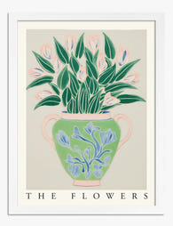
Poster Ausdrucksstarke Blumenvasen
Translation missing: de.products.product.sale_price Ab €16,95€23,95 -

Leinwandbild Botanische Boho-Vasen
Translation missing: de.products.product.sale_price Ab €64,95€107,95 -

Poster Botanische Treppe
Translation missing: de.products.product.sale_price Ab €17,95€29,95 -

Leinwandbild Vintage-Ausstellungsplakat mit weißen Blumen
Translation missing: de.products.product.sale_price Ab €64,95€107,95 -
Poster Botanischer Blumenstrauß in Vase – Grün & Pastell
Translation missing: de.products.product.sale_price Ab €17,95€29,95 -

Leinwandbild Vintage-Szene mit gemusterten Tellern & geblümtem Kleid
Translation missing: de.products.product.sale_price Ab €64,95€107,95 -

Leinwandbild Botanisches Motiv in Heritage-Grün
Translation missing: de.products.product.sale_price Ab €64,95€107,95 -

Poster Boho Botanische Harmonie – Blumen in Line-Art
Translation missing: de.products.product.sale_price Ab €17,95€29,95 -

Poster moderne botanische Blüte in Tiefgrün
Translation missing: de.products.product.sale_price Ab €17,95€29,95 -

Poster Vintage-Gartenblüten
Translation missing: de.products.product.sale_price Ab €17,95€29,95 -

Poster Botanische Vintage-Blüten in Violett auf Beige
Translation missing: de.products.product.sale_price Ab €17,95€29,95 -

Leinwandbild Modernes Blumenstillleben mit Vasen
Translation missing: de.products.product.sale_price Ab €64,95€92,95 -
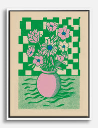
Leinwandbild Grafische Blumen-Vase, Pink & Grün, Schachbrettmuster
Translation missing: de.products.product.sale_price Ab €64,95€107,95


Mehr aus The Frame

Every Flower in William Morris's World: A Guide...
William Morris designed roughly 50 wallpapers and around 30 chintzes across his career, and almost every single one features a plant. If you've ever stood in front of a Morris...

What Colours Go With Bouquet Prints? Pairings I...
You've found a bouquet print you love. Now you need to know if it will actually work above your sofa, opposite that mustard armchair, next to the curtains you spent...

Boho Sun Wall Art: How to Nail the Look Without...
Boho sun art has a reputation problem. Done badly, it screams student halls and macramé overload. Done well, it's one of the warmest, most grounding aesthetics you can put on...