The Best Flower Prints for Bedrooms (And Exactly Where to Hang Them)
From the right scale above your headboard to colours that won't keep you wired at midnight.

Bedrooms are the hardest room to get art right. The wall above the bed is huge, the lighting is low, and the space needs to feel restful rather than busy. Flower prints, done well, are one of the most reliable ways to solve all three problems at once.

Why flower prints work so well in bedrooms (and what to avoid)
Florals carry softness without trying too hard. They bring organic shapes into a room that's usually full of straight lines (the headboard, the wardrobe, the nightstands), and they pull in nature without committing you to a full botanical theme.
What to avoid: anything too saturated or high-contrast. A flower print in electric reds, hot oranges or graphic black-and-white can read as energising rather than calming, which is the last thing you want six inches from your pillow. Skip prints with very busy backgrounds too. The eye should land somewhere soft.
Also avoid anything that feels too literal or seasonal. A print that screams "spring" or "summer holiday" will feel off in February. You're going to look at this thing every morning and every night, probably for years. It needs to age well.
The best floral styles for calm, sleep-friendly spaces
Different floral styles do very different things to a room. Here's how we'd match them to common bedroom aesthetics.
Minimalist and Scandi bedrooms
Go with single-stem botanical line drawings, faded pressed-flower studies, or pale watercolour washes. Think one tulip, one branch of blossom, one sprig of eucalyptus. A lot of negative space around the subject is what makes these work. They read as restful, not decorative.
Modern and contemporary bedrooms
Larger-scale photographic florals in muted colour palettes (dusty pink peonies, cream magnolias, slate-blue hydrangeas) hold their own without overwhelming. Avoid anything too vintage-looking here. Crisp, clean, slightly oversized is the goal.
Boho and maximalist bedrooms
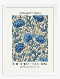
This is where you can push it. Vintage botanical illustrations, dense floral compositions, pressed wildflower arrangements, or moody Dutch-master-style still lifes all work. The trick is keeping the colour palette grounded (terracotta, ochre, rust, sage) rather than letting it tip into rainbow.
Modern farmhouse bedrooms
Hand-painted-feel watercolours of wildflowers, garden roses or cottage florals. Loose, slightly imperfect brushwork beats anything too crisp or photographic here. Soft-framed in natural oak or off-white.
Japandi bedrooms
Ink-style brushwork florals, cherry blossom studies, or single ikebana-style stems. Restraint is everything. One print, generous mat, thin frame in black or warm walnut.
If you want to browse by style rather than colour, the full flower art prints collection is a useful starting point, and the broader botanical art prints collection covers leafier, less flower-forward options if you want to mix the two.
Sizing it right: above the headboard, beside the bed, or opposite
Most people hang bedroom art too small. The result is a print that looks marooned on a sea of wall, which makes the whole room feel unfinished.
Above the headboard
The print (or arrangement) should be roughly two-thirds the width of the bed. For a standard UK king (150cm wide), that means art around 100cm wide. For a double (135cm), aim for around 90cm. A single 70x100cm portrait print works for a double bed. For a king, a 100x70cm landscape print, or our 100x150cm XL canvas, lands much better than anything smaller.
Hang the bottom of the frame 15-25cm above the top of the headboard. If you have no headboard, treat the top of the mattress plus pillows as your baseline and hang 20-30cm above that. Aim for the centre of the print to sit roughly at standing eye level, around 145-150cm from the floor.
For high ceilings (over 2.7m), bump the size up and the hanging height slightly higher. Low ceilings (under 2.4m) want the art closer to the bed and slightly more horizontal in shape.
Beside the bed
Above nightstands, smaller is fine. A 30x40cm or 40x50cm print at roughly the same height on each side feels intentional. The bottom of the frame should clear any table lamps by about 10cm. This is where pairs really shine.
Opposite the bed
The wall you see when you wake up. This is prime real estate and often underused. A single statement print here (60x80cm or 70x100cm) gives you something soft and lovely to look at first thing, which is genuinely better than waking up staring at a wardrobe door.

Colour matching your florals to bedding and walls
The rule we follow: pick one or two colours in the print that already appear somewhere in the room. Not exactly matching, just echoing.
If your bedding is white or off-white
You have the most freedom. Almost anything works, but dusty pinks, soft mustards, sage greens and muted blues feel especially good against neutral linen. Avoid stark black-and-white florals here unless the rest of the room has graphic contrast to back it up.
If your walls are painted a colour
Match the print's secondary tones to the wall, not the primary subject. So if your walls are sage green, look for a print with sage in the leaves or background rather than a print that's entirely green. You want harmony, not camouflage.
If your bedding has a strong colour
Pull a print that contains a softer version of that colour. Navy bedding pairs beautifully with prints featuring pale blue hydrangeas or dusty blue cornflowers. Blush bedding wants prints with peach, cream and a touch of green to break it up. The pink wall art collection is a good place to start if you're working with blush, mauve or terracotta in the room.
Colours that actively help sleep
Professional consensus among interior designers is that cooler, desaturated tones (soft blues, sage greens, lavender, dusty pink) read as more restful than warm saturated ones (red, orange, bright yellow). This isn't a hard rule. A warm-toned bedroom can absolutely have warm-toned art. But if you're choosing between two prints and one is noticeably more saturated, the calmer one will probably serve you better long-term.
Colours to think twice about
Bright reds, hot pinks, electric oranges and high-chroma yellows. These can be gorgeous in a living room but tend to feel busy in a bedroom. If you love them, use a smaller scale (30x40cm beside the bed) rather than a statement piece above the headboard.
Single statement print vs. a pair: when to use each approach
This is the question we get most often, so here's a clear framework.
Go with a single statement print when:
- Your bed is centred on the wall and there's a clear focal point already
- You have a king or super-king bed (a single large print balances the visual weight)
- You're going for a minimalist, modern or Japandi look
- The wall is wide enough that one big piece (around two-thirds the bed's width) fills it properly
- You want the eye to rest, not move
Go with a pair when:
- You have matching nightstands and want symmetry
- The bed is a smaller double and a single print would either be too small or too dominant
- You're working with a boho, traditional or modern farmhouse aesthetic
- You want a sense of rhythm and balance rather than a single hero moment
- The wall is wider than the bed and a single print would float awkwardly
Pairs work best when the two prints are clearly related (same artist, same colour palette, same framing) but not identical. Two different flowers in the same style, hung in matching frames, feels considered. Two copies of the same print feels like a hotel.
What about gallery walls above the bed?
We're cautious about these. A gallery wall over your sleeping head can feel cluttered, and there's the small but real concern of multiple things falling on you. If you want one, keep it to three or four pieces maximum, hang them tightly grouped, and make sure each fixture is properly anchored. A horizontal triptych (three prints in a row, same size, same frame) is usually a safer bet than a scattered arrangement.

Framed vs. canvas: which finish suits bedrooms better
Both work in bedrooms, but they create different moods.
Framed prints
Framed flower prints feel more polished and a touch more formal. The frame creates a defined edge, which gives the wall structure and makes the print feel like a deliberate object rather than wallpaper. Our framed prints come with UV-protective acrylic glaze rather than glass, which matters in bedrooms because it doesn't reflect harsh light back at you when you're trying to read or sleep, and it won't shatter if anything knocks it. The matte paper underneath has no glare at any angle.
For minimalist, Scandi, Japandi and modern bedrooms, framed almost always wins. A thin oak or black frame with a generous white mat is hard to beat.
Canvas prints
Canvas reads softer, less formal, more textural. The matte poly-cotton surface absorbs light rather than bouncing it, which gives bedrooms a slightly cosier feel. Canvas is also lighter than framed prints of the same size, which is worth knowing if you're hanging something large above the bed. Our canvas prints are hand-stretched over solid FSC wood frames with mirrored edge wrapping, so the main image stays uncropped.
For boho, maximalist, modern farmhouse and bedrooms with a more lived-in feel, canvas often suits better. It's also our go-to for larger scales (the XL canvas runs up to 100x150cm) where a heavy framed piece would feel overbearing.
The honest trade-off
Framed prints look more finished but weigh more and cost more once you factor in framing. Canvas is lighter, more affordable at large sizes and works in slightly humid rooms (en-suites, basement bedrooms) where you'd worry about a frame warping. The biggest issue with framed art generally is poor framing: warped backings, frames that arrive separately from the print, sloppy fitting. We ship the print already fitted into the frame in one box, fixtures attached, ready to hang.
5 flower print picks we'd put in our own bedrooms
These are the styles we keep coming back to.
1. A single oversized peony in dusty pink. Soft, romantic without being saccharine, and the scale (70x100cm framed, or 100x150cm on canvas) makes it feel like a real piece of art. Works above a king bed against white or pale grey walls.
2. A pair of pressed-flower botanical studies. Wildflowers on a cream background, in matching thin oak frames, 40x50cm each, hung above matching nightstands. Quiet, considered, never goes out of style.
3. A loose watercolour wildflower meadow. Painterly, slightly imperfect, with sage greens and dusty mauves. Best at 60x80cm above a double bed in a modern farmhouse or country-leaning room.
4. A single Japanese-style cherry blossom branch. Lots of negative space, soft pink against off-white, in a thin black frame. The print to choose for a Japandi or minimalist bedroom where less is genuinely more.
5. A moody Dutch still life in muted tones. Dark green background, blooms in cream, blush and burgundy. The maximalist choice. Works above the bed in a room with rich wall colour, brass fixtures and layered textiles.

If you want to see more options laid out by colour and style, the bedroom wall art collection groups everything we'd recommend for sleep spaces specifically.
A quick sanity check before you commit
Live with the choice for a few days before hanging. Lean the print against the wall where it'll go, look at it in the morning, look at it at night, look at it with the curtains closed and open. If it still feels right after three days, hang it. If anything about it bugs you, return it within the 99-day window and try something else.
The wall above your bed is the first thing you see every morning. It's worth taking the time to get a print that actually earns that spot.

In diesem Blog vorgestellte Fab-Produkte
-

Poster Vintage-Gartenblüten
Translation missing: de.products.product.sale_price Ab €17,95€29,95 -

Poster Nachtblüten – Kobaltblau & Rosé
Translation missing: de.products.product.sale_price Ab €17,95€29,95 -

Poster Blütenharmonie in Blau
Translation missing: de.products.product.sale_price Ab €17,95€29,95 -

Poster Nächtliche Blütenharmonie
Translation missing: de.products.product.sale_price Ab €17,95€29,95 -

Poster Minimalistische weiße Blüte
Translation missing: de.products.product.sale_price Ab €16,95€23,95 -

Poster Surreales Schwarz-Weiß-Schachbrett mit Blüte
Translation missing: de.products.product.sale_price Ab €16,95€23,95 -

Poster Lavendelblüte auf kariertem Hintergrund
Translation missing: de.products.product.sale_price Ab €16,95€23,95 -

Poster Zarte weiße Blumen auf warmem Beige
Translation missing: de.products.product.sale_price Ab €17,95€29,95 -

Poster Zarte Aquarellblüten in Rosé und Blau
Translation missing: de.products.product.sale_price Ab €17,95€29,95 -

Leinwandbild Florale Muse in Blüte
Translation missing: de.products.product.sale_price Ab €64,95€107,95 -

Poster Stillleben mit lila Hortensien
Translation missing: de.products.product.sale_price Ab €17,95€29,95 -
Poster Klassisches Blumenmotiv in Blau
Translation missing: de.products.product.sale_price Ab €17,95€29,95 -

Poster Wildblumenwiese – inspiriert von Klimt
Translation missing: de.products.product.sale_price Ab €16,95€23,95 -

Poster Floraler Blütentraum von Klimt
Translation missing: de.products.product.sale_price Ab €17,95€29,95 -

Poster klassisches blau-weißes Blumenmuster
Translation missing: de.products.product.sale_price Ab €17,95€29,95 -

Poster Matisse-inspiriertes Schlafzimmer mit Bergblick
Translation missing: de.products.product.sale_price Ab €17,95€29,95 -

Poster Lebhafte Blumenmarkt-Szene
Translation missing: de.products.product.sale_price Ab €16,95€23,95 -

Poster Geometrische Blumen in Blau, Beige und Weiß auf Puderrosa
Translation missing: de.products.product.sale_price Ab €16,95€23,95 -

Poster Blumengarten von Gustav Klimt
Translation missing: de.products.product.sale_price Ab €17,95€29,95


Mehr aus The Frame

Creative Studio: Colour and Personality, on Pur...
Most maximalism advice treats colour like a costume. Pile it on, mix the patterns, call it personality. But a creative studio is not a stage set. It is the room...

The Boutique Hotel Feel at Home: What to Copy, ...
There's a specific feeling you get walking into a good boutique hotel. The lobby art makes you stop. The bedroom print feels like it was chosen for that exact room....

Mediterranean Escape: Terracotta, Sage, and the...
There's a reason the same three colours keep showing up in every Mediterranean room you've pinned. Terracotta, sage green, and warm white aren't just pretty together. They're a coded language...