How to Build a Gallery Wall With People Art Prints (Without It Looking Like a Rogues' Gallery)
A portrait-specific guide to grouping faces and figures on one wall without it feeling like a Victorian portrait gallery.

Putting one portrait on a wall is easy. Putting six on the same wall, all staring out at you and your dinner guests, is where things get awkward. This is a guide to building a gallery wall around figurative art that feels intentional, calm, and modern, rather than like a corridor at a country house.
The gallery wall trap: why multiple portrait prints can go wrong
Faces are different. Your brain is hardwired to notice them, scan them, and read emotion in them before it reads anything else on the wall. That's why a single portrait is such a powerful focal point, and why six portraits clustered together can feel weirdly intense, like the whole wall is watching you cook pasta.
The problem isn't the prints. It's the cumulative effect of multiple human gazes pointed in slightly different directions, all competing for the same attention your eye is desperate to give them. Most generic gallery wall advice ignores this entirely, because it's written for landscapes and abstracts where the subject doesn't stare back.
The fix is not to use fewer people prints. It's to think about composition, crop, gaze direction, and unifying elements before you start banging in picture hooks. Get those right and a wall full of figures becomes one of the most striking things you can put in a home.

Rule one: vary the crop and composition (not every print should be a face)
This is the single most important rule, and it's the one nobody talks about. If every print on your wall is a tightly cropped face looking directly at the viewer, you've built a rogues' gallery whether you meant to or not.
Mix the crop types. For a six-piece wall, we'd suggest something like: one close-up face, one full-body figure, one back view or silhouette, one partial figure (hands, legs, a torso), one group composition with two or more people, and one print where the figure is small within a larger landscape or interior. That ratio gives the eye somewhere to rest between the more direct portraits.
The same logic applies to gaze. If every subject is staring straight at the viewer, the wall feels confrontational. Mix in figures looking sideways, looking down, reading, walking away. As a general principle, subjects on the outer edges of your gallery wall should be looking inward toward the centre, not off into the corners of the room. It pulls the composition together.
For people wall art ideas that aren't all faces, look for prints featuring dancers mid-movement, line drawings of bodies, beach scenes with figures in the distance, or photography of hands and gestures. Browse photography art prints for documentary-style figure work and people art prints for illustrated and painted options.
Choosing a unifying element: frame finish, colour palette, or artistic style
A gallery wall needs one thing that ties everything together. With portrait art, you really only have three good options, and you should pick one and commit.
Colour palette. The simplest cohesion strategy is going entirely black and white. Monochrome portraits read as a single visual statement even when the styles vary wildly, which is why salon walls in galleries lean so heavily on black and white photography. If you want colour, pick a palette of two or three tones (warm earth tones, or cool blues and greys) and only buy prints that sit within it.
Artistic style. All line drawings. All vintage photography. All painterly figure studies. Mixing a photorealistic portrait with a minimalist line drawing rarely works because the eye reads them as belonging to different rooms.
Frame finish. If your prints are visually varied (some colour, some black and white, different styles), the frames have to do the unifying work. We'll come back to this.
You only need one of these three to be consistent. Trying to lock down all three at once usually produces something that looks like a hotel lobby.
Three gallery wall layouts that work for people prints
Specific layouts with real measurements, for real walls. All dimensions assume the standard gallery centre-line of 145cm to 152cm (roughly 57 to 60 inches) from the floor to the visual centre of your arrangement.
Layout one: the 2x3 grid (calm and modern)
Best for: above a sofa or sideboard, on a wall at least 2m wide.
Six prints, all the same size (we'd suggest 30x40cm or 40x50cm), arranged in two rows of three. Use 5cm spacing between frames for a calm, considered look. Total wall footprint at 30x40cm with 5cm gaps: roughly 130cm wide by 85cm tall.
Mix your crops within the grid. Don't put all the close-up faces in one row. Alternate face, figure, back view across both rows so the eye travels.
Layout two: the anchor and satellites (asymmetrical, modern minimalist)
Best for: a feature wall in a hallway or above a bed.
One large anchor print (60x80cm or 70x100cm) sits slightly left of centre. Three or four smaller prints (30x40cm) sit to the right of it, stacked or staggered. Maintain 5 to 6cm spacing throughout.
The anchor should be your most commanding piece, often a single direct portrait. Everything else is a quieter supporting cast: silhouettes, partial figures, abstract bodies. This layout uses the natural intensity of a single face by giving it space, instead of multiplying it.
Layout three: the salon wall (dense, European, more confident)
Best for: a tall wall, a stairwell, or a dining room where you want drama.
Eight to twelve prints in mixed sizes (mix 20x30cm, 30x40cm, and one 50x70cm anchor). Tighter 3 to 4cm spacing. The arrangement is intentionally irregular but should follow invisible alignment lines: the top edges of some frames should align, the bottom edges of others should align, and the overall shape should resolve into a rough rectangle.
Salon style only works with a strong unifying element. We'd go monochrome or all-illustrated for this one, because the density amplifies any style clash.

How many people prints is too many? Mixing with other subjects for balance
A wall of all-portraits can absolutely work, but it takes confidence and a strong unifying element. If you're nervous about it, mix.
Our rule of thumb: for a gallery wall of six to eight pieces, no more than 60 to 70 percent should feature human figures. The remaining 30 to 40 percent should be a quieter visual register: a still life, a botanical, a landscape, a piece of typography, or a pure abstract. These act as breathing space between the portraits and stop the wall from feeling like surveillance.
For a denser salon wall of ten or more pieces, you can push the portrait ratio higher (up to 80 percent) because the sheer density blurs the intensity of any individual face. A wall of three or four pieces, on the other hand, should probably contain only one or two portraits at most. Small numbers amplify the staring effect.
If you're starting from scratch, building around a curated wall art set is the easiest way to nail the ratio without overthinking it.
Frame consistency: why matching frames make figure art look intentional
The interior designer Emily Henderson's three-frame-styles-maximum rule is the right one. We'd actually go further for portrait walls: stick to one or two.
Here's why frames matter more for figure art. When prints share a subject (faces, bodies), any inconsistency in framing reads as messiness. The eye is already working hard to process multiple human forms. If it also has to switch between thick oak, thin black, and ornate gold, the whole wall reads as chaotic.
Our recommendations:
- All black, thin profile. The default. Works with everything. Modern, recedes into the wall, lets the prints speak.
- All natural oak. Warmer, softer, brilliant for illustrated portraits or earth-tone palettes.
- All white. Best in genuinely white-walled rooms. Can disappear too much in any other context.
Mixing black with natural oak can work if the palette is consistent across the prints, but it's a step harder to pull off. Mixing three frame finishes across a portrait wall almost never works.
A real-world frustration with gallery walls is poor framing quality. Frames shipped separately from prints, prints not properly fitted, warping, bubbling under glass. We frame everything in solid FSC-certified wood, fit the print properly, and ship the whole thing in one box, ready to hang. UV-protective acrylic glaze instead of glass means no glare bouncing off your dinner guests, and no fading even on a sunny wall.
Hanging tips: spacing, alignment, and the centre-line method
The centre-line method is the only hanging technique you need. Decide where the visual centre of your arrangement should sit (we recommend 145 to 152cm from the floor, roughly eye level for an average adult standing). Lay your entire arrangement out on the floor first, measure where the centre falls, and hang from there.
Spacing rules:
- 5 to 8cm between frames for a calm, modern look. This is what we'd default to for most homes.
- 3 to 5cm between frames for salon-style density. Tighter spacing increases visual energy.
- Never less than 3cm. Below that, frames start visually merging into a blob.
- Never more than 10cm. Above that, the prints stop reading as a group and become individual pieces that happen to be near each other.
Use paper templates. Cut newspaper or kraft paper to the exact size of each frame, mark where the hanging fixture sits on the back, and tape them to the wall first. Move them around. Live with them for an evening. Then, and only then, start drilling.
Alignment matters more than symmetry. A gallery wall doesn't need to be symmetrical, but it does need invisible alignment lines: tops of frames in a row should line up, or bottom edges should align, or the centre points of two prints should sit on the same horizontal line. The eye reads alignment as intention, even when the overall shape is irregular.

Our recommended starting point for a people-print gallery wall
If you've never built a portrait gallery wall before, here's the lowest-risk starting formula. Six prints, all 30x40cm, all in matching thin black frames, arranged in a 2x3 grid with 5cm spacing. Centre line at 150cm from the floor.
For the prints themselves:
- Two black-and-white photographic portraits. One direct gaze, one looking away. These set the tonal anchor. Black and white art prints are the easiest unifying device for a first attempt.
- One full-body figure. A dancer, a swimmer, a walker. Adds composition variety.
- One back view or silhouette. Reduces gaze intensity on the wall.
- One line drawing of a body or hands. Brings in a different visual register.
- One group or pair composition. Adds narrative interest.
Once the wall is up, live with it for a fortnight before you decide whether to add anything. Most people overshoot on the first attempt and end up wanting to remove one or two pieces.
A final thought
Modern portrait prints work on a wall the way a good dinner party works: a mix of voices, a few quiet ones to balance the loud, and everyone roughly facing inward. Pick your unifying element, vary your crops, match your frames, and trust the spacing. The fear of the rogues' gallery is real, but it only happens when every piece is doing the same loud thing. Give your wall some range, and the faces stop staring and start belonging.


In diesem Blog vorgestellte Fab-Produkte
-

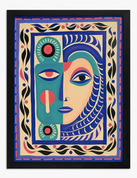
Poster Abstraktes Gesicht im modernen Folk-Stil
Translation missing: de.products.product.sale_price Ab €17,95€29,95 -

Poster Modernes Volkskunst-Porträt in Blau, Grün und Koralle
Translation missing: de.products.product.sale_price Ab €17,95€29,95 -

Poster Abstraktes Gesicht im modernen Folk-Art-Stil
Translation missing: de.products.product.sale_price Ab €17,95€29,95 -

Poster Minimalistisches Porträt in Pink und Orange
Translation missing: de.products.product.sale_price Ab €16,95€23,95 -

Poster Minimalistische Menschen in Reihe
Translation missing: de.products.product.sale_price Ab €17,95€29,95 -

Leinwandbild Minimalistische Menschensilhouetten
Translation missing: de.products.product.sale_price Ab €64,95€107,95 -

Leinwandbild abstraktes Volkskunst-Porträt in kräftigen Farben
Translation missing: de.products.product.sale_price Ab €64,95€107,95 -

Poster Modernes Volkskunst-Porträt
Translation missing: de.products.product.sale_price Ab €17,95€29,95 -
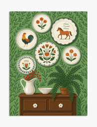
Poster Volkskunst-Charme mit Wandtellern
Translation missing: de.products.product.sale_price Ab €17,95€29,95 -

Leinwandbild Modernes Volkskunst-Porträt
Translation missing: de.products.product.sale_price Ab €64,95€107,95 -

Leinwandbild Markantes Folk-Art-Gesichtsporträt
Translation missing: de.products.product.sale_price Ab €64,95€107,95 -

Poster Porträt einer modernen Muse
Translation missing: de.products.product.sale_price Ab €16,95€23,95 -

Poster kräftiges blaues Porträt
Translation missing: de.products.product.sale_price Ab €16,95€23,95 -

Leinwandbild Modernes Porträt im Volkskunststil
Translation missing: de.products.product.sale_price Ab €64,95€107,95 -

Poster Menschen in sanfter Hügellandschaft
Translation missing: de.products.product.sale_price Ab €17,95€29,95 -

Poster Verspieltes modernes Porträt in Blau, Pfirsich & Gelb
Translation missing: de.products.product.sale_price Ab €16,95€23,95 -

Poster Modernes Streifen-Porträt in Blau & Pfirsich
Translation missing: de.products.product.sale_price Ab €16,95€23,95 -

Poster Kräftiges blaues Figurenporträt
Translation missing: de.products.product.sale_price Ab €16,95€23,95 -
Poster Abstraktes Gesicht in Blau, Türkis und Pink
Translation missing: de.products.product.sale_price Ab €17,95€29,95 -

Leinwandbild Modernes minimalistisches Porträt in Orange und Rosa
Translation missing: de.products.product.sale_price Ab €64,95€92,95


Mehr aus The Frame

Why Impressionist Art Looks Incredible in Moder...
There's a quiet contradiction in how we decorate now. We chase clean lines and quiet palettes, then hang 150-year-old paintings of poppy fields above the sofa. It works, beautifully, and...

How to Build a Floral Gallery Wall Around Bouqu...
You bought a bouquet print. You hung it up. You love it. And now the wall around it looks emptier than before. This guide is for that exact moment, with...

How to Decorate with Cat Art Without It Looking...
You love cats. You also love your interiors. These two things are not in conflict, but a lot of cat-themed decorating advice acts like they are, pushing you towards either...