How to Display Art Prints at Home: Hanging, Grouping, and Layout Ideas
The measurements, hardware, and design principles that separate confidently displayed art from prints that just look a bit off.

Most art prints don't look bad because of the print. They look bad because they've been hung 15cm too high, spaced like strangers at a bus stop, or floated above a sofa they can't visually anchor. This guide fixes all of that.
The golden rule of hanging height (and why 'eye level' is vague)
"Hang at eye level" is the most repeated and least useful piece of art advice on the internet. Your eye level and your partner's eye level are probably 15cm apart. The professional standard most galleries and museums use is to centre the artwork at 145 to 152cm (roughly 57 to 60 inches) from the floor.
That number is the centre of the print, not the top or the hook. Measure from the floor to the midpoint of the artwork itself. This single rule corrects the most common mistake in home display: hanging too high.
There are exceptions, and they matter. In rooms where you're mostly seated (lounges, bedrooms, dining rooms), drop the centre to 140 to 145cm so the art relates to you while you're sitting. Hallways stay at the standard 145 to 152cm because you view them standing and walking. Above furniture, the rule changes again, which we'll get to next.

Single prints: centring above furniture for maximum impact
A single print above a sofa, bed, console, or sideboard should follow two rules: the 2/3 width rule, and the 15 to 25cm gap rule.
The art should span roughly two-thirds the width of the furniture below it. A 220cm sofa wants art that's around 140 to 150cm wide. A 90cm console wants something around 60cm wide. Smaller than two-thirds and the art floats; larger than the furniture and it overwhelms.
The bottom edge of the frame should sit 15 to 25cm above the top of the furniture. Closer than 15cm feels cramped. Further than 25cm and the art visually disconnects from the piece below it, drifting up the wall like it's trying to escape.
If you want one statement piece rather than a cluster, this is where size matters. Large art prints at 70x100cm or above tend to do the heavy lifting better than two or three medium prints fighting for attention. One confident piece beats three uncertain ones.
Gallery walls: the grid layout vs the organic cluster
Gallery walls split into two camps, and choosing the right one is mostly about the room.
The grid layout
Identical frames, identical sizes, evenly spaced. Usually 4, 6, or 9 prints arranged in a perfect rectangle. The grid is calm, considered, and works beautifully in modern, minimal, or transitional rooms. It also forgives uncertainty: if the spacing is right, the grid is right.
For grids, use 5 to 7cm between frames. Slightly tighter than an organic cluster because the geometry is doing the work and you want the prints to read as one unified piece.
The organic cluster
Mixed sizes, mixed orientations, sometimes mixed frame colours. The cluster feels collected over time rather than installed in an afternoon. It suits older homes, eclectic interiors, and anywhere a strict grid would feel too formal.
For clusters, the sweet spot between frames is 5 to 7.5cm (2 to 3 inches). Under 5cm and the frames feel cramped, like they're elbowing each other. Over 7.5cm and the grouping breaks apart, reading as separate prints rather than a composition.
The cardboard spacer trick
Cut a piece of stiff card to your chosen gap, say 6cm wide. When you're positioning the next frame, hold the spacer between the two frames before marking your hook position. You'll get perfectly consistent gaps without measuring twice for every frame.
Plan it on the floor first
Before a single nail goes in the wall, lay your prints out on the floor in the rough configuration you want. Adjust until it feels balanced, then take a photo from directly above. For complex clusters, trace each frame onto kraft paper, cut out the templates, and tape them to the wall with masking tape. Move them around until the layout works, then nail through the paper before tearing it away.
For pre-curated combinations that take the guesswork out, wall art sets are designed to balance scale, colour, and subject without you having to engineer it from scratch.

Leaning prints on shelves and mantels: when it works, when it doesn't
Leaning is the most underrated display method and the most overused. It works brilliantly when there's intent behind it, and looks lazy when there isn't.
It works on a picture ledge with two or three prints layered front-to-back, the larger piece behind, smaller pieces overlapping. It works on a mantel with a single substantial framed print leaned centrally, flanked by a candle or a small plant. It works above a sideboard for renters who can't drill, as long as the print is wide enough that the leaning angle isn't extreme.
It doesn't work when a small print leans alone on a wide shelf, looking abandoned. It doesn't work when the leaning angle is so steep you can see the back of the frame. It doesn't work when there's nothing layered with it, no second object to give it context.
A practical rule: if you're leaning, lean in pairs or trios. A single leaned print needs to be either large (60x80cm minimum) or grouped with at least one other object. Canvas prints, with their depth and substance, often lean better than slim framed prints because they have presence on their own.
Framed vs unframed: how each display style changes the feel of a room
This is one of the most consequential choices you'll make, and it's not just about looks.
Framed prints are more polished, more permanent-feeling, and more forgiving in formal rooms. A solid wood frame around a giclée print on matte paper has a quiet authority that unframed paper can't match. The downside: frames are heavier, more expensive (often two to three times the cost of the print itself), and commit you to a particular look.
Canvas prints are lighter, sit flush to the wall, and have a contemporary, relaxed feel. They suit lounges, bedrooms, kitchens, and humid rooms (bathrooms, near radiators) where paper would buckle over time. Hung unframed, canvas reads as casual and modern. Framed in a floater frame, it reads as gallery-grade.
Unframed paper prints, fixed with bulldog clips, washi tape, or magnetic poster hangers, are the most casual option. They suit kids' rooms, studies, and rented flats where commitment is low. They look intentional in some contexts and student-y in others. Use sparingly and confidently.
A note on deckled or torn-edge prints: if the print has a beautiful raw edge, float-mount it (the print sits on top of a backing board with the edges visible) rather than hiding the edges behind a traditional mat. Float mounting shows off the paper and adds depth.
For a starting point on style and scale, browse the full art prints collection or, if you're after something graphic and contemporary, abstract art prints tend to handle large formats and mixed groupings particularly well.

Lighting your art prints (natural light, picture lights, and UV protection)
Light is what lets you see your art and what slowly destroys it. Both things are true at the same time.
Natural light
North-facing rooms get soft, even light all day, which is ideal for art. South-facing rooms get strong direct sun, which is the most punishing condition for prints. East and west rooms get a few hours of intense sun, which over years adds up.
Don't avoid hanging art near windows. Just understand what's happening: visible light causes fading too, not only UV. The damage is cumulative and depends on intensity multiplied by hours of exposure.
UV protection (and what it actually does)
UV-protective glazing blocks the ultraviolet wavelengths that cause the fastest fading. Quality framed prints use UV-protective acrylic rather than glass, which has two advantages: it's lighter, and it doesn't shatter. Acrylic is also less reflective in most lighting conditions, so you're not staring at your own face when you try to look at the print.
UV protection isn't a force field. It dramatically slows fading from sunlight but doesn't stop visible-light fading entirely. The print's inks matter too: pigment-based giclée inks designed for archival use will last hundreds of years even in direct sunlight, where cheaper dye-based inks can shift in months.
If you have a serious print collection, rotate pieces every year or two so no single work takes the full sunlight load. It's the same principle museums use.
Picture lights and ambient lighting
A picture light (a slim fixture mounted above the frame) is the most flattering way to light a single statement print after dark. Use a warm white bulb (2700 to 3000K) and a low wattage. Anything cooler will make the colours look clinical.
Avoid pointing harsh downlights directly at art from the ceiling. They create glare on the glazing and flatten the image. Indirect ambient light, supplemented with a dedicated picture light if you want drama, works far better.
Common display mistakes that make good art look bad
Hanging too high. The single most common mistake. Most people hang art 10 to 20cm higher than they should. Trust the 145 to 152cm centre rule, and drop it lower above seating.
Scale mismatch. A 30x40cm print above a three-seater sofa looks like a stamp. The 2/3 width rule exists because the eye reads disproportion as wrongness even when it can't name what's wrong.
Wrong spacing in groupings. Frames spaced under 2cm feel cramped and chaotic. Frames spaced over 8cm feel disconnected, reading as several prints rather than one composition. Stay between 5 and 7.5cm for clusters, slightly tighter for grids.
Wrong hardware. Plasterboard walls need proper plasterboard anchors, not just a nail, for anything heavier than 2kg. Brick and concrete need wall plugs and screws, ideally with a masonry drill bit. Picture hooks rated for 5kg are fine for medium prints; large framed pieces (70x100cm and above) want two hooks for stability and to keep them level.
Ignoring negative space. Cramming art into every available wall makes a room feel smaller and busier. Leave breathing room. A confident single piece on a generous wall often beats five pieces fighting for the same area.
Mixing too many frame styles in one grouping. In a cluster, two or three frame finishes is plenty. Five different frames reads as indecision, not eclecticism.

Ready-to-hang: why proper framing makes display effortless
The biggest variable in displaying art well isn't your wall, your hardware, or your eye. It's the quality of what arrives at your door.
Prints and frames shipped separately, then assembled at home, are where most of the visible failures come from: paper that's not flat against the backing, gaps between print and mat, slightly warped cheap MDF frames, fixtures you have to source and attach yourself. By the time you've sorted all that, the joy of buying art has worn off.
Properly fitted framed prints arrive in a single box with the print correctly mounted, the glazing already in place, and the hanging fixtures attached to the back. Solid FSC-certified wood frames hold their shape rather than warping. UV-protective acrylic glazing replaces fragile glass. You hang it and you're done.
That's the difference between art display being a project and being a fifteen-minute job. Get the print right at the source, follow the measurements above, and the rest is largely just deciding where you want to look at it every day.
The short version
Centre your art at 145 to 152cm, drop it lower in seated rooms, and aim for two-thirds the width of the furniture below. Keep gallery wall gaps between 5 and 7.5cm and use a cardboard spacer for consistency. Plan layouts on the floor before you commit to the wall. And when in doubt, one well-sized piece confidently hung beats four hesitant ones.

In diesem Blog vorgestellte Fab-Produkte
-
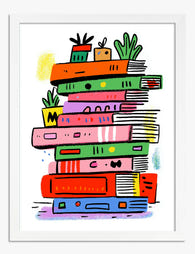
Poster bunter Buchstapel mit Pflanzen
Translation missing: de.products.product.sale_price Ab €17,95€29,95 -
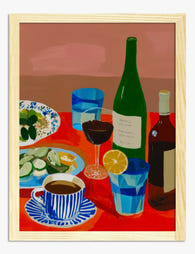
Poster Einladend gedeckter roter Tisch
Translation missing: de.products.product.sale_price Ab €17,95€29,95 -
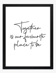
Poster Zusammen ist Zuhause
Translation missing: de.products.product.sale_price Ab €17,95€29,95 -
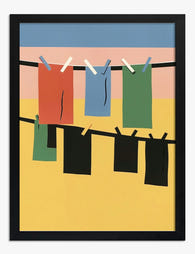
Poster Bunte Wäscheleine
Translation missing: de.products.product.sale_price Ab €17,95€29,95 -

Poster Welcome Home – Typografie in Pink und Gelb
Translation missing: de.products.product.sale_price Ab €17,95€29,95 -

Poster Zuhause mit Herz – Rote Typografie
Translation missing: de.products.product.sale_price Ab €17,95€29,95 -
Poster Farbenfroher Bücherstapel
Translation missing: de.products.product.sale_price Ab €17,95€29,95 -

Poster Gemütlicher Buchladen im Vintage-Stil
Translation missing: de.products.product.sale_price Ab €17,95€29,95 -

Poster Moderne geometrische Formen in Gelb und Grün
Translation missing: de.products.product.sale_price Ab €17,95€29,95 -

Poster Gemütliche Bibliothek mit gelbem Sofa
Translation missing: de.products.product.sale_price Ab €17,95€29,95 -

Leinwandbild Farbenfrohes Bücherregal
Translation missing: de.products.product.sale_price Ab €64,95€107,95 -

Poster Tischrunde in Pastellfarben
Translation missing: de.products.product.sale_price Ab €16,95€23,95 -

Poster Zimmerpflanzen am Treppenabsatz
Translation missing: de.products.product.sale_price Ab €17,95€29,95 -

Leinwandbild Vier Wanderer am Grashang – Schwarz-Weiß
Translation missing: de.products.product.sale_price Ab €64,95€107,95 -

Poster Lebendige Retro-Villa im Mid-Century-Stil
Translation missing: de.products.product.sale_price Ab €17,95€29,95


Mehr aus The Frame

How to Build a Gallery Wall Around One Inspirat...
Most gallery walls fail because they try to say too much. A truly great inspirational display works like a well-edited sentence: one strong message, supported by quieter elements that hold...

How to Build a City-Themed Gallery Wall That Ac...
Most failed gallery walls die at the same step: someone buys five prints they love individually, hangs them, and realises they have nothing in common. City art is especially prone...

How to Create a Travel Gallery Wall with Italia...
A travel gallery wall should feel like a love letter, not a souvenir display. The trick with Italy specifically is balancing the country's natural drama (lemon groves, Vespa-lined streets, terracotta...