How to Build a Gallery Wall Around Minimal Line Art
Build a gallery wall that actually feels finished, starting from the most forgiving art style there is.

Most gallery wall guides treat every print the same. They shouldn't. Building a wall around minimal line art is genuinely easier than building one around bold abstracts or photography, and once you know why, you can plan the whole thing in an afternoon.
Starting with line art: why it makes the perfect gallery wall anchor
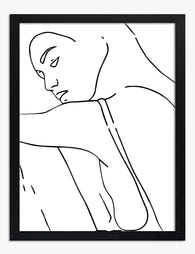
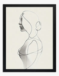
Line art is the easiest art style to build around because it carries almost no visual weight. A continuous line drawing of a face, a single botanical contour, an abstract figure in two strokes. These pieces leave breathing room around them, which means almost anything you add later has space to land.
Three things make line art the ideal anchor. The palette is usually neutral (black on cream, ink on white, occasionally terracotta or sage), so it doesn't fight with whatever you hang next to it. The compositions are spare, which gives your eye somewhere to rest between busier prints. And the style reads as quietly confident, so a wall built around it feels considered rather than chaotic.
If you've been browsing minimal line art prints and feeling slightly overwhelmed about how to make them work as a group, this is your shortcut. Pick the line art first. Build outward.

Choosing your hero piece: size and subject
Your hero piece is the largest print on the wall. It does the heavy lifting visually, and everything else orbits around it.
For size, the rule we use: your hero should be roughly one-third the width of the wall area you're filling. If you're working above a 220cm sofa, your hero wants to land around 70x100cm. For a smaller hallway wall around 150cm wide, a 50x70cm hero is plenty. Going too small here is the most common mistake. A timid hero piece makes the entire arrangement look like an afterthought.
For subject, pick something with a clear focal point. A single face in profile, a figure, a continuous-line nude, or a strong botanical silhouette. Avoid abstract scribbles as your hero. They work beautifully as supporting players but lack the gravitational pull a hero piece needs.
A note on print quality, because this matters more with line art than any other style. When the whole composition is a few thin strokes, every imperfection shows. Bands, pixelation, dull blacks. Giclée printing on thick matte paper is what makes the line look intentional rather than thin, and it's why line art bought cheap rarely looks the way you wanted.
Adding contrast: pairing line art with photography, abstract, and botanical prints
Line art on its own can feel cold. The trick is pairing it with two or three other styles that bring texture, depth, or warmth without competing for attention.
Abstract prints add movement. Look for soft shapes in muted colours: ochre, dusty pink, warm grey, sage. One or two abstract pieces among your line art will stop the wall feeling flat. Avoid anything with strong primary colours unless you're deliberately going for that contrast.
Botanical prints add organic texture. A pressed-flower study or a soft leaf illustration works beautifully because it shares line art's love of negative space. Browse botanical art prints for the kind of quiet, considered pairings that feel like they grew there together.
Black and white photography adds depth. A grainy landscape, an architectural detail, a still life. Photography brings tonal range that pure line drawings lack, and the monochrome palette keeps the wall cohesive.
The formula we recommend: 60% line art, 30% one supporting style, 10% wildcard. So on a seven-piece wall, that's four line drawings, two botanicals or abstracts, and one photograph or bolder piece.
How many pieces you actually need (based on wall width)
Most guides hand-wave this. Here are real numbers.
- Wall width up to 120cm (small hallway, between two doorways): 3 pieces
- 120 to 180cm (standard hallway, narrow alcove): 3 to 5 pieces
- 180 to 240cm (above a two-seat sofa, dining wall): 5 to 7 pieces
- 240 to 300cm (above a three-seat sofa, large living room wall): 7 to 9 pieces
- 300cm and above (open-plan living, stairwell run): 9 to 12 pieces
These are starting points. You can always graduate your wall over time, which we recommend rather than buying everything at once. Start with three anchor pieces (your hero plus two supporting), live with them for a fortnight, then add the next layer once you can see the gaps.
For sofa walls specifically, your gallery should fill roughly two-thirds to three-quarters of the sofa's width. Anything narrower looks marooned. Anything wider visually disconnects from the furniture below it.

Layout templates: the classic grid vs. the organic salon hang
There are two layouts that work reliably with line art. Pick one and commit. Hybrid attempts usually look unresolved.
The classic grid
Equal-sized prints, equal spacing, arranged in a clean rectangle. Two by two, three by two, three by three. This works brilliantly with line art because the uniform structure amplifies the calmness of the drawings.
Spacing: 5 to 7cm between frames is the sweet spot. Closer than 5cm and the prints visually merge. Wider than 8cm and they start to feel like separate decisions.
The grid is best for: above sofas, behind dining tables, anywhere you want a single statement. It's also the easiest layout to plan because you don't need to make compositional decisions, just measure carefully.
The organic salon hang
Mixed sizes and orientations, anchored by your hero piece, with smaller prints arranged around it in a loose but balanced cluster. Looks effortless. Is not effortless. But it's far more forgiving than a grid because slight measurement errors disappear into the asymmetry.
Spacing: 4 to 6cm between frames, kept consistent throughout. The sizes vary, the gaps don't.
To plan it: cut paper templates the size of each frame, tape them to the wall, and rearrange until the composition feels balanced. Your hero sits slightly off-centre. Smaller pieces fill the corners. Two same-sized pieces shouldn't sit directly next to each other.
The salon hang is best for: hallways, stairwells, anywhere with a sense of journey, and walls where you want to keep adding pieces over time.
Keeping it cohesive with consistent frame finishes
Frame finish is the single most underrated decision in gallery wall planning. Get it wrong and even perfectly chosen art looks like a junk drawer.
For line art specifically, you have three good options:
Black frames sharpen the contrast and make the lines pop. Best on white or pale walls, and best when your line art is genuinely high-contrast (strong black ink on bright white paper). Black frames make the wall feel graphic and intentional.
Natural oak or light wood frames soften the look and bring warmth. Best for sage, beige, or warm white walls, and ideal if your line art uses softer tones (sepia, terracotta, dusty navy). Wood frames make the wall feel collected rather than curated.
White frames disappear into pale walls and let the line art float. This works beautifully when you want maximum minimalism, but it can also make pieces feel disconnected if your wall colour is very close to the frame. Use sparingly.
Our strong recommendation: pick one finish and use it across the entire wall. Mixing black and wood frames in the same arrangement almost always looks accidental rather than eclectic. If you want variation, vary the mat size or print orientation, not the frame.
A practical note on framing quality. Cheap frames warp, especially in living rooms with radiators or bathrooms with humidity. Solid wood frames hold their shape, and acrylic glazing (rather than glass) is lighter, doesn't shatter, and won't yellow over time. Our framed prints arrive ready to hang in a single box with the print already fitted, which sounds basic but is genuinely the difference between a Saturday afternoon project and a Saturday afternoon disaster.
Common gallery wall mistakes that make line art disappear
Line art is forgiving in some ways and brutally unforgiving in others. These are the mistakes we see most often.
Spacing too wide. When prints are 10cm or more apart, the eye reads them as separate objects rather than a single composition. Line art is especially vulnerable because the sparse compositions already feel airy. Keep spacing tight.
Wall colour too close to the print background. Line art on cream paper hung against cream walls is invisible from across the room. Either go for stronger contrast (line art on dark walls, or use black frames as the boundary), or commit fully to the tonal whisper but accept it's a quiet wall.
Wrong mat size. Line art benefits from generous matting, more than you'd think. A 5 to 7cm mat around the print gives the drawing room to breathe and makes the whole piece feel intentional. No mat at all can work, but only if you're confident in the composition.
Mixing frame styles. Already covered above, but worth repeating. One frame finish across the whole wall.
Hero piece too small. Always size up. The instinct is to play it safe; the result is a wall that looks unfinished.
Hanging too high. Centre of the gallery should sit roughly 145 to 150cm from the floor, which puts the visual centre at average eye level. Above a sofa, the bottom edge of the lowest piece should sit 15 to 20cm above the back cushions.

Three complete gallery wall combos using our collections
Here are three real combinations, each designed for a specific room and budget. Use them as templates or starting points.
Combo 1: The hallway whisper (3 pieces, narrow wall)
Best for: hallways 120 to 180cm wide, on white or cream walls.
- One 50x70cm continuous-line face print (hero), portrait orientation, oak frame
- One 30x40cm botanical line drawing, oak frame
- One 30x40cm soft abstract in dusty pink or sage, oak frame
Hang in a stepped arrangement: hero on the left, two smaller pieces stacked on the right. Total wall span around 110cm. Spacing 5cm throughout.
Combo 2: The sofa anchor (5 pieces, classic grid)
Best for: above a 220cm sofa in a living room with neutral walls.
- Five identically sized 40x50cm prints in black frames, arranged in a row of five (or stagger to two-three)
- Three line art prints (figures or faces) and two soft abstract or botanical prints
- All portrait orientation, mat size consistent
Total wall span around 220cm. This is the easiest layout to execute and arguably the most striking. Browse wall art sets for pre-curated groupings that take the guesswork out of this approach.
Combo 3: The salon stairwell (7 pieces, organic hang)
Best for: a generous living room wall (240cm+) or a stairwell run.
- One 70x100cm hero line drawing, portrait, oak frame
- Two 50x70cm supporting pieces (one botanical, one abstract), oak frames
- Three 30x40cm smaller line art prints, oak frames
- One 40x50cm black-and-white photograph as the wildcard, oak frame
Anchor the hero slightly left of centre. Cluster the supporting pieces around it with consistent 5cm spacing. The photograph sits at the far edge, drawing the eye outward.
A final note on building over time
You don't have to finish the wall in one go. The most interesting gallery walls grow. Start with three anchor pieces in a layout that has room to expand (the salon hang is much more forgiving here than the grid), live with it for a few weeks, and let the gaps tell you what's missing.
If a piece doesn't earn its place after a fortnight, take it down. The wall is never finished, just paused.
Measure twice, hang once, and trust that line art is the most patient art style there is. It will wait for you to get it right.


In diesem Blog vorgestellte Fab-Produkte
-

Poster Minimalistische Menschen in Reihe
Translation missing: de.products.product.sale_price Ab €17,95€29,95 -

Poster Minimalistische Linien auf beigem Grund
Translation missing: de.products.product.sale_price Ab €16,95€23,95 -

Leinwandbild Minimalistische Figuren
Translation missing: de.products.product.sale_price Ab €64,95€107,95 -

Poster Elegante Balance – Line Art in Schwarz-Weiß
Translation missing: de.products.product.sale_price Ab €17,95€29,95 -

Poster urbanes, minimalistisches Raster in Koralle & Blau
Translation missing: de.products.product.sale_price Ab €17,95€29,95 -

Leinwandbild Yoga-Balance – Minimalistische Line Art in Schwarz-Weiß
Translation missing: de.products.product.sale_price Ab €64,95€107,95 -

Leinwandbild Minimalistische Linien in Schwarz-Weiß
Translation missing: de.products.product.sale_price Ab €64,95€107,95 -

Leinwandbild weiße Kontur auf taupefarbenem Hintergrund, abstrakt
Translation missing: de.products.product.sale_price Ab €65,95€93,95 -

Poster minimalistische Figurenreihe
Translation missing: de.products.product.sale_price Ab €17,95€29,95 -
Poster minimalistische Muse – Einlinienzeichnung in Schwarz-Weiß
Translation missing: de.products.product.sale_price Ab €17,95€29,95 -

Leinwandbild minimalistische Harmonie – farbige Figuren
Translation missing: de.products.product.sale_price Ab €64,95€107,95 -

Leinwandbild Bauhaus – modern und minimalistisch
Translation missing: de.products.product.sale_price Ab €64,95€107,95 -

Leinwandbild Bauhaus: Moderner Minimalismus und geometrische Formen
Translation missing: de.products.product.sale_price Ab €64,95€107,95 -

Leinwandbild Paul Klee – Eine Linie ist ein Punkt, der spazieren ging
Translation missing: de.products.product.sale_price Ab €64,95€107,95 -
Poster Minimalistische Einlinienzeichnung einer Frau
Translation missing: de.products.product.sale_price Ab €17,95€29,95 -

Leinwandbild Frau im Profil – Minimalistische Einlinienzeichnung
Translation missing: de.products.product.sale_price Ab €64,95€107,95 -

Poster Minimalistische Balance in eleganter Line-Art
Translation missing: de.products.product.sale_price Ab €17,95€29,95 -

Poster Minimalistische Figuren
Translation missing: de.products.product.sale_price Ab €17,95€29,95 -

Poster Minimalistische Balance – Geometrisch in Schwarz-Beige
Translation missing: de.products.product.sale_price Ab €17,95€29,95 -

Leinwandbild Einlinienzeichnung: mühelose Anmut
Translation missing: de.products.product.sale_price Ab €64,95€107,95


Mehr aus The Frame

Urban Jungle Interiors: Using Wall Art Instead ...
The urban jungle look is having a moment that refuses to end. But most of the people pinning those plant-drenched living rooms will never own 47 monsteras, and that's fine....

Room by Room: How to Hang William Morris Floral...
You've fallen for Morris. The question now is which floral goes where, at what size, in what frame. This guide skips the Arts and Crafts lecture and gets straight to...

Jungle Bedroom Ideas for Adults: Grown-Up Ways ...
Jungle bedrooms have a reputation problem. Search the term and you'll find nursery mood boards, cartoon monkeys, and bright kelly green walls that would keep anyone awake. The grown-up version...