From Hedgerows to Hallways: The Enduring Appeal of Wildflower Art
Why these untamed botanical prints have outlasted every interior trend of the last two centuries.

Wildflower art is everywhere right now, but it didn't arrive in 2024 with a moodboard and a Pinterest account. Its roots run back through 18th-century scientific illustration, the workshops of William Morris, and centuries of artists trying to make sense of the messy, beautiful chaos of a hedgerow in June. Understanding that lineage is the difference between buying a print that will date in 18 months and choosing one you'll still love in 20 years.
The origins of wildflower illustration: science meets beauty
Long before wildflowers became a decor category, they were a research tool. The earliest botanical illustrations were commissioned by physicians, apothecaries and natural historians who needed accurate visual records of plants for identification, medicine and taxonomy. Think of figures like Maria Sibylla Merian in the late 17th century, or the meticulous plates produced for Curtis's Botanical Magazine from 1787 onwards.
These were working documents that happened to be beautiful. Each specimen was rendered in fine detail on a cream or ivory background, often with the Latin name handwritten beneath, sometimes with cross-sections showing the seed pod or root system. The aesthetic we now associate with "vintage botanical" prints, with their pale grounds, scientific labels and isolated specimens, is essentially a working scientist's visual language preserved in amber.
What makes these illustrations endure is their precision. A buttercup drawn by a botanist in 1820 still reads as a buttercup today, because the artist was answering to nature rather than fashion. That's a big part of why vintage botanical prints have outlasted nearly every decorative trend they've ever shared a wall with.

How the Arts and Crafts movement popularised wildflowers in the home
By the late 19th century, Britain was deep into the Industrial Revolution, and a generation of designers had decided they'd had quite enough of factory-printed everything. William Morris, John Ruskin and the Arts and Crafts movement they led pushed back hard against mass production, championing handcraft, natural materials and motifs drawn directly from the British countryside.
Morris's most famous patterns, things like Honeysuckle, Willow Bough and Pimpernel, weren't formal garden flowers. They were hedgerow plants, the kind you'd see on a walk through the Cotswolds or along a Surrey footpath. This was deliberate. Morris saw wildflowers as a symbol of authenticity, of nature unmanaged and unmechanised, and he wanted them embedded in domestic life.
This is the moment wildflowers stopped being scientific subjects and started being decorative ones. Once Morris had put pimpernel on a wallpaper, the door was open for every subsequent generation of designers to do the same with poppies, cornflowers, oxeye daisies and cow parsley. The Arts and Crafts movement essentially gave us permission to bring the hedgerow indoors.
The modern revival: why wildflower art is everywhere right now
The current surge in wildflower art trends isn't an accident, and it isn't really new. It's the latest chapter in a recurring cultural pattern: when life gets too synthetic, people reach for the wild.
Three forces are driving today's revival. The first is biophilic design, the now well-established principle that exposure to natural imagery and materials measurably reduces stress and improves wellbeing. Hospitals, offices and schools have been quietly adopting biophilic principles for years. Homes are catching up.
The second is the rejection of overly curated aesthetics. The minimalist, all-grey interior of the 2010s has given way to something looser, warmer and more personal. Wildflowers fit this mood perfectly because they are inherently uncurated. A meadow isn't styled. A foxglove doesn't pose.
The third is generational. Younger buyers, particularly those drawn to cottagecore and slow-living aesthetics, are gravitating toward imagery that feels honest and grounded. Wildflowers carry no pretension. They don't try to be grand. That's exactly the appeal.
Vintage botanical vs. contemporary meadow scenes: what's the difference?
If you're shopping for botanical wildflower prints, the single most useful distinction to grasp is the one between vintage botanical illustration and contemporary meadow scenes. They look different, feel different, and suit very different rooms.
Vintage botanical prints
These follow the scientific tradition. Expect:
- A cream, ivory or off-white background
- A single specimen or small group, isolated against negative space
- Fine, precise linework with hand-coloured detail
- Often a Latin name, common name or plate number at the base
- A formal, almost archival feel
They read as collected, studious and slightly old-world. Hang one and you're nodding to centuries of natural history. Hang six in a grid and you've got something that looks like it came out of a country house library.
Contemporary meadow scenes
These come from a completely different tradition, closer to landscape painting than scientific recording. Expect:
- A wide, immersive composition showing flowers in situ
- Painterly or photographic style, often impressionistic
- A full colour palette including sky, grass and atmospheric light
- No labels, no isolation, no white space
- A loose, romantic, sometimes dreamy feel
These don't catalogue a flower. They put you in the field with it. A good contemporary meadow scene gives you the sense of wind moving through long grass, which is a very different emotional register from a labelled specimen of Digitalis purpurea.
Neither is better. They're answering different questions. Vintage botanical asks "what is this plant?" Contemporary meadow asks "what does it feel like to stand among them?"

How print quality has changed (and why it matters for your walls)
A wildflower print is only as good as the paper, ink and process behind it. The category has a quiet quality problem: a lot of what's sold online is digitally printed on thin poster stock with inks that fade within a couple of years of direct sunlight. If you're going to commit to a piece of art and a wall, this matters.
Three things to look for:
Giclée printing on heavyweight matte paper. Giclée (pronounced "zhee-clay") uses pigment-based archival inks sprayed at very high resolution onto thick paper. The result holds fine detail beautifully, which matters enormously for botanical work where the whole point is the delicate veining of a leaf or the texture of a petal. Our art prints use museum-grade giclée on thick matte paper specifically because wildflower imagery lives or dies on that level of detail.
Archival, fade-resistant inks. Cheap inks shift colour within months. Pigment inks rated for archival use can last for hundreds of years without noticeable fading, even in direct sunlight, particularly when paired with UV-protective glazing. If a print is going on a wall that catches afternoon sun, this is non-negotiable.
Proper framing. This is where the category falls down most often. Frames shipped separately from prints, warped MDF mouldings, prints that bubble inside the mount, glass that shatters in transit. Look for solid wood frames (FSC-certified if you care about sourcing, which you probably should), acrylic glazing rather than glass for safety and weight, and prints that arrive properly fitted and ready to hang in one box. It sounds obvious. It isn't standard.
Quality isn't about snobbery. It's about whether the print you hang in 2025 still looks right in 2045. Wildflower art is one of the few decor categories that genuinely rewards long ownership, so it's worth getting the materials right.
Five wildflower art styles and the interiors they suit best
Here's the practical bit. These are the five main types of wildflower wall art and the rooms they actually work in, with the reasoning behind each pairing.
1. Vintage botanical specimens for traditional, transitional and library-style rooms
Single specimens on cream backgrounds work brilliantly in rooms with depth and weight: panelled walls, deep greens, navy, oxblood, dark woods. The formality of the scientific style matches the formality of the room. A grid of four or six identically framed specimens above a console table or running up a staircase reads as collected and considered.
Frame them in slim black or warm walnut mouldings for a transitional feel, or gilded frames if you're leaning properly traditional. Avoid wide, chunky frames, which fight the delicacy of the imagery.
2. Contemporary meadow scenes for cottagecore, romantic and softly modern interiors
Wide painterly meadow scenes need space to breathe. They suit lounges and bedrooms with soft palettes: chalky whites, sage greens, dusty pinks, warm neutrals. Because the imagery is immersive, scale matters. A 70x100cm print or even a 100x150cm canvas above a bed or sofa lets the scene actually function as a window into a landscape.
Canvas works particularly well here because the matte, slightly textured surface enhances the painterly quality and avoids any glare across a large piece.
3. Single-stem minimalist prints for modern and Scandinavian rooms
A single foxglove on a generous expanse of white. A solitary cornflower. These pieces lean on negative space and quiet composition, which makes them ideal for modern interiors where the architecture is doing a lot of the work and the art needs to support rather than compete.
Pair with slim black or natural oak frames, keep mounts generous, and resist the urge to cluster. One large print at 60x80cm has more presence than three smaller ones jostling for attention.
4. Photographic wildflower landscapes for rustic, farmhouse and country interiors
Photographic prints showing real meadows, hedgerows or coastal wildflowers ground a space in a specific landscape. They work especially well in farmhouse kitchens, country bedrooms and entryways where you want a sense of place. Texas bluebonnets, Scottish thistles, English chalk-downland orchids: choose imagery that reflects either where you live or where you'd rather be.
Natural wood frames or unframed canvas suit this style best. Avoid anything too polished or gilded, which fights the honesty of the photograph.
5. Abstract floral and loose ink studies for eclectic and contemporary interiors
The newest end of the category. Loose ink washes, abstracted petals, blurred edges, half-suggested forms. These pieces sit comfortably alongside contemporary art, modernist furniture and bolder colour schemes because they read as art first and flowers second.
They also mix beautifully with vintage botanical prints in a gallery wall, where the contrast between scientific precision and gestural abstraction creates the collected-over-time feel that's almost impossible to fake.

A note on gallery walls and mixing styles
If you can't decide between vintage and contemporary, don't. Some of the most considered interiors mix them deliberately. A few specimen prints in matching slim black frames alongside one larger painterly meadow scene gives you both scholarship and atmosphere. The trick is consistency in framing (or deliberate inconsistency, but never accidental) and a unifying palette across the prints themselves.
For a gallery wall, lay everything out on the floor first. Aim for roughly even spacing of 5-7cm between frames, and let one piece anchor the arrangement at slightly larger scale.
Why wildflower art is an investment, not a trend
The reason wildflower imagery keeps returning across centuries is that it answers something durable in how we want to live. It connects us to landscape, to seasons, to the unmanaged and the real. That's not a 2024 mood. It's a recurring human one.
If you're choosing wildflower art now, treat it the way the Victorians treated their botanical plates: as something that will outlast the room it's hung in, the sofa beneath it and possibly the house itself. Buy fewer, better pieces. Pay attention to materials. Choose imagery that means something to you, whether that's the specific flowers from a walk you remember or a meadow scene that simply makes you breathe out when you look at it.

The hedgerow has been finding its way indoors for 300 years. Hang it properly and it'll stay there.
If you want to keep browsing, our nature art prints and broader botanical art prints collections are the best places to start narrowing down a style.

In diesem Blog vorgestellte Fab-Produkte
-

Poster Wildblumen-Illustration in Rosa und Gelb
Translation missing: de.products.product.sale_price Ab €17,95€29,95 -

Poster Spaziergang in der Wildblumenwiese
Translation missing: de.products.product.sale_price Ab €17,95€29,95 -
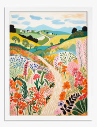
Poster Farbenfroher Wildblumenweg
Translation missing: de.products.product.sale_price Ab €17,95€29,95 -
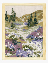
Poster Pfad durch sanfte Hügel mit Wildblumen
Translation missing: de.products.product.sale_price Ab €17,95€29,95 -

Poster William Morris »Wallflower«
Translation missing: de.products.product.sale_price Ab €17,95€29,95 -

Poster Wildblumen-Tapisserie von William Morris
Translation missing: de.products.product.sale_price Ab €17,95€29,95 -

Poster Wildblumenwiese – inspiriert von Klimt
Translation missing: de.products.product.sale_price Ab €16,95€23,95 -

Poster Botanischer Wildkräutergarten – Blau, Gelb, Pink
Translation missing: de.products.product.sale_price Ab €17,95€29,95 -

Poster Geißblatt im Stil von William Morris
Translation missing: de.products.product.sale_price Ab €17,95€29,95 -

Poster Wildblumenwiese inspiriert von William Morris
Translation missing: de.products.product.sale_price Ab €17,95€29,95 -

Poster Landschaft mit Wildblumenwiese
Translation missing: de.products.product.sale_price Ab €17,95€29,95 -

Poster Wildblumenwiese in Pink und Violett
Translation missing: de.products.product.sale_price Ab €17,95€29,95 -

Poster Wildblumen in Rosa mit goldenen Zweigen
Translation missing: de.products.product.sale_price Ab €17,95€29,95 -

Poster Wildblumenwiese in Pastell – Aquarell
Translation missing: de.products.product.sale_price Ab €17,95€29,95 -

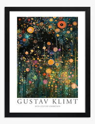
Poster Wildblumen-Sinfonie von Gustav Klimt
Translation missing: de.products.product.sale_price Ab €17,95€29,95 -

Poster Klimt-inspirierter Wildblumenwald
Translation missing: de.products.product.sale_price Ab €16,95€23,95 -

Poster Wilde Wiesenblumen in Pink und Gelb
Translation missing: de.products.product.sale_price Ab €17,95€29,95 -

Leinwandbild Wildblumenwiese im William-Morris-Stil
Translation missing: de.products.product.sale_price Ab €64,95€107,95 -
Poster Wildblumengarten bei Nacht
Translation missing: de.products.product.sale_price Ab €17,95€29,95


Mehr aus The Frame

Why William Morris Prints Look Brilliant in Mod...
William Morris has been quietly miscategorised for decades. His patterns get filed under "country cottage" or "Arts and Crafts revival" and rarely escape, which is a shame because his tree...

Why Arts and Crafts Nature Prints Are the Antid...
The minimalism hangover: why bare walls stopped feeling calming For about a decade, the aspirational interior was a white box with one boucle chair in it. That look has officially...

Botanical Petal Art: Why Close-Up Prints Feel M...
Full florals have had a long run, and they're not going anywhere. But if you've noticed that the botanical art appearing in design magazines, boutique hotel lobbies, and the better-styled...